
Please take a moment and tell me which set the following image is from:
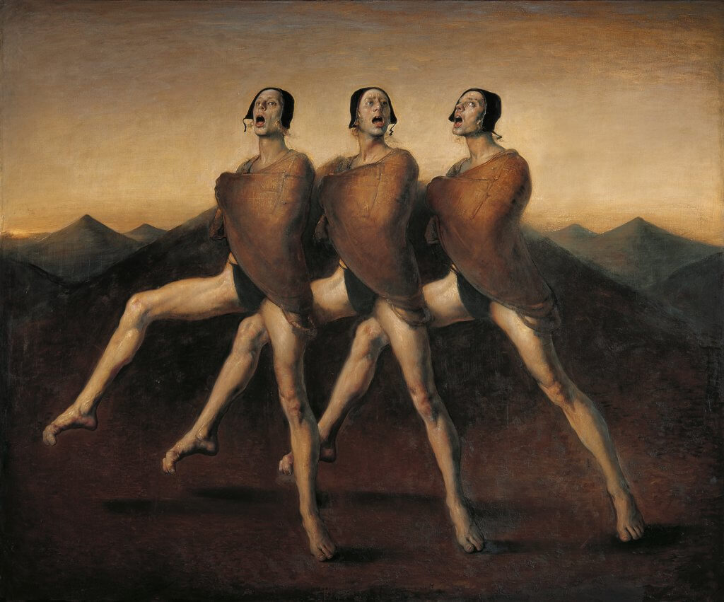
Now, this isn’t Magic art at all. It’s a painting by the Norwegian painter Odd Nerdrum. How surprised are you? A little? Not at all? If you knew it wasn’t, how did you know? Maybe, for a moment you thought: Hmm, could be Seb McKinnon or maybe rk post. If you had to put it in a color, which would it be? I mean, there’s really one choice: black. Why, though?
It could (and should) be argued that, on principle, black cards need to be more visually stunning and weird and eerie. And I start with Nerdrum’s figure painting above because it’s going to prove a point of mine: Some artists are more suited to create for the particular frame of Magic cards. And no one is more appropriate or perfect than rk post.

rk post has contributed art for Magic since Exodus and for all colors, but his black cards are what I’m most interested in. They are, by far, the most illustrative and visually disturbing (in a good way).
What makes Unmask so wonderful is the framing. We’ll see rkpost do this often. His figures–often women–are centered exactly in the middle. And when they aren’t, it’s done for a reason (see below). The card is from the set Mercadian Masques, so the card’s theme plays into that, but the woman, so far as I know, isn’t a major player in the lore. But what’s happening is she’s front and center. The background is an unbusy and complimentary blue-green. The focus is on her red hair and the process of her unmasking. Might seem unfair to compare this version to the Secret Lair one, but you can see how the busyness of the Secret Lair one is ruinous. And while much art in Mercadian Masques is centered, most have multiple characters in scene or busy backgrounds.
There is a subtle horror to the stylized and archetypal nature of a card like Unmask. Stylized in that there’s no devotion to literalism–putting her in a story from lore or reflecting the flavor text. And archetypal in that the art is reflecting the best aspect of the card’s ability. That is, it’s synecdochic. Synecdoche is another Greek word of rhetoric which means “a part for the whole.” What we may call a representative sample. We often hear it or use it when we say, “I need everyone’s eyes on this.” You need more than eyes–that body part is chosen as a way to represent the whole person. Bog Initiate is another rk post card in this vein.
rk post has distilled a card’s mood and feel and given it a graphic interpretation. That, to me, is more mysterious than a slice of a story like a comic book box excerpted for the card art. (Yet another great example of archetypal black art is Rob Spencer’s Terror. The art is meant to encapsulate what terror is.)
post has struck upon a way of representing black cards’ figures in such a way as to make them terrifying in profile. What’s eerie about this presentation is how it looks clinical. Or formal. Like Nefashu is sitting for a portrait. The cards are meant to represent the ability in the most concentrated way. And here we have the zombie mutant posing with its multiple arms and heads and chopping devices. The busier the frame, the worse a Magic card is for me. And by worse, I mean, I will not spend much time looking at the art. rk post knows that, in the TCG frame, less is more.
Look back at the top of this article to the Nerdrum painting, “The Singers.” The lighting is almost spotlighted and heavy with chiarascuro. The figures are center-framed. The attention is on them, not the background. They are stylized in their pose and terrifying all the more for it.
Similarly, with Avatar of Woe. rk post ups the composition game. Here, the self-named avatar is to the side, in opposition to all previous examples. But her pose is still the same. Facing us, goading us, showing off, daring. And each sufferer of woe behind her is in a different stage of submission. The one directly behind her is not visible at all. The second one is half seen and crossed by her scythe. The third is as yet untouched but in preparation of woe. The background is repetitious but there’s variation to keep us interested. It’s in grayscale but compelling because they are the background themselves.
Art appreciation is, of course, subjective. And Magic players have their own favorite artists. But I will forever be drawn to those who aim to elicit horror, especially in black cards, through dramatic framing and a classical, figurative, and ascetic sense of composition. There is a concept in art history called “horror vacui” (Latin for “fear of empty space”) and the idea was that artists filled up all available space with design since a vacuum was considered impossible and, well, bad. In this sense, filling in all empty space potentially could’ve worked as a way to ward off evil. And so on. I feel like much of Magic card art is taken in by busyness and the horror vacui. “If we give players more stuff to look at then we’ll give them their money’s worth!” Alas.
As my fellow Hipster, Donny Caltrider, has pointed out, much of the art is now focused on story and lore and marketing. Which I understand. But sometimes, when can aesthetics simply prevail? Look again at rk post’s art above and try not to tell me that a vacuum can often be the most beautiful background for horror.
Kyle Winkler (he/him) is a teacher and fiction writer. While he was pre-teen when Magic: The Gathering was released, he didn’t start playing until recently. He’s the author of the cosmic horror novella (The Nothing That Is), a collection of short stories (OH PAIN), and a novel (Boris Says the Words). His favorite card is a toss up between Crypt Rats and Oubliette.