
Good morning, and welcome to the final article of Masterpiece Theater Marvel Masterpieces 2020 art review here on Hipsters of the Coast. We’re finishing our exploration of Dave Palumbo’s artwork from the 2020 Marvel Masterpieces trading card set, and this is Volume IX. If this is your first time here you can find the rest of the set within Volumes 1-8 below:
Volume I | Volume II | Volume III | Volume IV | Volume V | Volume VI | Volume VII | Volume VIII
Marvel Masterpieces 2020 is the most recent premier trading card set from Upper Deck Entertainment, raising the banner of the bi-annual Marvel Masterpieces series for this new decade. What makes the Marvel Masterpieces sets different is that each is illustrated by a single artist only; 2016 marked the return of Joe Jusko, illustrator of the original 1992 set, and 2018 ushered in famed Italian comic artist Simone Bianchi. This year, a master of imaginative realism in Dave Palumbo was chosen to be the next Marvel Masterpieces artist.

Palumbo announced that he would be the featured artist for the set in July 2020 via Instagram, and his contribution is the largest artistic project to date for the artist. Just this single set is comprised of more pieces than his decade long catalog of work for Magic: the Gathering, of which he is perhaps most well and widely known.
This column has covered each of Palumbo’s Marvel Masterpieces illustrations individually, and in each article Dave and I have look at fifteen or so illustrations. With this edition we will have gone through all 135! Each article includes artist commentary, bits of collecting information, tidbits from the back of the cards themselves, and as always, a TON of stellar artwork. This final grouping is full of obscure and lesser known characters, but includes some of the most important works of the entire series, from those that draw upon the illustrative masters of the last century to those that provide a much needed narrative within our greater community and society.
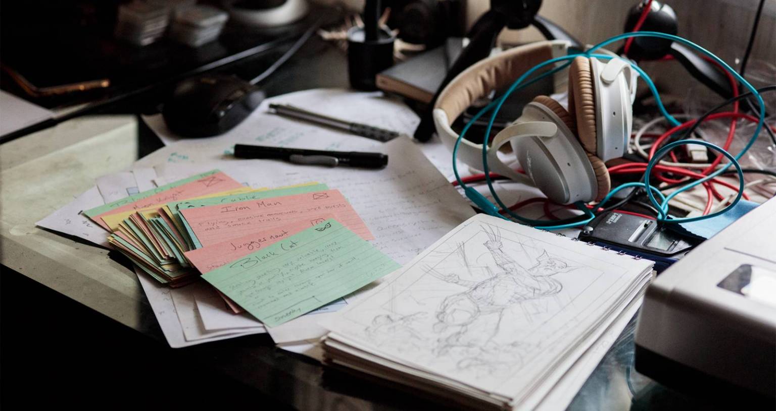
Palumbo’s character notes and song choices; each painting has its own notecard.
Each entry will include the published artwork as well as the song Dave chose to accompany each work. Each painting has its own soundtrack per se, and the work wasn’t complete until he felt it fully reflective of the song he chose. As in previous volumes, there are no songs for the Battle Spectra scenes, and duplicate appearances of the same character have the same song, in case you’ve heard it before. In order to replicate Dave’s headspace, I also listened to the song as I wrote each entry, and I highly encourage you to do the same. Hit play and then look back at the artwork and read the caption for full immersion.
It’s time for Volume IX. Let’s begin!
Vision
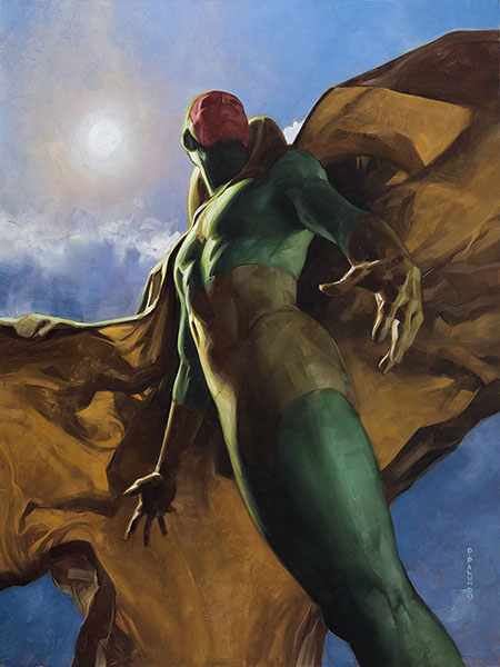
Vision by Dave Palumbo, oil on panel, 18” x 24”
Song: Germania by Hell
This work is very high up on my favorites list from the set, and Dave told me a bit about the process of how this painting evolved:
For whatever reason I’ve always felt like the Vision was really cool even though I was never an Avengers reader. But I wanted to pay tribute with this epic upward angle that makes him look so powerful and ethereal. My original plan for the sun and sky were a bit different, but as I was painting, it just kind of took its own path. Something in the colors felt reminiscent of NC Wyeth and I just had to follow that. I think it gives the piece a sort of serenity.
He mentioned NC Wyeth, one of the masters of narrative art during the Golden Age of Illustration at the beginning of the last century and perhaps one of the most important artists ever to paint within the genre. You may have seen his illustration of Robert Louis Stevenson’s Treasure Island; we can see where Palumbo drew inspiration; a controlled but vibrant palette, dramatic shadows as his cape billows in the breeze not unlike a ship’s sail, and dusky lighting to further the drama and evoke emotion. To draw inspiration from Wyeth is to stand on the shoulders of giants, as Isaac Newton once said, and is very much why these works transcend their trading card packs and become so much more.
Boom Boom
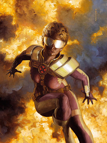
Boom Boom by Dave Palumbo, oil on panel, 12 x 16”
Song: Rumble and Sway by Jamie N Commons
This character is just so 90s to me, I was like: ok, let’s go all in on the 90s-ness. Looking at it now, that costume design really leaves you no choice so I’m not sure how successful I was or how inevitable it was. But its super fun, and really brings me back.
For Millennials, the 1990s and the X-Men are synonymous. Tabitha Smith, better known as Boom Boom, first exploded onto the scene in 1985; and as Dave mentioned, she made her mark on the 1990s storyline and is represented thus. The entire background is fire from whatever she’s just detonated, and as it still burns from her hands it reflects off the gaudy gold glasses and shoulder pads of her panther pink jumpsuit. This is nothing short of a Saturday morning cartoon nostalgia trip, and it sure brings me back too.
Mysterio (Canvas Gallery)
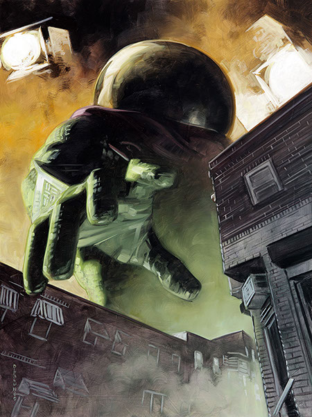
Mysterio (Camvas Gallery) by Dave Palumbo, oil on panel 12” x 16”
Song: The Horror by RJD2
This piece is a sort of counterpart to the base card art, clearly meant to be from the point of view of Mysterio’s victim. That classic Spider-Man issue where Mysterio “shrinks” him is just so iconic; I had to work it in somehow.
Dave mentioned when we talked about the Mysterio Base card he didn’t want to replicate what Joe Jusko did in 2016, showing Spiderman shrunk in an amusement park, the size of a spider compared to his foe. It’s more than plausible Mysterio would use this same trick again, and this is a perfect Sci-Fi, pulp cover riff off that same idea. The only difference is now we the viewer are the size of a spider, as his monstrous hand reaches down through a movie set. This is a fantastic piece of narrative art that lets you choose your own adventure.
Seeing that this was a counterpart to the base card, it was only fitting that I tried to acquire it to live alongside its painted brother. I was successful, and it’s headed to the framer as soon as I finish this article. I’ll talk more on both of them in a month or so in their own feature.
Old Man Logan vs. Scarlet Samurai
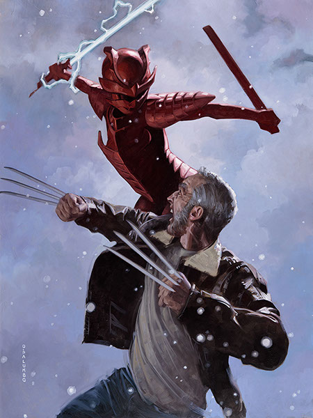
Old Man Logan vs. Scarlet Samurai by Dave Palumbo, oil on panel, 18” x 24”
Song: N/A (Battle Spectra)
We move from one of my top paintings to one of Dave’s:
One of my favorites of the set. I don’t know why Wolverine always feels appropriate in a snowy setting, but this one just felt pretty clear to me from the beginning. I don’t think there was a lot of sketching and searching, just very quick to this twisting, vertical composition. I guess I was taking a cue from JC Leyendecker that a strong silhouette or interesting shape is the key to a successful piece.
Once again Dave has turned to the masters who came before him. JC Leyendecker is another of the Golden Age illustrators and a contemporary of NC Wyeth who we spoke about earlier. He is quoted as saying, “a good cover has a distinct silhouette,” and I found that quote in a Muddy Colors article by none other than, you guessed it, Dave Palumbo from back in 2018. This work is so dynamic because Dave made sure that the composition worked as an assemblage of shapes and shadows first, and you can see that in his preliminary work below. This painting, and honestly this entire set, is the encapsulation of Old Master study and practicing what you preach.
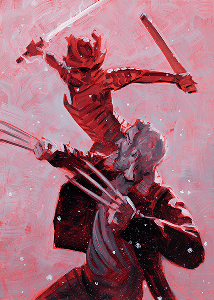
Old Man Logan vs. Scarlet Samurai (Preliminary) by Dave Palumbo, oil on panel, 5” x 7”
Heimdall
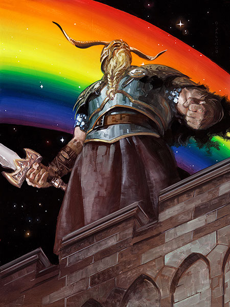
Heimdall by Dave Palumbo, oil on panel, 12” x 16”
Song: The Crown and the Ring by Manowar
The guardian of Asgard stands stoic watch to the tune of wildly dramatic organ music, as if he’s heralding the arrival of someone important. Yet he still stands at the ready, sword in hand and fist clenched, in case something else comes through the Bifrost. The rainbow is the attention getter here and particularly striking, departing from the color palette of this piece but bringing comic book lightness to an otherwise serious painting. Dave was a bit uneasy about its inclusion:
To be honest, I wasn’t sure that rainbow was going to work but I’m sure glad I tried.
It was definitely a bold move, but sure paid off in the end and made this piece wonderfully unique.
Mystique
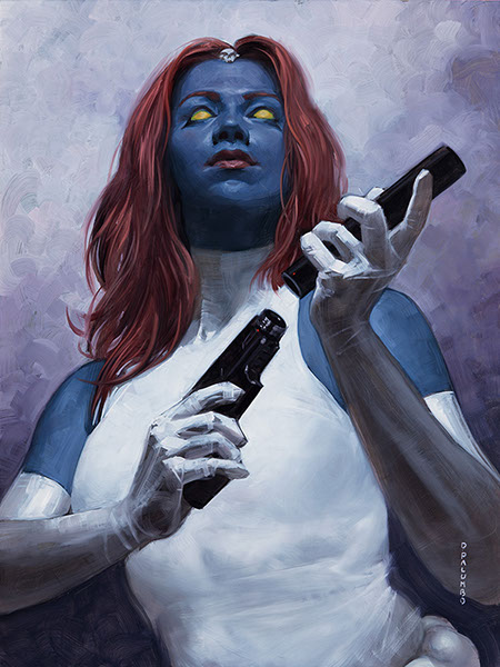
Mystique by Dave Palumbo, oil on panel, 12” x 16”
Song: Nobody Speak by DJ Shadow [NSFW]
It’s only fitting that this bad-ass lady would have a bad-ass backing track. Palumbo shows her in her natural blue form, reloading her magazine, with the stark white of her suit acting almost as negative space against her cerulean skin tone. The half portrait is a bit Bond girl but all business. And it’s as if we’re looking at her from the inside of a mirror—a dichotomy of danger and beauty.
Legion
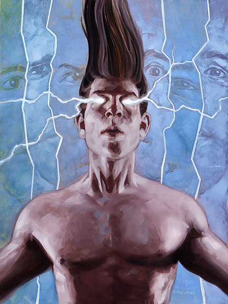
Legion by Dave Palumbo, oil on panel, 12” x 16”
Song: Communique by Prick
Legion is the mutant son of Professor X (who we’ll see in a bit), who is often found as the antihero due to his intense dissociative identity disorder. Working such a complex character trait into a painting is no easy task, but Dave has done just that, showing the character’s fractured multiple personalities behind his signature on-end hair. A full spectrum of emotion can be seen in the eyes that gaze forward behind his head, and yet his main expression is emotionless. You just never know what Legion you’re going to get.
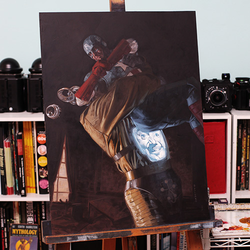
Captain America vs. Arnim Zola
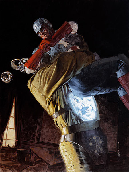
Captain America vs. Arnim Zola by Dave Palumbo, oil on panel, 18” x 24”
Song: N/A (Battle Spectra)
I was very happy with all three of the Cap pieces. I like to think of this portrayal as “smashing fascism in the face.” But it’s clearly not that simple, as we can see it’s a knock down drag out fight from the busted furniture in the background. Arnim Zola still has that infuriating smile on his TV screen.
The idea of smashing fascism in the face seems to be all too relevant in 2021, but none the less this is a great modern representation of two classic Marvel characters going toe to toe. This is yet another side of Cap, no longer kneeling or springing from the flames, but in mid-battle. And all the while Zola has that smug, unnerving look on his vintage, back-lit face. It’s man vs. machine-that-was-once-a-man, and just a really neat conglomeration of action.
This is also one of only a few original paintings remaining direct from Dave, and is painted at the larger of the two sizes. If you’re interested, you can find it here.
Professor X
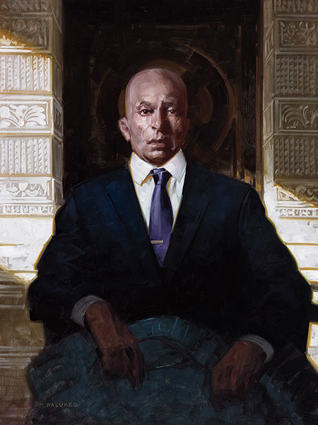
Professor X by Dave Palumbo, oil on panel, 12” x 16”
Song: Mastermind by Del the Funky Homosapien and Dan the Automator
Charles Xavier, aka Professor X, has always been one of my favorite Marvel personalities and is my favorite of all the X-Men. We greet him in his home, and Palumbo has taken extreme care in the ornamentation we see behind him, as well as the subtle “X” we see carved into the back wall of the mansion. He’s in his natural habitat, and this is a calm portrait of contemplation, thought, and resolve in an otherwise ocean of action.
Vision vs. Ultron
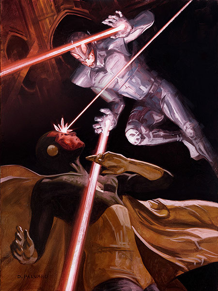
Vision vs. Ultron by Dave Palumbo, oil on panel, 12” x 16”
Song: N/A (Battle Spectra)
The only thing better than one laser is two, and better than that? Three lasers! We find Vision and Ultron locked in a science fiction shoot-out, a futuristic version of two sharpshooters squaring off in the Old West. The red ground heightens the energy and risk, and we’re not sure when one of these fated lasers might land on its target. It’s maybe my favorite Battle Spectra of the group—I’ll never not love to watch a good Avengers battle.
It’s also a fun juxtaposition of the MCU story behind these two characters as witnessed in Avengers: Age of Ultron. In the movie, Vision is born from the artificial intelligence J.A.R.V.I.S. that was uploaded to synthetic body of Ultron’s creation using the Mind Stone. The movie often gets a bad rap but I quite like it; if you haven’t seen it, it’s worth a watch.
Sentry
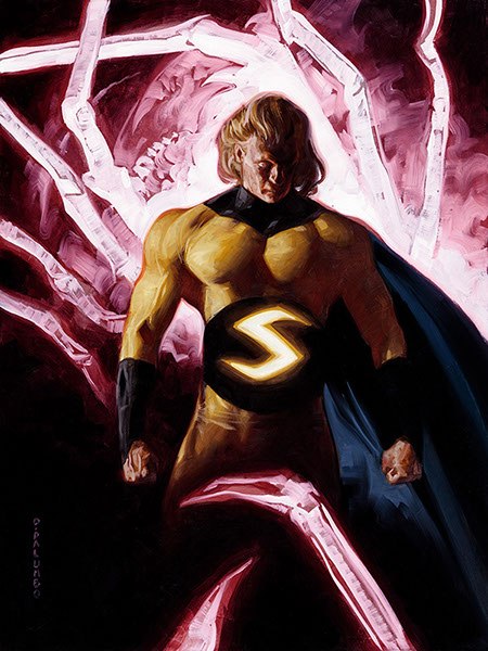
Sentry by Dave Palumbo, oil on panel, 12” x 16”
Song: Sacrifice by Clint Mansell
Sentry is not a character I was really familiar with—there always seem to be one—so I had to do a bit of homework. He’s a hero with the “power of one million exploding suns” and a pretty wild backstory of a hero long forgotten, but it’s that raw power we get in this portrait. The solar streaks appear as pure electricity behind him, and the glowing S all but eclipses the background. Sentry was a perfect choice for a Holofoil variant.
Nebula
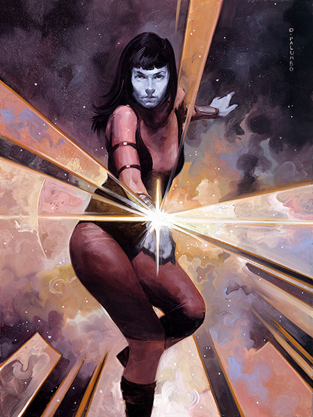
Nebula by Dave Palumbo, oil on panel, 12” x 16”
Song: Hallo Spaceboy by David Bowie
The vibe I was after for Nebula was “space pirate,” and I ended up basing the pose on images of Errol Flynn.
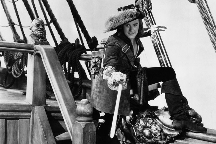
Errol Flynn in Captain Blood (1935)
We saw Palumbo use a similar cue from classic cinema in Howard the Duck (modeled after Humphrey Bogart) and he’s drawn upon another star of the silver screen here for Nebula. Add that to his spectacular rendition of space, and a Bowie backing track, and this makes for an out of this world version of the space pirate.
As an aside, I do believe David Bowie is the top soundtrack choice across all cards, having three songs matched with characters out of the set. It didn’t go unnoticed, Dave.
Rogue
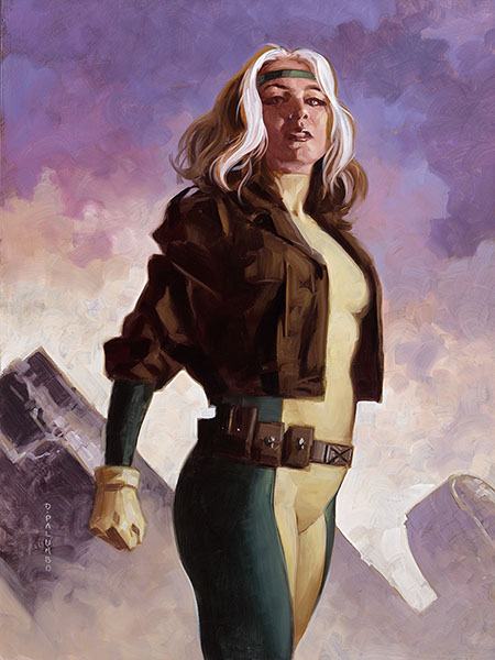
Rogue by Dave Palumbo, oil on panel, 12” x 16”
Song: Heroes by David Bowie
Of all the paintings in this set, it was this one that sparked a bit of controversy. I’ll let Dave explain:
This piece started as an experiment in making a gender neutral heroic pose and then adapting it to a particular character. To be honest, I’ve never quite clicked with Rogue the way so many fans do, so I didn’t have as personal of a feel for her. But I know she’s strong and heroic and brave, so it seemed that should be the focus. At the same time, I’d been thinking a lot about how male and female heroes are portrayed and how women superheroes don’t get drawn in that classic Superman stance so much. I guess I was trying to figure if, even being aware of the over-sexualized depictions of women in comics and aiming to avoid them, I was unconsciously treating my women characters differently. So I figured I’d just tackle this on as “what feels strong and heroic and brave” with androgynous preliminary pencils and then fine tune from there. In the end, I wasn’t really sure that my experiment produced any results in that I might well have ended up in this same place anyway. That said, this has been the one piece which has really prompted any sexist criticism from folks online so I guess that might be a sign of some success.
Palumbo’s Rogue is yet another shining example of his vision of superheroes as the Everyman and Everywoman. Turn out some folks couldn’t handle her painted as the woman next door, who also happens to be a superhuman mutant, and he had to delete more than one crass comment from Instagram. But as for me, I am here for it, and thankful he stayed true to his goal of showing the breadth of how superheroes can be represented.
Hawkeye
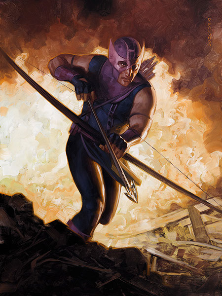
Hawkeye by Dave Palumbo, oil on panel 12” x 16”
Song: London by The Smiths
This is comic book costumed Hawkeye, dashing away from what appears to be the aftermath of one of his exploding arrows. As Dave describes on the back of the preliminary art card: “Who doesn’t love a good slow motion, running from the explosion moment?” There’s a great tension in this work: a sense of motion and urgency, in needing to get away from the flames, and at the same time heaviness, as if our hero is processing what he’s just done and that’s keeping him in the fray.
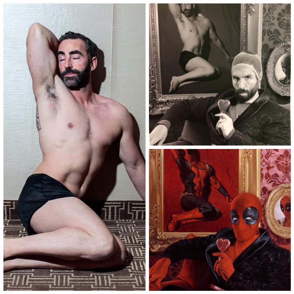
Deadpool (Holofoil)
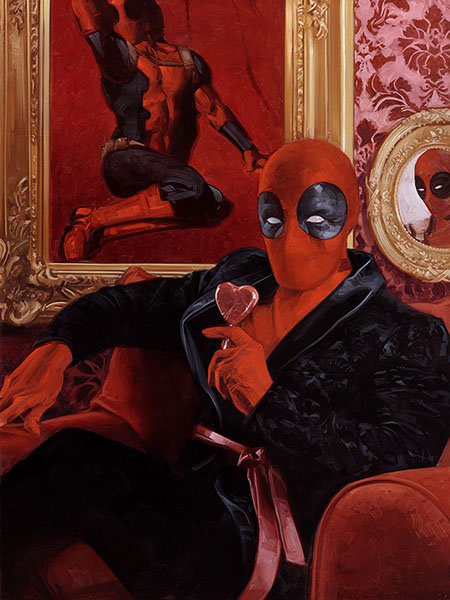
Deadpool (Holofoil) by Dave Palumbo, oil on panel, 18” x 24”
Song: Is That All There Is by Peggy Lee
If there’s one piece that I feel the hard work paid off, it’s this one. I struggled for over a year on committing to a concept for Deadpool that I was happy with. Ultimately, I was thinking about what would a formal Deadpool portrait look like, and this is where it lead me. Kind of a picture of Deadpool’s sensual side. The painting within the painting is Deadpool mimicking the Marilyn Monroe centerfold, along with the heart shaped lollipop and satin robe, is very much a “Happy Valentine’s day to me” Deadpool.
This is one of those paintings that both this set will be remembered by, right alongside the Canvas Gallery Spider-Man and a handful of others. The backing track really rings true as he taps into Deadpool’s softer side, of an early Wade Wilson, and at the same time infuses that dark comedic relief we know and love. What a package of fun storytelling.
And as a little treat, here’s a look at the reference shot, courtesy of Dave and the MCC Podcast from when this set first debuted.
Wrapping Up
And so ends Volume IX, and our look at all 135 pieces of Marvel Masterpieces 2020 artwork. This was an incredible adventure, and as I mentioned early on, my most comprehensive writing project to date. I have never done a full review of an entire set, for Magic or otherwise, but so far these nine articles include more than 25,000 words on what Dave has created for the 2020 Marvel Masterpieces. It is an artistic triumph the likes I’ve never seen, and will be hard-pressed to see again. It’s been an absolute privilege working with him to tell the stories behind these paintings. This set’s release has been a game changer for a lot of folks, and I count my lucky stars to have been able to interact and engage with such brilliant artwork from a stellar artist.
If you’d like to see all 135 works in a single three page gallery, you can find that here, along with information on which pieces are available for purchase and those that have already been sold. There are now less than ten original paintings available for purchase as of the writing of this article.
Next time, Masterpiece Theater will enter the “Appendices” of what I’d like to talk about with this set, and explore Dave’s preliminary works, both those that we see within the set and some others available outside what was printed on the cards. I’ll also have a promised Sketch Card Showcase, and as I mentioned earlier, a write up on my Mysterio once they come back from the framer. From there I’ll begin a new series that will incorporate the work of 2016 and 2018 as well, and you’ll hear more on that later this year. Remember you can keep up with all things Marvel Masterpieces 2020 by following me on Twitter. Feel free to ask questions or retweet to continue the conversation. Thanks and see you next time!
Donny Caltrider has been playing Magic since 2002 and collecting original Magic art since 2017. He has an M.A. in Museum Studies from Johns Hopkins University and enjoys telling stories about art, objects, and the intersection of fantasy with real-life. You can find him on Twitter talking about #mtgart, museums, and other #vorthos related goodness. Follow along and continue the conversation!