
Good morning everyone, and welcome back to the Mirror Gallery on Hipsters of the Coast. It’s Grand Art Tour day, right about a week ahead of the Kaldheim set release next Friday on February 5. The full spoiler list has been out since last Wednesday, and I’ve spent the better part of the last week pouring over the new cards and anxiously awaiting the artwork posted by the artists. We’ve got a lot of great art to see today.
If this is your first time reading one of my Grand Art Tour articles a bit of background: the series was inspired by New York Magazine art critic Jerry Saltz, and his 2010 article entitled A Grand Tour. His piece highlights some of his favorite works that were being exhibited in New York City during the summer of 2010, and in the same way the Grand Art Tour for each new set highlight as many of my favorite newly released illustrations as I can fit. You’ll see cards across the entire set, from all colors, rarities, and border treatments. For these following works in particular, there is an emphasis on narrative storytelling, legibility within challenging compositions, and simply put, some things you just can’t see at card size that are worth looking at up close.
This rendition will be a little different than previous iterations, too: instead of twelve individual works as I usually do, every other entry will be some sort of subtheme or special occurrence that happened in Kaldheim. It could be a new or particularly impressive style, a group of related works, or something that places an artwork in a larger or more important context within the game of Magic.
That all will make more sense soon, so let’s get started. In no particular order, these are my favorite pieces of art from Kaldheim.

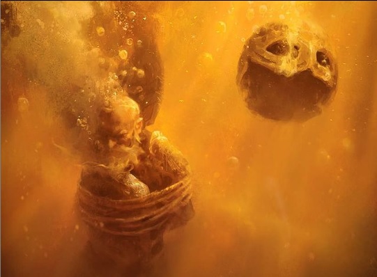
Return Upon the Tide by Martina Fackova
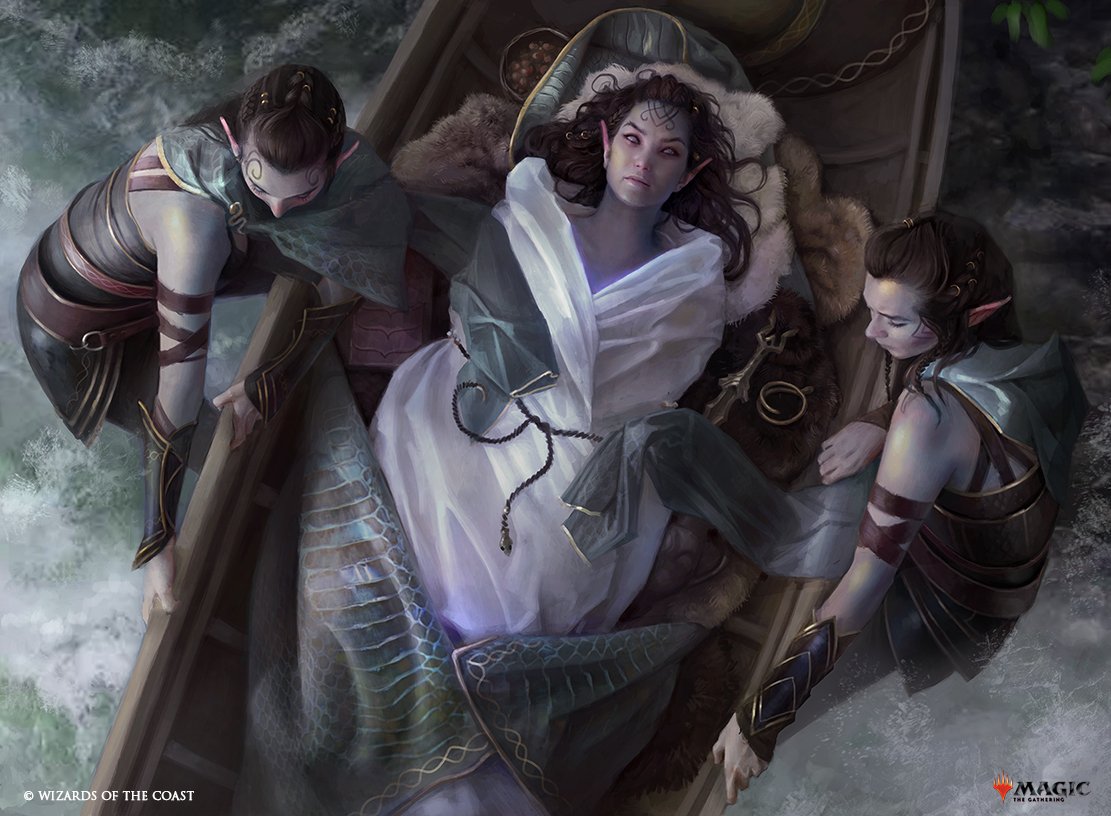
Return Upon the Tide by Martina Fackova. Digital.
We’ll start with a piece that took the internet by storm when it came out, not because of the card, but because of the art. This is Fackova’s second card for Magic after her debut in Core Set 2021 and what an incredible follow-up she’s given us. A triumph of texture and a smash-hit as far as storytelling, Martina has captured a Viking funeral from the God’s point of view, above.
The deceased, surrounded by their grave goods and wrapped in their finest, is set out to sea, and we get all of the realism we could ask for, from the attendants at the ready to the waves that crash upon the boat. This is an impressive piece at card size and even more at full resolution, and you must take a few moments before you move on to look closely. From the snakeskin blanket to the spray of the sea, there is just a lot of detail she’s incorporated without over-complicating the work. She’s going to be an artist to watch for quite some time.
Master & Commander: Donato Giancola and Volkan Baga
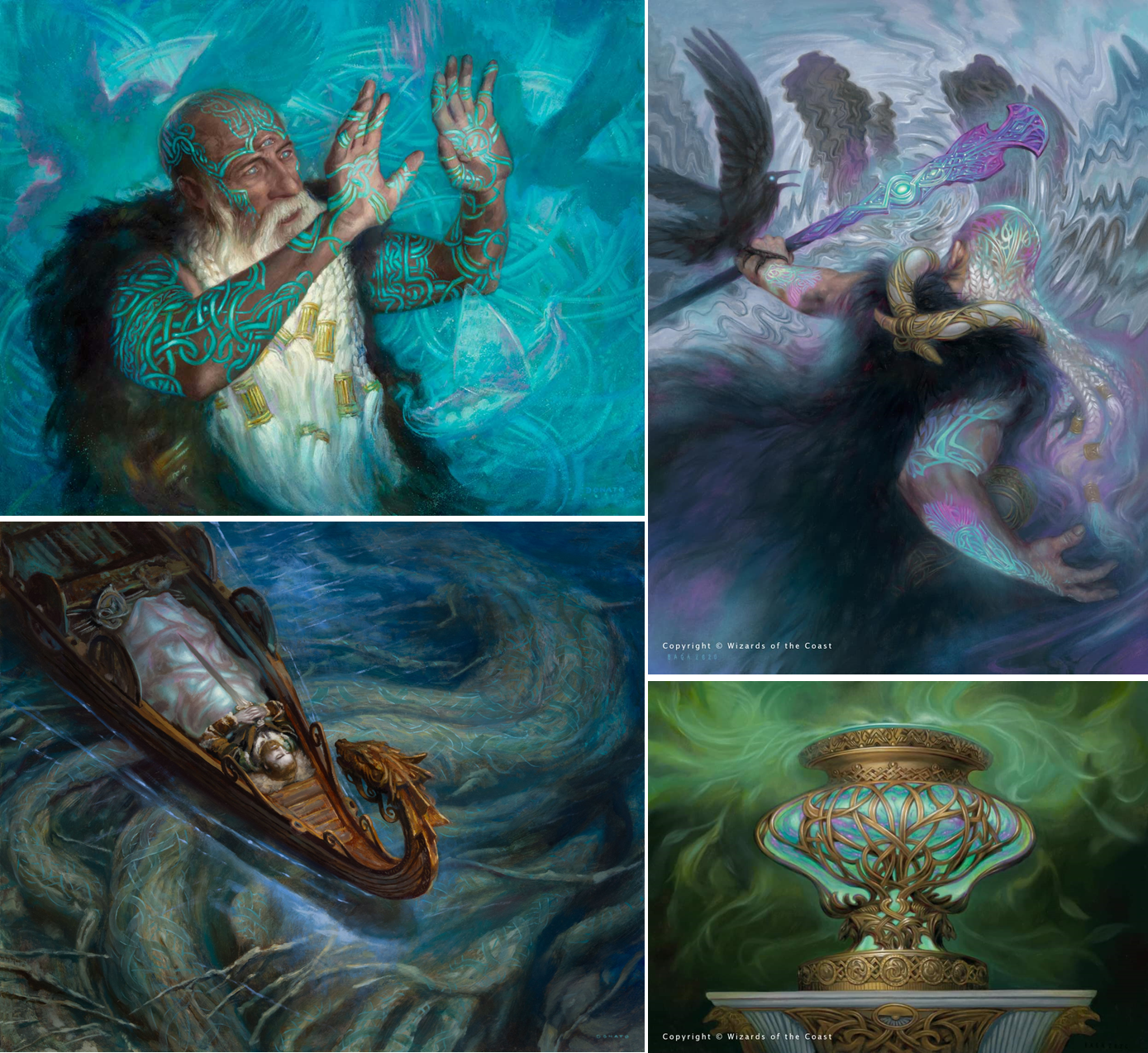
Top Left: Strategic Planning by Donato Giancola, oil on panel, 16” x 20” Bottom Left: Funeral Longboat by Donato Giancola, oil on panel, 16” x 20” Top Right: Alrund’s Epiphany by Volkan Baga, 16” x 22” approx. Bottom Right: Cosmos Elixir by Volkan Baga, oil on board, 13” x 17.3”
Kaldheim is, by all my research, the first time that Donato Giancola and Volkan Baga have worked on the same set that had definitive world building—meaning not a Core Set, supplemental set etc. Why is that important? Because Baga was once Donato’s studio assistant in Brooklyn, NY, and as you can see, learned much from the master as his student. (Baga recounts some of his experience in a 2009 interview.) Having them work side by side within the same setting is nothing short of awe-inspiring.
Both artists had the opportunity to illustrate Alrund, God of the Cosmos in their own way outside of his legendary card. Donato shows the God from the front in Strategic Planning, and Baga from behind in Alrund’s Epiphany; in each Alrund is entranced in his foretelling magic.
The artists each also had a Norse-inspired vessel as well, as seen in Funeral Longboat and Cosmos Elixir. Look at the undulating swirls in each painting that literally set the artworks in motion, and the use of color to outline and shadow as opposed to simple black; that’s not by accident, but rather a mark of these artists. Each is a masterwork within this larger context and it’s just a privilege to have these two titans working side by side on the same thing once again.
Battershield Warrior by Colin Boyer
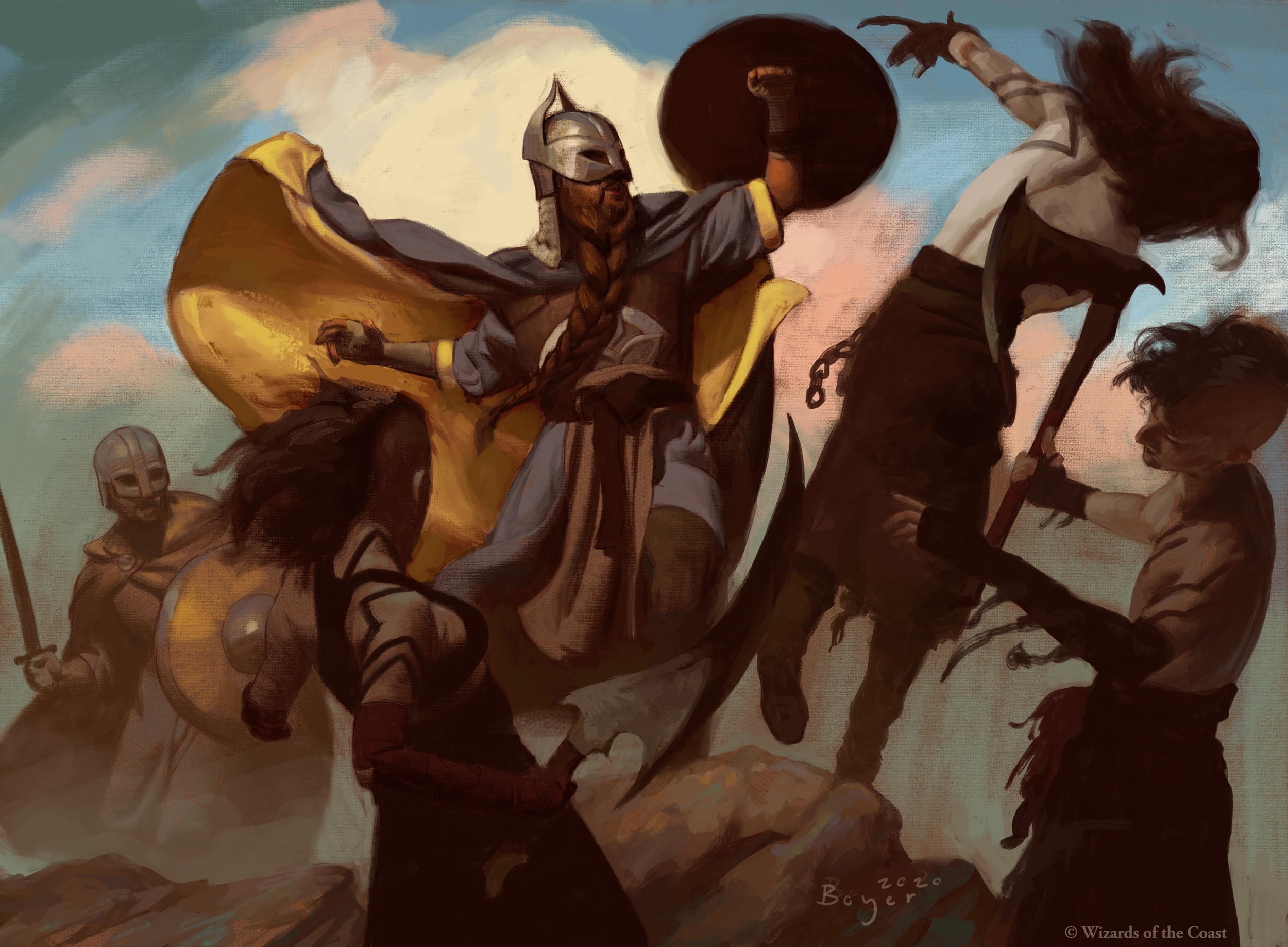
Battershield Warrior by Colin Boyer. Digital.
This is a piece I missed entirely until the artist shared the full art on Twitter. It’s one of those stylistic departures hidden within the main set that, as far as I can see, is the only one of its kind. Boyer mentioned that it was maybe his first multi-figure composition for Magic, and as such he needed to lean on something other than his prior experience. He sought the masters of the Golden Age of illustration, the likes of Howard Pyle and NC Wyeth.
What has resulted is a contemporary execution steeped in artistic tradition and style, created for this new world of Kaldheim but filled with a hundred years of illustrative expression. Boyer has just begun working as an Art Director for Magic, and I can’t wait to see this sort of inventiveness infused into other sets as well.
The Emperor’s New Style: Aaron Miller’s Valkyrie’s Sword and Shard Token
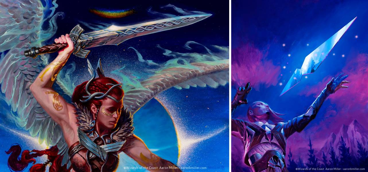
Left: Valkyrie’s Sword by Aaron Miller, oil and acrylic on Masonite panel, 18” x 24” Right: Shard Token by Aaron Miller, oil on canvas, (currently rolled in storage; Aaron said its at least 20” x 30” and maybe even 24” x 36”. HUGE.)
I’m very excited to talk for a minute about Aaron Miller’s new artwork, a showcase of a seemingly new style I’ve been waiting to see again for more than a year now. I mentioned at the end of last year when talking about his Enlightened Tutor, that he had mentioned some of his future work veered hard in that direction. Well, we see that on full display here in Kaldheim within his Valkyrie’s Sword and Shard Token.
He’s created these wonderful complementary contrasts of blues and purples that are equal parts otherworldly and entrancing, dreamscapes that border on the abstract as we saw in Enlightened Tutor but here are still grounded in realism. I love, love, love it; and I’m very excited to see more of Aaron’s work to continue to come out this year.
Weigh Down by John Di Giovanni
Weigh Down by John Di Giovanni. Digital.
This is the artist’s first work in paper for Magic, having done only one other card in Sphinx’s Revelation for the digital-only Amonkhet Remastered set on MTG Arena. The sea of gold immediately stands out being contained within the frame of a black card, and we’re a bit betwixt until we focus in on the bound and drowning intruder that finds himself sinking to the bottom of the ocean. The refraction in the water, the streams of bubbles and his floating helmet reorient and confirm what we’re looking at, and allow for the full realization of exactly what’s happening in this haunting scene.
This artwork makes you stop and look, and is breathtaking in both color and composition. I hope to see more of their work in the future.
Hole in One: Snowfield Sinkhole by Marta Nael & Woodland Chasm by Titus Lunter
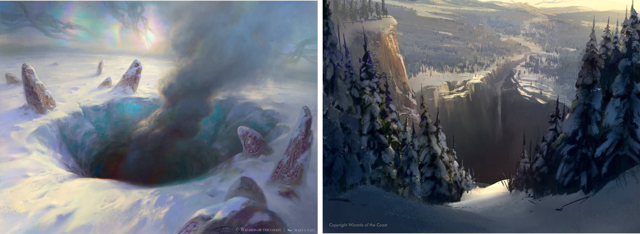
Left: Snowfield Sinkhole by Marta Nael. Digital. Right: Woodland Chasm by Titus Lunter. Digital.
How do you paint a hole in the ground and make it interesting? Beautiful? Terrifying? Well, like this.
Marta Nael hails from Spain, and Snowfield Sinkhole is her second Magic card and third illustration for the game. Look at the colors she’s incorporated in the ice to give it depth, substance and feeling. The sinkhole itself swirls with texture, like a drain, as it draws you closer and pulls you in, and the lighting dances across the frozen snow perfectly and effortlessly. It’d an impressive piece of art, and I hope this is not the last landscape we see from her.
And if you’re a regular reader of mine you’re already familiar with Dutch artist Titus Lunter and his incredible landscape contributions to Magic over the last five years. Yet he continues to surprise us with captivating commissions like Woodland Chasm. Now by card name definition this fissure needs to be immense, yes—but the vortex he’s created at the mountain’s base seeks to swallow the illustration in its entirety, card frame, viewer and all. You can almost hear it, the emptiness and reverberation of the mountainside. It’s an illustration that works fantastically inside and outside of the frame, and is one of my new favorites of his.
Snakeskin Veil by Matthew Stewart
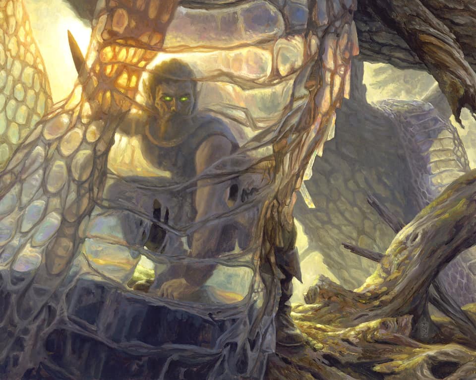
Snakeskin by Matthew Stewart, oil on Ampersand board, 16” x 20”
Set after set, year after year, Matt Stewart is quietly painting phenomenal works of art. This is a card that a lot of folks are going to miss—but not here, not after learning about what went into it as recounted during the original art auction. I had to talk about it.
How do you legibly paint a warrior hidden behind snakeskin, so that you can see the figure, the skin itself, and the surrounding details? Well first you have to figure out what things look like through actual snakeskin, and that’s exactly what Matt did: he bought real molted snakeskin to see how light shines through, to capture the iridescence and shimmer. It’s allowed him to create something imaginative but founded in realism, so that we believe this could actually be happening. This had to be one hell of a challenge, but in doing so is he’s created one of the strongest works of art in the set.
Arni Slays the Troll by Simon Dominic & The Bloodsky Massacre by Livia Prima
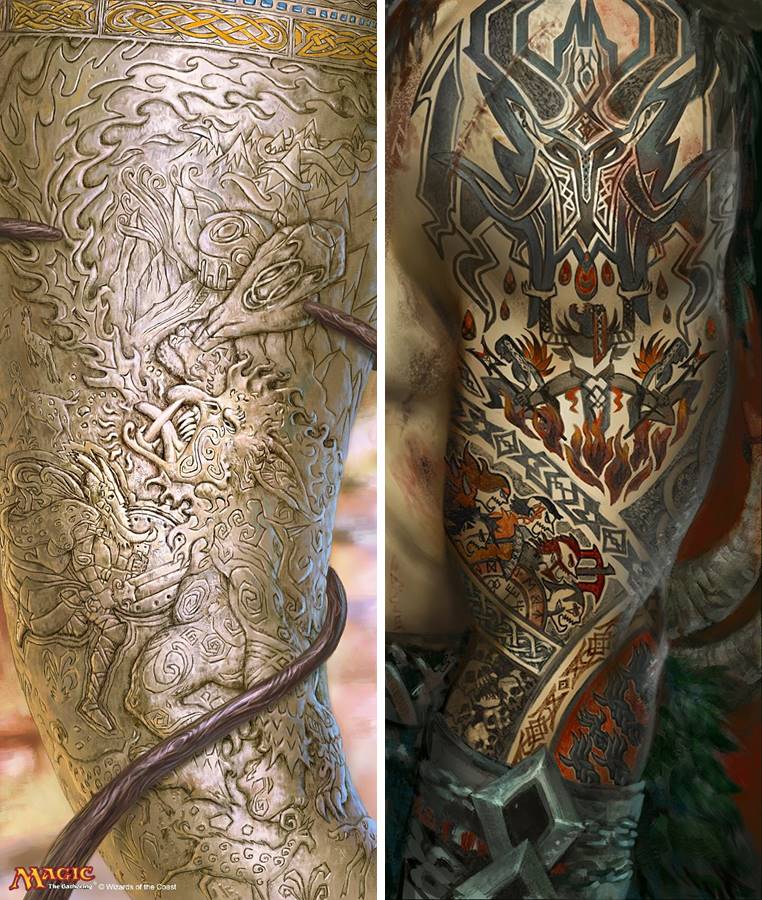
Left: Arni Slays the Troll by Simon Dominic. Digital Right: The Bloodsky Massacre by Livia Prima. Digital
Kaldheim heralded the return of the ever-popular Saga cards, enchantment spells that tell a story and feature vertically-oriented artwork done as if it was created on the world it represents. There are so many spectacular examples, but these are two that really stood out: Arni Slays the Troll by Simon Dominic and The Bloodsky Massacre by Livia Prima.
Dominic’s work takes the form of a carved troll’s horn, glistening in the light and appearing oh so very real. It tells the story of the Kaldheim legend Arni Brokenbrow, and his defeat of an invading troll by way of head-butting contest. (Yes, really.) His battle ends with a horn lodged in his head, so the fact that the story itself is carved on a horn itself is not lost and a fitting flavor gem for those Vorthos folk who enjoy these things as I do. Perhaps this is even that same horn?
Alongside, Livia told us the story of her Saga when she posted her art on Twitter: the demon Varragoth escaped from his nefarious realm, becoming the leader of the Skelle clan and murderously marauding until the sky rained with the blood of those massacred. He was returned by the Gods to Immersturm, but the Skelle recount his rampage and await his return as told by their tattoos, a core concept of their culture. Again, this is imaginative realism at its best, inventive rendering to reinforce the realism, and fantastic storytelling in every sense of the word.
In Search of Greatness by Ilse Gort
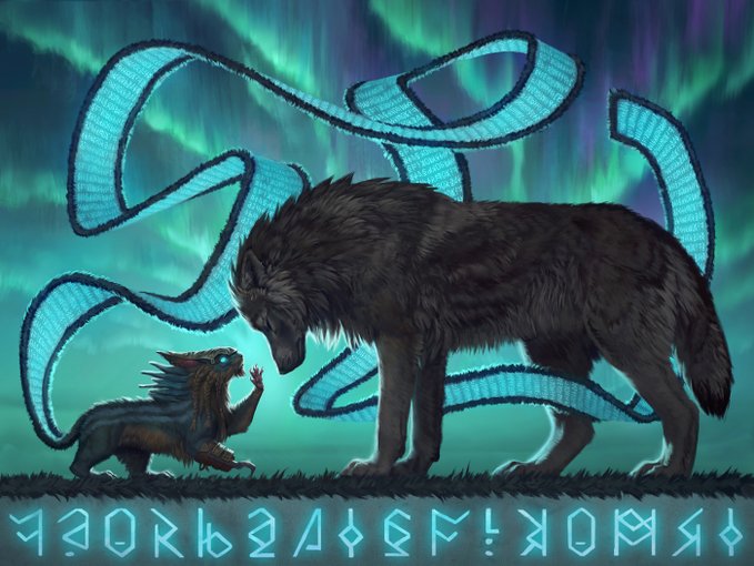
In Search of Greatness by Ilse Gort. Digital.
Ilse Gort has done it again with another great piece of artistic narrative, this time aptly named In Search of Greatness. To the left we see the legendary squirrel Toski, his runic tail trailing about the illustration, and he’s connected with an unknown and unnamed wolf of Kaldheim. Although the runes at the bottom don’t say anything in particular, they create a literal stage underneath a beautiful aurora borealis backdrop. It’s a charming moment frozen in time within the frame of the card, as if it could be found in an age old children’s book of Kaldheim, and hopefully one day we’ll get the rest of this story.
Carving a Path: Victor Adame Minguez and Adam Paquette
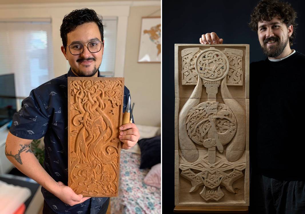
Left: Binding the Old Gods by Victor Adame Minguez, mahogany wood, 4.5lbs., 9” x 21” x 1.5” Right: The Three Seasons by Adam Paquette, solid lime wood (3 separate pieces). 37lbs., 34.5” x 16” x 4”
If I could write on all the Saga cards I certainly would. But in addition to the two I’ve mentioned previously, I had to save space for these two as well. We know Saga illustrations need to tell a story, again ideally as if it would be told within the actual fantasy culture; these go one step further. To reinforce this narrative the two artists, Victor Adame Minguez and Adam Paquette, chose to actually carve their Saga artwork, just as it might have been done by a craftsman on Kaldheim. The results are simply astounding, and each artist put their literal sweat and blood into these pieces. Victor noted it was a lot of blood by Swedish knife that went into Binding the Old Gods; Paquette made mention that his neighbors were audience to more than 100 hours of the hammer and chisel tapping it took to shape The Three Seasons.
These are not the first three-dimensional artworks to be featured on a Magic card, but they are the first time we’ve seen a saga actually be rendered in the material it seeks to represent. These artists did not have to go this hard, and yet they did; for the love of their craft, and their love of the game. Bravo, Gentlemen.
Wrapping Up
And so we’ve reached the end of yet another Grand Art Tour. Kaldheim is host to a plethora of fabulous artwork by both some new folks on the block and old favorites that have been with Magic for some time. Their work has come together in a great melting pot of inspiration and imagination, and shaped one of the deepest worlds we’ve seen Magic attempt in quite some time. There is so much to explore in Kaldheim, and I hope you enjoyed the bit of a change of pace as far as the way I’m looking at artwork. I’ve mentioned before it’s very much my intention to make this year one of connecting the dots between art, and this series is one way I’m going to try and do that.
Next time I’m going back Behind the Brush with one of Magic’s new artists who debuted within the Showcase series. She has done some of my favorite alternate art of the set, and is going to give us a bit of insight into the very new and very metal artwork she’s brought to Magic for the first time.
Remember, to see original #mtgart and other #vorthos related things, follow me on Twitter. Feel free to ask questions or retweet to continue the conversation. Thanks and see you next time!
Donny Caltrider has been playing Magic since 2002 and collecting original Magic art since 2017. He has an M.A. in Museum Studies from Johns Hopkins University and enjoys telling stories about art, objects, and the intersection of fantasy with real-life. You can find him on Twitter talking about #mtgart, museums, and other #vorthos related goodness. Follow along and continue the conversation!