
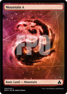
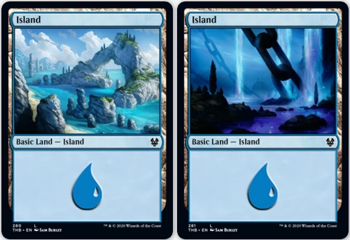
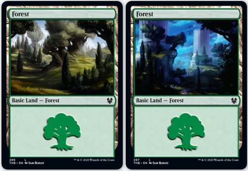
Good morning everyone, and welcome back to the Mirror Gallery here on Hipsters of the Coast. I hope you all enjoyed your prerelease last weekend, either your local game store or on Magic Arena, and that you opened some sweet art on brand new cards. One thing you undoubtedly noticed was something a little different in the basic land slot of each and every pack: the entirely new “Nyx” full art basic land, illustrated by Sam Burley.
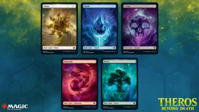
These lands are unlike anything we’ve seen before in Magic, and where our journey begins today with none other than the man who created them. Sam Burley has illustrated 80 cards for Magic, and over 50 of them have been basic and non-basic lands. For this trip to Theros, he painted not only the five Nyx full-art lands, but all the other basic lands as well, namely the “Above” and “Below” depictions that can be found in products outside of booster packs.
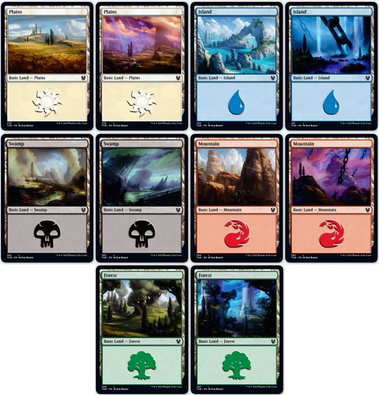

It’s not often a single artist illustrates the entirety of a set’s basic lands, so this becomes a unique point of departure to explore everything the plane of Theros has to show us through its landscape: on the ground, within the Underworld, and of our wildest dreams. Let’s see what Sam has to say about his work, his experience, and exactly what went into the Burley Basic Lands of Theros Beyond Death.
Hi Sam, and welcome to the Mirror Gallery here on Hipsters of the Coast. Before we go too far let’s do an introduction: who are you, where are you from, and what do you do?
Hey! I’m a super boring guy from Connecticut, currently living in Seattle. Besides being a Magic artist, I’m a huge gamer and it was always a dream of mine to work on the game ever since I fell in love with it as a kid back in Ice Age. Magic’s Ice Age, mind you . . .
It’s probably worth mentioning too that I had the pleasure of working at Wizards for upwards of five years as Magic’s concept artist until 2018. I eventually left to work from home as a freelancer again, but my time in the office gave me a much deeper love and understanding for the game than I already had. It was a blast to be a part of shaping the creative and even design a couple cards! The timing also worked out that I had already spent a lot of time making concept art for Theros Beyond Death many months, possibly years, before it began commissioning.
A concept of The Land of Nyx by Sam Burley. Digital.
Let’s jump right into these basic lands. There are three types we see in Theros Beyond Death, let’s call them Above, Below, and Nyx for simplicity. How did these work chronologically? Were they all commissioned at the same time, in one shot, or what was the timeline?
Haha, this the only time in my life that I’ve received fifteen commissions at once. The art director, Dawn Murin, pinged me extra early in the commissioning process to check my availability and said “There are three cycles of five (lands) . . . Do you want all 15?” I was so amazed and flattered that I gasped.
I couldn’t resist the opportunity and Dawn was willing to help me make it work. In the end we tackled them one cycle at a time over the course of about six months. Above first, Below second, and Nyx third.
Fifteen at once?! That’s a HUGE commission Let’s walk through each cycle in the order you completed them, and maybe you can distill what we see and what went into their creation:
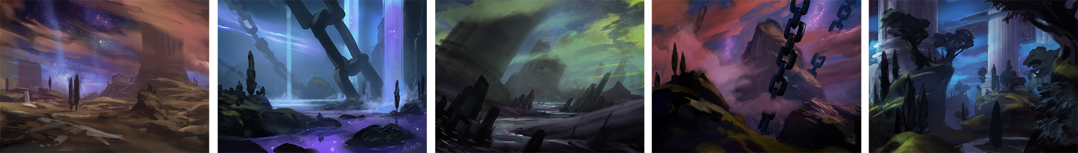
Above Lands
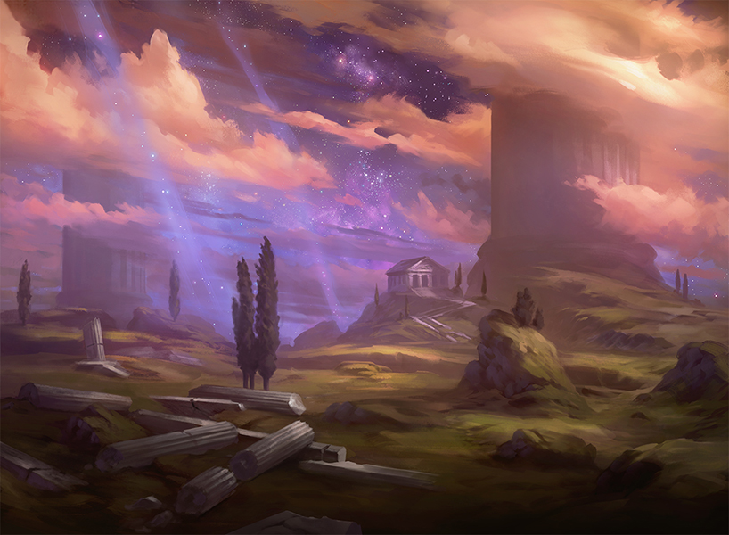
The Above lands show Theros as its mortal inhabitants see it. From rolling fields to rocky archipelagos, these landscapes situate us firmly in a Grecian-inspired fantasy world. Sam walks us through them.
The art descriptions for these were very short and literally the same for each land. “Show us a wide, glamour shot of the most beautiful landscape you can imagine for a Theros Basic Land — Plains (Island, etc.).” It’s a bit unusual to have something so open-ended, but that’s my favorite kind of prompt (and I like to think Dawn was happy to trust me on these).
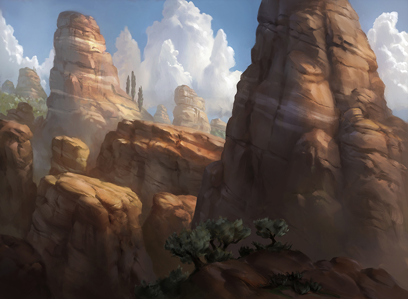
Mortal Mountain by Sam Burley. Digital.
Theros is all about a kind of classically beautiful aesthetic, and my inspiration came heavily from Hudson River School artists (which tend to be true for any of my lands, but even more so here). They embody the art history buzz phrase sublime landscape, which is all about warm light, long shadows, stunning clouds, a framed focal point, and visual S-curves that gently lead your eye into the painting. Go ahead and look up Thomas Cole and you’ll understand. The hope was to capture some of that sublime-ness while accurately representing Theros itself.
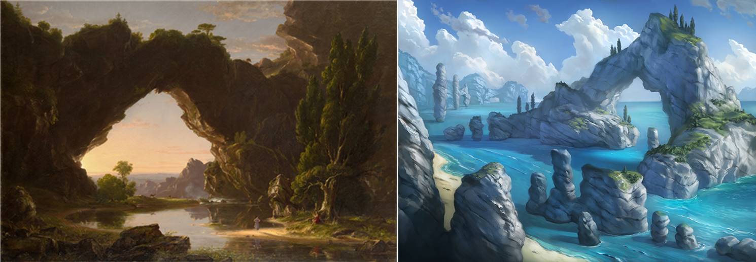
Left: Evening in Arcady by Thomas Cole, oil on canvas, 1843, 32 5/8” x 48 5/16.” Collection of the Wadsworth Athenaeum of Art, 1948.190, Bequest of Clara Hinton Gould. Right: Mortal Island by Sam Burley. Digital.
Typically I’ll do a bunch of sketches on my own, but only submit my one or two favorites. In this case, I only sent it one for each and Dawn approved all of them. And while not always the case, they changed very little on the way to the final.
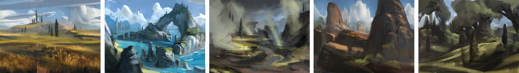
The sketches for the “Above” or Mortal World Basic Lands. Digital.
Realizing there would only be the single cycle of mortal realm lands made for a fun challenge. It felt like it was up to me to try and boil down all of the original Theros block into one, quintessential landscape to represent each color.
I’d say you achieved exactly that Sam. These feel like the Theros we visited before, yet are completely new and seem to embody everything we’d expect and want to see.
Let’s take the deep dive next; down to the Underworld . . .
Below Lands
The Below lands show the Underworld of Theros, often from the point of view of those who dwell there. For the most part this is uncharted territory, and Sam is our guide for this new expedition.
Similar to the Above lands, the art descriptions here were pretty short and sweet, and all the same: “Show us a wide, glamour shot of the most beautiful landscape you can imagine for a BASIC LAND — PLAINS (Island, etc.) in the UNDERWORLD. The colorful NYX effect fills the sky, and softly illuminates the landscape in perpetual twilight. The general terrain and pallet here should still feel correct for a Basic Land — Plains (Island, etc.).”
Obviously the Underworld is the big new thing in Theros this time around, so I wanted to highlight the elements that make it stand out. The colorful clouds, the Nyx-y sky, the huge columns, and giant chains. Poplar trees also go a long way in making anything feel like Theros. The style guide represented all of these things in detail, so each land felt like a bit of a buffet where I could mix and match the concepts that felt best for each color.
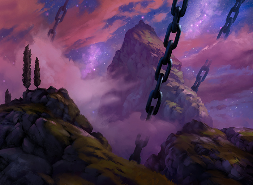
Underworld Mountain by Sam Burley. Digital.
Originally I had some statue-people scattered across the Plains and Island, but we decided to remove them. It was making the pieces a little too grim looking, and there was already enough going on to signal that you’re seeing the Underworld. Here are all the approved sketches.
Sketches for the Underworld Basic Lands. Digital.
One of the traps with working digitally on images that are ultimately printed is that it’s really easy to make super bright, vivid colors that printer inks are literally and physically unable to reproduce. They are outside the printable “gamut.” To compensate, a printer will instead use the next closest color it can handle in those areas, which results in flat, dull areas of color instead of that nice round gradient you painted. Why am I telling you this? Well intense blues and purples are notorious for getting painted way out of gamut, and those just happen to be the colors I used the most here. Trying to keep them in bounds (mostly) was probably the single biggest struggle working on this cycle.
Underworld Plains by Sam Burley. Digital.
These five are truly both beautiful and at the same time wonderfully eerie. The chains and pillars create that heaviness, yet the Nyx starfields seem to make everything ok. Magnificently done.
And last but certainly not least, the super special Nyx lands. I know you’re excited to talk about these so let’s jump right in.
Nyx Lands
The Nyx lands seek to embody the dream realm of Theros. Sam transports us there.
Funny story . . . I was quite familiar with these even before receiving the assignments.
Towards the end of my time at Wizards I had teamed up with a talented guy named James Arnold (Senior Graphic Designer on Magic) to mock up this exact concept, under Dawn’s art direction. We burned through a couple ideas before deciding on this take.
The file Dawn would later send to me as reference was the very same one James and I collaborated on. Being a project I was already passionate about, I was absolutely thrilled to be the one to paint them out!
The sketch process of these was pretty actually uneventful. Dawn and I were very much on the same page from the get-go and both sketch and finish were essentially rendering out each symbol in the manner James and I had already established. I somewhat randomly chose to do the Swamp first and made it my priority to determine exactly how much soft-ness we wanted along the edges of each symbol before moving onto the others. This was a critical task since the legibility of each mana symbol was crucial, but obviously we wanted these to look as much like billowing nebulas as much as possible.
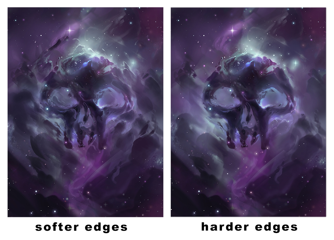
The Nyx Swamp, Edge Comparison.
Of these, we split the difference slightly, but erred on the side of harder edges to make sure the symbols stayed legible.
I really tried my best to make each of these feel like the color they represent, as well as accentuate the mana symbol itself. In the Island, for example, I wanted the big bright area that stretches down below the symbol to look something along the lines of a waterfall.
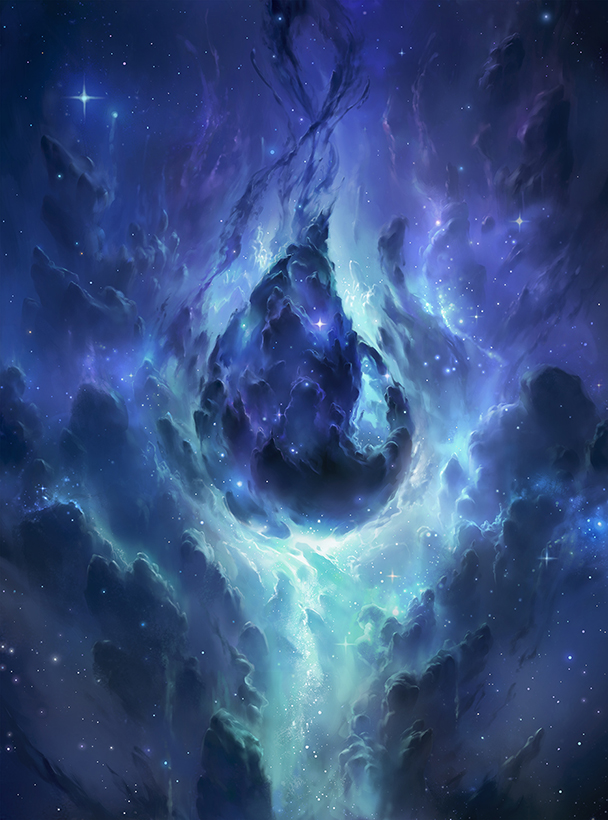
Nyx Island by Sam Burley. Digital.
And in the Forest, my goal was to design nebulas that looked like that were drifting upwards, almost blooming, to evoke a sense of growth.
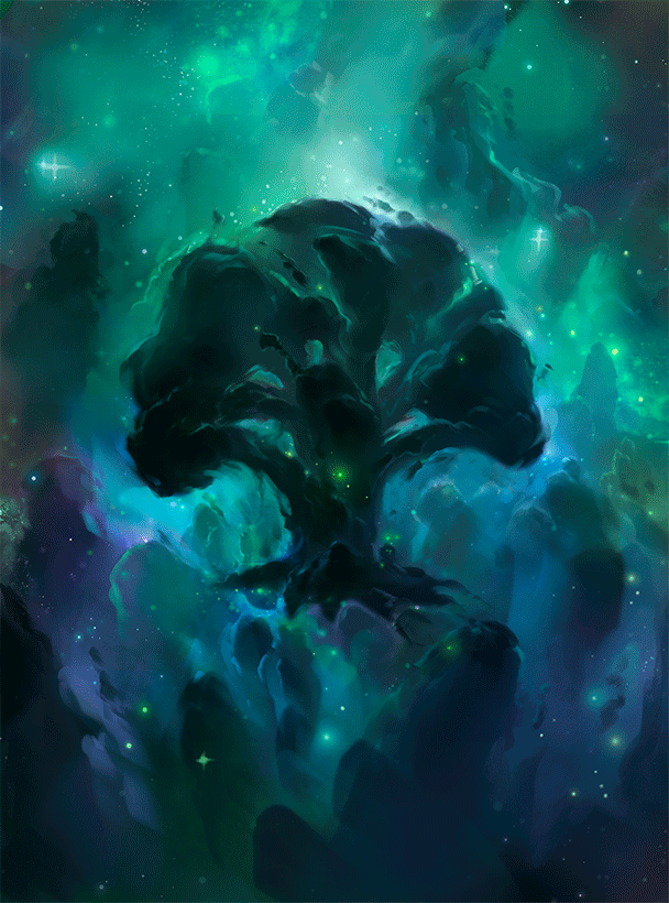
Process GIF of the Nyx Forest by Sam Burley. Digital.
The Swamp features shapes that are more long and tendril-like, like an inky ichor that swirls around and parted only just long enough for us to glimpse the symbol it was concealing.
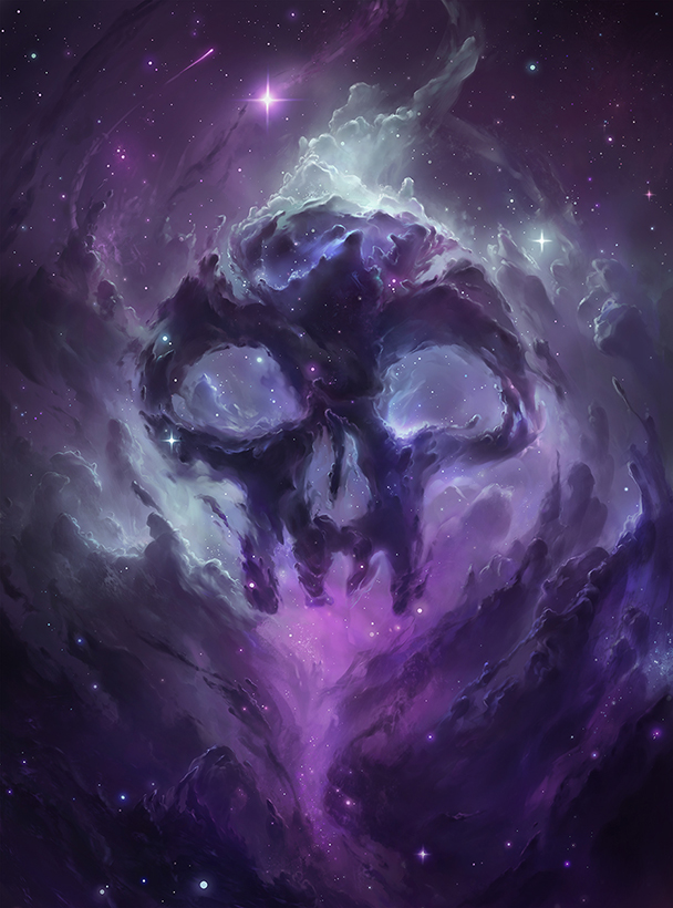
Nyx Swamp by Sam Burley. Digital.
In any case, these effects were all meant to be pretty subliminal, but I hope each card feels right to players in the end.
The imaginative feelings that you were able to make these abstract artworks evoke is really incredible. These lands are super special, and I think they’re going to be a fan favorite for a very long time.
Bringing It Together
I’ve got just a few more questions, curiosities that came up in discussion as cards were being previewed. We see chains as a continuing motif in the background of much of the Theros: Beyond Death art. Can you talk to what they mean, both in your Below landscapes or otherwise?
From a story perspective, I admittedly don’t know the details. But my understanding is that some or all of the titans were trapped down in the Underworld, not to mention Elspeth herself and many peoples of Theros. The chains serve as powerful symbolism in driving home the idea that much of this realm acts as a prison, which in turn explains why you’d have mechanics like Escape.
The chains are also a great visual simply for helping identify pieces of art as being located in the Underworld (along with other motifs that were stressed in the style guide). When there are literally ten of thousands of Magic cards already out there in the world, carving out space for new visuals can be pretty difficult. The chains are definitely something I don’t remember seeing before so I was happy to seize on them. Beyond that though, I just love their size. It’s both a little surreal, and makes you consider the power and magnitude of whatever god, titan, or otherwise it was that constructed them. And that kind of awe and majesty is an aspect of Theros that I love.
I don’t recall seeing them before either, and they’re one of my favorite elements of the set for exactly what you just said. The scale is just mind-blowing!
How did you ensure that each of these cycles, especially the Above and Below lands, would be visually distinct?
Luckily the creative team had put a lot of work into solving this for me already with the style guide. But to try and make it extra clear, I decided to give the Above lands a high horizon line (implying the viewer is high up), and the Below lands a low horizon line (implying the viewer is down low). Get it? I feel like it’s the art version of a dad joke, but I stand by it nonetheless. Within both cycles the horizon lines are also at almost exactly the same height. Thus, a player could quickly determine which cycle any land belonged to by looking at the horizon if the visuals indicators weren’t enough. That was the hope at least.
Dad jokes and bad puns are more than welcome here, Sam! What a cool technique, it’s ever so slight.
Do you see the difference?
How about here? So cool!
Basic land cycles are nothing new for you and the bulk of your previous Magic work- what made these the same, or different?
Besides the setting, the above and below lands weren’t really anything unusual. That said, each of Magic’s planes has a distinct tone, palette, and just overall aesthetic, and I always try to alter my style just a little bit to match that flavor. That alone keeps things interesting. Additionally, I didn’t do much in terms of landscapes for Theros the first time around, so I was glad to have such an opportunity in spades the second time!
Did you have a favorite one of the fifteen, or cycle of the three? Any reason why or why not?
The Nyx lands might just be my favorite thing I ever worked on. Ever. I could have kept at them for years and not gotten bored. Anything a little surreal and dealing with flowing, organic shapes and textures is just soooo up my alley. Clouds, nebulas, waves and floaty stuff . . . All the time, yes please! Combine that with getting to try something totally new for Magic and you get an experience that makes me a very happy and engaged artist!
That’s really awesome, and your excitement really shows in the final product. I’m smiling as I write this, knowing that so much thought and excitement went into these. So what was it like, the experience of illustrating the entirety of the Theros basic lands?
It was pretty amazing, but part of me feels bad to have hogged them all, haha.
Nevertheless, I owe Dawn a very special thank you. She’s an outstanding art director (and a pretty awesome human in general) and I’m so honored and grateful that she would have the faith in me to send all fifteen my way. Thanks Dawn!
Sam, thanks so much for letting us explore your work on these fifteen basic lands for Theros Beyond Death. Like all your contributions to Magic they are out of this world, and as always, I’m looking forward to what’s next!
Wrapping Up
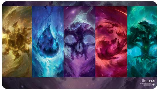
I want to give another special thanks to Sam Burley for joining me today, answering my questions, and being our Theros-ian tour guide to the landscape of Theros Beyond Death. You can find Sam online and follow his work on Twitter @SamBurleyArt. And if you’re interested in a print of any of the fifteen lands, you can get yourself one here, and playmats for each of the Nyx Lands, as well as the combo mat below, are here.
These lands have changed the face of Magic, and will forever be a unique high note of the game’s return to Theros. I hope you all enjoyed this little visual sojourn, and took away a little piece of the giant puzzle it was to create these fifteen artworks.
Next time in the Mirror Gallery, I’ll have another special guest joining me to give us a tour through another part of Theros. Here we’ve traveled on the ground, through the Underworld, and into Nyx. But in two weeks we set our course across the night sky.
Stay tuned, enjoy art, and I’ll see you then.
Donny Caltrider has been playing Magic since 2002 and collecting original Magic art since 2017. He has an M.A. in Museum Studies from Johns Hopkins University and enjoys telling stories about art, objects, and the intersection of fantasy with real-life. You can find him on Twitter talking about #mtgart, museums, and other #vorthos related goodness. Follow along and continue the conversation!