
Welcome to the Mirror Gallery here on Hipsters of the Coast. My name is Donny Caltrider, and this is where we explore the artistic side of Magic. Wizards of the Coast has given us four free War of the Spark preview cards to share with the world, and each takes a closer look at what is going on outside of the major conflicts of the War on Ravnica. Four common black cards, each doing their best under the circumstances.
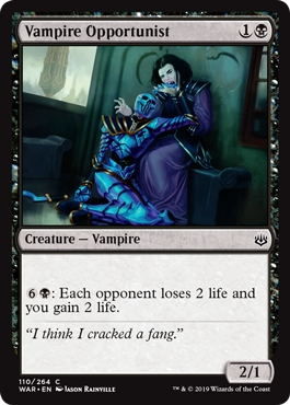
Even though a battle is raging through the streets, there are some that must continue with business as usual. For some, that means getting a bit creative in where you find your next meal, like Vampire Opportunist:
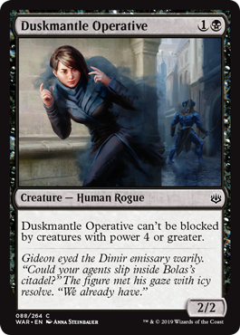
Or it could mean you have to be a bit more careful when traveling the streets, even for the most skilled agent of the Dimir. It seems like Duskmantle Operative has figured it out:

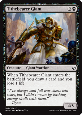
Lots of Ravnican citizens still have jobs to do. War often means opportunity, especially for those of the Orzhov. It certainly seems like the war is making Tithebearer Giant’s job a bit easier:
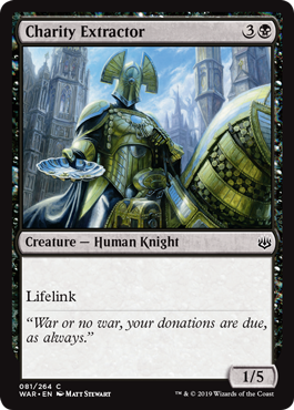
For a member of the Orzhov Syndicate one thing, above all else, remains true. Our last card says it best:
“War or no war, your donations are due, as always.”
For this preview we are headed behind the front lines, to explore the side-streets and alley-ways of Ravnica, and to chat with the artists that illustrated them for some added insight. We have some exclusive looks into the creative process that led to these cards. Let’s get started!
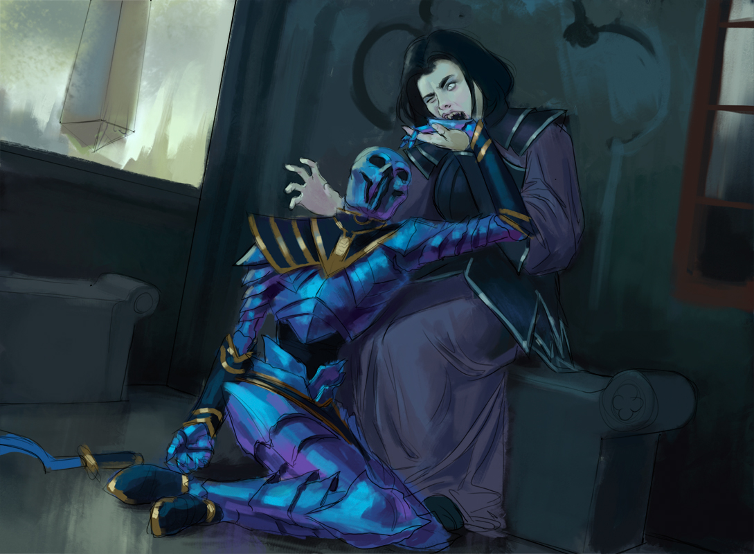
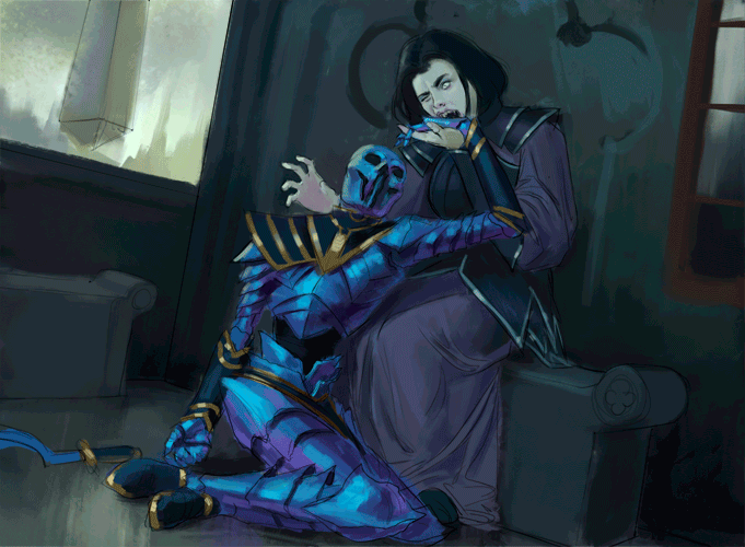
Vampire Opportunist
Behind the front lines, you still gotta eat.
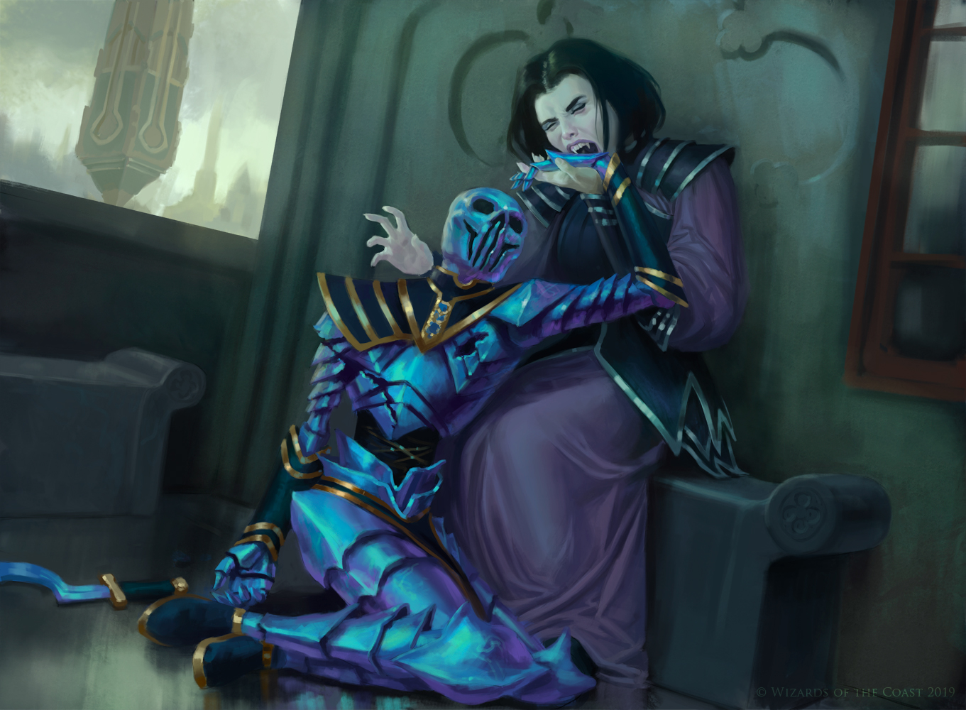
Vampire Opportunist by Jason Rainville. Digital.
Our first card today is Vampire Opportunist by Jason Rainville. Jason has been illustrating for Magic since 2014, and has his art on 75 cards as of the writing of this article. I was able to catch up with the artist to take a deep dive into exactly what went into creating this card, so let’s start exactly where the artist does, looking at the art brief given by Art Director Taylor Ingvarsson:
Setting: During the WAR OF THE SPARK on RAVNICA
Color: Black creature
Location: Anywhere in Bolas-occupied Ravnica
Action: Show a female Dimir vampire trying in vain to drink blood from the body of a dead Eternal. Maybe she’s wincing as her fangs fail to penetrate into the Eternal’s blue-plated head.
Focus: The vampire
Mood: “…Ow.”
Notes: It’s a lighthearted scene, but no need to “ham it up” to sell the humor.
Although a playful scene from initial conception, you can imagine a vampire trying to break through the Eternal’s Lapis-Lazuli coating is no easy feat, and neither would be its depiction. Jason walked me through his entire process from here to show us all exactly how he did it, so I’m going to turn it over to him. Take it away Jason!
Jason: This brief was given to me when I was visiting my girlfriend in Germany and I worked on the initial parts of it away from my regular setup. Despite that I started as I always do: pencil thumbnails, or small, rough sketches that I doodle at card size to try to get the composition and values working. I had the idea that since this could potentially be a funny piece, it could reference something overly dramatic to heighten that humour. I decided to add as an option a reference to a Pietà. Michelangelo’s statue is a little too nurturing to work:
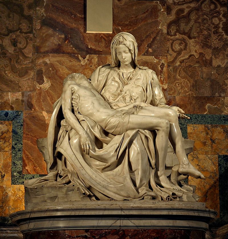
The Pietà by Michelangelo Buonarroti (Italian, 1475-1564), carved marble, 1498-1499, housed in St. Peter’s Basilica, Vatican City
But the Pietà at Saint Patrick’s Cathedral in New York had a pose I could work with:
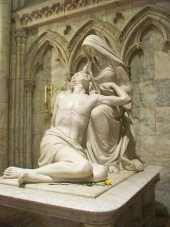
The Pietà by William Ordway Partridge, carved marble, St. Patrick’s Cathedral, New York
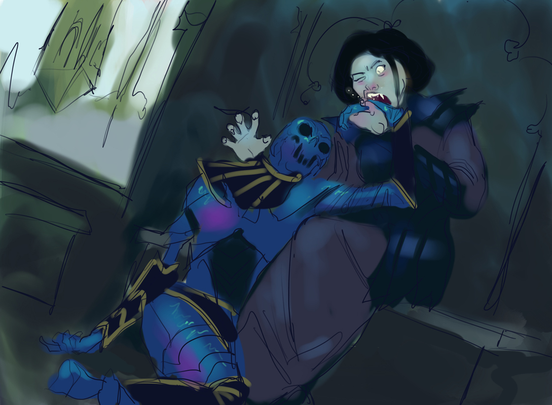
I took my thumbnail sketches and transferred them to my girlfriend’s iPad to work on colour sketches. Unfortunately due to the way I was working I don’t have readily available pictures of my pencil thumbnails. I do however have my very rough colour sketches I sent in for approval—as you can see I need more practice with the iPad. 😉 This was relatively rushed and cartoony for my colour sketches.
Once the sketch was given the okay, and once I was back home, I took some classic embarrassing reference photos, blanking off the background so I could see the values better. As a stand in for the mummy’s wrist, yes, I am in fact biting my PS4 controller.
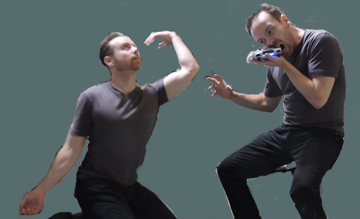
From here I began to do a rough re-sketch based on this reference. I didn’t follow the reference for “my” mummy’s head, as I liked the idea of it looking up at her, with an implied smile, “Haha I chipped your tooth.”
[Donny: This idea would carry through all the way to the flavor text, “I think I cracked a fang.”]
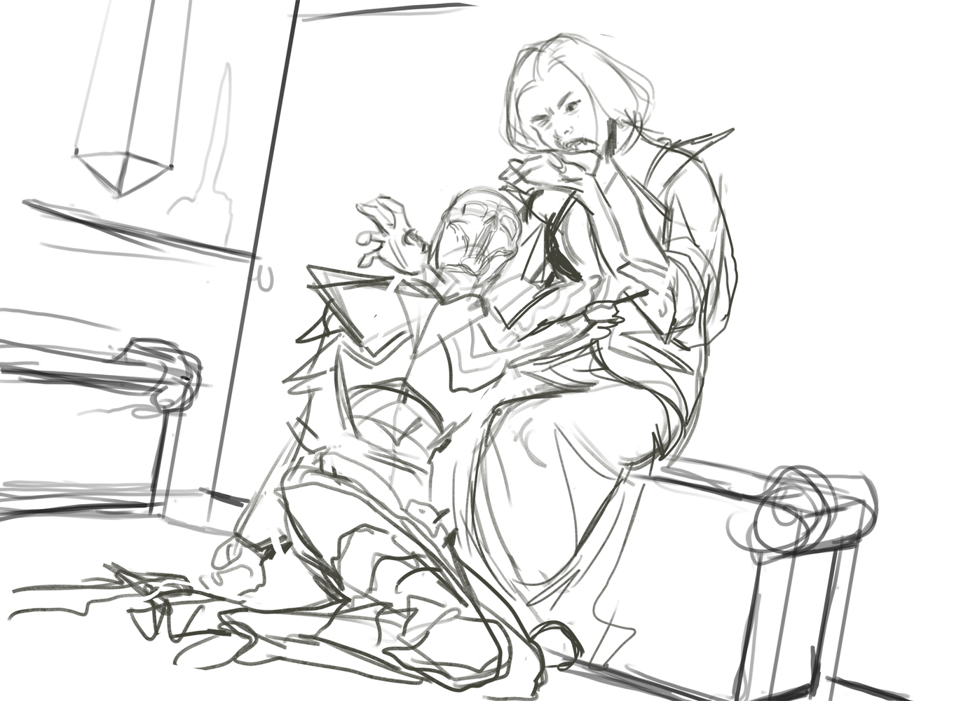
And then once that was done, I did a tighter sketch overtop:
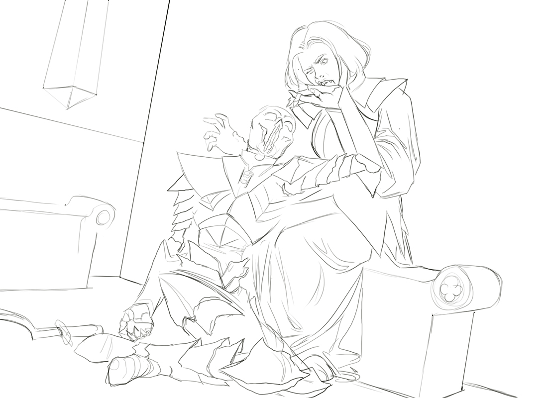
I reintroduced the colours underneath, and began one of the most important parts of my process; the rough colours. After these are done, 80-90% of what the image is going to look like is settled:
And while the image is 80-90% “settled,” 80% of the work is still ahead of me: the rendering! I work back to front as I don’t separate my layers very often:
A process GIF of Jason as he moves through his rendering layers.
You might notice during the course of the rendering there was a request to close her other eye, as the image still felt a bit overtly comical.
And that’s it!
Thank you Jason! What a wonderful walkthrough, being able to go from the earliest stages of just words all the way through to final stages of the piece—something we don’t get to often see. The flavor woven into this card is wonderful, as the flavor text and art work together with the card name to convey uniform feelings and ideas.
Keep an eye out for this vampire, as I think we’ll see this card across sealed and draft pools as early board power or a late game finisher. As you drain your opponent’s life total, hopefully you’re a bit more successful than this overzealous vampire just looking for a bite to eat, and now in need of serious dental work.
Duskmantle Operative
Behind the front lines, without a trace.
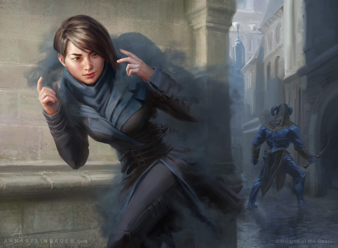
Duskmantle Operative by Anna Steinbauer. Digital.
Our second card today is Duskmantle Operative by Anna Steinbauer. She has been illustrating for Magic since 2015 and almost always has a few cards in every set. Her total Magic catalog now over 50 cards! Let’s begin again with the art description, this time from Art Director Dawn Murin:
Setting: During the WAR OF THE SPARK on RAVNICA
Color: Black creature
Location: Alley or other street location in Bolas-occupied Ravnica
Sky: Bright “Act 2” skies, if we see the sky here
Action: Show a FEMALE DIMIR SPY who is sneaking out of the darkness of an alleyway into the light. Because of her stealth magic, the pool of shadow clings to her, and she’s emerging out of the darkness like she’s removing a cloak. Maybe a large minotaur Eternal is searching for her somewhere in the background, unable to find her because of her sneakiness.
Focus: The Dimir spy
Mood: Even though she’s a shadow-rogue, she’s the protagonist of this piece, compared to the undead Eternals who are invading the city
We know from Guilds of Ravnica that the Dimir are now very much out of Duskmantle, and have come into the light to do their work on the streets of Ravnica. That’s not to say they don’t still operate in the shadows, but that sometimes they can be seen if they so choose. That’s exactly what we have here. This female Dimir spy is shown in contemporary Ravnican styling, seen in early Guilds of Ravnica concept art that was shown when the set was first announced in May of 2018.
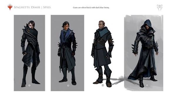
From her haircut to her multi-lapel jacket with multiple belts, this assassin is undoubtedly Dimir in her depiction.
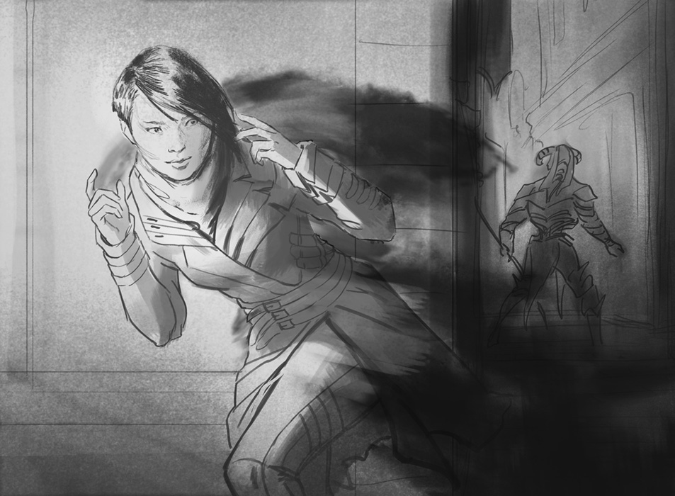
Sketch for Dimir Operative by Anna Steinbauer. Digital.
From the earliest sketch, this piece is clearly focused on the spy and her umbrage of shadow—a rare up close and personal look at one of Ravnica’s most secret societies. The artist does an incredible job making the cloud not just a cloak: the assassin is one with the shadows, as if she apprarated out of thin air, Harry-Potter style. This card is flavorful in both art and ability, and another excellent piece by Steinbauer that even provides a fantastic cosplay reference being so close and detailed.
Tithebearer Giant
Behind the front lines, debts are due.
If one thing is true on Ravnica, it’s that when debts are due to the Orzhov, you can bet your bottom dollar they are coming to collect them, no matter what the circumstances may be. The next two cards we have to show you deal with exactly that, and the first is Tithebearer Giant by Wisnu Tan:

Tan is one of Magic’s newest artists, and this is only his fifth ever Magic card! While I don’t have the full artwork to share, I do want to take a moment and talk about flavor, because this card is spot on. Let’s start with the card title: we know we’re on Ravnica, and any card that references the word “tithe,” defined as paying one tenth of your earnings as a tax for the support of the Church, is mostly certainly Orzhov. We then have some flavor text from the Orzhov second-in-command oligarch herself, Teysa Karlov:
“I’ve always said full war chests win wars, but I didn’t mean by bashing enemy skulls with them.” – Teysa
While a bit of comic relief, this quote exalts the evolution of the people of Ravnica: mobilized for war, yet still true to keeping with what they’ve always done to survive. Even in terms of card mechanics on the card itself, we have an enter-the-battlefield ability to draw one card and lose one life; the Orzhov will always help you, but you’re going to have to bleed a little.
This Orzhov Giant is out to collect the church’s debts whether it’s from Ravnican citizens or Eternals, and he’s prepared to do what he must to make that happen. Is he actually fighting in the war, or is this standard operating procedure to collect what’s owed? I’m not so sure. What I do know is this card will find its way into many a Limited deck, providing a solid creature with some always welcome card advantage for a minimal price—a deck slot that would make his Orzhov over-bearers proud.
Charity Extractor
Behind the front lines, debts are still due.
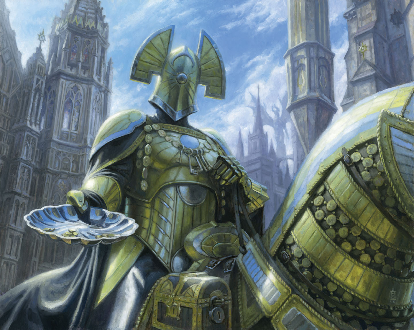
Charity Extractor by Matt Stewart, oil on Ampersand gessoboard, 16” x 20”
The last card we’ll look at it today is Charity Extractor illustrated by the infamous Matt Stewart. I’ve gotten to know Matt over the last few years, and he was willing to share some of his reference photos that went into concepting this hulking knight—another rare behind-the-scenes look at what goes into creating card artwork. First things first, the art brief from AD Dawn Murin:
Show an intimidating ORZHOV KNIGHT on horseback whose role is demanding payments from debtors. Maybe he wears a necklace of ostentatious gold coins and a sumptuous dark cloak embroidered with gold thread, and holds out an offering plate to us.
We’ve seen several art briefs so far. They are what an Art Director needs to see on the card, but it’s ultimately up to the artist to create the scene through their own imagination, reference photos, and the Wizards internal set style guide that contains the important design information for continuity. An Orzhov knight has a way they’ve been designed to look, and this Orzhov Knight looks quite similar to the rest across the three Ravnica sets; look at the helmet especially. Style guide information can never be shared with the public, but it’s the one constant that artists have in order to make Magic look cohesive.
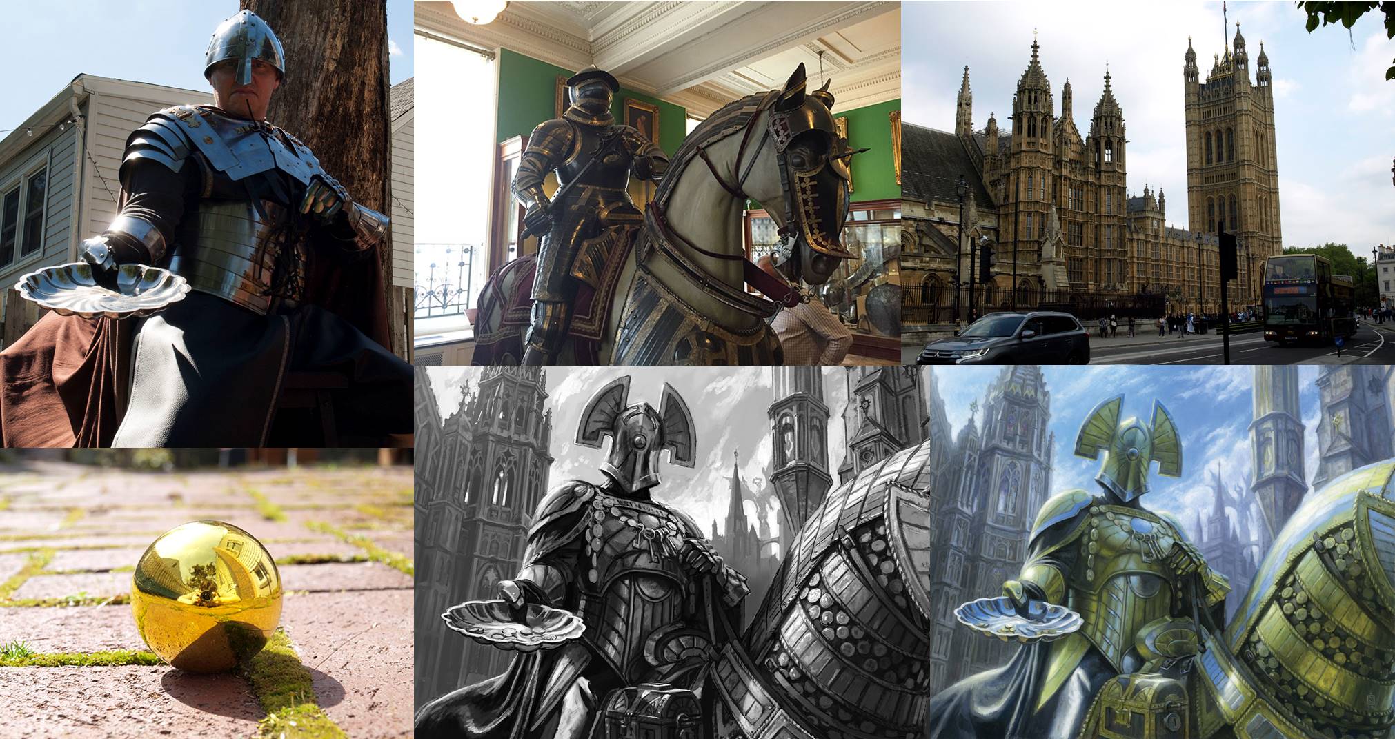
Based on the art description for this painting, Matt needed an armored knight on horseback with an offering plate. So, he became that:
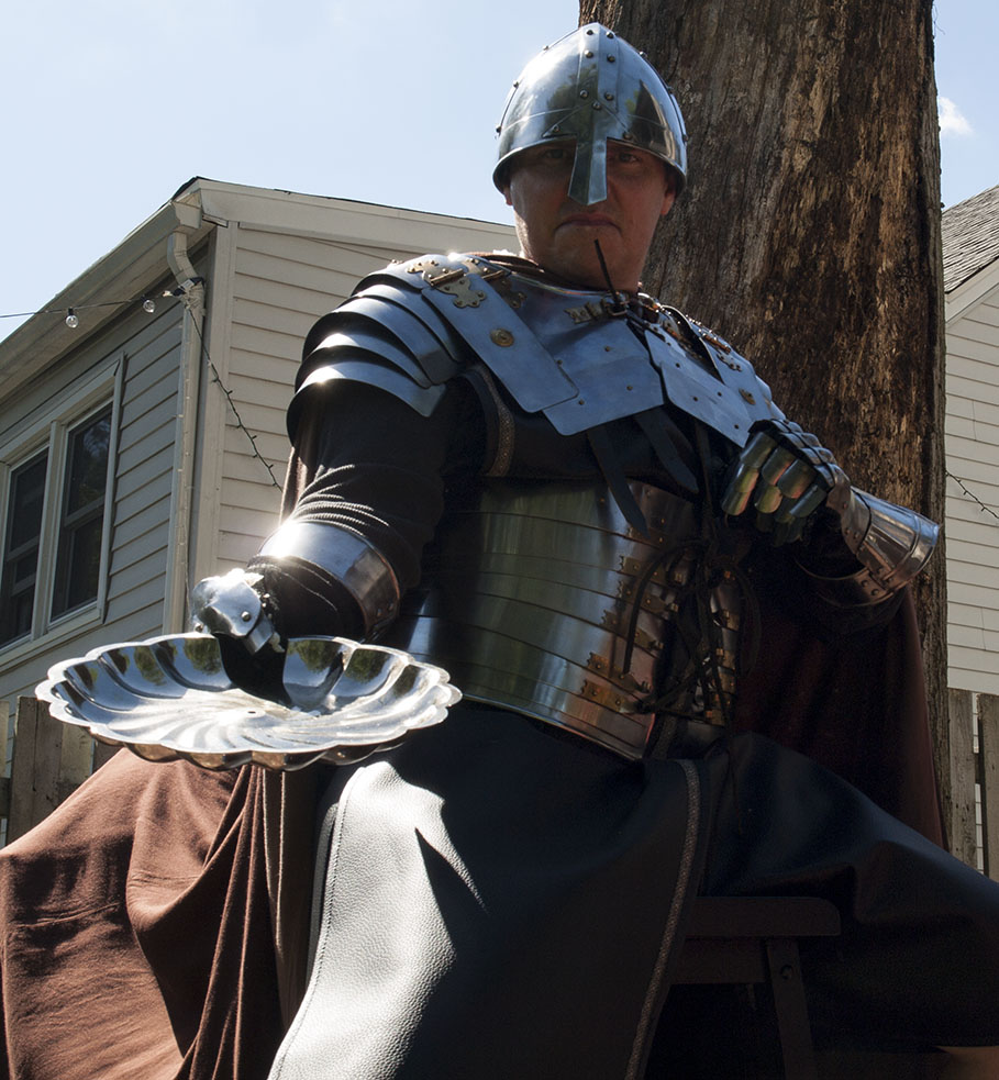
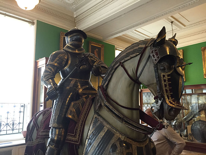
Yes, that is artist Matt Stewart underneath that armor. And he needed some horse armor to go with it, so he went back through his personal reference photos he’s shot to find a fitting one from the Wallace Collection in London:
The tone of the Orzhov gold? It’s a Christmas ornament:

And the buildings in the background? Based off photos he took of the Palace of Westminster in London:

Once Matt had all these basic elements accounted for, he could start putting them together into a harmonious sketch. He used to sketch traditionally with pencil on paper, but now for the majority of his Magic work he works digitally in the preliminary steps to save time and for ease of alteration. Like we’ve seen so far in each of these cards he’s stuck very close to the art brief, but the keys you see around the knight’s neck and the lockbox to his side were additions from the artist’s own imagination.
These tiny details are huge in conveying the idea of that this overbearing templar takes his debt collection very seriously. Everything came together into the sketch for Charity Extractor:
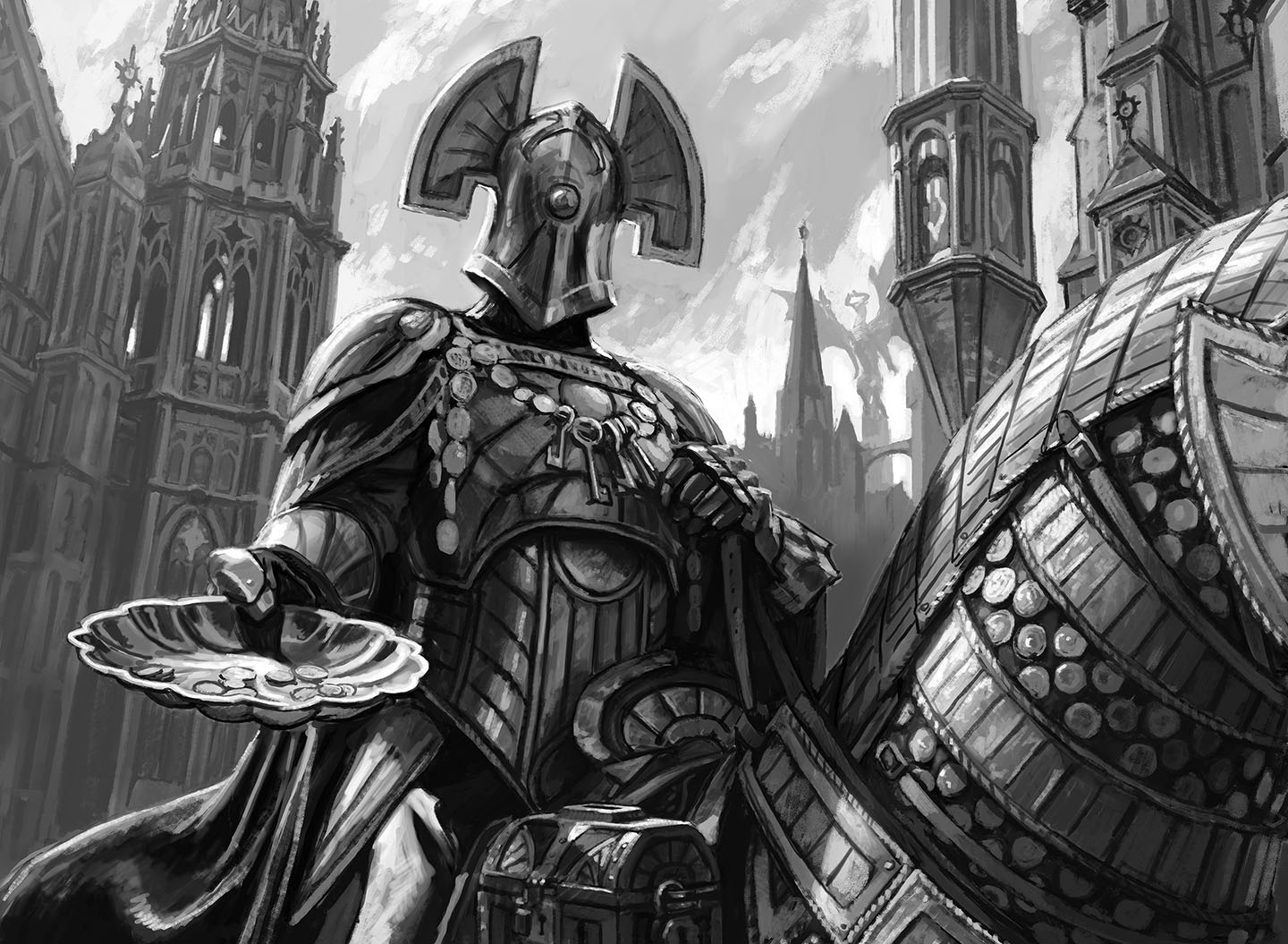
With a completed sketch and in combination with his color reference, Matt was able to create the final artwork for the card as you see it printed. Putting all the images together, you can see exactly where certain aspects were drawn from, and how the hand of a master artist has brought them together as one fabulous piece of art.
Wrapping Up
It’s almost hard to believe all the steps that go into the two-inch illustration box on a Magic card, but it’s these creative journeys the artists take that create the look and feel of the game we love. The art is very much a part of what makes Magic the best game in the world, and it’s these behind the brush moments like the one’s we’ve explored that really make it special.
I hope everyone enjoyed these four free preview cards given to us by Wizards of the Coast, and it was an absolute treat to be able to take you all behind the front lines of some of the art and flavor of these denizens of the Ravnican streets. To see original #mtgart and other #vorthos related things, follow me on Twitter. Feel free to ask questions or retweet to continue the conversation. Thanks, and see you again real soon!
Donny Caltrider has been playing Magic since 2002 and collecting original Magic art since 2017. He has an M.A. in Museum Studies from Johns Hopkins University and enjoys telling stories about art, objects, and the intersection of fantasy with real-life. You can find him on Twitter talking about #mtgart, museums, and other #vorthos related goodness. Follow along and continue the conversation!