
“I need to make three cuts, what do you think?” Your decklist gets shared among your friends, and they begin the time-honored tradition of helping you with the hardest of decisions. The feedback rolls in, and they ask “Why are you running Sisay’s Ring? Why not run Thran Dynamo instead?” You know that they’re coming from a good place, but deep down inside you have to come to terms with something. It’s better to run the card that looks like a steampunk-inspired Kinder Egg, than the one that demonstrates Donato Giancola’s mastery of painting hands.
Today, we’re going to talk about my top ten pieces of Magic art on unplayable cards. They’re the beautiful misfits; the charming little train set with the square wheels. We desperately want them to be good, but they’ll only ever be nice to look at.
10. Vindictive Mob by Wayne Reynolds
The crowd has exploded out of the tunnel with jagged weapons and an absence of subtlety. The heat of their torches seems to push them out into the streets, like the heat behind a cannon ball. By using a muted palette on the mob, Reynolds removes their individuality. This piece from Ravnica stands out to me for its movement and sense of urgency.
9. Floodtide Serpent by Steve Belledin
Relative power level is a longstanding joke within Magic. This serpent, which causes a tidal wave to crash upon Meletis, can be stopped by two Grizzly Bears that would normally eat trout in the spring. Nevertheless, Belledin’s piece is an example of showing a sense of scale, without the usual trope of birds flying around. We’re viewing the serpent from a place of safety, but we can only wonder for how long.

8. Atalya, Samite Master by Rebecca Guay
Thanks to the Mothers Day Secret Lair, Rebecca Guay has made a return to Magic after a decade-long absence. The majority of her work is found in the earlier years of the game, with cards like Mobilize and Moment’s Peace, bringing a storybook feel to the game pieces in play. Guay uses tree branches, swirls of air, and the folds of a dress to guide us up to the light around Atalya’s face. This piece always brings me calm when passing it over in my bulk box. I’ll probably never play it, but I can’t give it away either.
7. Dross Ripper by David Rapoza
Dross Ripper is a costly mana investment to make a 4/4, but we can be distracted by David Rapoza’s use of light to instill fear. Bony ribs and spiny edges catch the light, whether that be from the setting sun or a brushfire. Some kind of destruction has happened, with soft, billowy smoke rising behind the Phyrexian dog. The frontal view gives us something to be intimidated by, a predator that has seen us before we’ve seen it. It’s a sobering beast to look at, only to get smashed by the mischief of a Tin Street Hooligan.
6. Antagonism by Donato Giancola
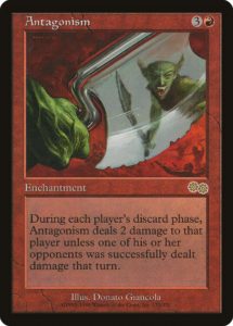
Among many accolades, Donato Giancola is renowned for painting hands. Antagonism tells the story of a conflict within a conflict, despite having an ax take up most of the frame. Amidst the bloody battle, there’s a boiling point between two goblins. Like Uma Thurman in Kill Bill, holding her sword to get a view of her blind spot, this goblin’s ax reveals the motives of the one behind them. Perhaps they’re looking to settle a score amidst the chaos, but the goblin smile might say that this is an assassination and not a showdown.
5. Narcissism by Christopher Moeller
For a card with a one-word title, without flavor text, Christopher Moeller’s composition does a lot of heavy lifting. The creature depicted appears nowhere else in Torment. We don’t know how or why they got the mask. But we do know that there’s a sense of self-admiration, despite the numerous jagged, praying mantis limbs. You could draw comparisons to an angler fish, luring prey with a mesmerizing light. The mask is there to stay, and we can only wonder what lies beneath.
4. Pardic Lancer by Justin Sweet
When it comes to long weapons depicted on Magic cards, it’s common to see them portrayed from the front. With Wojek Halberdiers and Goblin Striker, we get that sense of being charged upon. But with Justin Sweet’s Pardic Lancer, the horizontal view tells a different story. The lancer appears to be mid-ambush, setting off to charge down the hill. Their stride and gaze lead us along the weapon itself, along with the slant of the hill and smoke plume behind the figures. Like Vindictive Mob above, this piece gives us a sense of speed and direction.
3. Rhystic Cave by Rob Alexander
It wouldn’t be a list of unplayable cards without one of the all-time stinkers, Rhystic Cave. Rob Alexander is synonymous with Magic, having painted the original pieces for icons like Underground Sea and Wooded Foothills. Not only has he touched the pinnacle of Magic card power, but he’s also made pieces for some of the worst cards to ever come in a booster pack. Rhystic Cave is the venerable backdrop to any fantasy story. Our hero delves beneath the surface, past crystals and waterfalls, to uncover the secrets of what lies below. They’ll return empty-handed, though, because this cave is as unplayable as the day it was discovered.
2. Alabaster Wall by Randy Gallegos
The legacy of Mercadian Masques is a varied one. It had a host of terrible cards, paired with a vibrant, often whimsical art direction. High Market tells the story of a busy commercial hub in the sky. Meanwhile, Moonlit Wake is the kind of piece that might grace the cover of an 80’s D&D module, or a box of tea from Celestial Seasonings. Alabaster Wall by Randy Gallegos fits right into the coastal feel of the set. Despite having the wall take up most of the composition, Gallegos has us moving all over the piece with the use of shadows and architectural elements. This gives an otherwise flat surface a sense of depth. The color palette has a distinctly Mediterranean feel, like that of Dubrovnik or Santorini. You can feel the warm sea breeze as you take in how little this card impacts a game of Magic.
1. Aven Trooper by Greg Staples
When setting out to write this piece, I thought to myself, “It’s time to find nine other cards that I can put behind Aven Trooper.” If you look at a white card from Torment, you’ll see that they have low-resolution, pixelated art. Scryfall includes that as a warning for people passing through the set. And yet, Greg Staples’ work defies those odds. The two-tone background is the defining characteristic of this piece, framing the avian soldier as they fly through the air. Few cards use this much white negative space, with Jeremy Wilson’s showcase version of Embereth Shieldbreaker being a recent example. Aven Trooper is the epitome of the unplayable card with art that you love. It’s too costly to play, too underpowered to keep up, but too enchanting to stop thinking about.
Why would a loving god allow great art to be placed on terrible cards?
Not every card design can be a hit, but they all need art. Even the bad ones require the dedication of an artist to put up quality work. It’s up to us to make peace with the great art that landed on a dud design. There’s a time and a place for everything, even the creature that costs a total of seven mana and a card to turn into a 2/3 flier. We may not play them in our decks, but that doesn’t mean they can’t live on our walls, or in our hearts.
Travis is a writer and photographer from the wooded foothills of New York, currently living in South Carolina. He plays nearly every Magic format, but has a special love for Legacy, Premodern, and Canadian Highlander. He has loved Magic since Starter 1999, but he champions having a healthy mental and financial relationship with the game. When not playing games, he enjoys cycling, tea, and dog parks. You can follow his exploits here on Twitter and Instagram.