
Hello everybody and welcome to my addition to the 10th Anniversary of Hipsters of the Coast’s founding. Knowing that this week was coming, I spent much of August reflecting back on the last ten years and eventually my tenure with Magic, which just happens to be twenty years ago. With hindsight, I feel like there was a lot of serendipity regarding the point in time when I discovered Magic. My beginning was only a few months from Onslaught block, giving me a concentrated look at tribal strategies, followed up by a year of artifacts on Mirrodin, and a year of legendary creatures on Kamigawa.
Yet, right from the beginning, it was not tribes, artifacts, or legendary creatures that I clung to. Instead it was the core set made up of 350 cards known as Seventh Edition that would forever define learning Magic in my mind’s eye. What I didn’t know at the time was that this set had a unique art direction. With Seventh Edition, Wizards was forgoing all of the previous art that had previously adorned the cards, in favor of completely new art.
This led to a bit of controversy, as many of the established players understandably no longer were able to recognize core set cards at a glance. Ironically, this choice had the opposite effect on me, as this was the way that I’d always known the cards. But something that I became aware of in the last ten years or so was that Seventh Edition and its art are commonly held in pretty low regard. This is a travesty to me.
This week, in keeping with Seventh Edition September, I want to redeem the set and will be presenting ten times Seventh Edition had the best art. The first half of the list will be rather interchangeable, as the pieces all have their positive traits that make them sought after, but not so much that I dispute someone ranking them in a different order. For the second half of the list, I really believe them to be some of the best art in the set, especially compared to their counterparts.

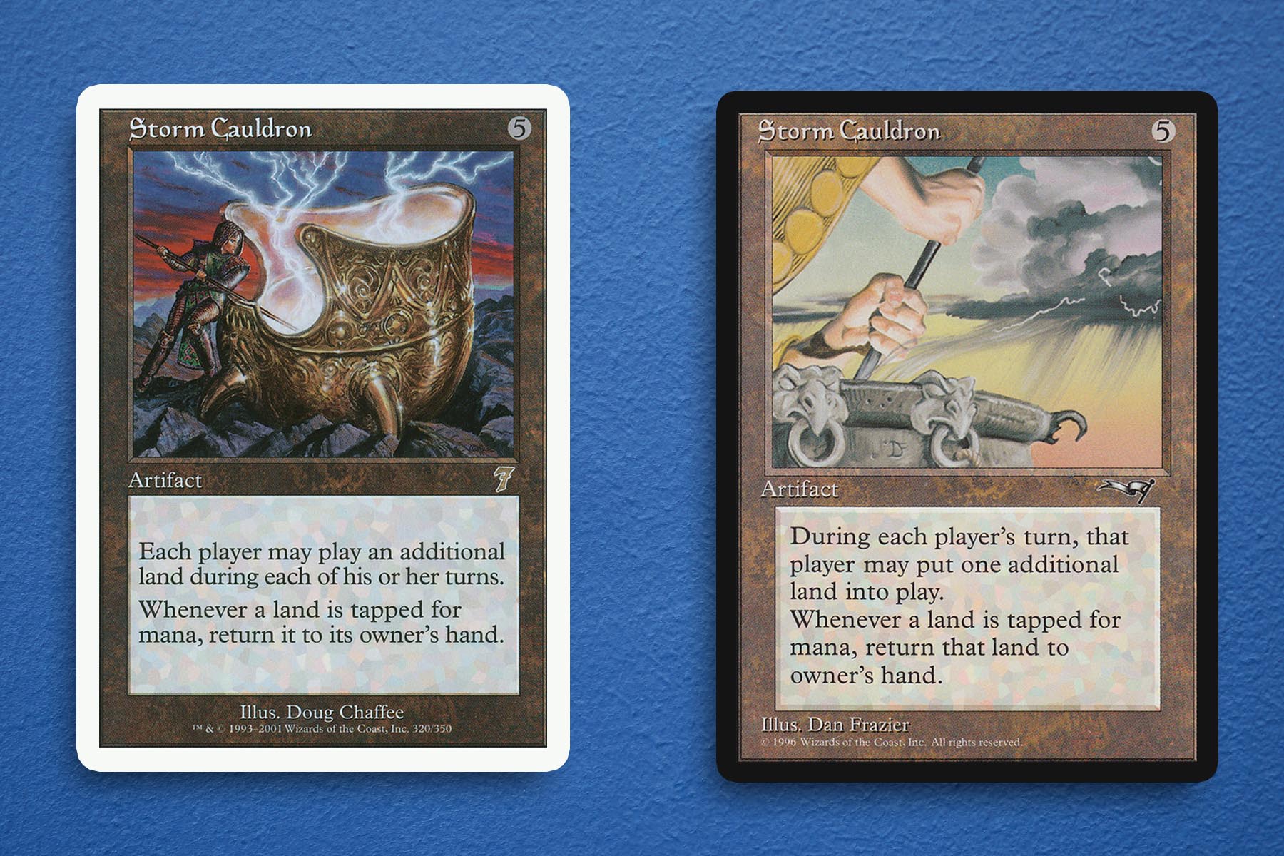
10. Storm Cauldron
Right off the bat, I know that Storm Cauldron is on my radar in the first place, purely due to a Borborygmos Enraged deck that I had back in the mid-2010’s. As with every piece of art on this list, there is no disservice meant towards the Dan Frazier version. In the six years that separate Alliances from Seventh Edition, it’s fair to say that how Magic chose to represent its spells and permanents evolved. Doug Chaffee’s rendition puts more focus on the actual cauldron and can’t be easily confused for a spell or enchantment if the context of the card frame is taken away. With how well Wizards is presently able to tie card mechanics into the art, I would be intrigued to see how the two effects of the card could be captured.
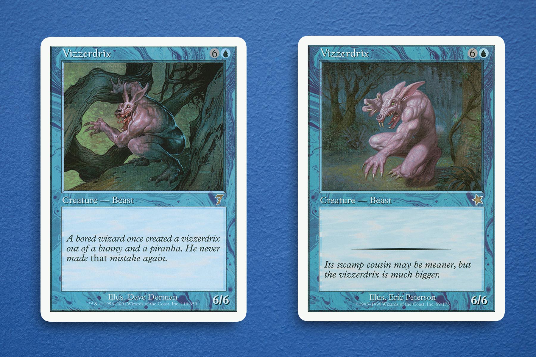
9. Vizzerdrix
One cannot talk about core set rares of the early 2000’s without dedicating at least a little bit of time to the Vizzerdrix. This strange merging of a bunny and wrestler is unsettling at first and honestly, remains unsettling years later. The piece by Dave Dorman just feels a lot more believable as a creature that could be wandering about the Multiverse, when compared to its Portal counterpart. Because of the absurdity of the art, regardless of the fact that it is a completely forgettable card that just so happens to also be a rare somehow, I have never forgotten this card and probably never will.
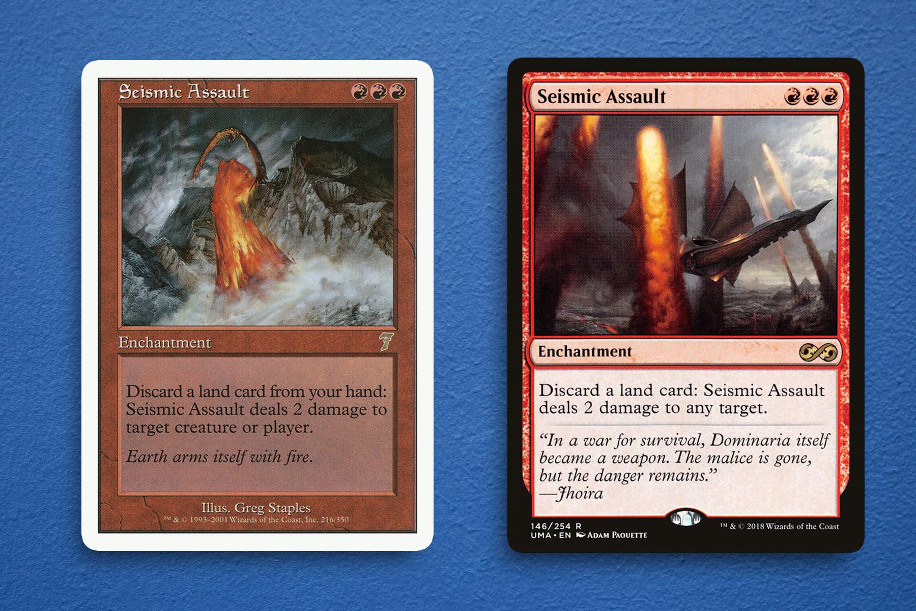
8. Seismic Assault
Much like Storm Cauldron, Seismic Assault came onto my radar as part of the same Borborygmos Enraged deck. At the time we had the version first seen in Seventh Edition, which was carried over to the subsequent reprints versus the original printing from Exodus. And it was never really a contest for me, a deck such as Borborygmos is going to revel in the image of the earth throwing a lava punch was far more flavorful than the rendering featuring the Weatherlight.
From a card concepting perspective, I think the new version really helps to explain the mechanics of what is going on, which the original version does not necessarily capture. Regardless, I do think that the original has a lot of merit, depicting the flowstone of Rath as a strong visual representation of why the plane was so attractive to the Pyrexians of old Magic lore.
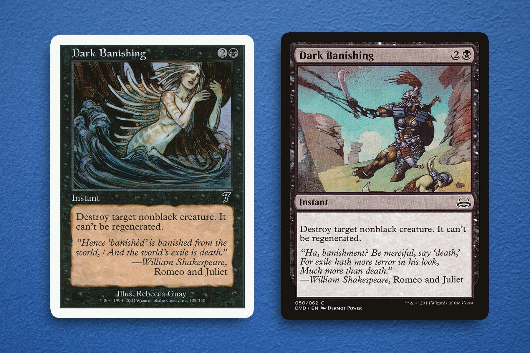
7. Dark Banishing
From an objective standpoint, it might be fair to say that alternative versions of Dark Banishing really sell the lethal implications of the spell, but I consider any piece by Rebecca Guay to be noteworthy. In a game where characters are routinely torn asunder, the juxtaposition of this beautiful piece on a removal spell is incredible. I love this look for merfolk, as also seen on Rebecca’s Ancestral Memories in this set, plus the general composition of this little scene depicted in the art simply reminds me why I love customizability of Magic in the first place.
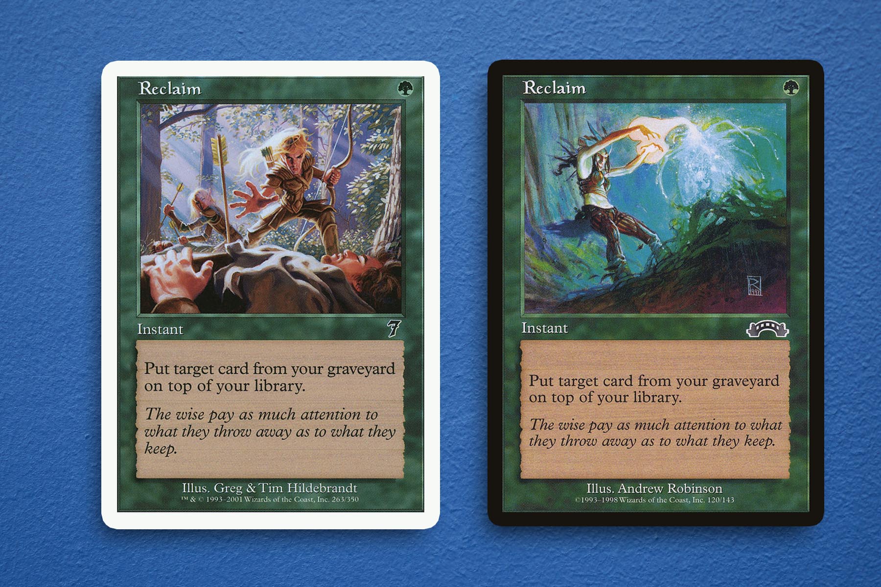
6. Reclaim
This might be due to an oversaturation of the usual art used for Reclaim, but I happen to think that the Seventh Edition version has such a different energy from what we saw with the Exodus version. This character flaw in myself can also be seen in my distaste for the overused Mirage version of Pacifism when the Tempest version is also available for use at any time.
While I am certainly a fan of how Magic is able to redefine the look of fantasy, I really enjoy the classic look of the elves within this piece done by Greg and Tim Hildebrandt. The lighting is striking and the implication of what the spell is doing is far more grim in retrospect. While it doesn’t really fit into the look of modern Magic, I would love to see a callback to it in a future reprint or similar card design.
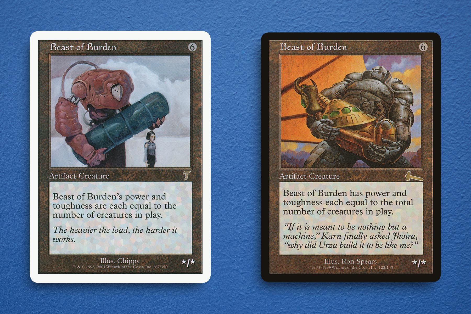
5. Beast of Burden
I don’t know how to properly quantify just how happy I am that this piece of art exists. Who is this smaller figure? Why is this massive golem subservient to them? Why it is carrying this very heavy object? Is this a normal day in their lives? None of those questions need be answered, because something is just so delightful about the piece without any additional context.
The original piece certainly has its place, setting a precedent that Urza built a lot of machines that looked the same, one of which was lucky enough to become Karn. But the Chippy version not only delineated itself from the former, but also used contrast of color and figure size to make the whole piece more striking.
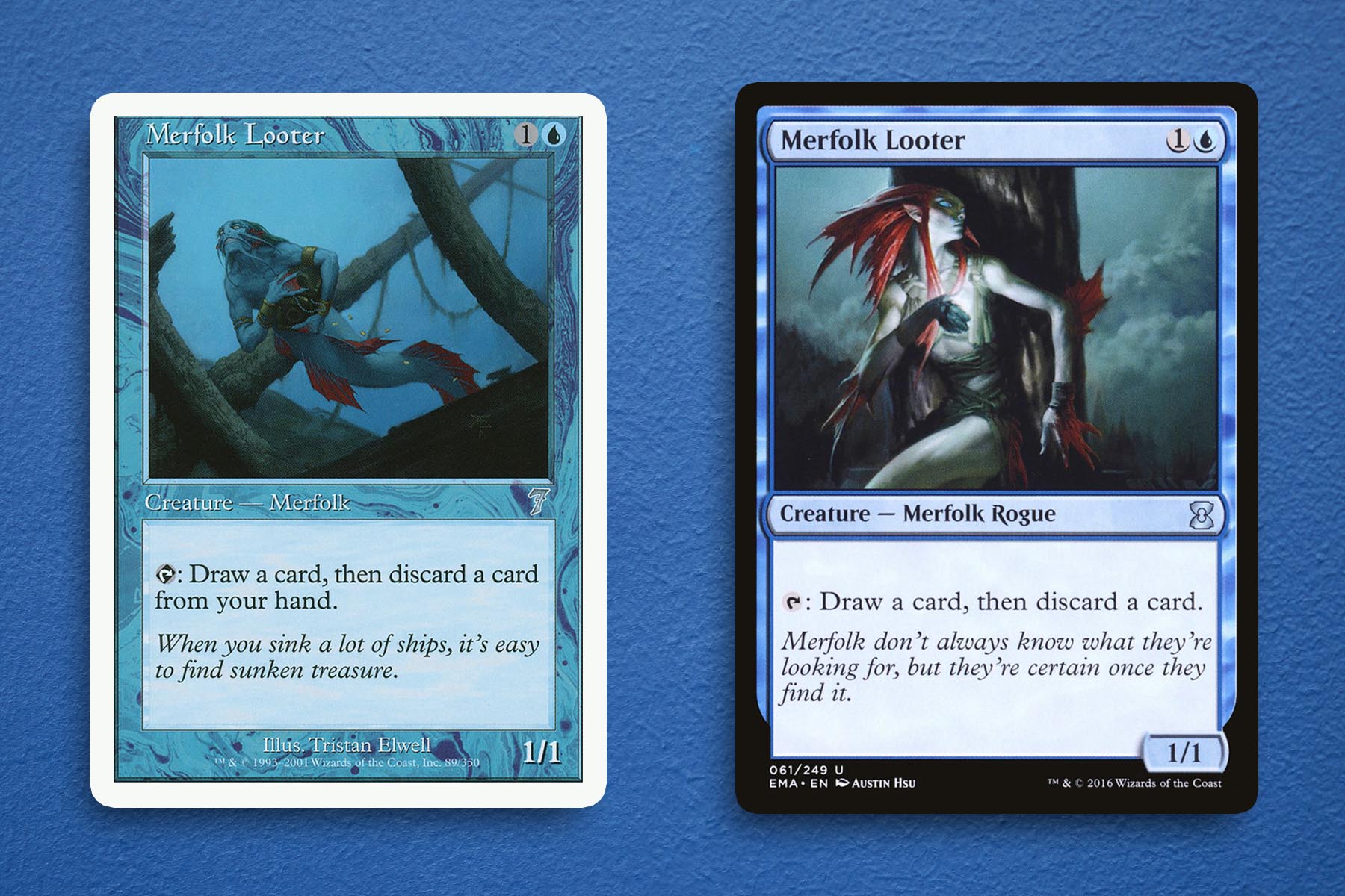
4. Merfolk Looter
The Seventh Edition art for Merfolk Looter has been in rotation with the Austin Hsu version first seen in Magic 2010, and for good reason. While I know it comes from a place of nostalgia, the Tristan Elwell piece in its near monochromatic style is more haunting than the other pieces and combines with the flavor text—which is exclusive to Seventh Edition—to create a memorable card, top to bottom. This piece outranked Beast of Burden for me in terms of the art from the set, exclusively because of how this atmosphere comes together so strongly. It is important to also take note of the Exodus printing that, while memorable in its own right, paints a completely different picture of what is being looted.
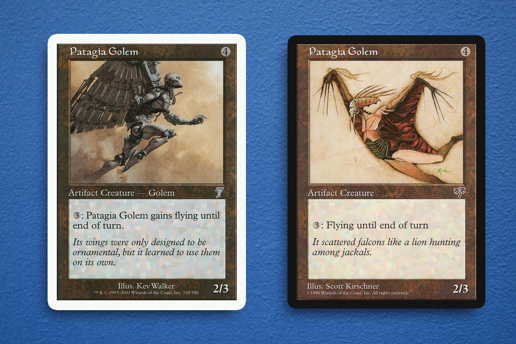
3. Patagia Golem
For me, the look of Magic at my entry point did so much to shape my love of the game. My first set, Onslaught, saw Butcher Orgg, Krosan Colossus, and Visara the Dreadful coming out of packs. Because of this I’ve always been a bit of a Kev Walker fan and the preexisting cards with their art were immediately on my radar. I think it is Kev’s frequent use of muted colors that really bring a grounded feeling to the pieces they have produced.
Regardless of this bias, I think it is easy to see that they did the best iteration of Patagia Golem. This broke the shallow interpretation of fantasy I had in 2002, presenting a juxtaposition of this solid, heavy figure majestically soaring through the sky. And the only issue I have with this version is how easily it can be confused as an angel. With this being my basis for Patagia Golem, when I eventually saw the Mirage version, I didn’t realize it was the majestic icon of my youth.
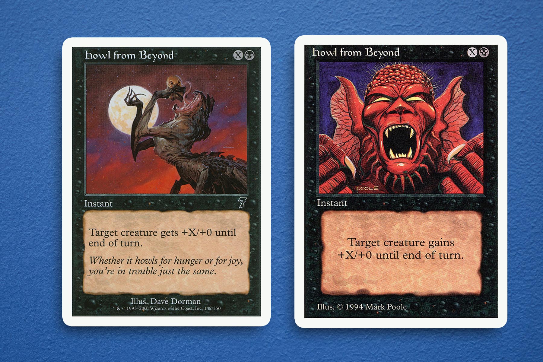
2. Howl From Beyond
If I can be completely honest, my top two were incredibly hard to rule on. To me, this version of Howl from Beyond is head and shoulders better than any other version out there, to the point that I almost feel that the card itself isn’t good enough for the art it was given. While not essential to making good Magic art, I think this version just has so much more energy and liveliness to it, making it feel like it has a place within this very action and combat-centric game. Lastly, I don’t know what this monster is or what it is about to consume, but the piece itself just feels so of its time in such a rad way.
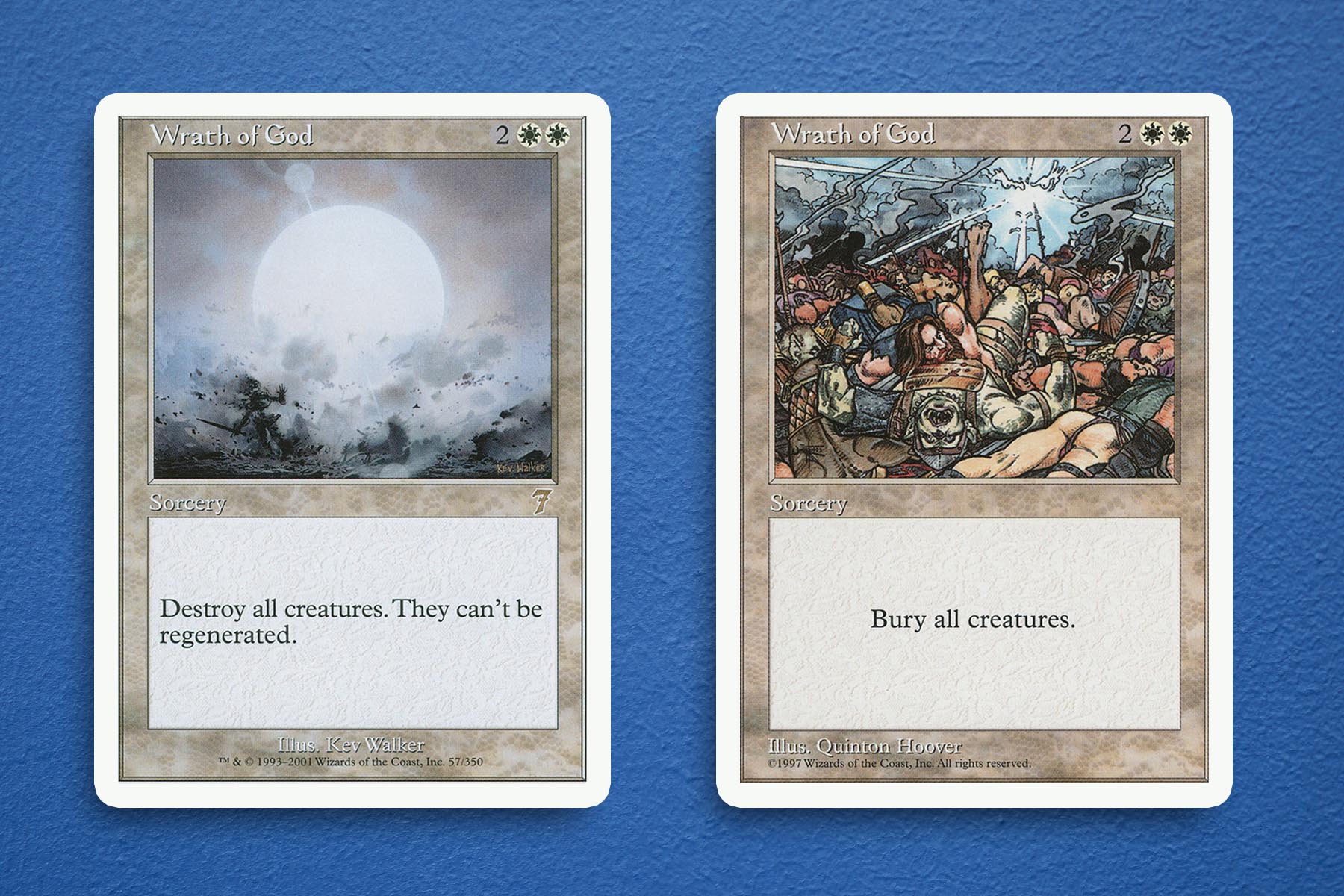
1. Wrath of God
For the briefest of moments Wrath of God by Kev Walker was not going to make it into my top three, because it seemed like such an easy pick. But the longer I thought about it and the more reflection I did on how iconic this piece is, how it was mirrored for Damnation, and how extraordinary it is compared against the iterations before and after it, I needed to hold this piece by Kev Walker in as high of regard as I could. In many ways this is the artist doing what they do best, using that same muted color palette I spoke about before and creating a minimalist piece that fully encapsulates what this spell is doing: removing all combatants from the battlefield.
For all the jabs players may have made against the art in this set, hope that I have proven that there were at least a few hidden gems. I love these kinds of articles because they give me a chance to really highlight a part of Magic that I am very enthusiastic about but often find that I don’t have enough to say to sustain making it even a monthly topic. The art of Seventh Edition was hugely impactful on me even if I didn’t realize it at the time, with some of my most nostalgic pieces in all of Magic came from this set. Next time, we will be ending Seventh Edition September by returning to form with a Seventh Edition themed Commander deck. Until then, thanks for reading.
Ryan Sainio is a Graphic Designer who writes about EDH and the EDH community. He has been playing Magic: the Gathering since 7th Edition in 2002 and values flavorful and fun gameplay over competitively optimized decks.