
Good morning everyone, and welcome to the Mirror Gallery here on Hipsters of the Coast! Today marks my 300th article with the site. Before I dive into this week’s article, I want to reiterate what a privilege it is to write about the art of Magic: The Gathering and Marvel for you fine folks, and what a fantastic journey this has been over the last three and half years. Now, enough of that and onto the art.
Today I’m going to be doing something a little different—the brainchild of being on vacation and letting my mind wander a bit more than I’m usually afforded. I was exploring some other artwork for projects unrelated over the last couple of weeks, and as I was down a YouTube research rabbit hole, the algorithm suggested a video on Mark Rothko, and his Seagram murals. I encourage you to watch this brief video synopsis of his life and career, which includes the story of how his “multiform” style came to be. Rothko’s story is ultimately a very troubled tale with a tragic end, but the legacy his art has created is something magnificent that has been exalted well into this century.
Rothko is one of my favorite twentieth century artists, and having seen his work in person I understand first hand the gravitas often described when viewing his monstrous canvases. I think I last saw one in person back in college in 2010 or so, mostly by accident. A trip to the Phillips Collection with two good friends planted me by chance in that gallery’s Rothko Room, and it’s an experience I’ve never forgotten.
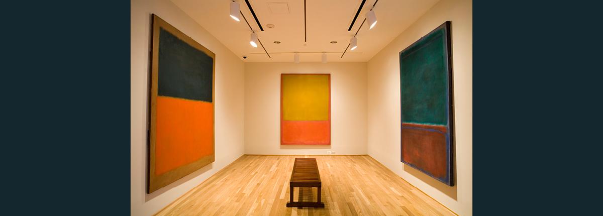
The Rothko Room at the Phillips Collection, Washington, DC
After watching this video and dredging those powerful memories, I wondered how Rothko might fit into what I’m writing about now. I began to think that perhaps my love of Magic art and Rothko could somehow be related. What if we could find Rothko in Magic?

I had some time to try and explore this idea, and before I went “full article” I wanted to make sure what I had in my head wasn’t some coffee-stirred nonsense. This would not just be about matching colors or composition, but about finding works that evoke a similar emotional response; after all that’s what makes Rothko’s paintings so powerful. I began with a random Rothko in one browser tab and Scryfall Tagger in the other.
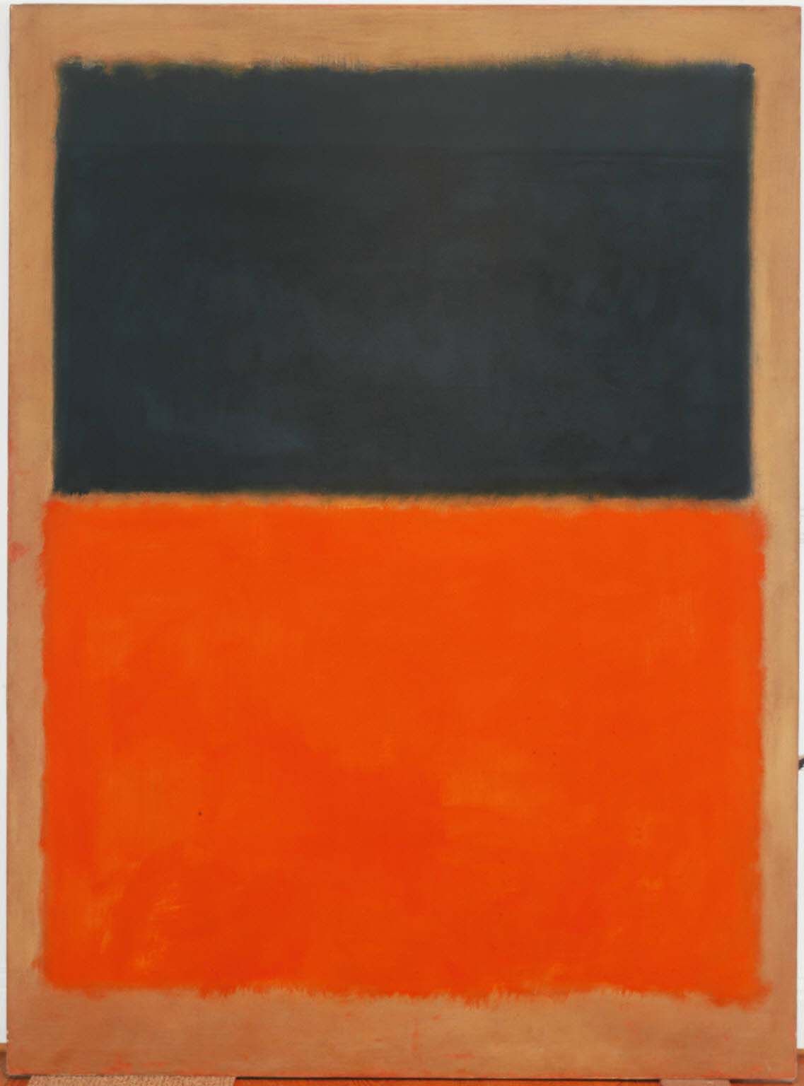
Test Subject: Orange & Tan (1954) by Mark Rothko
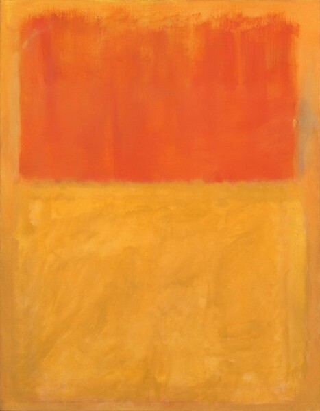
Orange & Tan (1954) by Mark Rothko, oil on canvas, 81 1/4 x 63 1/4 in. Collection of the National Gallery of Art, Washington, DC.
My Google search to find a Rothko at random yielded this work in the collection of the National Gallery of Art in Washington, DC. A museum I’ve visited several times, I’ve probably seen this in person too and just don’t recall from certain sensory overload more than a decade ago.
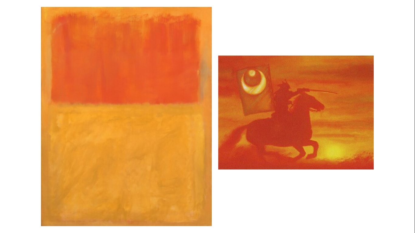
So I began. What do I see? A field of orange over a larger field of yellow on a tan ground. My first thought was that of a sunrise or sunset, that burning ball of orange that casts a glow as it goes up or down. A good starting point, I went forwards and backwards through Scryfall, and it was not long before I was stopped dead by Donato Giancola’s Konda’s Banner:
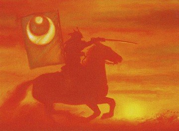
Konda’s Banner by Donato Giancola. Traditional.
Here we see that sunrise (or sunset) casting a glow across the banners held by an outrider of the greatest leader of Kamigawa, Konda, Lord of Eijango. A more abstract work by the often detail-oriented living master Donato Giancola, it echoes the palette and power we see in the Rothko. Feelings of hope, new beginnings, the dawn of something great, or the finale or deeds done well begin to well up inside you.
I felt I was onto something, and thought of no better point of departure than those four works from the Phillips Collection that began this love affair ten years ago.
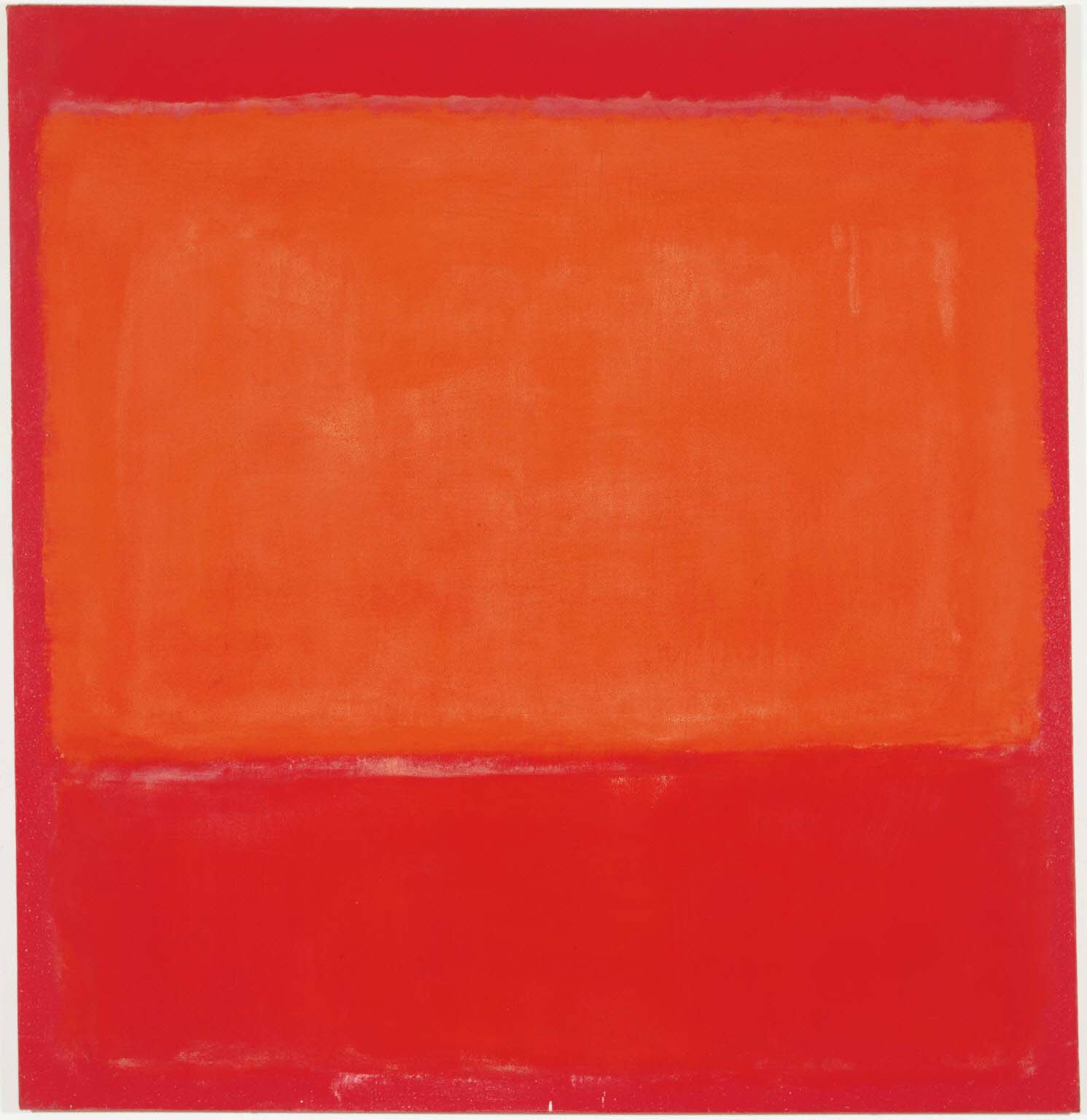
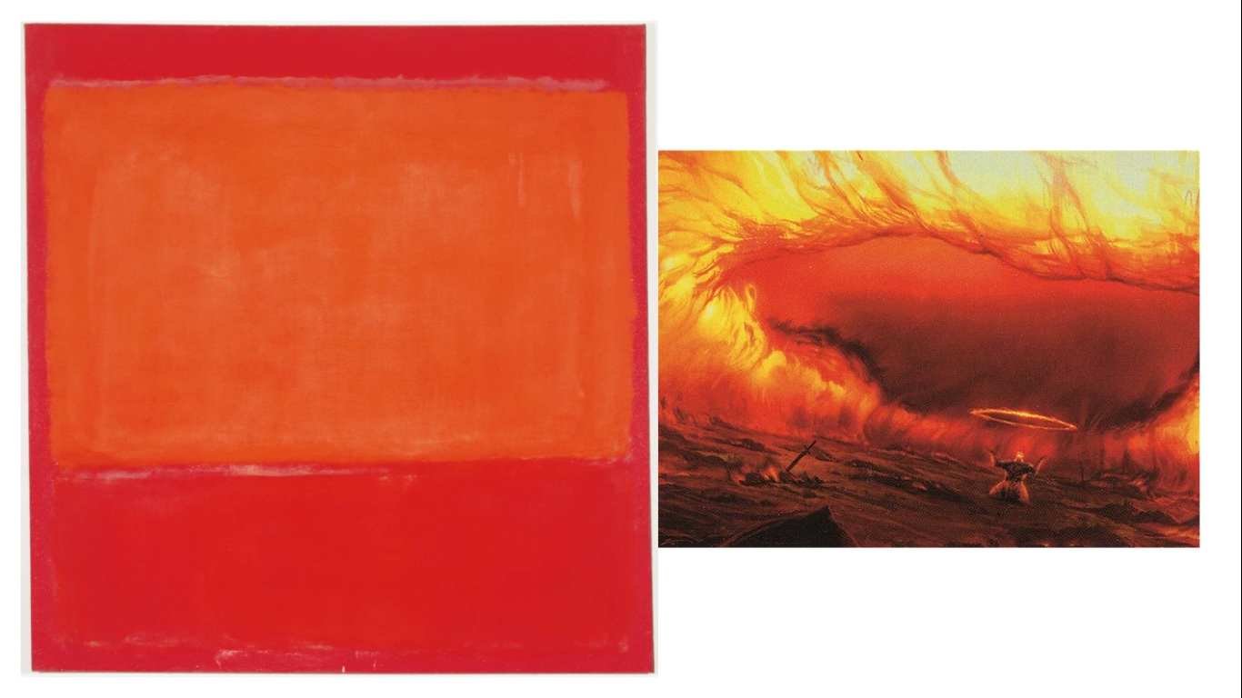
Ochre & Red on Red (1954)
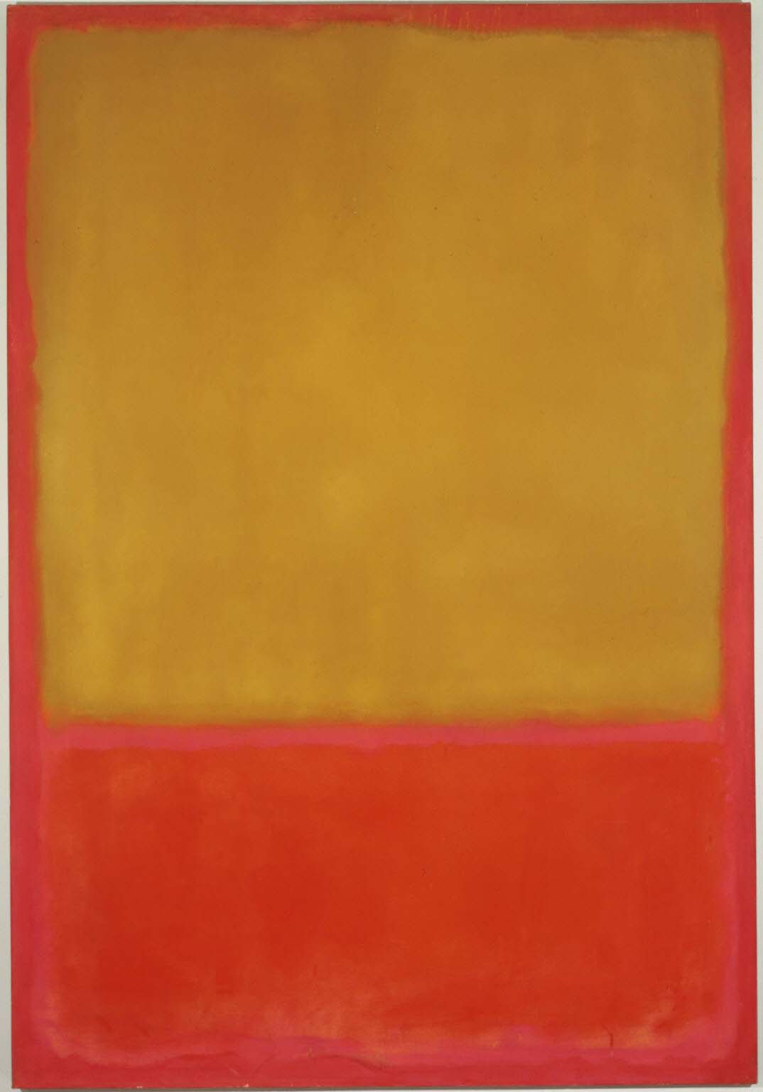
Ochre & Red on Red (1954) by Mark Rothko, oil on canvas, 92 5/8 x 63 3/4 in. Collection of The Phillips Collection, Washington, DC.
As you enter the Rothko Room of the Phillips from either direction, the first work you see staring back is this one.
To us, the Rothko conveys a happy painting, with warm colors evoking a beautiful sunrise or serene sunset, not unlike the work we just looked at. But there are two sides to every coin, for once Rothko had a woman seeking the same, visiting his studio and asking to buy a “happy” painting featuring warm colors. His response was not what she expected:
“Red, yellow, orange—aren’t those the colors of an inferno?”
What sort of work could read as positive, and yet be beautifully destructive? Once I began narrowing down, I found a brilliant simile: Aurelia’s Fury by Tyler Jacobson
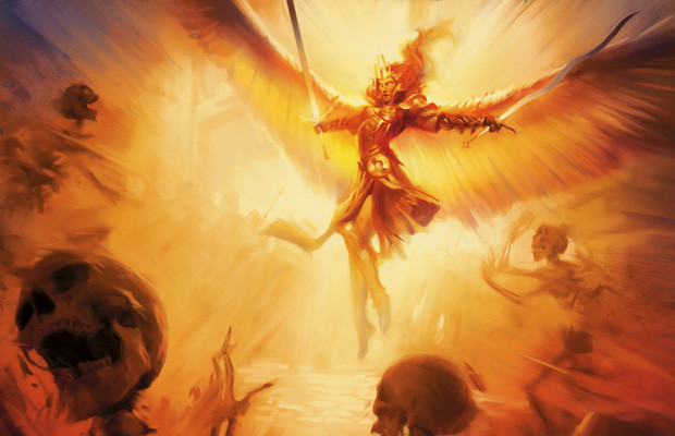
Aurelia’s Fury by Tyler Jacobson. Digital.
This is undoubtedly the Rothko of the Boros Legion, Ravnica’s guild of order, justice, and military prowess. I had a shortlist of art that appeared to have a relationship with this monumental abstract, and every single piece was somehow associated with the Boros.
The longer we look upon the Rothko the warmer it gets, and closer it becomes to the justicar of blinding light and white hot aura of the angel in the adjacent painting. The ochre too continually heats until it’s almost smothering, and we begin to dissipate just as we see those at the feet of the angel Aurelia. The fire is resplendent, but still burns all the same.
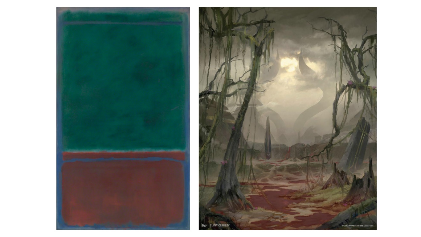
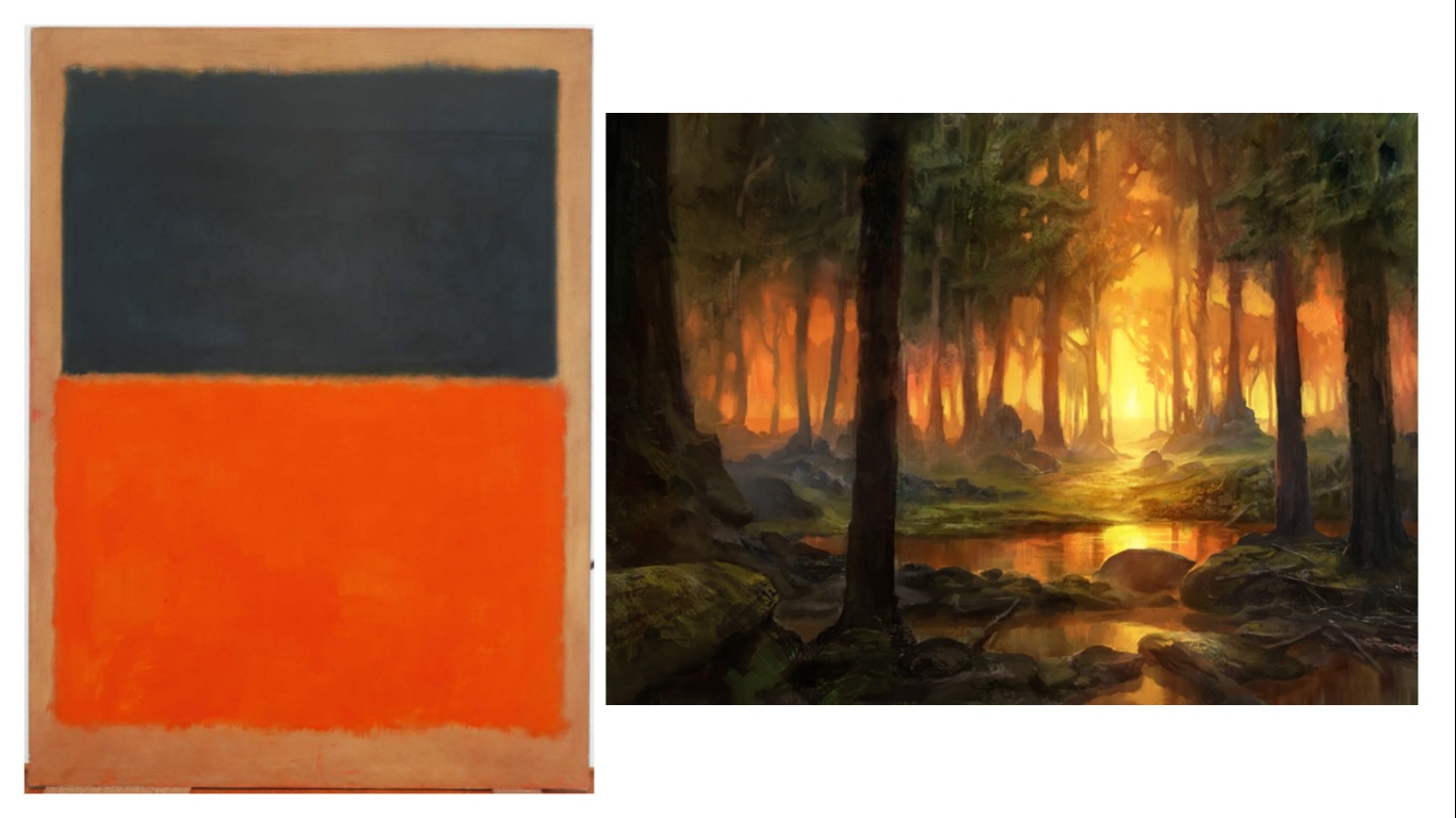
Green & Maroon (1953) by Mark Rothko
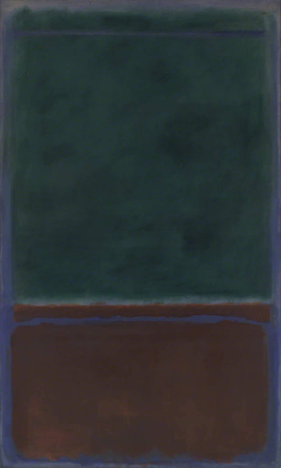
Green & Maroon (1953) by Mark Rothko, oil on canvas, 91 1/8 x 54 7/8 in. Collection of The Phillips Collection, Washington, DC.
The very first thing that I saw when looking at this work was the deep crimson on the bottom, and it immediately reminded me of the Luxa River turned blood during the Hour of Revelation on Amonkhet. This seemed a compelling and fitting parallel, so the Egyptian-inspired world is where my search began. It wasn’t long before I discovered the only vertical format work I’d select for this exercise, Clint Cearley’s Swamp from Hour of Devastation.
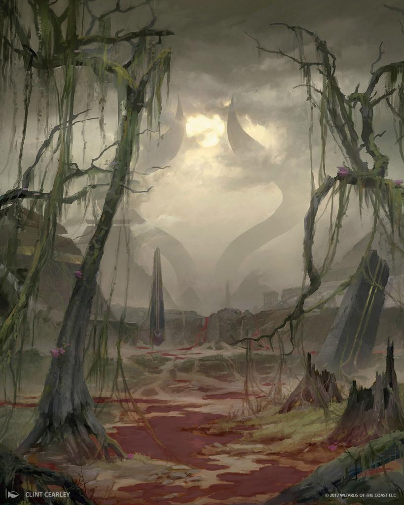
Swamp #187 by Clint Cearley. Digital.
There is a dreariness in Rothko’s work that echoes in this Swamp. The deep green with undertones of blacks and blues represent a battered landscape like we see in the second work, and that scarlet red could just as well be blood on the canvas as it is blood on the computer screen.
This is a 180 degree derivation from the two works we’ve looked at previously: there is no confusion of positivity. Where there was hope is now hopelessness, and what was a new beginning is nothing more than certain death. The sunlight, whether a soft flicker or licking flame, has gone out.
Green & Tangerine on Red (1956)
Green & Tangerine on Red (1956) by Mark Rothko, oil on canvas, 93 5/8 x 69 1/4 in, Collection of The Phillips Collection, Washington, DC.
This Rothko presented a challenge, as it did not initially create the emotional response felt in the preceding three works. I looked at a myriad of green creatures: saurians like Viashino Sandswimmer that work in terms of colors but felt flat and disconnected. The enveloping feeling from the enormous canvas can be found in elemental works like Steven Belledin’s Rampant Growth or Campbell White’s Brushfire Elemental, but neither piece has the appropriate intensity of tangerine: not orange, not ochre, tangerine.
So I changed gears and went deep into the forest. The work I then discovered was another digital landscape, this one commissioned for the Greek-inspired plane of Theros by Adam Paquette:
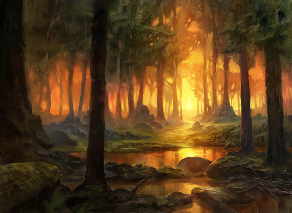
Forest #248 by Adam Paquette. Digital.
Paquette’s Forest features a focal point of blinding light creasing through the trees, a beacon surrounded by the earth from which it springs. Is that not what we also see in the Rothko? A body of green with variations like branches on a “red” ground that feels as tan as tree bark, and emits the same glowing color of fresh sun through tree branches.
The tangerine is still the showstopper: a beam of color that explodes from the background, and draws your attention through the rest of the work. I knew these wouldn’t all be easy, but sometimes the most challenging yield the truest comparison.
Orange & Red on Red (1957)
Orange & Red on Red (1957) by Mark Rothko, oil on canvas, 68 7/8 x 66 3/8 in, Collection of The Phillips Collection, Washington, DC.
This Rothko immediately felt “Mountain,” and thus that’s where I started. But after looking through more than a hundred Mountain-based basic lands, none of them felt right; there wasn’t enough emotion in those craggy peaks and winding foothills. I needed a feeling that could only be felt by fire. The inferno we spoke of earlier. A Worldfire:
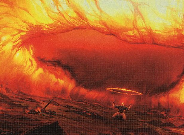
Worldfire by Izzy. Digital.
An all encompassing conflagration, the wreath of flame that is Worldfire is exactly the feeling derived from this Rothko. The reds and oranges are inescapable amongst a backdrop of the two colors combined. It’s an enveloping feeling that could be purifying or hellfire, and I guess that’s left up to the viewer’s self reflection to see just how it hits. What is it for you?
Wrapping Up
I truly hoped you enjoyed this juxtapositional journey between one of the greatest artists of the 20th century and the greatest card game to have ever been created.
Truly, these artworks could not have been born any differently. Rothko was a champion of abstract expressionism, and the Magic artworks are commissioned production art for a game. Rothko worked traditionally in oils on large canvases, with pulley systems and equipment in a gymnasium turned studio. All but the first of these Magic artworks are digital, rendered with stylus and technology on a screen only somewhat larger than what you’re reading on. And even beyond artistic period and purpose, consider the side by side just in terms of size. Rothko worked incredibly large as you’ve seen in the photo of the Rothko Room itself, and these Magic artworks, though all painted at different sizes, are presented in a box not even 2 by 2.5 inches on the size of a playing card.
And yet despite all these differences there is a relationship here. In all of these works can be found the attempt to explain part of the human condition, and to draw relevance from something greater to explain the everyday.
If this is something you enjoyed, would you like to see me do it again? Perhaps with a different museum collection, or even the reverse, like aligning the rest of the Ravnica Guilds with their contrived corresponding Rothko masterworks? Or maybe a different artist entirely? I thoroughly enjoyed this experiment, so please do let me know if there’s something you’d like to see, or even that you thought I missed.
Remember, to see original #mtgart and other #vorthos related things, follow me on Twitter. Feel free to ask questions or retweet to continue the conversation. Thanks and see you next time!
Donny Caltrider has been playing Magic since 2002 and collecting original Magic art since 2017. He has an M.A. in Museum Studies from Johns Hopkins University and enjoys telling stories about art, objects, and the intersection of fantasy with real-life. You can find him on Twitter talking about #mtgart, museums, and other #vorthos related goodness. Follow along and continue the conversation!