
Good morning, and welcome back to Masterpiece Theater here on Hipsters of the Coast for another edition of Marvel Masterpieces Parallels, a brand new series exploring Upper Deck’s Marvel Masterpieces from 2016-2020.
My last project was diving deep into the most recent Marvel Masterpieces 2020 set by Dave Palumbo and, as I neared its completion, I became curious about how his work would connect to the previous two “modern” Masterpiece sets that came before him. The 2016 set was done by Joe Jusko, artist of the first Marvel Masterpieces set in 1992. In 2018 wildly popular Italian comic artist Simone Bianchi followed in his footsteps, and completed his own Marvel Masterpieces set with new characters, new Battle Spectra scenes, and an entirely different stylistic take on the Marvel universe.
Each of the three sets are completely unique, and puts an artist’s style in the full spotlight. Jusko’s look is classic comic book, with all the muscle, color, and vibrancy of the sets from the 1990s, but reimagined for a new century. Bianchi is more contemporary: darker and grittier with bold blacks and colored outlines to make his characters distinct and out of this world. Palumbo falls somewhere in the middle: his big brushstrokes give a painterly feel to the genre, and bring a balance to the modern Masterpieces. His rendition especially is something that trading cards have never seen.
Across the three sets 2016-2020, there are 42 characters that were painted into each set at least once, and several characters that have multiple appearances within a given year.. In total we’ll look at more than 175 artworks from the last three iterations of Marvel Masterpieces, compare and contrast each artist’s creation, and learn some pretty cool stuff directly from the artist’s themselves along the way. This series isn’t about picking the best work, but rather talking about why each is a Masterpiece in its own right, and how these works function as a family of premier illustrations both within and across their respective sets.

This is part two of the three-part mini-series looking at the X-Men. Last month were the ladies, and today we’ll take a look at the male side of these historic teams in order (sort of) of their first appearance. This is Parallels: X-Men!
Professor X
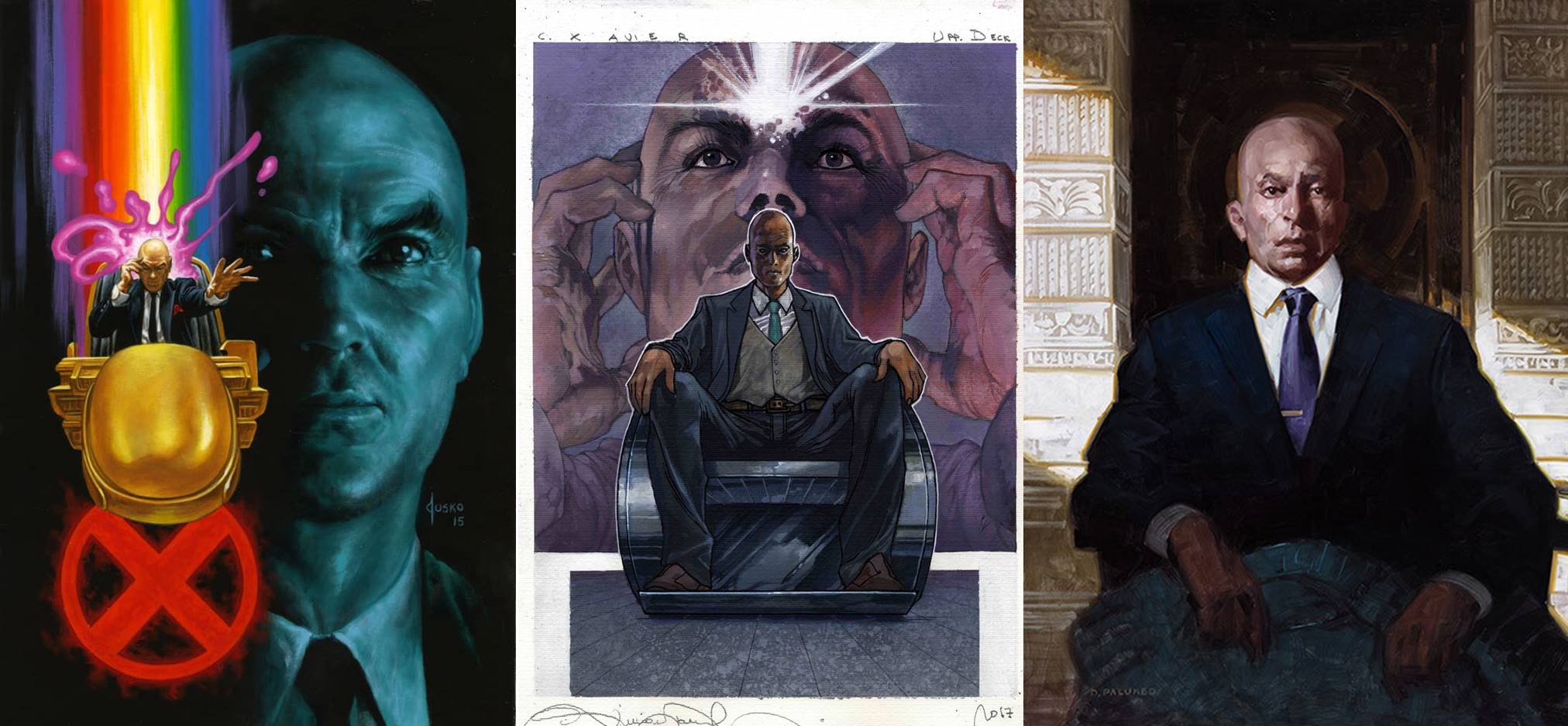
Left to Right: Professor X (Holofoil) by Joe Jusko, 2016; Professor X by Simone Bianchi, 2018; Professor X by Dave Palumbo, 2020
We begin with the founder, and we get almost an evolution of Charles Xavier, the namesake of the X-Men, in these three works.
Jusko shows us a younger Xavier in his hoverchair, hand to forehand to channel his telepathic abilities. If the background looks familiar, Jusko explains in his book, it’s an homage to Bob Peak: you’ve seen it on the Star Trek: The Motion Picture movie poster. Bianchi gives us a similar superimposed background, but the Professor is more mature, older, and focused, and trades the hoverchair for a different design of sci-fi wheelchair. Palumbo’s ages him perhaps the most, and with it comes a quiet serenity of wisdom and knowledge. He’s also included a very subtle “X” behind him. This is the portrait that would be hanging in the X Mansion long after his passing as a memorial to the man and his greatness.
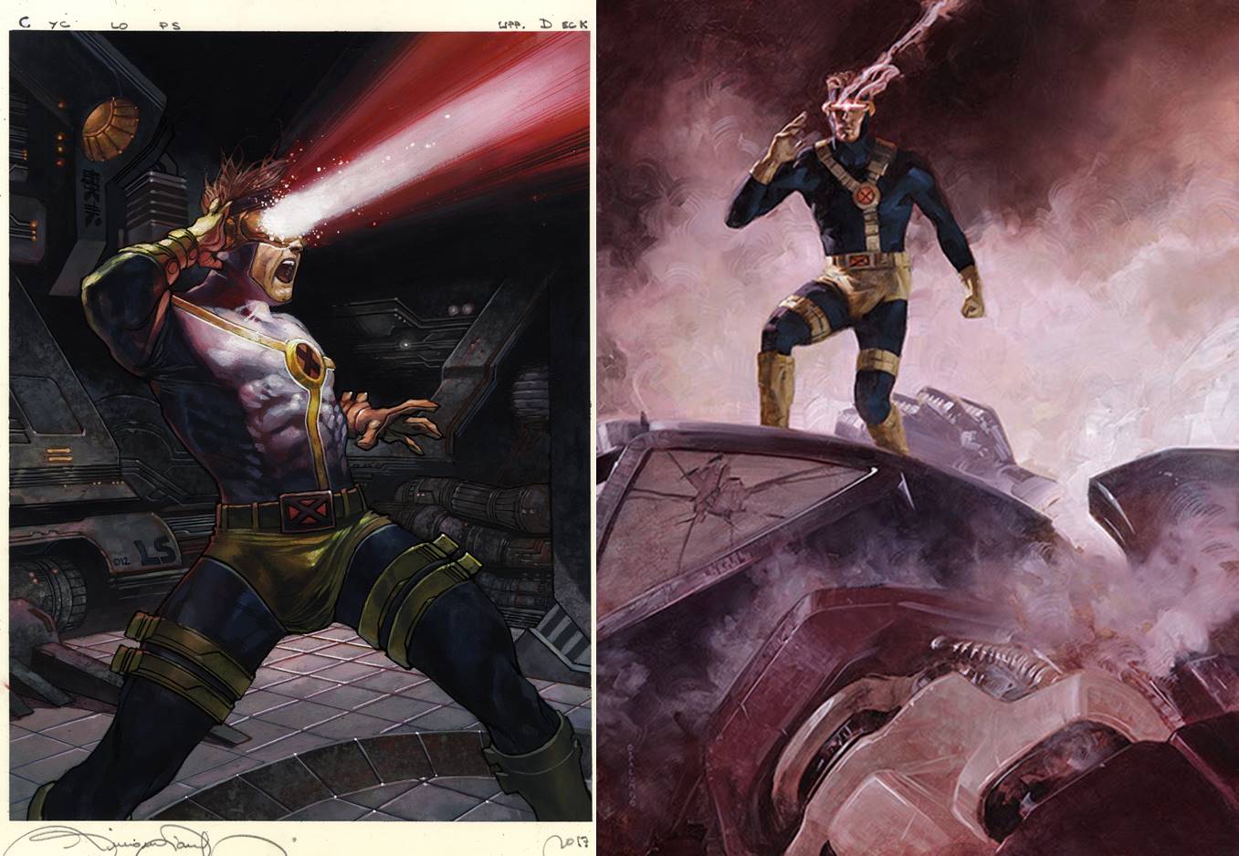
Cyclops
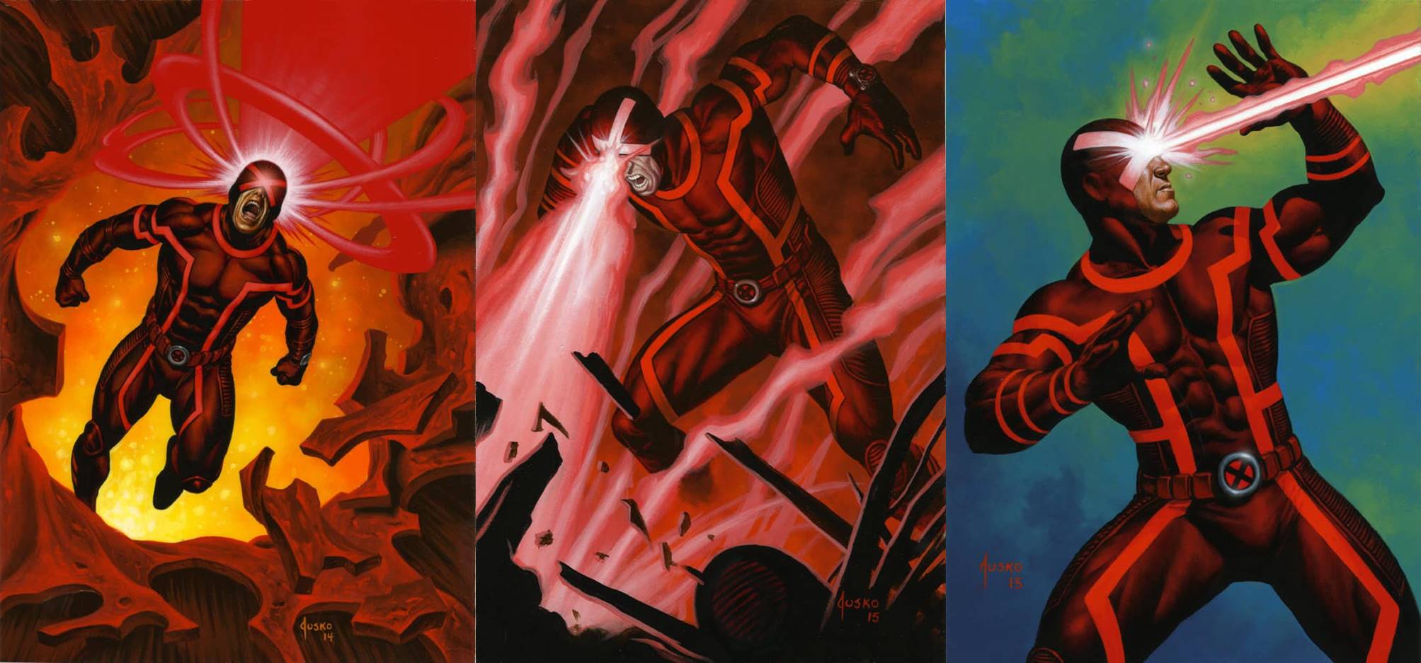
Left to Right: Cyclops (Base) by Joe Jusko, 2016; Cyclops (Holofoil) by Joe Jusko, 2016; Cyclops (Canvas) by Joe Jusko, 2016
In all three of Jusko’s depictions—Base, Canvas Gallery, and Holofoil—Scott Summers sports the contemporary Marvel Now/ Mutant Revolution costume of scarlet red. While maybe not the most popular with fans, it’s apparent that this costume and it’s symmetrical lines really spoke to Jusko, and whether a monochromatic or complementary color background, he’s made this costume fit the character and really come into its own.
Left:Cyclops by Simone Biancho, 2018. Right: Cyclops by Dave Palumbo, 2020
The other two artists chose Cyclops’ most popular 1990s costume, and have shown him much more traditionally with the intense use of his optic blasts. Bianchi shows us a Cyclops unleashed, perhaps even at a loss of control, while Palumbo painted a Cyclops on the hunt, having already taken down a Sentinel. For those that read my Marvel Masterpiece 2020 articles, you know that each Palumbo painting is paired with a song that is representative of the work. This is one is Eye of the Tiger, and now you can’t unhear it playing in the background. You’re welcome.
Beast
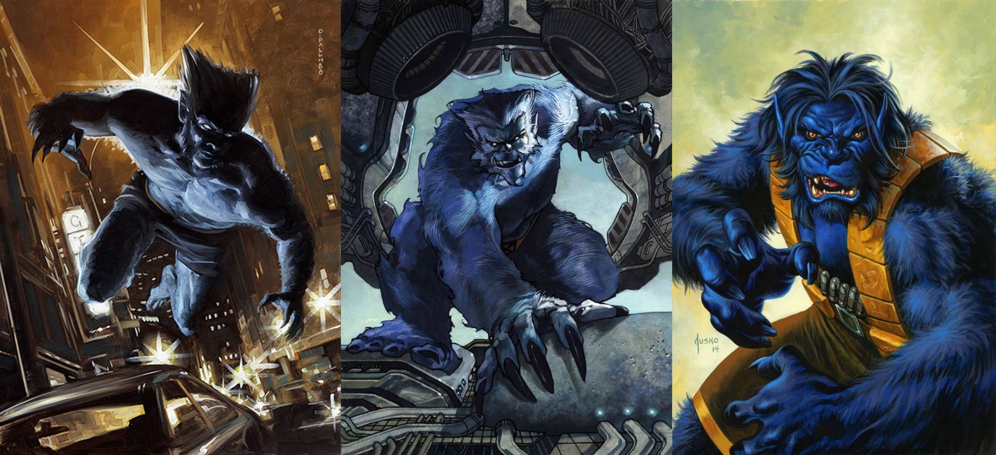
Left to Right: Beast by Dave Palumbo, 2020; Beast by Simone Bianchi, 2018; Beast by Joe Jusko, 2016
The Beast has been on the prowl since 2016, and each artist has made sure to accentuate just what makes this child prodigy turned mutant superhero the blue biped we love. Glowing eyes, sharp claws, a bit of backlighting, and a “lean forward” give the viewer the indication Beast could be on the move at any time, and you best hope you’re on his side when he does. Each artist has taken care to show the size of Beast: Palumbo comparing him to a moving vehicle, Bianchi framing him within what appears to be a ship, and Jusko cropping his arms outside the frame.
Colossus
Not unlike a creative chef, these artists have given us Colossus two ways:
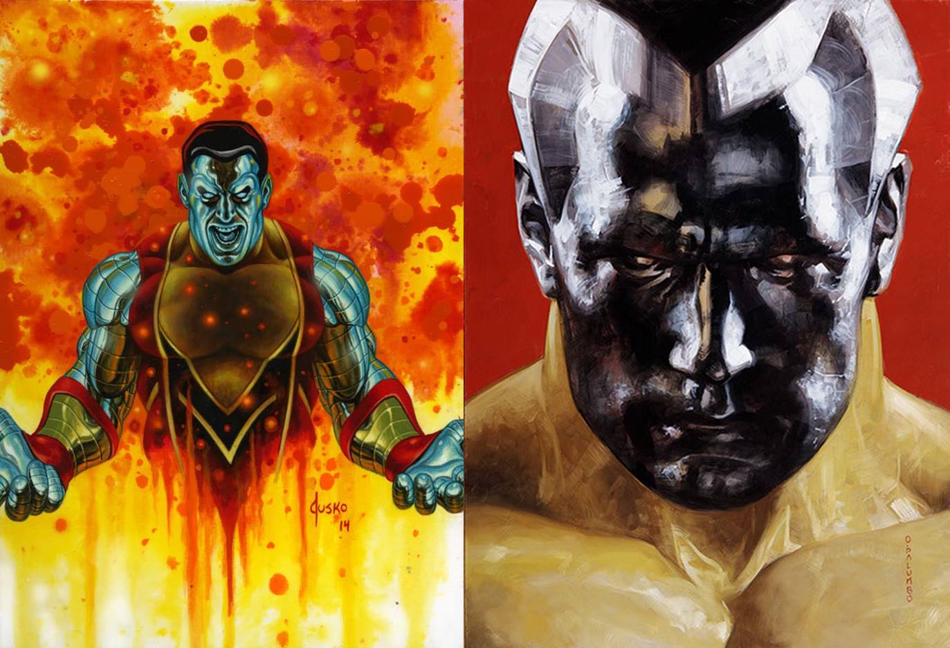
Left: Colossus by Joe Jusko, 2016. Right: Colossus (Holofoil) by Dave Palumbo
Up first is his portrait: Jusko has zoomed out, but used an interesting process of dropping acrylic onto the wet painting, spraying it with water, and then dropping more medium. He calls it “a controlled but spontaneous effect” in his book and it created an almost molten background for the metal man. Palumbo’s portrait is closer and more intense, a masterclass on metal rendering and one of the most unique of his entire set. It’s also one he liked so much he kept it in his personal collection, which speaks volumes I can’t.
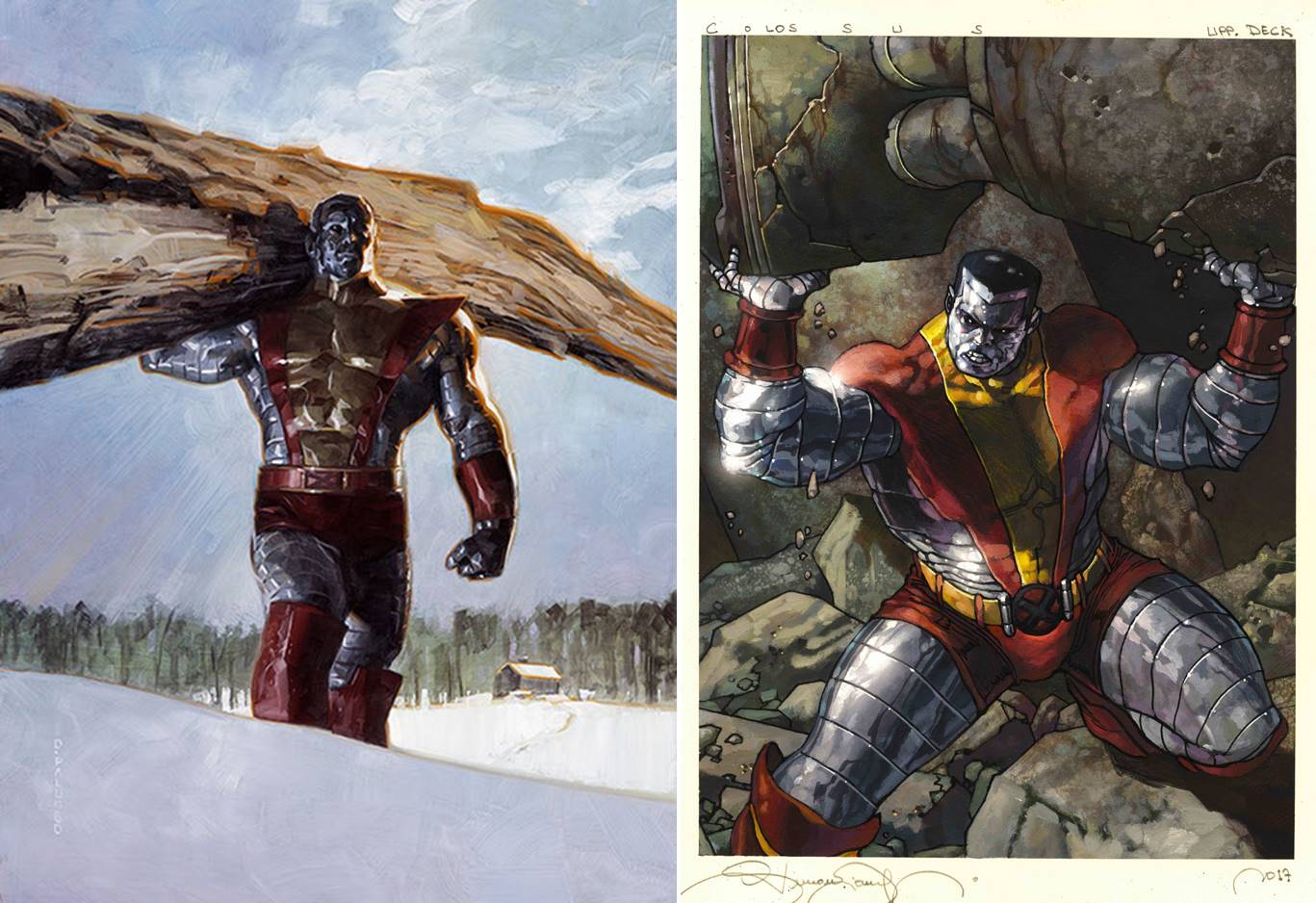
Left: Colossus (Base) by Dave Palumbo, 2020. Right: Colossus by Simone Bianchi, 2018
The other Colossus is the straightforward, signature strong man vibe that’s so often associated with the character. Whether moving trees or rocks, both paintings give us the scale that he’s larger than life, and lifting these objects not only shows his power, but his extreme size compared to all others.
Magneto
We’ll start our “villain section” with a bit of a story. The 2016 Magneto Base card actually has two versions:
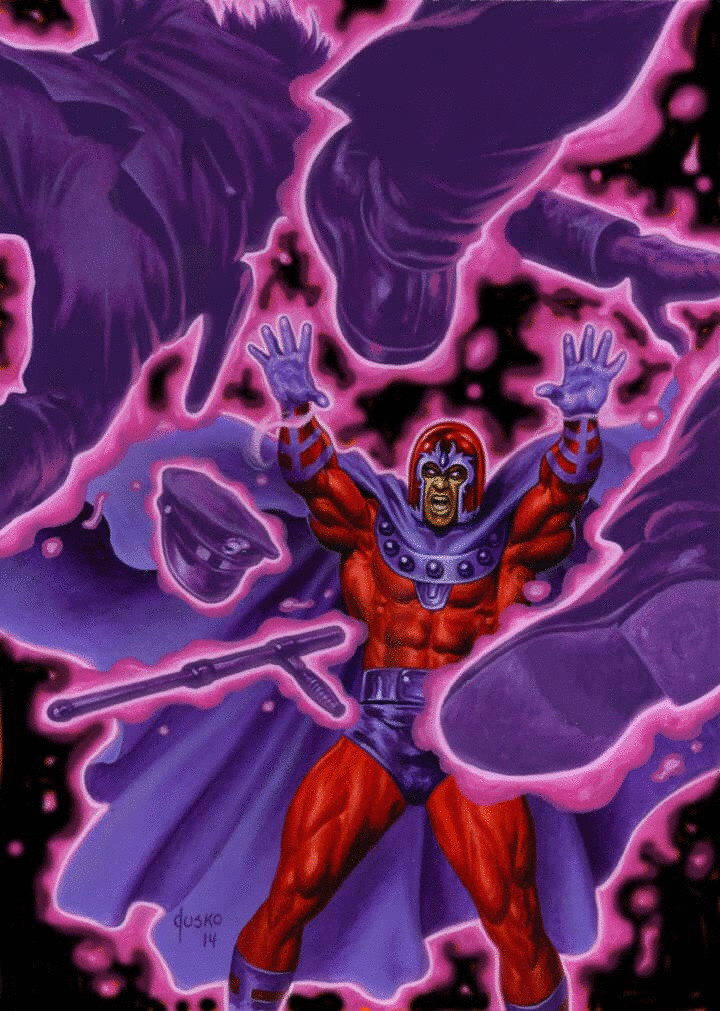
Magneto (Base) by Joe Jusko, 2016
The background of the original painting is orange, but when it didn’t scan as Jusko intended, he blacked it out in Photoshop. His preference was the black background for it’s intensity, but it was the orange that ultimately made it to the card, and matches it’s Holofoil counterpart below:
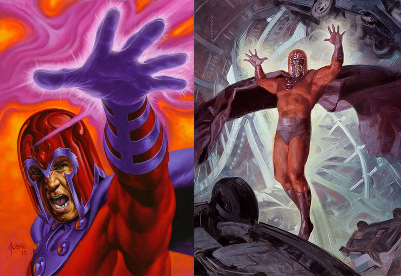
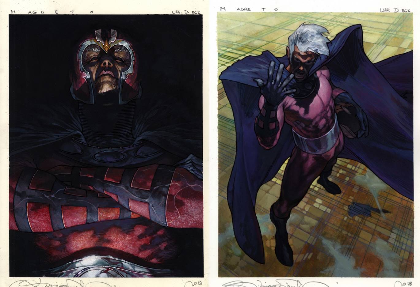
Left: Magneto (Holofoil) by Joe Jusko, 2016, Right: Magneto by Dave Palumbo, 2020
Moving on we get to see Magneto using his power, hand and arms outstretched in the manipulation of metal that is his namesake. I love how Paulmbo was able to imbue motion in the background, where girders and beams writhe about the character; it’s a perfect yet subtle encapsulation of his abilities.
Left: Magneto (Base) by Simone Bianchi, 2018, Right: Magneto (Canvas Gallery) by Simone Bianci, 2018
In 2018 Biancho went in an entirely different direction, and gives us an entirely different perspective of Magento. On the left he is stern, powerful, and void of emotion. This painting makes the viewer feel so small, and so insignificant as we look up at this most powerful mutant. The lighting is just fantastic, and this is one of the artworks the entire set is remembered by (and the back cover of his book).
And for the Canvas Gallery we get a rare view of the man without the helmet. He examines his hand, the same we saw exuding power and twisting metal, in quiet reflection of exactly what he is capable of. Is it remorse? Or wonder? Or ambition? Maybe a bit of all three.
Namor
Namor may seem like a bit of an unusual inclusion in this article, but he is one of Marvel’s oldest characters appearing first all the way back in 1939. He’s been a good guy, a bad guy, a good bad guy and a bad good guy, maybe the original anti-hero in many respects. While he didn’t officially join the X-Men until modern times, he’s considered “Marvel’s First Mutant” and was even suspected back in 1964 by Professor X and Magento themselves in X-Men #6 (July 1964). Thus he join’s today’s article with four iterations over the three sets.
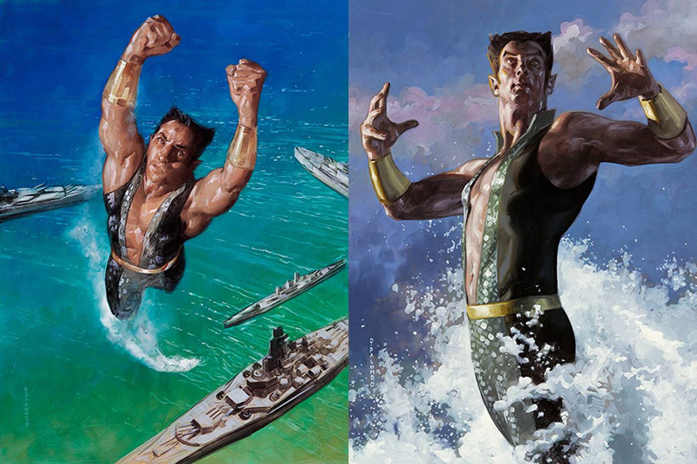
Left: Namor (Base) by Dave Palumbo, 2020, Right: Namor (Holofoil) by Dave Palumbo, 2020
Namor got a double feature from Palumbo in 2020, and oddly enough both of these show the fish out of water, an uncommon illustration of the Atlantean known for his actions below the waves. Palumbo has done some incredible work in oils to show the spray of the water as he breaches the surface above the battleships and breakers. Both paintings are situated circa World War II, and I love that he’s been placed in the historical context that is as much a part of his backstory as his superpowers.
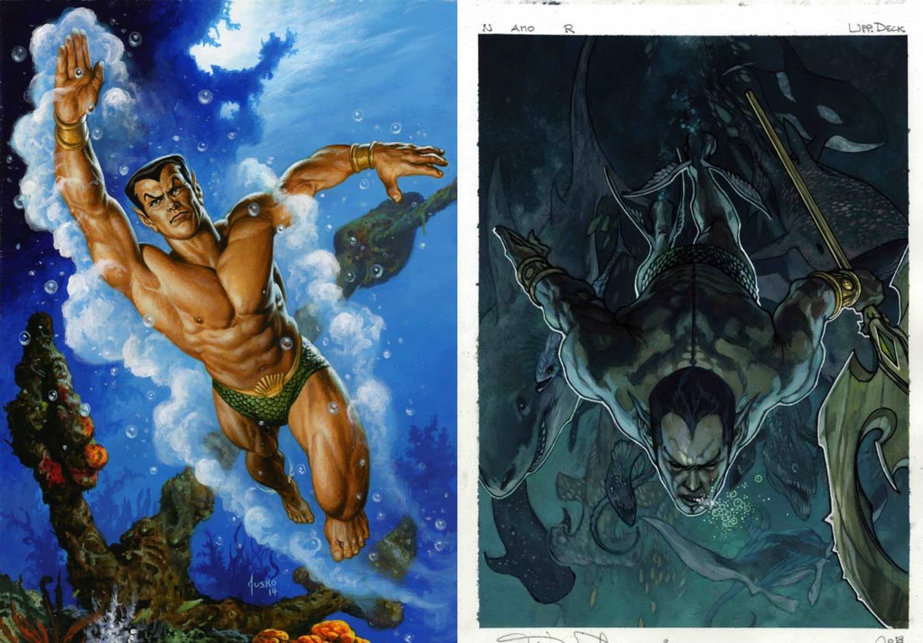
Left: Namor (by Joe Jusko, 2016, Right: Namor by Simone Bianchi, 2018
The 2016 and 2018 versions are more typical of how we’d expect to see the Sub-Mariner, deep below the surface with some number of sea creatures and flora and fauna surrounding him as he swims. As an aside, Prince Namor is set to join the Marvel Cinematic Universe (MCU) in Black Panther 2: Wakanda Forever, and it will be interesting to see exactly what version of the character we get for the silver screen
Wrapping Up
The X-Men will forever be one of Marvel’s most popular groups, and is filled with some of the most resonant characters found throughout the comic universe. This small cross-section highlights the diversity in depiction found within them, from costume to context, and really gives us a glimpse of just how wide the range can be in terms of showing multiple sides to a superhero. Not all superhero or trading card art has to show someone using their power, and those that don’t are some of the strongest works within their respective sets. It’s these unusual views that let us look inside the character, and are what makes Marvel Masterpieces artwork truly special.
We’ve one article to go in the X-Men miniseries, and I’m sure you’ve realized by now the absence of Wolverine. Arguably one of the most popular characters in the entire Universe, he’s tied for the third most cards across characters and will get his very own article. And just another reminder, I’ll also be covering the brand new Marvel Unbound set by fred.ian, and you’ll find that first quarterly article sometime in August as well. In the meantime, you can keep up with all things Marvel Masterpieces 2020 by following me on Twitter (https://twitter.com/DonnyCaltrider). Feel free to ask questions or retweet to continue the conversation. Thanks and see you next time!