
Good morning, and welcome back to Masterpiece Theater here on Hipsters of the Coast for Parallels, a brand new series exploring Upper Deck’s Marvel Masterpieces from 2016-2020.
I’ve spent the better part of the last six months delving into the most recent 2020 set by Dave Palumbo. As I neared its completion, I became curious about how his work would connect to the two “modern” Masterpiece sets that came before him. The 2016 set was done by Joe Jusko, artist of the first Marvel Masterpieces set in 1992 and in 2018 Simone Bianchi followed in his footsteps and completed his own Marvel Masterpieces set with new characters, new Battle Spectra scenes, and an entirely different stylistic take on the Marvel universe. And then in 2020, Dave Palumbo took the reins and once again gave the world a brand new take of these very special characters.
Each of the three sets are completely unique, and puts an artist’s style in the full spotlight. Jusko’s look is classic comic book, with all the muscle, color, and vibrancy of the sets from the 1990s, but reimagined for a new century. Bianchi is more contemporary: darker, grittier and using bold blacks and colored outlines to make his characters distinct. Palumbo falls somewhere in the middle: his big, bold brushstrokes give a painterly feel to the genre, and bring balance to the modern Masterpieces. His rendition is something that trading cards have never seen.
Across the three sets, there are 42 characters that each of the three artists painted, and several characters have multiple depictions within a given year, giving us quite a bit to look at. Over the next few months we’ll look at more than 175 artworks from the last three iterations of Marvel Masterpieces, compare and contrast each artist’s creation, and learn some pretty cool stuff direct from the artist’s themselves along the way. This series isn’t about picking the best work, but rather talking about why each is a Masterpiece in its own right, and how these works function as a family of premier illustrations both within and across their respective sets.

Today we stay in the Spiderverse, and Spider-Man has been fighting these folks since the 1960s; it’s Marvel Masterpieces Parallels: Spider-Man Villains.
Doctor Octopus
We’ll start this exploration with one of Spider-Man’s first enemies, who squared off against the web-slinger in The Amazing Spider-Man #3: Doctor Octopus!
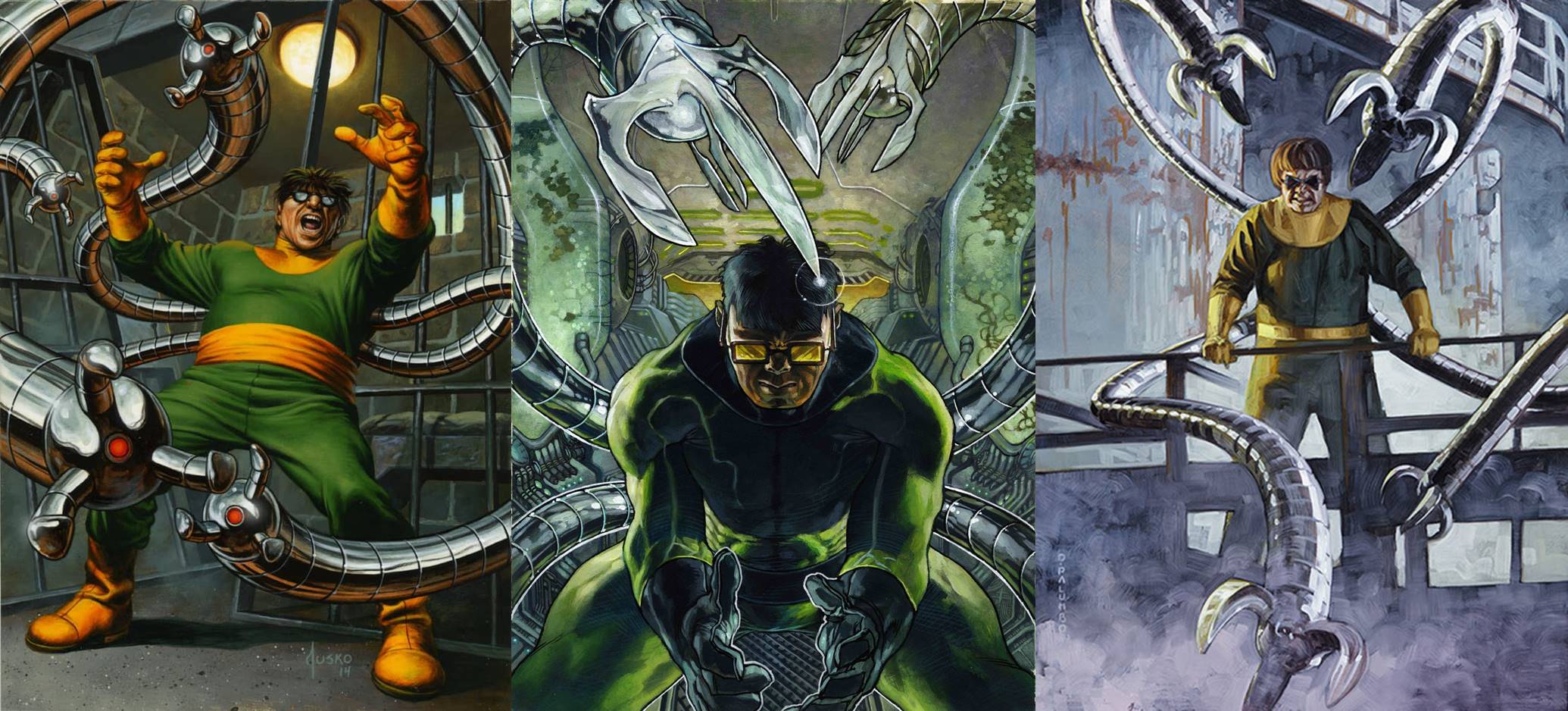
Left to Right: Doctor Octopus by Joe Jusko, 2016; Doctor Octopus by Simone Bianchi, 2018; Doctor Octopus by Dave Palumbo, 2020
In all three sets, Dr. Otto Octavius is shown in that pseudo bowl-cut, sporting eyeglasses and the green and yellow jumpsuit that so many have come to associate with the character. Each artist has set the Doctor’s tentacles in motion, and whether he’s sitting or standing, those mechanical arms are all trying to break the fourth wall and claw their way out of the frame to the viewer. I’m a particular fan of Bianchi’s inclusion of that little glint and glimmer he’s added to the front and center octopus claw, and his use of electric yellows and greens give that piece in particular a nuclear feeling that heightens the danger.
Kraven
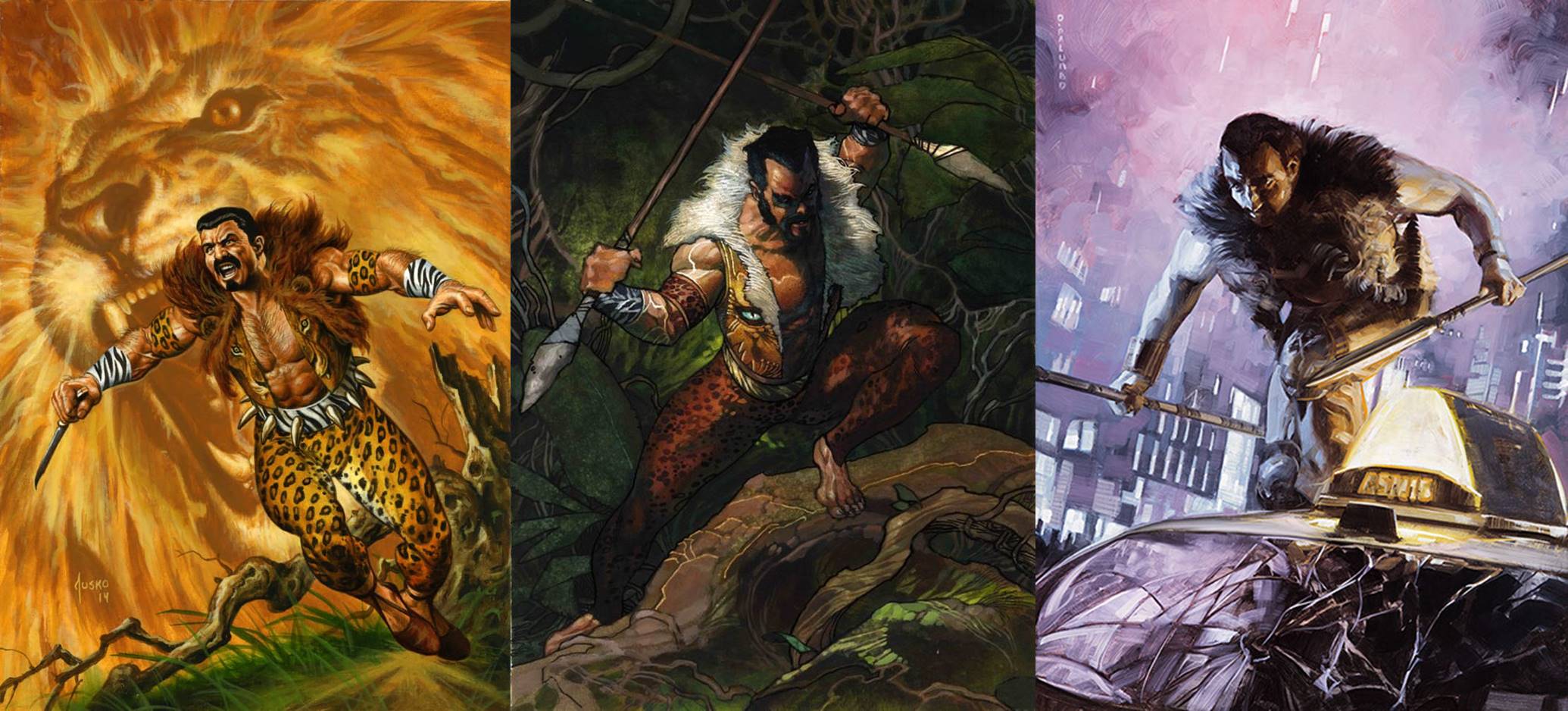
Left to Right: Kraven by Joe Jusko, 2016; Kraven by Simone Bianchi, 2018; Kraven by Dave Palumbo, 2020
Jusko and Bianchi take a similar approach, depicting a primal Kraven the Hunter, with spotted pants and striped cuffs, a lion-faced vest with pronounced and ominous eyeballs, and a fur collar that leaves no mystery as to who is the King of the Jungle.
But Palumbo’s Kraven sends the Sinister Six member into the city atop a dusky palette of purple. He still wears a vest of fur and carries his sharpened spears, but stands triumphant atop a taxi instead of Mother Nature. We see the same half-shadowed face as in the 2018 version, but the stark white collar is now dark, and city lights serve as illumination instead of the animalistic projection of his subconscious as in Jusko’s.
It’s almost as if we see “A Day In the Life of Kraven” in these three works: Jusko’s sunrise charge, Bianchi’s midday foray, and Palumbo’s nighttime adventure.
Mysterio
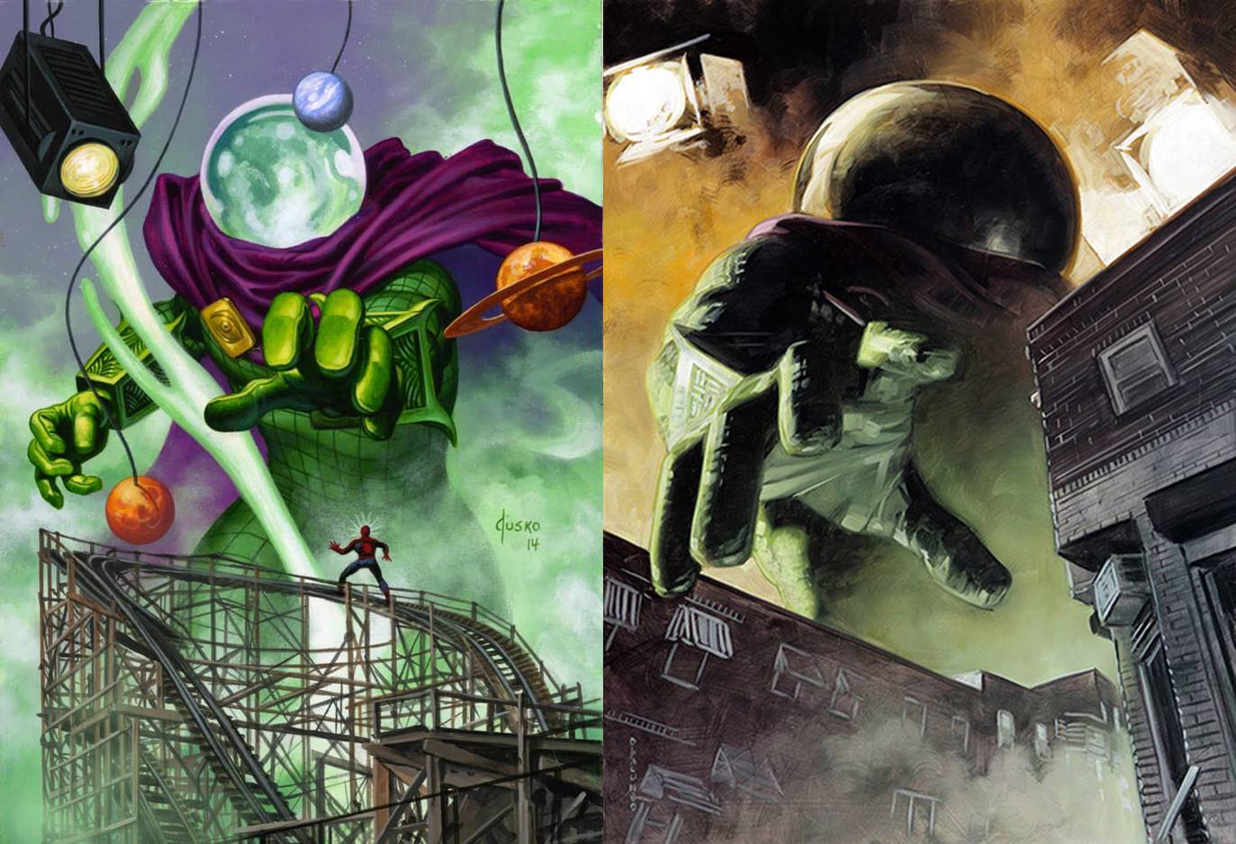
Left: Mysterio by Joe Jusko, 2016. Right: Mysterio (Canvas Gallery) by Dave Palumbo, 2020.
For my regular readers, you know my affinity for Mysterio. This character appears in each base set of the three years, with an extra encore in 2020’s Canvas Gallery series as well. Jusko’s Mysterio takes us back to The Amazing Spider-Man (1963) #67, a classic battle between villain and hero when Mysterio tricks Spider-Man into thinking he’s shrunk to the size of an ant in an amusement park! Jusko even used the actual Coney Island Cyclone roller coaster that stands in Luna Park as reference, and it could just as easily be an alternate comic cover as a trading card. We get that same sort of feeling in Palumbo’s Canvas Gallery, as we the viewer are shrunk to the size of the spider and Mysterio’s gargantuan hand reaches down to grab us, playing off that same infamous story.
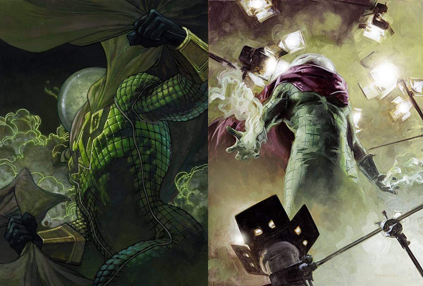
Left: Mysterio by Simone Bianchi, 2018. Right: Mysterio (Base) by Dave Palumbo, 2020.
But as we know with Mysterio, there’s always more! We view Bianchi’s Mysterio from below, a mix of shadow, smoke, and radioactive green line work that makes the mist glow from the background. Palumbo’s base artwork takes a similar approach, but brings up the lights as the character emerges from the smoke and mirrors, as if we’ve pulled back the curtain at the start of his performance.
Green Goblin
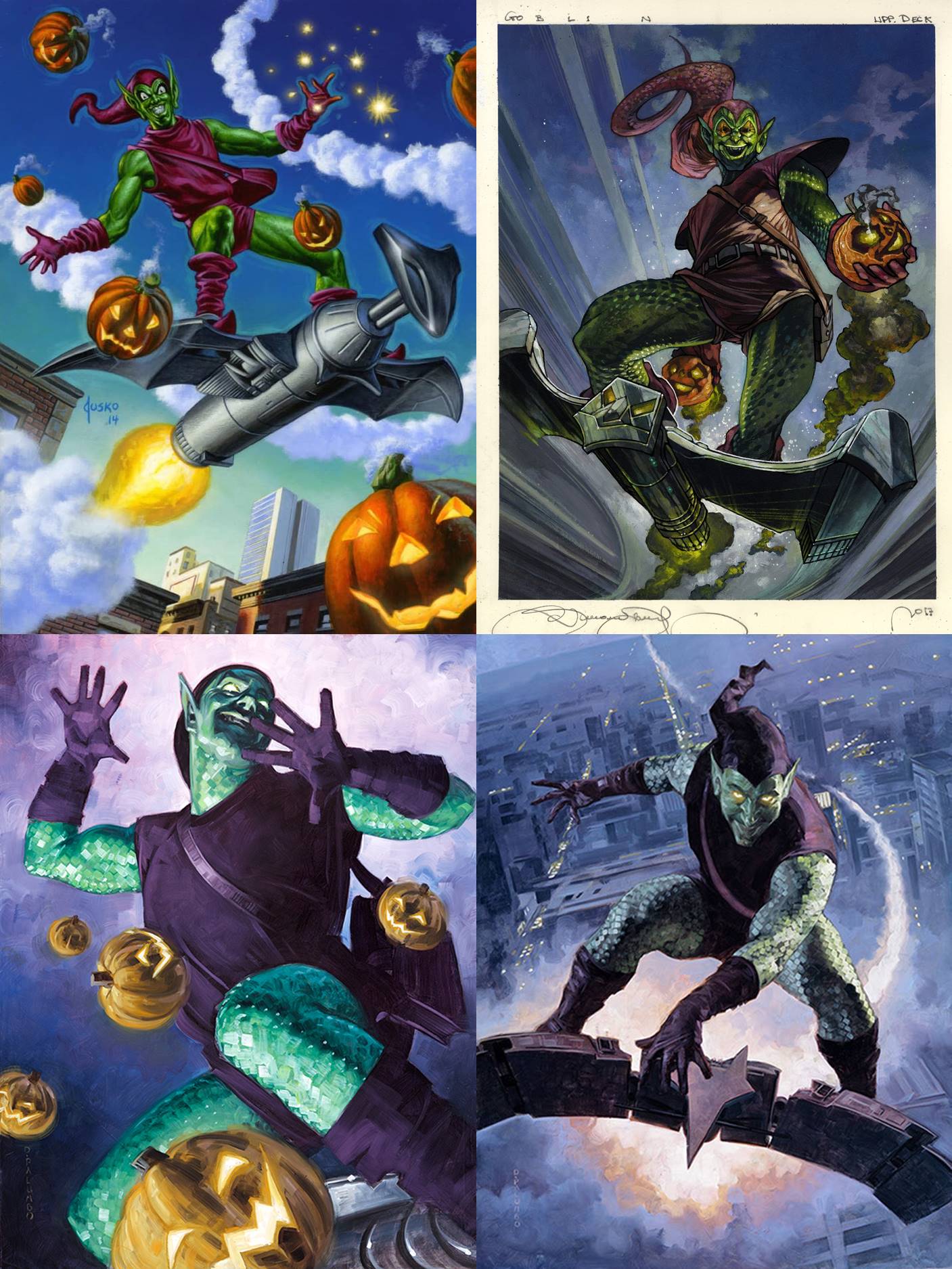
Clockwise from Top Left: Green Goblin by Joe Jusko, 2016; Green Goblin by Simone Bianchi, 2018; Green Goblin (Holofoil) by Dave Palumbo, 2020; Green Goblin by Dave Palumbo, 2020.
The Green Goblin also has four different artworks over these three sets, and the character comes with a certain “accessory kit” that every Green Goblin illustration must have: a trailing purple hat and big purple gloves, assorted pumpkins bombs, preferably already on fire, and his signature bat-shaped Goblin Glider. Jusko’s work pays homage to Romita’s cover from The Amazing Spider-Man (1966) #39, and Palumbo gives us a deconstructed Goblin in two parts, trading the glider for pumpkins between the two versions. Even with these slight differences, based on this four-square I predict Green Goblin to be one of the most similarly illustrated characters we’ll see across this series. He’s just timeless.
Venom
We’ll finish with one of Spiderman’s greatest villains, and one of the most popular characters in the Marvel Universe, Venom. He has two cards in 2016, a single card in 2018, and two again in 2020.
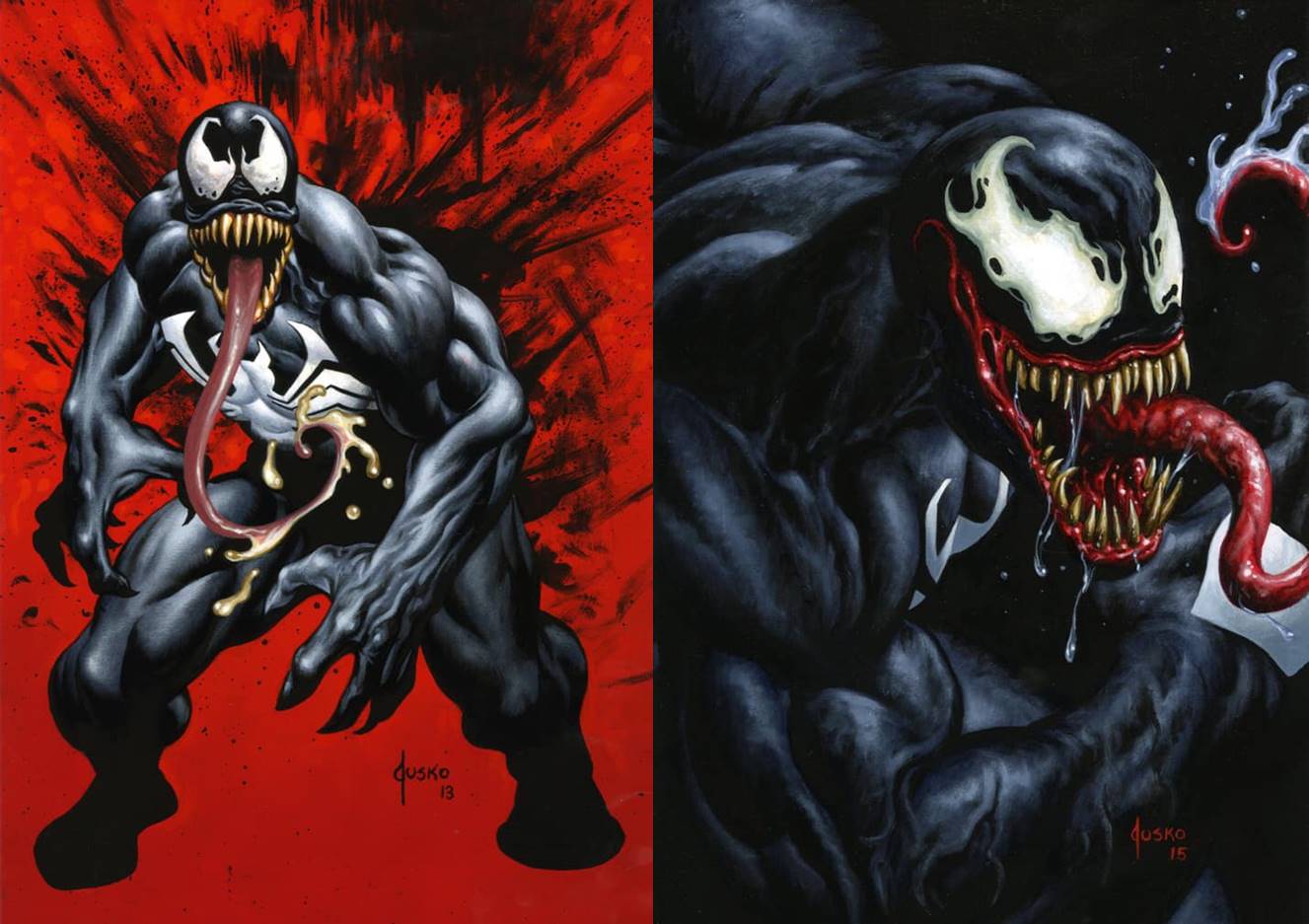
Left: Venom (Base) by Joe Jusko, 2016. Right: Venom (Canvas Gallery) by Joe Jusko, 2016.
Jusko makes it clear in his book that Venom isn’t his favorite character to paint, and was ultimately not in love with his base set depiction of the symbiote. He sought redemption in the Canvas Gallery version on the right above, and in so created something unique across the sets. A zoomed in, tight portrait of the character is the only time we find him this way, and is a fresh take on how to make him even more menacing.
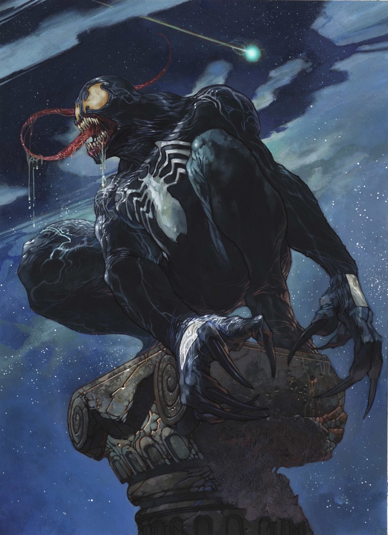
Venom by Simone Bianchi, 2018
High in the night sky is Bianchi’s Venom, perched as if a stone gargoyle but with all the musculature and might we expect to see from something almost human. Note the falling star in the background above his head, a beautiful and subtle symbol of the symbiote’s fall from grace.
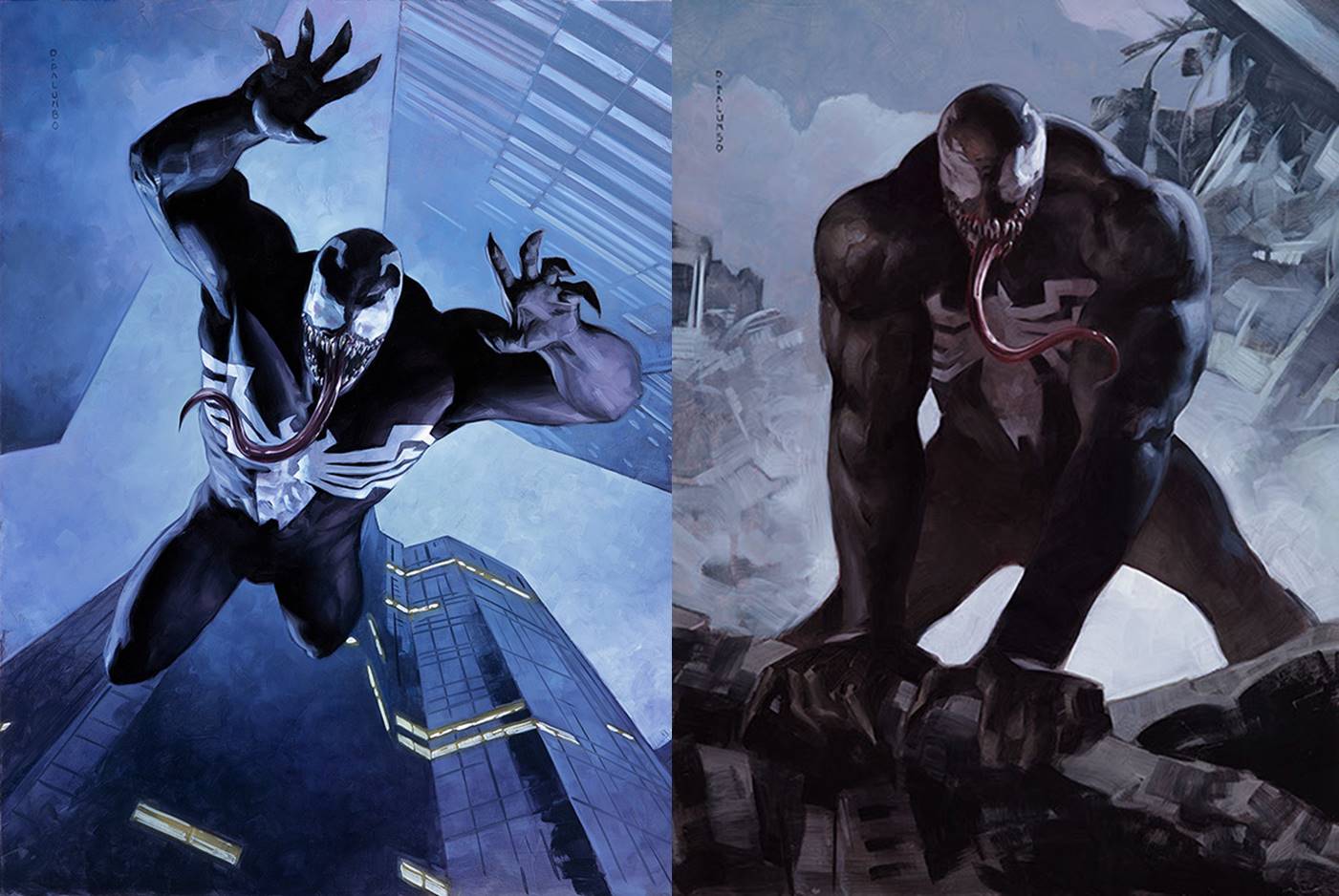
Left: Venom (Holofoil) by Dave Palumbo, 2020. Right: Venom (Base) by Dave Palumbo, 2020.
When arranged left to right as above we get a before and after, the pursuit and the final moments before one’s demise. Palumbo used actor, stuntman, and Marvel superhero model Pat King as reference for Venom, and thus has made the character feel incredibly real; he’s completely believable but he’s born from a real human reference, and that makes him even scarier.
Wrapping Up
We’ve looked at nearly twenty artworks across five of the baddest villains Spider-Man has faced over the last sixty years. Some, like Green Goblin, have an artistic universality that stretches across the years, while others only share bits and pieces between each other, from comic cover callbacks to classic scenes shown in different ways. I love looking at these works as a whole, and with each group it reinforces just how special the Masterpieces line of artwork is within the entire genre of comic-related art.
Next month we’ll jump into the world of the X-Men, and take a look at the Women of the X in particular in that first article. In the meantime, you can keep up with all things Marvel Masterpieces 2020 by following me on Twitter. Feel free to ask questions or retweet to continue the conversation. Thanks and see you next time!
Donny Caltrider has been playing Magic since 2002 and collecting original Magic art since 2017. He has an M.A. in Museum Studies from Johns Hopkins University and enjoys telling stories about art, objects, and the intersection of fantasy with real-life. You can find him on Twitter talking about #mtgart, museums, and other #vorthos related goodness. Follow along and continue the conversation!