
Good morning everyone, and welcome back to the Mirror Gallery here on Hipsters of the Coast.
Truth time: I’ll be the first person to admit that when I heard Time Spiral Remastered was going to be a Spring release, I thought “neat, a reprint set” and didn’t give it much of a second thought. I well remember the timeshifted cards from the original Time Spiral set, where old cards in the classic Magic frame were reprinted within the product right alongside the current expansion. It was a neat thing back then, yes, but hadn’t that already been done once? How was this really any different, aside from putting different cards into that frame? Whether it was the announcement timing being amongst the chaos of late last year, or just the general state of the world, I just wasn’t all that excited.
But that was then, and that’s not how nostalgia works. You don’t get to pick and choose what will well up your memories, and send you flying ass over teacup back into the past. Because that’s exactly what happened here.

A week ago this set was previewed in color order, and as each preview day put more new art into that Magic frame of memory, I found myself watching a little bit closer as the Hipsters internal chat whirred with photos. With each color and card my excitement grew, infusing a piece of my childhood into my current art-centric relationship with Magic. When we arrived on the last day of multicolor cards, lands, and artifacts and finished the 121 card timeshifted set, I texted my friend Jake from my local game store, The Game Haven of Maryland.
“I’m in. One box please.”
His response could not sum this article up any better.
“The old borders are just too nice.”
Required Reading: Rhystic Studies Frames Video
This would normally be the part where I dip into a bit of background about some history behind our topic at hand to get started, but fortunate for us Sam from Rhystic Studies has already taken care of that in his Frames video that came out in February 2018.
The near hour long documentary is a must watch video in its own right, but is especially poignant now as we re-insert one of the most flavorful elements in the game’s history, this 1997 frame, back into Magic for the first time in 15 years. Give it a watch when you have a chance; I think you’ll very much enjoy it.
Ain’t That a Frame
As mentioned, Hipsters had an ongoing discussion of previews as they were released. Travis Norman assumed the role of conductor of the hype train, and David McCoy kept the newly previewed card images flowing throughout the week. Topics from card inclusion to why something looked the way it did, good or bad, were had on the regular, and it was a really fun way to spend preview season amongst my fellow writers. I wasn’t able to contribute as much as I would’ve liked, but was fortunate to be able to hear a lot of great points and perspectives, many of which I’ll share through the article. This is a short tour of some cards that came up, as well as some that I’m really excited about, and we’ll go in color order just as they were previewed. Let’s begin.
White
I’ve never been much of a White player, but that doesn’t make me any less excited to see some of these cards in the old border. I’m also interested to see how they print, as the white text on white ground can be visually challenging for folks that don’t see very well (me among them). A few personal standouts making their return:
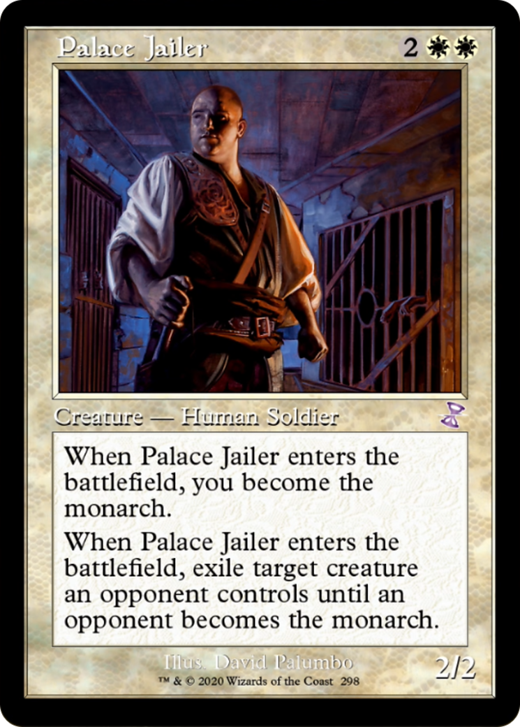
I’m a big fan of Palumbo’s work both within and outside of Magic, and these deep purples and somber palette of Palace Jailer create a nice compliment and contrast to the classic white frame. The colors found within contemporary artwork is both a blessing and curse to this retro refitting, and we’ll see both throughout this article.
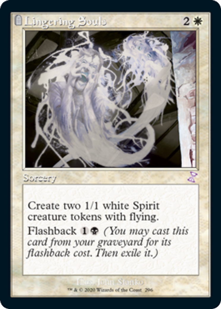
With the classic frame also comes the graveyard reminder seen here on Lingering Souls. Years ago beginning in the Odyssey set, the tiny tombstone in the top left that acted as a visual cue that the graveyard was somehow involved. It only appears on a few cards in TSR, but its novelty is not lost for someone who was playing when that element debuted.
Blue
The blue preview put our Hipsters chat on high alert, as folks taunted one another while writers toiled at their day jobs. From our corner of the world in terms of nostalgia, these cards seemed to hit the hardest. From highly played cards like Ponder, True-Name Nemesis, and Remand (the one that made my heart sing; Remand was my go-to card in the days of Dragonstorm Standard).
To the niche and tribal cards from fringe and Commander decks that have been around for what feels like forever: Ryan Pancoast’s Master of the Pearl Trident, Eric Fortune’s Mulldrifter, and even Jesper Ejsing’s Fblthp, the Lost!
The consensus as proposed by David was that the blue frame brings out the character in crowd favorite Magic cards, perhaps better than anything we’ve ever seen.
Black
I think the highlights in black come as cards that look and feel as if they were always in the old border, even though we know that to be untrue.
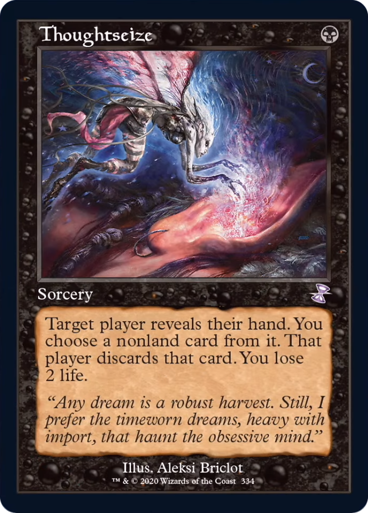
This artwork for Thoughtseize is the original to the card from back in Lorwyn, a set with flavor roots in old English, Irish, Celtic, and Welsh mythos and fairy tale. The world itself feels old and full of memory, and that feeling is recreated here. To bring this classic artwork and one of the most played Magic cards in history in line with that story line is simply brilliant.
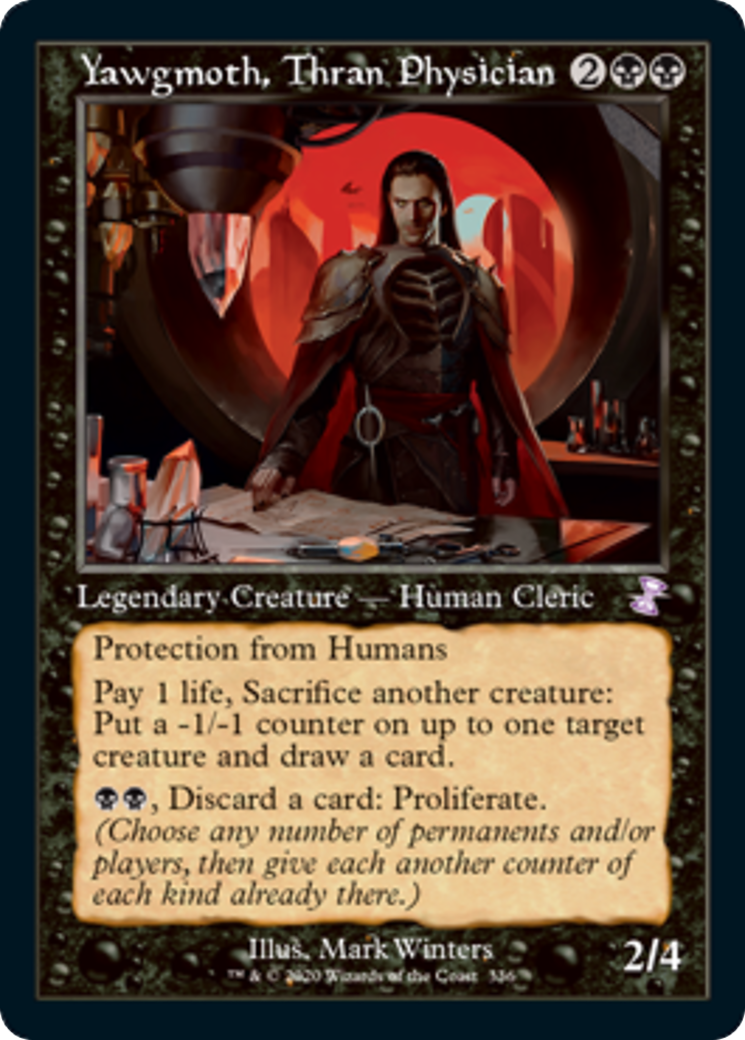
The other is Yawgmoth, Thran Physician by Mark Winters. A highly rendered digital artwork from 2019 is sent hurdling back twenty years in the past simply by changing its border. I expect this will be another big time favorite with folks, and I’m excited to see him helm a Commander deck full of cards from Magic’s story rich expansions of the 1990s.
Red
Within red, the old border on contemporary art serves two purposes. First, it emphasizes the fire and flames present within the artwork, enunciating their power and allowing them to really burn! See Lava Spike, Molten Rain, and Past in Flames:
Whether or not the illustrations are physical paint on canvas or pixels on a computer, a fireball just feels right within these confines.
But the red border can do the opposite too, and tone things down as well. To several of these inclusions it amplifies the presence of the subject, but by way of peace. It’s the silence of the quiet workshop of Feldon of the Third Path, full of reflection, juxtaposed next to the ringing in your ears in the heat of battle in Alesha, Who Smiles at Death and Temur Battle Rage.
Green
When it was time for Green, our friendly neighborhood robot David McCoy also pointed out that Green had one of the hardest challenges in adapting new artwork to the old border, as much of the digital illustrations use much brighter and starker shades of green than is found within the body of the border. This contrast in greens is especially present in Reclamation Sage and Elvish Mystic, though less so in Courser of Kruphix.
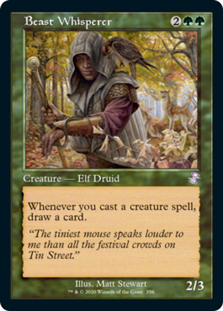
And while some of these colors might not line up perfectly, this isn’t universal, of course. Travis Norman noted in our conversation that cards like Matt Stewart’s Beast Whisperer fit the frame very well, as if they first appeared in something like Mercadian Masques.
For me the big winner here is Thragtusk.
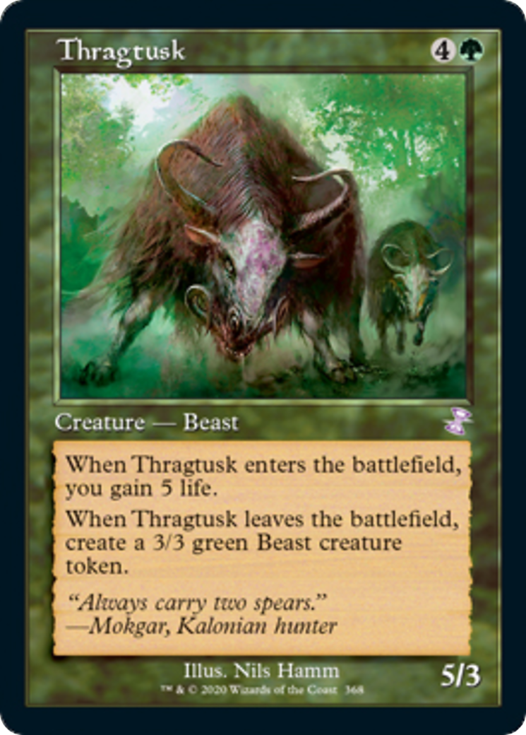
I love the work of Nils Hamm and his impressionistic and imaginative style across creatures, spells and landscapes. Inside this classic frame this work can really thrive, and this takes me back to the days when I first started playing, the days of Onslaught and the beasts of the Krosan Forest.
Multicolor
The multicolor cards fight some of the same battles we saw in green, where the swirling gold presents a clashing canvas against vibrant, digital color palettes of some of the illustrations, like Dovin’s Veto and Mortify.
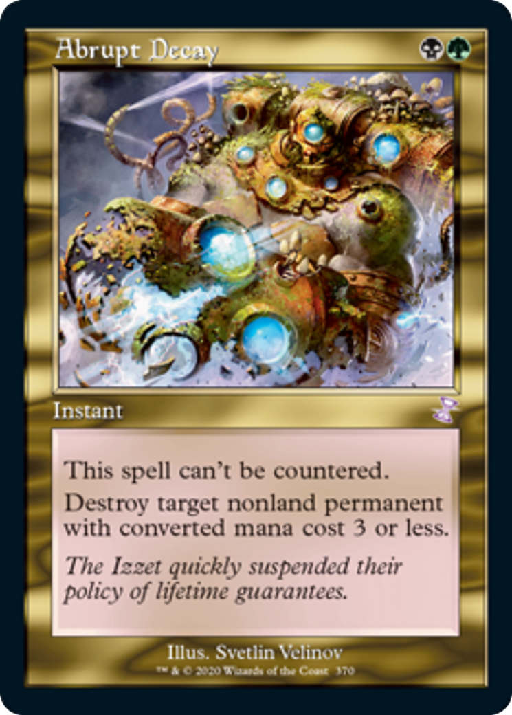
And please don’t misunderstand me; these illustrations still work just fine. But for some other artworks, they appear made for this frame! Look at Svetlin Velinov’s Abrupt Decay, a near perfect color and composition fit.
And Michael Kormack’s Knight of the Reliquary, in all her stoic glory.
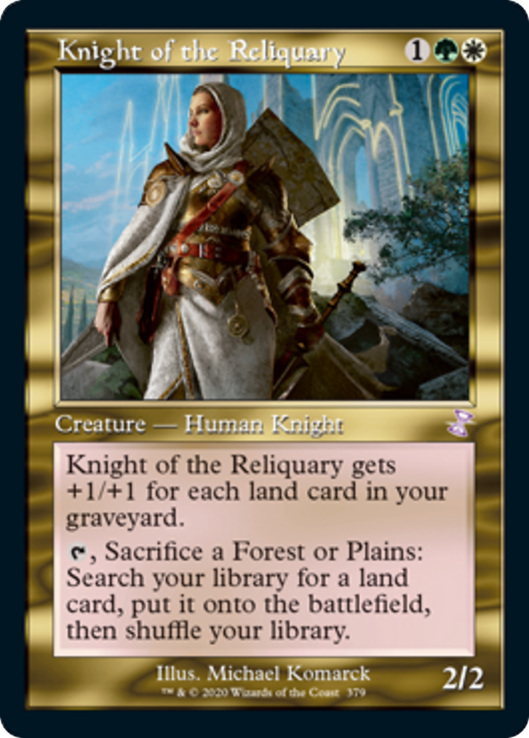
Again, it’s as if these cards were born for this frame, and for folks who put as much into the aesthetic of their deck as the power level, it’s going to make a lot of player’s very happy.
This was also like the fifth time that Travis said “big paper boomer energy,” when one of these older cards came out. He’s not wrong.
Artifacts
Now to my personal favorite section: I love artifacts, always have and always will, and it was these cards are what finally tipped my hand into buying into this set. Lightning round—ready?
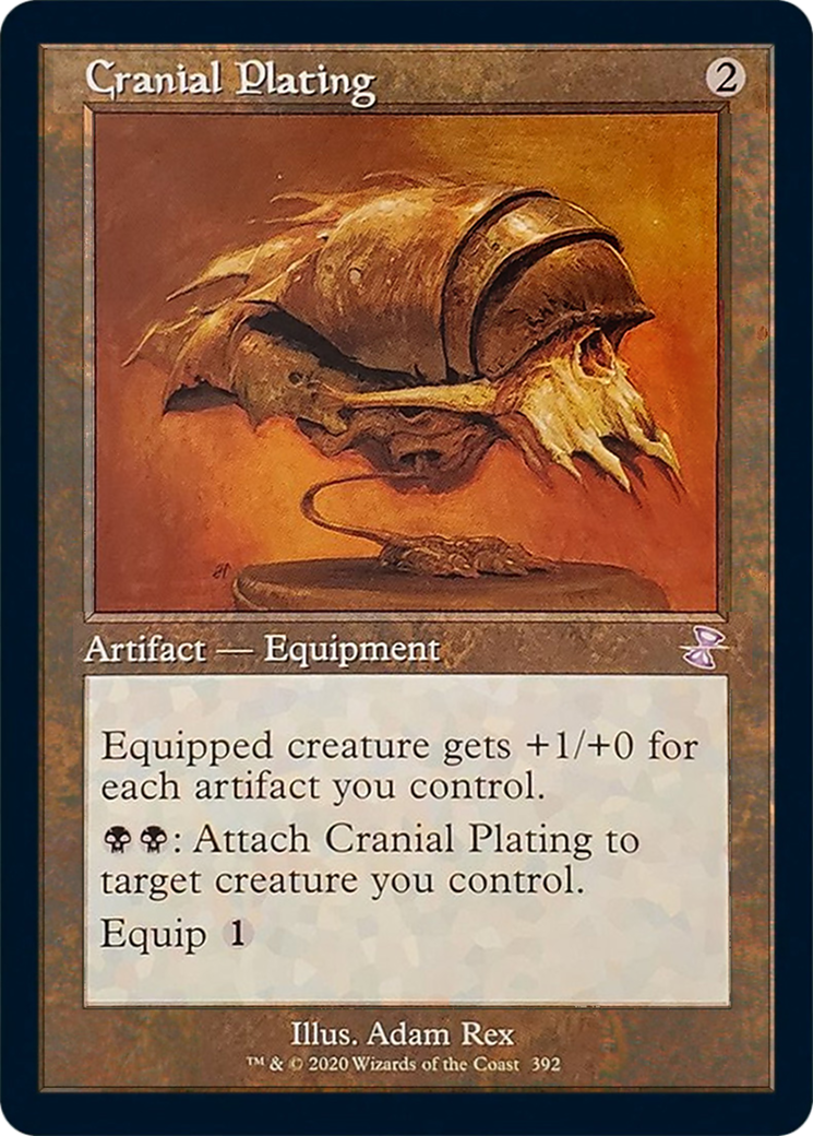
Old school Adam Rex doing Adam Rex things with a skull in the brown frame that goes into my Affinity deck I still have built. Long live Cranial Plating and Mox Opal. Yes, please.
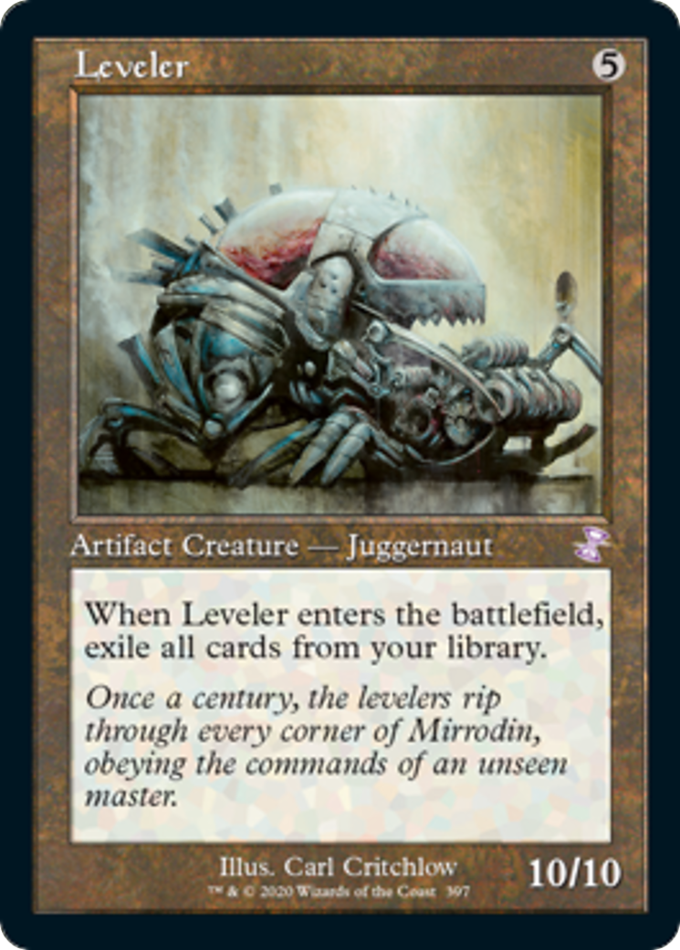
And Carl Critchlow? Carl is a master of metal and artist #1 in my nostalgia book. I’ll take a set of Levelers.
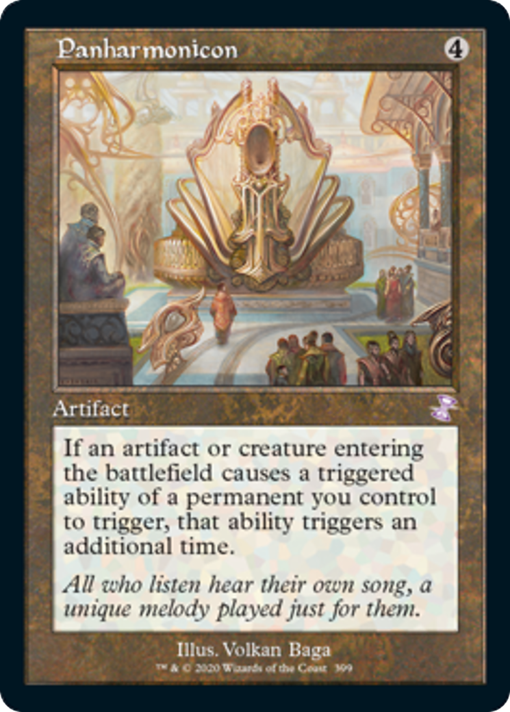
And Volkan Baga too!? Panharmonicon is of my favorite artworks in all of Magic: its Kaladesh summed up in a single card AND the most World’s Fair reference we can find in the game.
Be still my beating heart, I’m getting one of all of these artifacts, and you can’t stop me.
Lands
And finally, this wouldn’t be the Mirror Gallery without a land discussion, now would it? Fist we get the frame crossover point between artifact and land, and the only of this cycle from Mirrodin to appear in this set: Ancient Den.
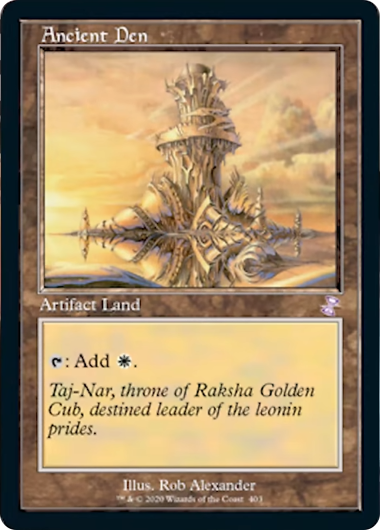
The artifact land in the classic border makes this artwork feel like old Magic. For players that started in the early 2000s, the only way to describe it is it feels like home.
Really across the board of land selection, it matters not when or where the landscape was painted, or whether created traditionally, digitally or a bit of both, they just work in this frame twenty years their senior. Bojuka Bog, Mystic Sanctuary, and Ramunap Ruins, oh my.
Wrapping Up
I honestly don’t know if I would have believed it without seeing it, that these newer illustrations would look so absolutely perfect in this frame from days gone by. Whomever was responsible for choosing these cards had a monumental task and did a really incredible job.
But we know the classic frame can only be a treat, and that the new frame must continue. Within our Hipsters discussion folks pointed out that it’s better vehicle to convey game mechanics, has anti-counterfeiting measures, and is more accessible. As someone who doesn’t see particularly well, it allows the game to be played with less mistakes and more enjoyment 90% of the time. That does not mean I won’t be adding these cards to my collection though, in fact it’s quite the opposite. A little bit of old frame flair will go a long way in my Commander decks.
I suspect part of what makes these old border cards so exciting is the nostalgia I mentioned earlier, and that ignition of memories from years past when life was simpler. Those days you spent looking forward to playing Magic on top of books at recess or on the picnic tables at Scout camp. Those feelings are incredibly hard to replicate, but it’s what Wizards was able to achieve here, and I for one hope it’s successful enough that they do it again somewhere down the road.
Remember, to see original #mtgart and other #vorthos related things, follow me on Twitter. Feel free to ask questions or retweet to continue the conversation. Thanks and see you next time!
Donny Caltrider has been playing Magic since 2002 and collecting original Magic art since 2017. He has an M.A. in Museum Studies from Johns Hopkins University and enjoys telling stories about art, objects, and the intersection of fantasy with real-life. You can find him on Twitter talking about #mtgart, museums, and other #vorthos related goodness. Follow along and continue the conversation!