
This past weekend during the Magic World Championship, Wizards of the Cost unveiled Magic’s new banner for the foreseeable future. This marked the third “facelift” to the Magic logo and the fourth logo overall for the Magic brand. These changes do not change the card back and only affect how the game is marketed. In fact, the original logo from 1993 is and always has stayed intact on our cards. While I could get into the graphic design elements of this change—the dominance of the Planeswalker emblem seems like a smart addition that they may have simply overlooked in 2015, but I don’t know how I feel about the alignment—I wanted to talk briefly today about how this change is symbolic of a shift in the Magic brand that has been in the works for quite awhile and really not that new.
Understanding History
Right off the bat, I looked at the new logo and thought to myself “this doesn’t feel very Fantasy, this doesn’t feel like the game that I started playing in 2002.” And right there is the core of a very weak argument that I have against this logo. With set after set coming out, preview articles happening monthly and new supplementary products drawing our attention each year, it can be hard to remember how long some people have been playing Magic. Lorwyn was a decade ago and Onslaught was fifteen years ago. To say that the game has changed is pointing out the obvious fact of any work of art that continues uninterrupted for two decades.
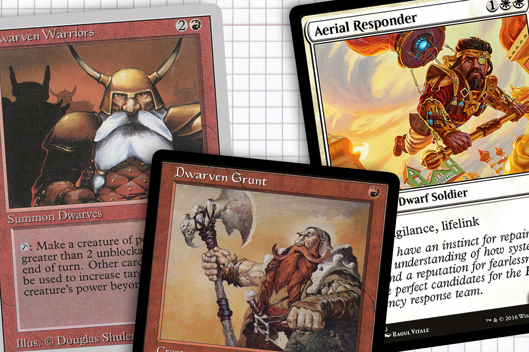
The Fantasy that may have captured my imagination fifteen years ago isn’t really what Magic is anymore. Just look at how a creature type like Dwarves have evolved over the game’s history:

For better or worse—even with the intervention of Magic 2010’s soft reboot for more resonant fantasy—Magic isn’t drawing its influences mainly from Greek/Roman mythology and Tolkien anymore. I would contend that starting with Invasion block Magic’s Art Directors subtly started visually defining its own version of Fantasy. It would take another dozen years and a lot of persistent world building, but in retrospect most non-Mirrodin worlds in the Modern-format era were built on some degree of outside influences. And I believe our first trip to Innistrad carried enough success to be all Wizards needed to justify a very strong shift towards top-down worlds.
At first I loved this shift. Innistrad and Theros felt distinctly Magic while also being influenced by a real world culture. But over the last few years I’ve grown out of loving that a majority of the new worlds we’ve discovered have leaned more towards top-down, drawing from real world or perceived cultural influences. Real world influences mean real world references and tighter art direction. These more consistent world guides may add weight to an argument that Mike Linnemann tried to debunk last month that “all the art looks the same,” but I don’t know that its a problem for the wider audience.
Let’s take two recent new worlds I think concentrated the least on being top-down: Tarkir and Ixalan. Tarkir was a world drawing from a half-dozen different Asian cultures—that classic Mongolian/Ottoman/Shaolin blend—but the core of the block was feuding clans overlayed on a time travel story. Ixalan draws a lot from Mesoamerican architecture and history, but the marquee elements thus far have been dinosaurs and pirates. Both of these worlds have taken influences from existing cultures but without the audience needing to know the backstory to understand the cards. Both of these blocks are symbolic of both what Magic is and what it no longer is.
So This is Magic Now?
So what does this all have to with the new banner? Well, I see this as another piece of the Magic pie aligning with where the game has been going creatively and visually since even before I started playing. To the general public Magic is a Fantasy game in the style of Lord of the Rings or Harry Potter. I see that as an understandable misconception, but the last time Magic was that game artistically was Lorwyn where the influences were Welsh folklore. Magic has become, since the new millennium, a game bigger than the Tolkien box. In front of our eyes it has crafted its own brand of Fantasy where steampunk dwarves, ninja rats, and conquistador vampires all exist and make sense.
Does the new banner encapsulate what drew me to the game? Not really. I liked the handwritten style and I thought it gave the game character. Does it capture the collective elements of steampunk, ninjas, and conquistadors? In my opinion, no. Does it change how I will play game? Not in the least. And that’s what’s important.
At the end of the day, any problems I might have with Magic’s new banner are unimportant. The back of the card isn’t changing and that’s the only version of the logo I spend a meaningful time looking at. The changes are not aimed towards keeping me in the game, but drawing new people to it. Fellow Hipster Katie Bates has good thoughts about the marketing angle of the new logo. These kinds of changes happen in other industries all the time and that has never stopped me from using Twitter or drinking Coca Cola. It won’t stop me from playing Magic: the Gathering. The real question is, will it stop you?