


On September 9, amid the previews for Reality Fracture, I was mouthbreathing my way through my Instagram feed when I tumbled headfirst into a post by Serena Malyon: the full art for the just-previewed Jace’s Machinations.
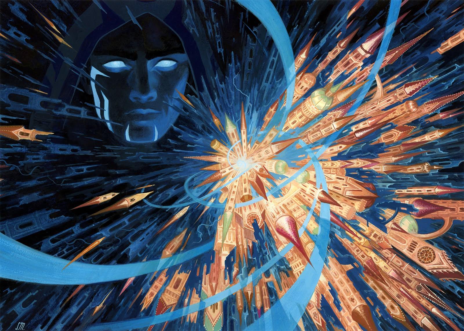
Serena Malyon, “Jace’s Machinations”
While staring at the kaleidoscope-shiver of colors ripping across the right side of the frame—Jace shredding his erstwhile home, Ravnica—I thought to myself: How does she keep doing it? This, I was sure, would be my favorite Magic illustration of the year.
Except then, a few days later, she posted Hall of Echoes.
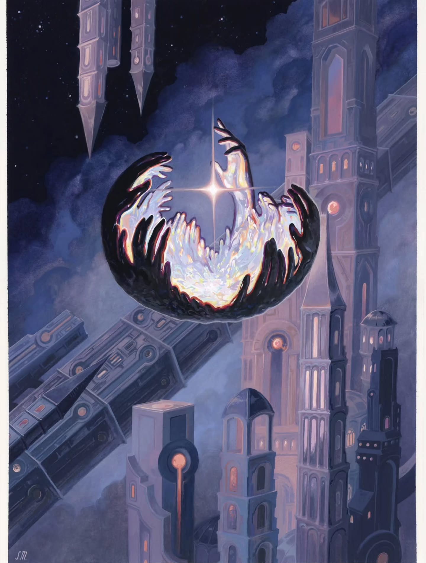
Serena Malyon, “Hall of Echoes”
And there I was again. How does she keep doing it?

Keep being the operative word, because Malyon has been on a tear ever since she made her Magic debut in Streets of New Capenna (with, among others, the arresting “Golden Age” showcase treatment version of Soul of Emancipation). In the next few years New Capenna, she would work mostly in special treatment series, like the stained glass art treatments for Dominaria United and Wilds of Eldraine’s “Enchanting Tales” reprints, most notably the haunting Rhystic Study.
Murders at Karlov Manor Commander would give a taste of Malyon’s art on “normal” Magic cards, including an all-time favorite sorcery of mine, Prisoner’s Dilemma. But her reputation really took off in Bloomburrow, when she illustrated works that blended evocative fantasy realism with intense, even mystical abstraction.
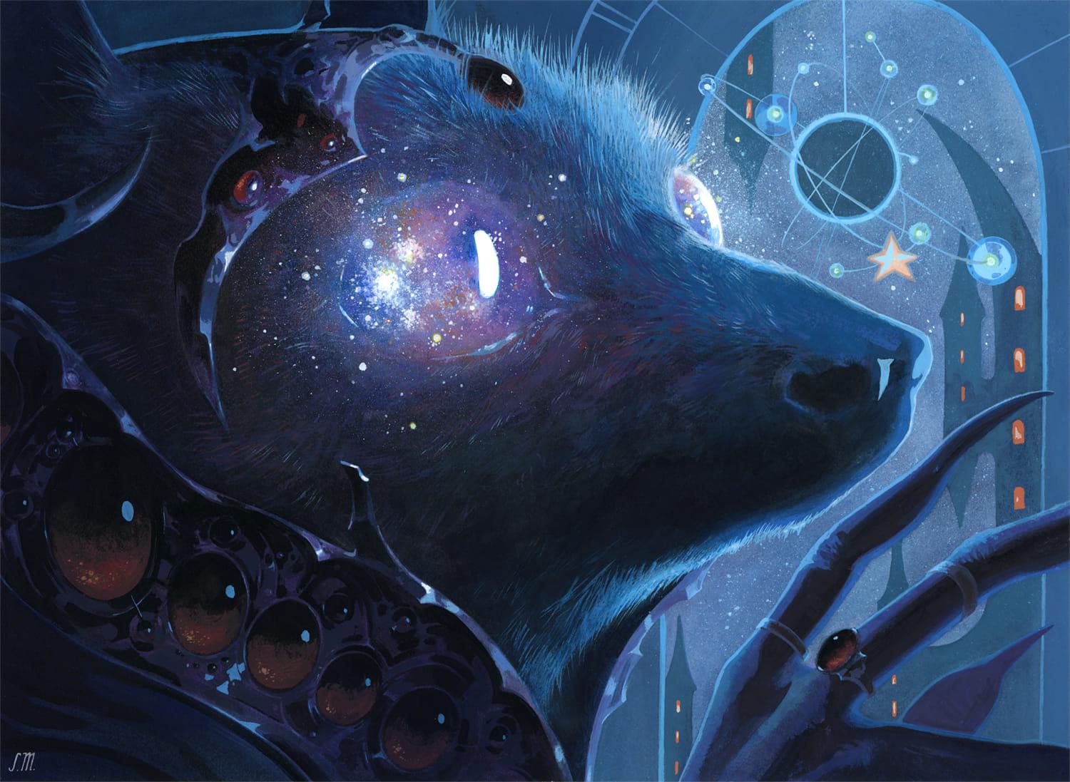
Serena Malyon, “Stargaze”
I’m talking For the Common Good and Season of the Burrow and, by far my favorite, Stargaze. I remember being stopped in my tracks when I first saw that one, struck by Malyon’s ability to balance absurdly fine detail—look at the individual hairs on the bat’s head!—with the alien glow of the cosmos, so milky and bright that it spills out of the reflective eye and into the material world.
This must be her best work, I said to myself. She won’t beat this.
And then, the following year: Edge of Eternity’s Beyond the Quiet.
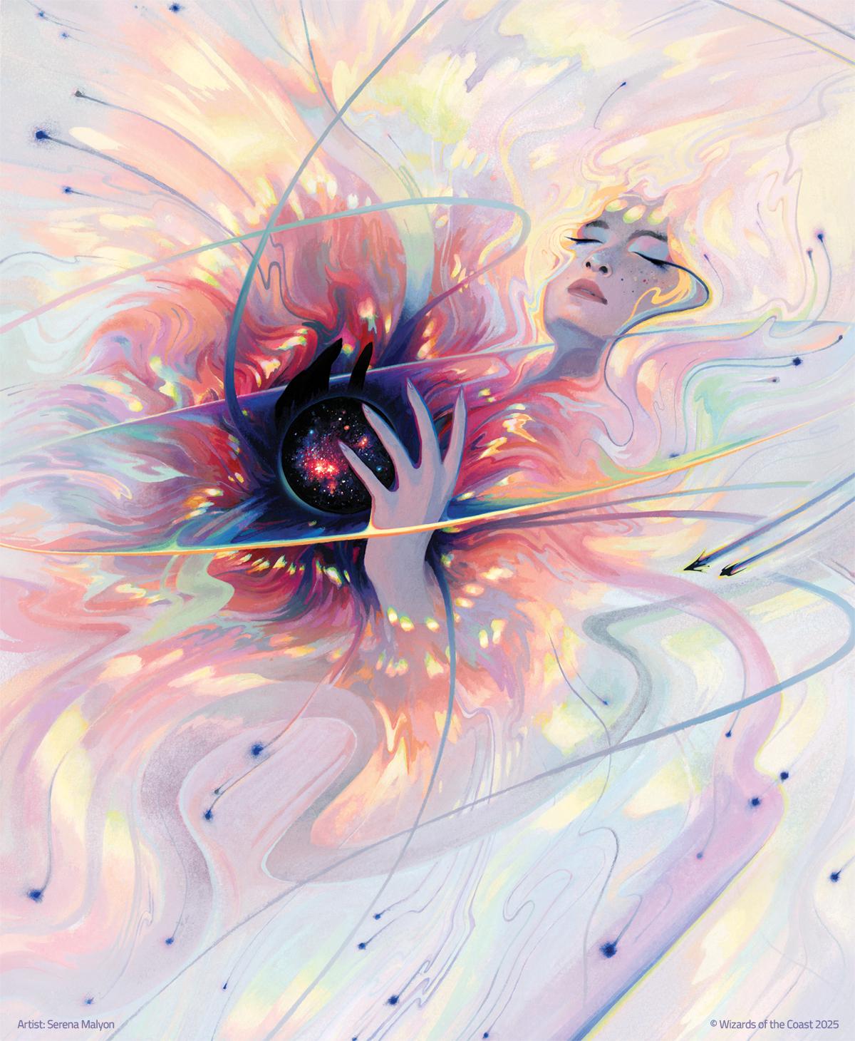
Serena Malyon, “Beyond the Quiet”
If I would have started writing about this image, I probably wouldn’t have stopped (thankfully, “Beyond the Quiet” has enjoyed plenty of deserved acclaim). So instead, in my frenzied desire to figure out how she does it, I reached out to Malyon herself.
Malyon’s Milieu
Malyon told me that her trajectory as an illustrator was a long one. “I grew up around a lot of art, as both of my maternal grandparents were artists, so I’ve been making art since I was a kid,” she said. “I loved going to museums and looking at the works of the old masters, and when I got to art school, I found a passion for illustration.”
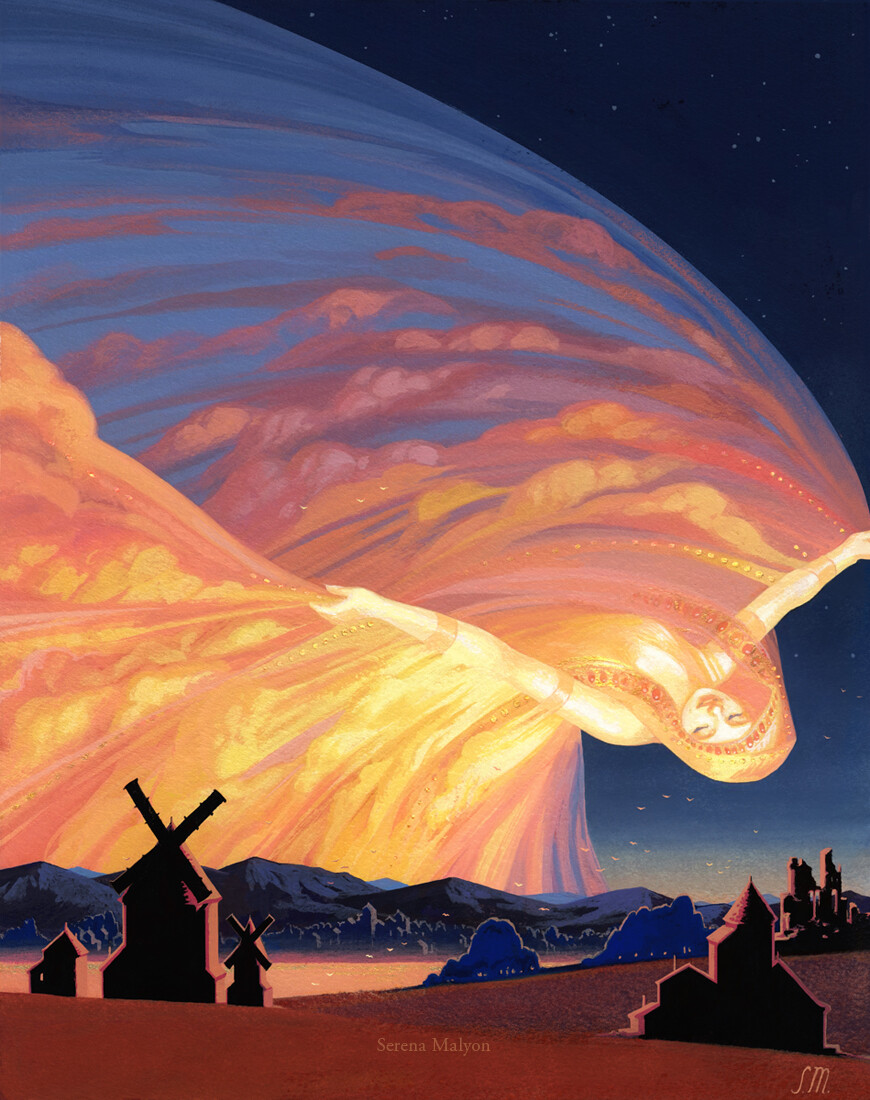
Serena Malyon, “Dawn”
“My career started slowly, it took me quite some time to nail down a style and get my name out there,” she continued. “But after a few years of sharing my work online, I had a few book covers under my belt, and I’d illustrated the Mouse Guard Alphabet Book.” She started working on Magic shortly afterwards, and her career “has taken off since then.”
As I was writing to Malyon, I found myself trying to grasp for words to describe her work’s enchanting allure. I started with style. Part of her artwork’s appeal, it seems to me, is that it abuts but doesn’t fully inhabit the fantasy realism of Magic’s house style; it stands out as something else. As it turned out, Malyon had a similar ambivalence.
“I have a lot of trouble defining my style,” she said. “It’s definitely not what one thinks of when you say ‘fantasy realism,’ though if I’m working on main set Magic artworks, I try to tone down the stylization a bit.”
Then if style, per se, isn’t the key to understanding her work, milieu might be.
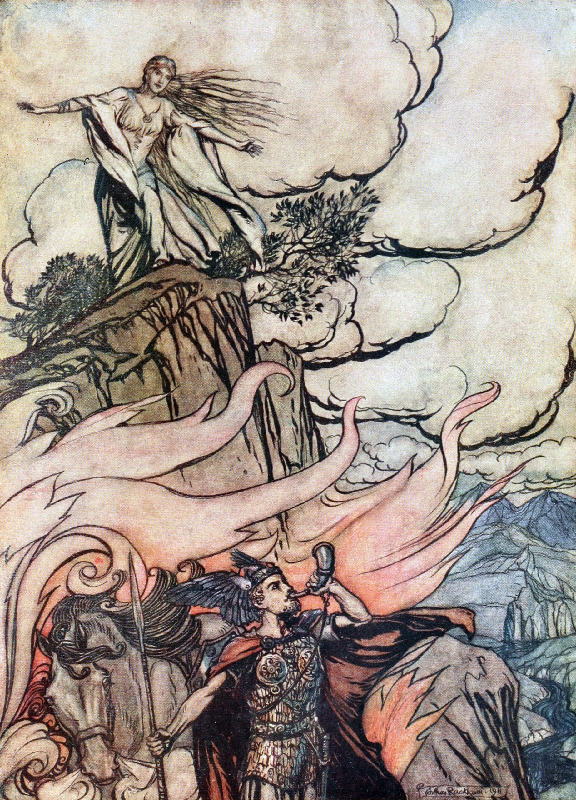
Arthur Rackham, “Siegfried leaving Brünnhilde,” illustration to Richard Wagner’s The Ring
Some of Malyon’s greatest influences, she told me, are illustrators like Arthur Rackham, Edmund Dulac, N.C. Wyeth, Maxfield Parrish—figures from the Golden Age of Illustration, a period from the late nineteenth century through the mid-twentieth century during which improved photographic reproductions (and thus color printing), a healthy market for children’s books and illustrated magazines, and various new aesthetic movements all led to a glut of beautiful, touching, enchanting illustration. (Andrew Tinsley, a fellow writer for CASCADE CASCADE, has written on Rackham’s echoes in Magic art).
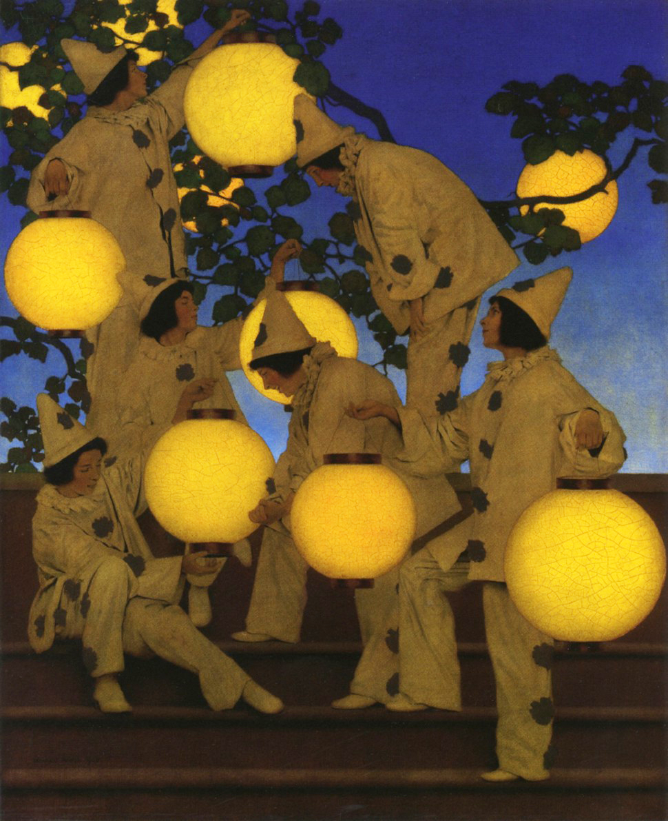
Maxfield Parrish, “The Lantern Bearers”
Although these artists each had distinctive methods, their work tends to pop with expressive color, luxuriate in flowing lines, and favor strange expressive compositions over realist proportions. Not coincidentally, the Golden Age flourished in the same moment as the Art Nouveau, Impressionist, Arts and Crafts, and Symbolist movements, all of which prized both intense attention to the natural world and an openness to non-“realist” mystery. A similar sensibility threads through Malyon’s work. And not for nothing, she shares some influences with the Golden Age illustrators: she, like Rackham, is attracted to the Pre-Raphaelites—“how they use light, how they craft a composition.” The influence is plain in “Beyond the Quiet,” which evokes John Everett Millais Ophelia.
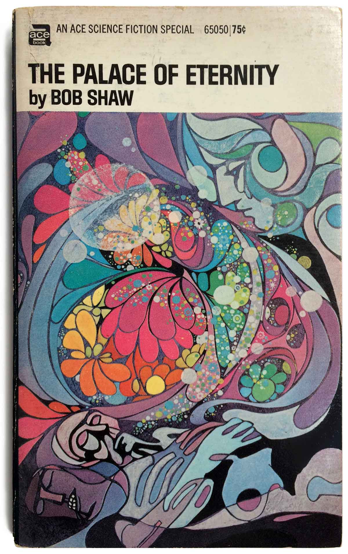
Dillons’ cover for The Palace of Eternity
Postwar art made an appearance in Malyon’s list of inspirations, too: “One of the biggest influences on me has been the work of Leo and Diane Dillon, and their use of pattern, rendering mixed with flat shapes.” The Dillons were marquee illustrators for book covers and children’s books from the 60s onward–if you’ve ever found a beat-up sci-fi novel with an arresting, moody, trippy image set against a big block-lettered title cover, you’ve seen an image that the Dillons either influenced or created themselves.
(They’re also only consecutive winners of the Randolph Caldecott Medal, which, both objectively and to the part of my mind that resides permanently in the early-aughts elementary school library, is a high achievement).
This treasury of influences perhaps explains Malyon’s work better than any vulgarly simplistic labels would. The works of Golden Age illustrators and the Dillons, and indeed Malyon herself, are all informed by illustration’s role as a storytelling device: their works dialogue with the prose of a story (or the text of a card), rather than standing totally self-evident. Their works are evocative and ever-so-slightly unexplainable, at once inviting and incomplete.
“I basically try to create picture books for all ages, with all of the emotion, whimsy and detail that captivated me as a kid,” Malyon told me. “I focus more on storytelling than on realism.”
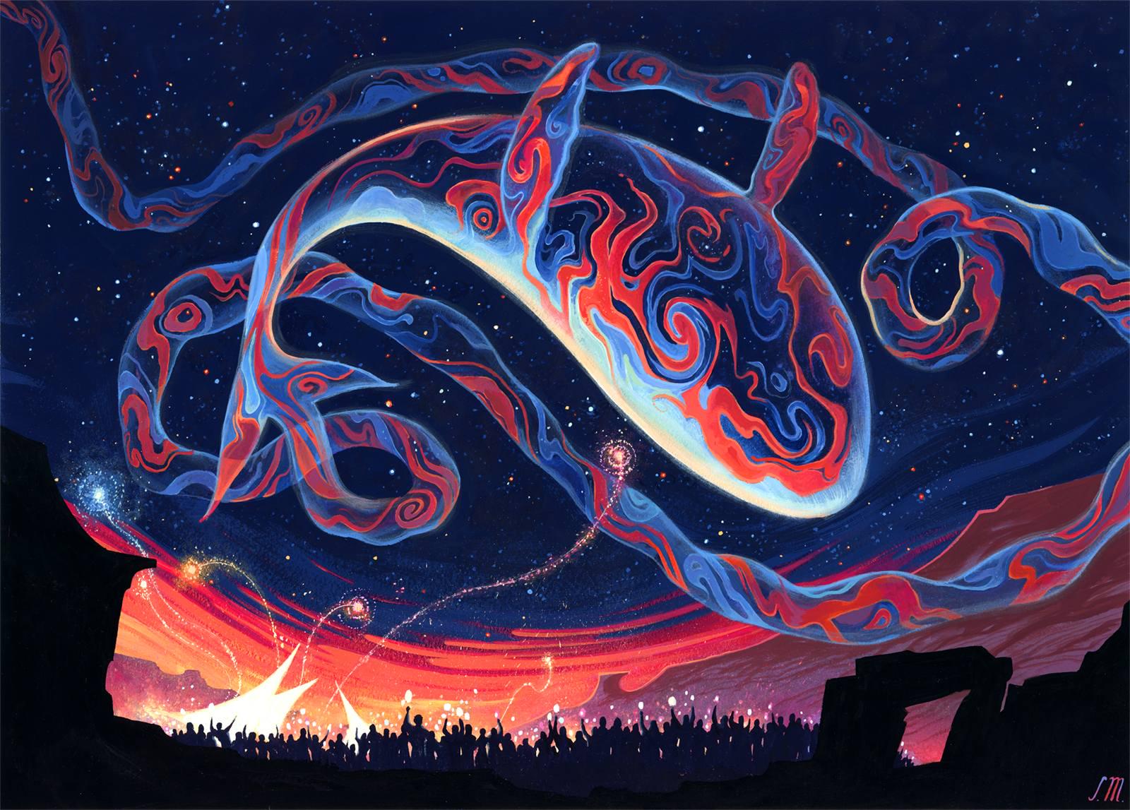
Spectacular Skywhale
This priority, I think, is why Malyon’s works genuinely feel like slivers of living stories. It’s easy to say that a work is good at storytelling when, in reality it just has a ton of details–more information than narrative—but Malyon’s illustrations work by freezing in place all the physical dynamism and symbolic weight of a story in a single scene, and then inviting the viewer into it.
Thus Spectacular Skywhale (my phone background earlier this year), which is impressive not just for the intricately detailed pattern flaming across the holo-whale’s underside but because of the gradated movement from the warm horizon into the deep, starspeckled sky and the gentle curve of the whale against the celebrants below. There is a sense, as you look at the image, that something beautiful is being raised for all to see, for all to participate in. So too for No Admittance, whose red-washed imagery both tantalizes (with the massive opening space of the door) and encloses (with the crushing verticality of the statues): you are here, you are tantalized, and you are doomed.
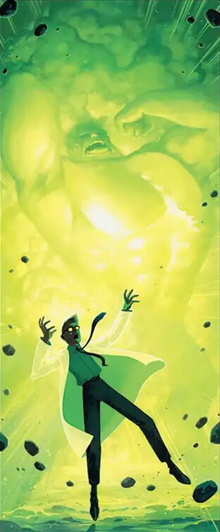
Origin of the Hulk
Likewise for the 13 Sagas Malyon illustrated for Marvel Super Heroes, which condensed famous story arcs from Marvel’s history into singular images. These works stick out because, again, of their visual-narrative language. Working in a vertical rather than horizontal aspect ratio, they’re dominated by imagery of transition or opposition—the greenscaled Hulk silhouetted behind the teetering Bruce Banner in The Origin of the Hulk or the tension between the brightly lit Fantastic Four and the cosmically shrouded titular antagonist of The Coming of Galactus.
And so too, of course, for Hall of Echoes.
Serena Malyon, “Hall of Echoes”
“I’m a bit surprised that this piece has been such a hit, because it’s just so abstract,” Malyon told me. “The brief I received took me a while to visualize. They asked for a sphere of iridescent liquid with a star in the center, and the liquid is forming hands, which are reaching for the star. And there’s an abstract view of towers behind it. So… it was a challenge to figure out how to create something that made sense, but also felt like a compelling artwork. I ended up finding a colour scheme that I really loved, and then it was just an exercise in rendering.”
(This is no small achievement, since hands are notoriously difficult to illustrate, all the more so when they’re part of a strange living-metal relic cradling a newborn star, as though reaching with both power and longing for the center of all Creation. Or so I’ve guessed).
It strikes me that “Hall of Echoes” succeeds for much the same reason that “Beyond the Quiet” does: it renders boundless cosmic power at an intimate scale (the bend of a finger, the soft press of an eyelid): divine mystery incarnate. This dialectic makes the image feel somehow involving . This is the end of a story I can intuit but can’t quite grasp, or perhaps the start of one that I’m just barely ready to comprehend—like the arresting image on a bargain-bin sci-fi book cover or the children’s book illustration into which a viewer might headfirst tumble.
“I wanted to create a feeling of… almost reverence? The viewer is witnessing the mysterious unknown, a glimpse of something beyond comprehension, but it’s peaceful,” Malyon told me.
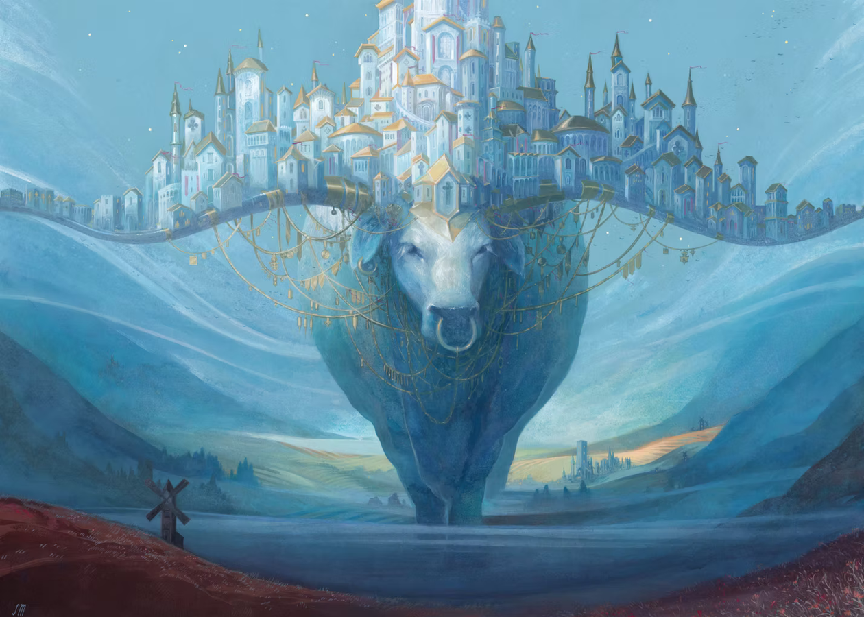
Steady
All these elements—the bifurcated compositions, the rich lines, the popping colors, the inviting narrative, the pervading mystery—are palpable in a work Malyon identifies as one of her favorites, “Steady.” The image depicts a gigantic ox—rendered sapphire either by the tone of its skin or the refracted light of the mist-kissed vale in which it walks—holding a gold-filigreed city, resplendent with cathedrals and chapels, aloft on its horns. A tiny windmill sits in the bottom right corner, gazing up in a glad greeting. One has the sense of a being, numinous and caring, laboring for all the world.
But really, I can’t do much better than the description Malyon added on her website: “The ox stays steady on its course, bearing its burden with grace.”
That work, and that line, captures Malyon’s oeuvre in miniature. In a media ecosystem populated with so much of the same, in which there seems to be a constant eructation of content and material and stuff, her work offers a little glimpse of something like mystery. Not the mystery of the menacing unknown so much as the half-realized possibility of an open storybook—that little whisper of possibility that isn’t spat at you but instead involves you.
Amid the noise, a little bit of grace.
Ryan Carroll (he/him) is a writer and Ph.D. candidate in English and Comparative Literature. On Substack as Dominarian Plowshare, he writes about Magic’s art, story, and experience. Outside of Magic, he writes on topics including 19th-century literature, information theory, television politics, and cliche.