
[Editor’s note: An earlier version of this article incorrectly referred to the Marvel Masterpieces sets as Marvel Masterworks]
I try to make it my business not to talk about Universes Beyond. But something’s been nibbling at me as more (and more (and more (and MORE))) previews drop for the next four months of Magic: why does this look this way?
Of course, this is the question we should always be asking ourselves when we encounter a piece of art; thinking about it can plunge us into the depths of the art and the depths of ourselves. But it feels like an especially necessary line of inquiry when it comes to UB, if only because it so often looks so weird. This weirdness, I think, has to do with the huge array of factors informing UB’s art direction–subject matter, tone, the necessity to pantomime existing imagery instead of creating new imagery (which I’ve previously written about).
I don’t have space to discuss all those issues, so instead I want to stick to one. I want to think through a formal feature of Magic art that’s so minute that you may have never noticed it, so important it undergirds Magic‘s entire visual vocabulary, and so finicky that it helps explain the strange look of Universes Beyond, particularly Marvel’s Spider-Man.

That feature is aspect ratio.
The Tale of 15:11
Aspect ratio, for the uninitiated, is the proportion between an image’s length and width.
You’re likely to hear the term most often in (let me editorialize briefly here) highly neurotic film discussion boards, but it’s actually the basic infrastructure of visual art. Aspect ratio governs the shape of an artist’s canvas, the dimensions of the screen on which a film is meant to appear, and, especially important for us, the creative space of a Magic card’s illustration box.
In this sense, aspect ratio is a core feature of Magic’s form—what Caroline Levine glosses as the “arrangement of elements—an ordering, patterning, or shaping” that structures a work of art. For Levine, any element of form is defined specifically by its affordances, which is to say the possibilities it directs. Roads afford driving and walking, photographs afford the ability to memorialize–and aspect ratios afford certain ways of composing images.
Originally, a Magic card’s illustration box appeared in 4:3 (1.33:1) aspect ratio (translation: the image is 1.33 times as wide as it is tall). This ratio changed with Magic 2015, growing to a slightly larger but more-awkward-to-say ratio: approximately 15:11 (1.36:1).
15:11 serves Magic‘s art direction extremely well. One of its affordances, to use Levine’s term, is to enable clear, legible images: a 15:11 frame can be divided very cleanly into both vertical and horizontal thirds, which makes it easy to create compositions that adhere to the Rule of Thirds.
For this reason, 15:11 lends itself well to a genre of painting that, amid the rise of EDH, has become ever more important for Magic: portraiture, like that in which legendary characters are depicted. 15:11 allows for an artist to depict characters in a variety of poses, show off their clothing and tools, and situate them against an unintrusive background. 15:11 compositions tend to be very well balanced between focal point and negative space, allowing characters to inhabit space without being suffocated by it.
Isshin, Two Heavens as One by Ryan Pancoast
As a concrete example: Ryan Pancoast makes great use of 15:11. The aspect ratio helps structure portraits like Angel of Destiny
and Isshin, Two Heavens as One, which are composed as medium-long shots that are divided into thirds along both their vertical and horizontal axes.
Fitted into this armature, Pancoast’s images are able to foreground their subjects’ dynamic actions, and they offer glimpses of their backgrounds without upsetting the balance of the greater image. Although Isshin is clearly in a decadent imperial locale, we attend most closely to him, not the scenery.
This, of course, is only true of the standard art frame. Borderless cards are slightly different, and, indeed, rather finicky. In theory, their aspect ratio is the same as an entire Magic card, 5:7 (.71:1). This ratio notionally allows an artist to represent full-body shots that capture the movement of an entire body (in this, it’s not so different from comic book covers, with their 5.3:7.72, a point to which I’ll return in a moment).

Syr Vondam, Sunstar Exemplar by Jeremy Wilson
In the meantime, notice my qualifier: full-art Magic cards are notionally in 5:7. But in reality, full-art Magic cards don’t actually use that aspect ratio. With the exception of textless cards like Ryan Valle’s Counterspell (which are about or 3.15:4), most of the real-estate on full-art cards is still obscured by translucent text boxes. For this reason, their functional aspect ratio is around 8:5 (1.6:1).
This means that while borderless cards’ compositions have some extra flair, they still tend towards the same medium-long shots of their standard frame cousins. You’ll notice, for example, that, even though cards like Aether Gust (illus. Mateus Manhanini) and Syr Vondam, Sunstar Exemplar (illus. Jeremy Wilson) theoretically use the whole card frame, the real action is still happening in the top half of the image.
We should keep in mind, too, that the actual size of Magic card images exert a considerable influence over the game’s visual language. While the 15:11 ratio sets the proportion for an image, it’s still never larger than a few inches; any illustration needs to be bold enough to catch the eye, but not so full of detail that it clutters our gaze, but neither so empty that it seems imbalance.
Enter Universes Beyond.
The Frame Problem
I don’t presume to make totalizing judgments about every Universes Beyond set and every artist working on them and every painting produced in them. But I want to hazard an observation: aspect ratio presents a problem for the art direction of Universes Beyond.
This isn’t because artists are somehow incapable of adapting their style to Magic’s aspect ratios. Obviously, that isn’t true. Rather, the issue is that different genres of illustration place demands on images that Magic’s aspect ratio struggles to accommodate.
This is eminently true of portraiture. As I mentioned earlier, the standard Magic illustration’s 15:11 aspect ratio is excellent for the game’s particular style of character illustration.. The viewer gets to see most of a character’s body—their costuming and tools and demeanor—and just a bit of the background.
But portraiture works differently in superhero media, particularly comic books. Since the medium entails a sequence of many panels rather than just one, small panels perform the bulk of the storytelling work; portraits are saved for large, vertically oriented splash pages and covers, whose aspect ratio is closer to 5:7. This framing allows artists to represent the full range of a character’s body in motion–especially important for acrobatic aces like Spider-Man.
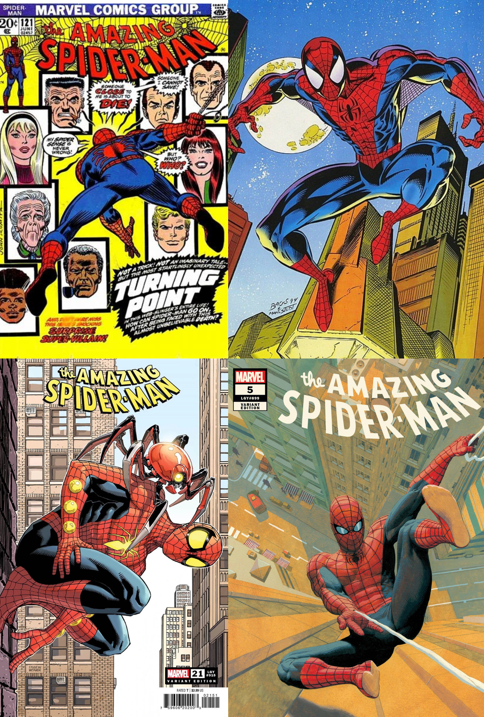
A collage of images of Spider-Man by John Romita Sr., Mark Bagley, Dustin Weaver, and Esad Ribic
For a sense of what I’m talking about, take a look at the work of some stellar Spider-Man artists: the melodrama of John Romita Sr. (top left), the expressive dynamism of Mark Bagley (top right) and Dustin Weaver (bottom left), the painterly delicacy of Esad Ribic (bottom right). Irrespective of these artists’ stylistic differences, all of their images work by drawing us into Spider-Man’s entire body; the background is legible, but the most important thing is his agile, electric form.
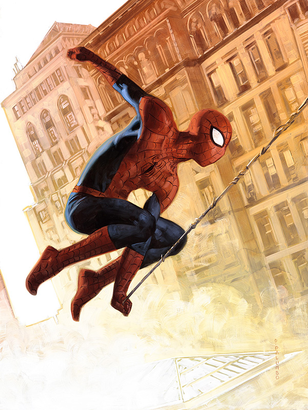
David Palumbo’s illustration of Spider-Man for the 2020 Marvel Masterpieces series.
Translating this aesthetic to a card is certainly possible, as evidenced by the Marvel Masterpieces trading card series (which I first learned about through Donny Caltrider’s thoroughgoing, caring, and exuberant analysis series). David Palumbo, a Magic artist who also illustrated the entire 2020 Masterpieces series, captures the energetic force of comic book imagery quite well. It’s not coincidental, I think, that he could do so in the vertically oriented 3.5:5 aspect ratio.
The challenge, for Magic, is that the standard card’s 15:11 aspect ratio doesn’t lend itself to this kind of imagery—which means, in turn, that it’s incredibly difficult for the set to capture the exact vibe it needs to capture. How can you jam the spirited energy of a comic book hero, which is perfectly suited by vertical orientation, into a horizontally oriented image?
There are a few options for mitigating this problem, but each one contains problems of its own, like a puzzling art direction matryoshka.
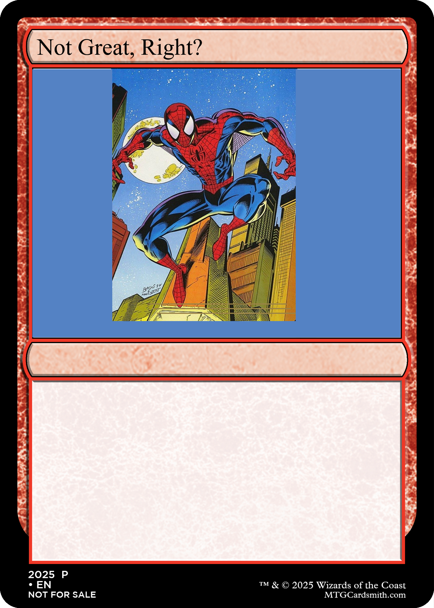
One solution might be for an artist to “zoom out,” from their subject, to use a long shot instead of a medium-long shot to capture the whole of a character’s body. But doing so risks messing with 15:11’s delicate balance between subject and backdrop. As we see in more than few Marvel’s Spider-Man cards—which I try to evoke in this mockup card—zooming out might make space for a character’s whole body, but it also makes the character themself appear rather small, dwarfed by the immense backgrounds around them. The result is that the images as wholes often feel barren and inert.
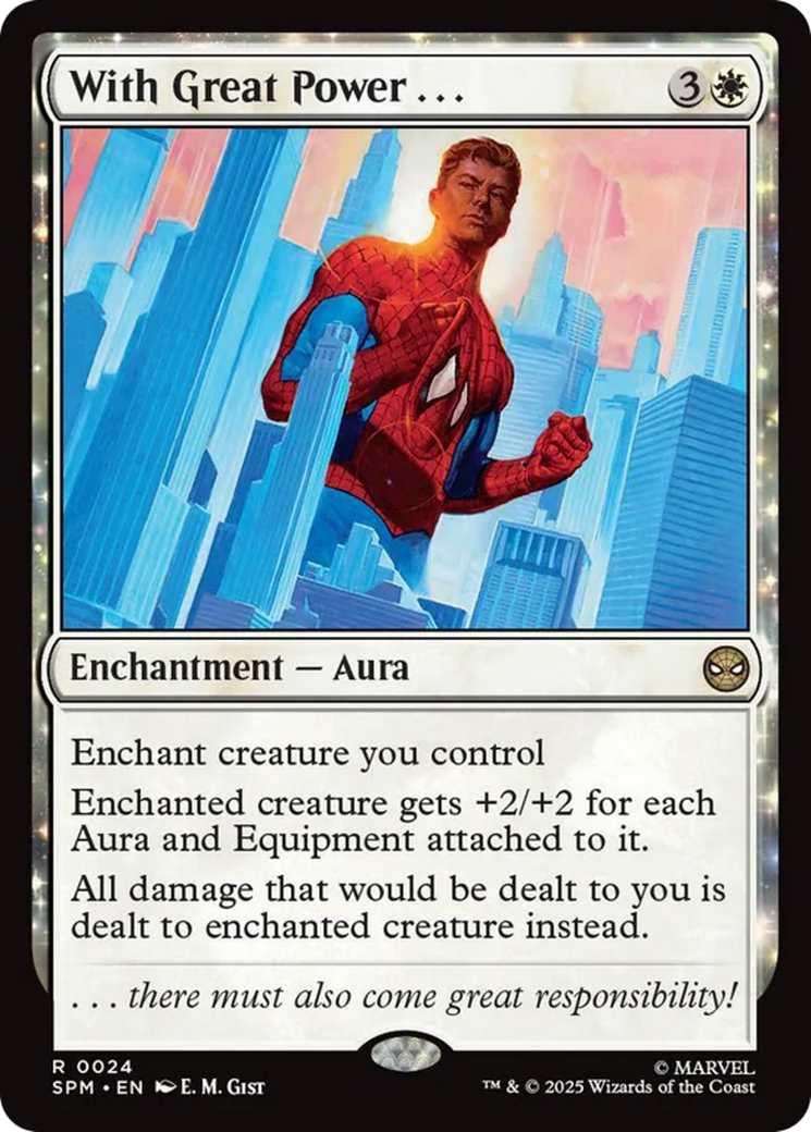
Okay, so maybe the answer is to zoom in. Some cards actually do this to great effect. E.M. Gist’s With Great Power… for example, doesn’t represent the whole of Spider-Man’s body. Instead, by using a medium-shot, it can figuratively juxtapose the character with a ghostly cityscape, and draw out his essential drama.
Still, you can only do that for so many cards; a Spider-Man set naturally promises to include images of the titular character swinging through New York City, throwing punches, jumping around, and so on. We can’t zoom in on everything.
Alright, fine, maybe the answer is to reduce the number of portraits entirely and include more wide shots of big battles and such. But once more, the set’s basic conceit gets in the way. The whole point of a Spider-Man set is to play cards based on Spider-Man characters–which Wizards of the Coast plainly recognizes, considering that a full 93 (!!!) Spider-Man and Spider-Man Eternal’s cards are legendary creatures, mostly from the proliferating posse of spider-people. The set, in other words, demands a lot of portraits.
These problems, I think, pinpoint why so much of the set’s art feels inert and empty. The demands imposed by the set’s theme (“we need a Spider-Man set”) collide with the demands imposed by the very infrastructure of the Magic card itself.
But not everything is doom and gloom.
Getting Ratio’d
The aspect ratio problem has helped me appreciate the experimentation happening in Marvel’s Spider-Man’s most visually striking cards.
Chief among them is Jim Cheung and Jay David Ramos’ enormous, interlocking panorama of alternate-art borderless cards.
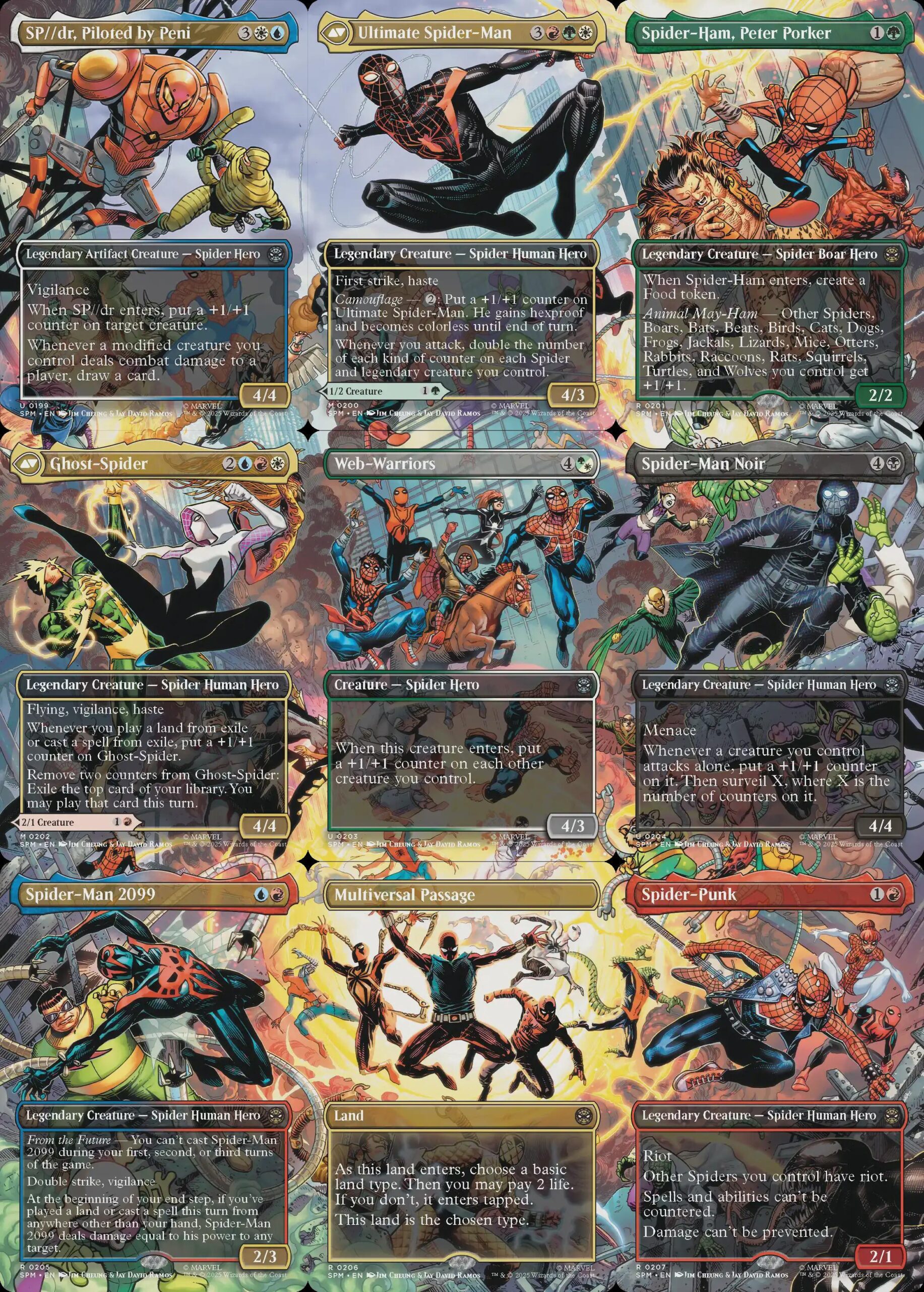
Jim Cheung and Jay David Ramos’ 9-card interlocking panorama of Spider-Man cards.
That this sequence is stellar shouldn’t be surprising. Ramos and Cheung are both primarily comic book artists, and Cheung in particular is one of Marvel Comics’ go-to artists for panoramic key art. But what makes their Magic cards really sing is that they challenge the visual restrictions imposed by Magic aspect ratio, and thus circumvent the challenges I mentioned above.
As we saw earlier, Magic’s borderless cards are notionally in 5:7, but are functionally more like 8:5 because artists don’t tend to represent important elements in the bottom of the frame; why draw something only for it to be covered by a text box? To this question, Cheung and Ramos’ art answers: why not?
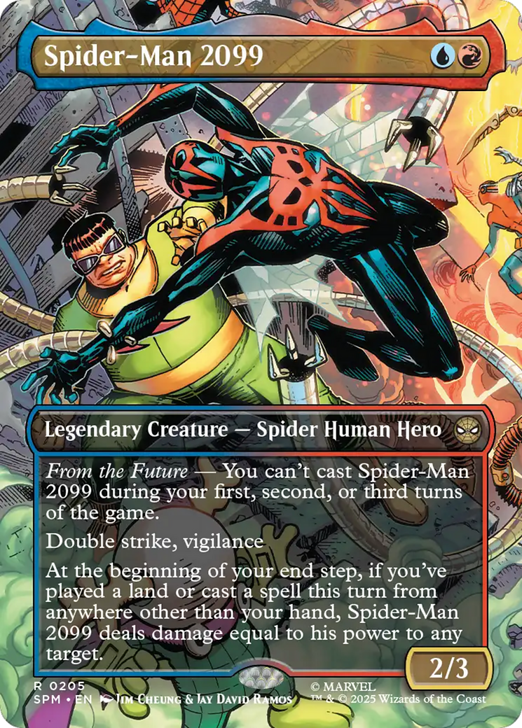
Jim Cheung and Jay David Ramos’ panorama, “Spider-Man 2099”
Illustrations like Cheung and Ramos’ Spider-Man 2099 are visually striking because they’re self-consciously incomplete. At the center of each frame is a dynamic action—in the case of Spider-Man 2099, it’s the titular character doing battle with Doctor Octopus. Spider-Man’s body occupies the bulk of the frame, but there’s a ton going on in the background–even more than will fit on the card, with its translucent text box obscuring additional villains at the bottom of the frame.
By the standards of Magic art, in which every inch of an illustration is precious material for worldbuilding, obscuring art is a cardinal sin. But Cheung and Ramos aren’t afraid to let a portion of the image fall outside of the frame if it means retaining the illustration’s visual energy. Indeed, precisely because we know that something is going on at the bottom of the frame, the image at the top seems all the more vibrant. This isn’t Spider-Man swinging through dead space, but a living body moving through a living world.
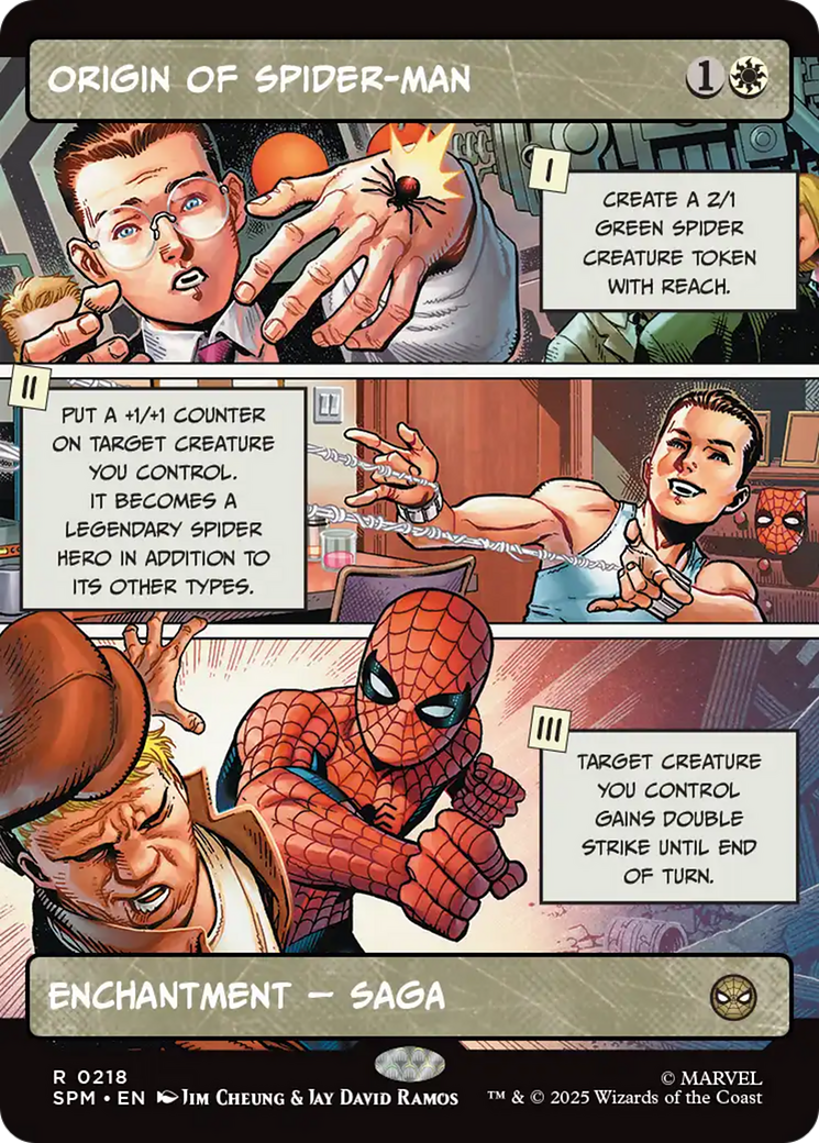
The same holds for the showcase cards that imitate comic book panels. Aspect ratio becomes a tool for creative storytelling in Cheung and Ramos’ Origin of Spider-Man and and Leinil Francis Yu and Sunny Gho’s Kraven’s Last Hunt, each of which uses three wide, differently sized panels to tell their titular stories. It’s one of the few great aesthetic innovations of this set, I think, to experiment with different art for different phases of a Saga. And what really makes it work is that each panel uses a different amount of space to convey its piece of the larger story; there seems to be a real movement because we’re progressing through different kinds of images.
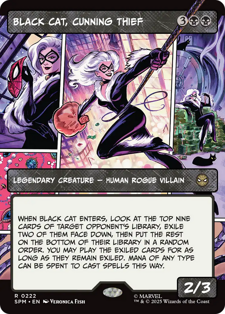
Veronica Fish’s “Black Cat, Cunning Thief”
Similarly strong are Yu and Gho’s Carnage, Crimson Chaos, Steve Ellis’ Green Goblin, and Veronica Fish’s , all of which blend portraiture with sequential storytelling. While their images as wholes fit in the borderless 8:5 aspect ratio, Fish, Ellis, and Yu and Gho splinter their images into a collage of smaller, differently shaped frames: medium shots, close-ups, long shots, actions, even extreme closeups that are partially cut off by the card’s boundary.
The effect is that the subjects don’t feel like inert action figures posed against evacuated backgrounds. Instead, they seem to move as though part of a story, much of which we see but much of which also extends beyond us. Because they throw off the burden of representing everything, they’re actually able to convey more.
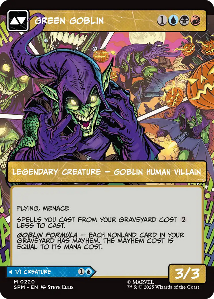
Steve Ellis’ “Green Goblin”
All these images succeed, to my mind, because they recognize that the aspect ratio of Magic illustration isn’t terribly compatible with superhero art. But rather than capitulate, Ellis, Cheung and Ramos, Yu and Gho test the (literal) boundaries, asking what kinds of imagery might come into view if we tweak the reliable 15:11.
These kinds of insights can gird our minds as we ask, to return to the first few paragraphs of the article, that evergreen question: why does this look this way? Even as the gap seems to widen between Magic’s best worlds and its worlds that are…not, there are still complex aesthetic processes unfolding at the level of the card, the kinds that inform our experience of the game.
Even more, art like Cheung and Ramos’ and Fish’s and Ellis’ and Yu and Gho’s represents that Magic still can be the site of thoughtful artistic experimentation, even when it’s subject to increasingly difficult creative restraints. And they reflect that the game, now more than ever, needs writers and artists willing to explore the forces that frame Magic itself.
Ryan Carroll (he/him) is a writer and Ph.D. candidate in English and Comparative Literature. On Substack as Dominarian Plowshare, he writes about Magic’s art, story, and experience. Outside of Magic, he writes on topics including 19th-century literature, information theory, television politics, and cliche.