
The first Magic cards I ever saw were from Ice Age and Alliances, in a cardboard box owned by the college-age kid of my parents’ friends. I didn’t know any rules, but I was immediately enamored by the art on cards like Lim-Dûl’s High Guard and Blinking Spirit.
I learned how to play Magic at summer camp as a kid, and then got into constructed formats in high school. But in between those milestones, I went years without having anyone to play with – while still buying booster packs from bodegas.
My Magic fandom was sustained by lore, and by art.
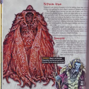
This period of time also happened to coincide with the original Weatherlight saga, spanning the history of the crew’s first adventures and the eventual defeat of Phyrexia.

Two decades after the conclusion of that arc, it’s Magic’s 30th anniversary, and the Phyrexians are once again invading Dominaria. So I want to reflect – but on the little things: the oft-overlooked snapshots of wonder and worldbuilding that deepened my love for Magic, years before its gameplay could.
I want to look back at the art and monsters that drew me in.
10. Delraich

Sinewy, clawed monsters are a dime a dozen, but Todd Lockwood shows some real creative flair with Delraich’s design.
The featureless dome where a head should be, paired with the three wailing human faces beneath its clavicle, is a wonderful starting point. I love how these faces suggest the gruesome fate of the souls that you sacrifice to pay for the card’s alternate cost. This little triptych of agony then leads us visually towards the pièce de résistance: a mouth that runs from the creature’s diaphragm to its pelvic floor, full of fingers that each have one or two teeth on their central planes.
This is an excellently-rendered, attention-grabbing design that says “buckle up, cos I’m gonna show you some shit”.
9. Air Bladder

When I couldn’t regularly play Magic with friends, I was evaluating cards by how much they ignited my imagination – not as game pieces, but as bits of lore.
This makes it pretty funny when I reflect on the fact that some of these cards were draft chaff like Air Bladder.
I remember thinking that the art was showing the eponymous organ growing out of an eagle the first few times I saw this card. Once I understood the flavor text, I realized that the glistening finned thing was actually a mutant Rootwater merfolk that was latching onto the eagle.
And then I remembered that Rootwater merfolk are human-sized, and therefore this eagle must be enormous.
The artist for this card is Donato Giancola, a legendary illustrator who the current generation of Magic artists grew up admiring and studying under. Here he is, masterfully rendering the art for a card that – if you know how to play the game well – you wouldn’t think about for more than half a second. It’s like hiring Phil Collins to write a 0.3 second notification sound for your new underwear delivery app.
Magic art is wild.
8. Root Greevil

Root Greevil contains the totality of all references to greevils in Magic cards. The only thing we know about them is that there are apparently many greevils, if we try to seriously read into the punny flavor text.
Why do this? Why just make up a random thing with no context or elaboration like this?
Because it’s awesome. Because it gets wheels spinning. Because it leads players to look at this and ask questions they never would have, like “What the fuck is a greevil?”
The art for this creature is wispy and ephemeral, which was typical for a lot of Andrew Robinson’s pieces. On Viashino Sandstalker, it gives the impression of a creature moving so shimmeringly fast that its onlookers would be unsure if what they saw was real or just a violent mirage.
Is a greevil some kind of energy creature like Dracoplasm, or just a normal thing moving really fast?
Who knows?
7. Silt Crawler

Despite the “back in my day” paper boomer stories about Mr. Siltastic, these days there’s not much good to say about Silt Crawler as a card. But, this dumpy little dude’s design still captivates me. That huge mouth, naked except for a single shovel-like tooth, is just so memorable.
Much of the rest of its anatomy appears to be based on real-world crocodilians, which makes that strangely gentle-looking mouth even more unusual – as well as the fact that this creature appears to have only two legs.
Arnie Swekel does a wonderful job of naturalistically rendering an alien creature here.
6. Pure Reflection

This card’s art is delightful. Is the dude with the black nail polish just showing his own Pure Reflection off to his weird dinosaur friend?
Why is that thing even there?
But it also delighted me for another reason: I saw that dinosaur thing a bunch – on Vigorous Charge and Hunting Kavu.
And then when I saw the art for Gurzigost a few years later, I remember thinking “Scott M. Fischer, do you know how to draw any other thing?”
It was only when putting together this list that I realized the art for Gurzigost was probably initially commissioned for Invasion block too, but ended up in the slush pile – before getting slapped onto a random beast in Torment.
Sorry Scott!
5. Souldrinker

OK, so this thing has at least two arms and a body. What’s the rest of it though? Trying to chart out Souldrinker’s appendages is like trying to untangle a knot with just your eyes.
I’m also tickled by the way the victim of this creature seems uncomfortable, but not, like, that uncomfortable with it. Is this just what Mondays are like on Rath?
It’s got the same sort of weird moody tension that you see in a lot of other pieces by Dermot Power, like Burning Palm Efreet and Mogg Assassin (which uses Power’s distinctive solid shadows to add a sinister vibe to what would be a goofy-looking goblin).
4. Harvest Wurm

Few cards make me feel like I’m visiting a picturebook fairy tale quite like Harvest Wurm.
Since Magic is a game that’s fundamentally about combat, it constantly has to fight to stop itself from collapsing all its worldbuilding into a single generic battlefield. After all, if the settings of Magic were only populated with ass-kicking warriors and apex predators whose diet consists entirely of ass-kicking warriors, they would be pretty conceptually flat.
Harvest Wurm depicts a fantastical creature performing a mundane chore on a pleasant day, with a farmer resting on its coils and birds fluttering about its head. The art has a Gaimanesque quaint matter-of-factness, that instantly sells you on the entire world implied by this one scene.
This could easily have been some violent monster trashing an environment like a rampaging elephant in musth. After all, the mechanical concept for both Harvest Wurm and Fallow Wurm (the only two cards illustrated by Stephen L. Walsh) is that they are aggressively-costed beaters with a catch.
But instead, these cards paint a comfy little vignette that lets you really imagine life in a fantastical place.
3. Unnatural Selection

Unnatural Selection has the signature stark lighting and eye-catching values that Kev Walker does so well, which really make the features of this creature pop. And the way multiple tentacles fuse together to make the upper body of the kavu just rules.
I built a whole deck around this card, purely because I loved its art. See, at the time, some creature types had inherent rules baggage.
For example, any creature with the type “wall” inherently couldn’t attack. Apocalypse introduced us to cards like Coalition Honor Guard, which forced players to target a creature with the type “flagbearer”. Since all flagbearers worked this way, I figured this was inherent to the creature type.
So I made an Unnatural Selection deck for multiplayer games, whose goal was to force players to change the targets of their spells (after they’d cast them) by turning things into flagbearers in response.
Pro tip: That’s not how any of those rules worked. And even if it were, the deck still wouldn’t be good.
That’s how much I loved this card’s art.
2. Yawgmoth’s Bargain
I never owned a copy of Yawgmoth’s Bargain, but I saw its art all the time – largely because this card is actually very strong.
This is a great portrait of classic old Phyrexian design, alongside cards like Eviscerator and Breach. These creatures were all tubes and teeth, guts and gaskets. But there was another reason I thought this art was special.
For the first third or so of Magic’s history, Yawgmoth – Father of Machines, Lord of the Wastes, the Ineffable – was the overarching villain. And we had no clue what he looked like.
At first, I thought Yawgmoth’s Bargain was the one card that depicted him, but that’s just some Phyrexian bargaining on his behalf, apparently.
Similarly, players thought the character shown in Yawgmoth’s Agenda might’ve been the big guy himself, but no – that’s just his general, Tsabo Tavoc.
Later, people got into arguments on message boards saying that he was actually shown in the art of Planar Despair based on its flavor text, but that wasn’t him either.
In the books, Yawgmoth eventually takes the form of a vast black cloud – so technically, that’s probably him at the top of the art for Warped Devotion, but that’s hardly satisfying.
Then a third-party magazine gave us the first full image of Yawgmoth himself.
InQuest Gamer, issue 74, page 34
This image actually turned out to be accurate, though perhaps retroactively. In 2018, the art for Yawgmoth’s Vile Offering finally canonized this appearance. Yawgmoth, Thran Physician also referenced it, in the design of the pre-phyrexian Yawgmoth’s outfit.
Personally, I love this “Dr. Robotnik, drawn by H.R. Giger” look for one of my favorite childhood villains. But that random Phyrexian in Yawgmoth’s Bargain also still rocks.
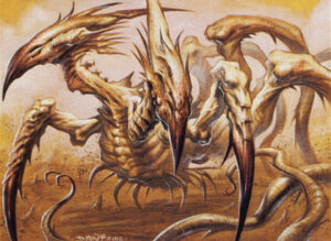
1. Spined Sliver
One of the things I loved most about Magic, from the very beginning, was all the creatures that were completely unique to it. Who cares about Serra Angel; everywhere has angels. Juzam Djinn’s art is incredible, but a big evil guy with horns and a goatee isn’t breaking any new ground. Goblins and elves and zombies and dragons – none of them are noteworthy.
I mean the really weird stuff.
As it turns out, Tempest block was absolutely full of unnecessarily crazy creature design.
It was Tempest that introduced a race of humanoid creatures whose design concept was “the shapes you see when you rub your eyes”, giving us bugshit wild art like Thalakos Seer.
It was Tempest’s Flowstone Hellion which decided that in Magic “hellion” didn’t mean “a rowdy teenager” but “a giant eyeless worm with a circular mouth ringed by spined tentacles”.
It was Tempest that decided that one of their new tribes was going to be a eusocial race of slugs with spider faces that were inexplicably named “spikes”, as seen on Spike Breeder.
But for me, the Magic monster that will always stand out the most is the slivers.
What even are slivers?
There was some inconsistency, with Jeff Laubenstein depicting them with eyes, nostrils, and a mouth in Clot Sliver and Interdict, and Richard Kane Ferguson apparently doing whatever he wanted in Muscle Sliver (or maybe that was also slush art?).
But Allen Williams and Scott Kirschner gave us several clear views of slivers’ overall anatomy in their mostly background-less pieces (something you don’t really see in Magic art these days).
Slivers have two prehensile “tails” extending from their thorax that could more accurately be called tentacles, judging from the way they are used to grip onto both surfaces and prey. They have a slender, crested, beak-shaped head without any apparent openings. And they have a single mantis-like claw coming out of the center of their chest.
Who came up with this body plan? I want to kiss them on the mouth. It’s absolutely insane.
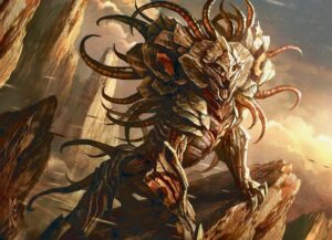
Honestly, I don’t blame Wizards of the Coast for wanting to redesign them for their appearance in Magic 2014 and Magic 2015. Slivers are not a design that’s easy to parse at first glance. It’s delirious and alien. If you’re not already familiar with their body plan, how on Earth are you supposed to make sense of Two-Headed Sliver?
Two-Headed Sliver, which also has an extra arm and tail
Belligerent Sliver, the much more sensible version of the same creature
But as much as the new slivers got some wonderful art, I’m glad the strange and inscrutable original design won out in the end.
The very first Magic deck I ever built was a sliver deck. The very first single I ever bought was Sliver Queen. The very first piece of Magic fanart I ever made was a poem extending the flavor text of Spined Sliver.
These weren’t creatures that made me go “ah, one of those”; they were creatures that made me go “what the fuck is that” – and that’s the reaction that got me to fall in love.
To me, slivers will always be emblematic of the vast and imaginative fantasy worlds that exist in Magic, and nowhere else.
Mani Cavalieri is a New York City-based writer, media critic, and your pale cousin who’s into reptiles. He publishes regular essays on media – from game reviews to gushing about how cool that weird Godzilla movie is – over on Eyez ‘n Teef (which you can also follow on Twitter, for all the trivia and toast recipes that don’t make it into full-length posts). He loves sharing cool things you didn’t know, and he WILL talk your ear off about them.