
Good morning everyone, and welcome back to another edition of Marvel Masterpieces Parallels in Masterpiece Theater here on Hipsters of the Coast! I’m continuing my exploration of Upper Deck’s Marvel Masterpieces from 2016-2020, a continuation of my deep dive into the most recent Marvel Masterpieces 2020 set by Dave Palumbo. As I neared that series completion, I became curious about how his work would connect to the previous two “modern” Masterpiece sets that came before him. The 2016 set was done by Joe Jusko, artist of the first Marvel Masterpieces set in 1992. And in 2018, the hugely popular Italian comic artist Simone Bianchi followed in his footsteps, and completed his own Marvel Masterpieces set with new characters, new Battle Spectra scenes, and an entirely different stylistic take on the Marvel universe.
Each of the three sets are completely unique, and puts an artist’s style in the full spotlight. Jusko’s look is classic comic book, with all the muscle, color, and vibrancy of the sets from the 1990s, but re-imagined with nostalgia for a new century. Bianchi is more contemporary: darker and grittier with bold blacks and colored outlines to make his characters distinct and out of this world. Palumbo falls somewhere in the middle: his big brushstrokes give a painterly feel to the genre, and bring a balance to the modern Masterpieces. His rendition especially is something that trading cards have never seen.
Across the three sets 2016-2020, there are 42 characters that were painted into each set at least once, and several characters that have multiple appearances within a given year. In total we’ll look at more than 175 artworks throughout this series from each of the last three iterations of Marvel Masterpieces. We’ll compare and contrast each artist’s creation, and learn some pretty cool stuff directly from the artist’s themselves along the way. This series isn’t about picking the best work, but rather talking about why each is a Masterpiece in its own right, and how these works function as a family of premier illustrations both within and across their respective sets.
Today we begin a three-article series focused around the members of the Avengers, and we’ll start with one of the most contentious relationships among the team and pack it into a single article. I’ve taken these two characters and their half dozen depictions each and broken them into three distinct categories: Ready for Action, Retro, and Reflection. I think these provide a good context for unpacking everything there is to see. This is Parallels: Captain America and Iron Man.

Captain America & Iron Man: A Pre-History
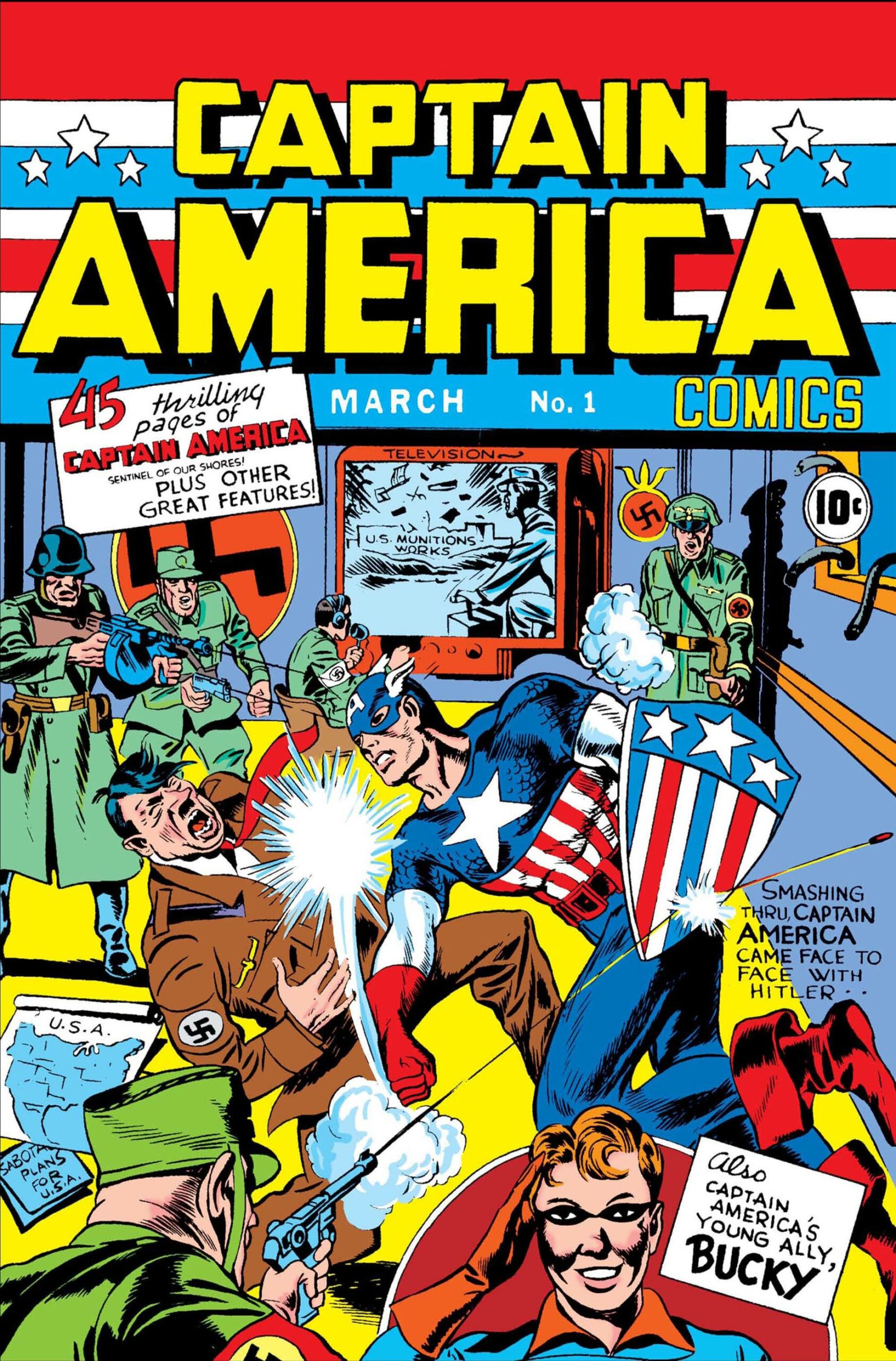
Captain America is the alter ego of Steven Rogers, created by Joe Simon and Jack Kirby in 1941 when Marvel comics was still known as Timely Comics. He was originally designed as a patriotic super soldier that would fight the Axis Powers of WWII in United States print during the war years; and after a short hiatus following the war in the 1950s, has remained in continuous publication since 1964 and one of the most popular Marvel characters to date.
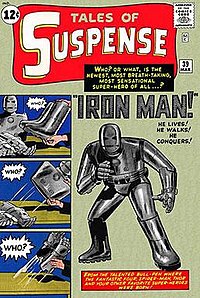
Iron Man came a bit later in Marvel history, also designed by Kirby but alongside the legendary Stan Lee, Larry Lieber, and Don Heck in the early 1960s. Iron Man would go on to have his own title and create what we know as The Avengers in 1963, a catalyst that has lasted and the story retold through this very day in both comics and movies.
Together the two have become pillars of both the Marvel Comic and Marvel Cinematic Universe, and share themes and departures among them like no two other characters. Let’s take a closer look!
Captain America: Ready for Action
Captain America (Base) by Simone Bianchi, 2018
We’ll begin with a bang, as that’s surely the noise this shield makes when it hits whatever it might be aimed at outside the frame. This is as dramatic as it gets, with firework ramparts in the background, outstretched arms and rocks flying as he leaps into the air, and an incredible sense of motion, as if he’s coming right off the card. Cap was created to fight the Nazis, and that’s what we have happening here.
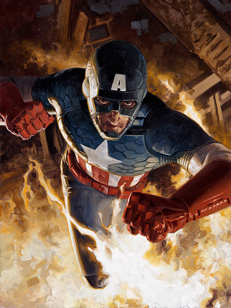
Captain America (Holofoil) by Dave Palumbo, 2020
Palumbo also sought to make Cap feel as if he was coming right off the card in his Holofoil variant. Dave paired each of his paintings with a song to try and capture an exact emotion, and this is set to Gonna Fly Now by Bill Conti, of Rocky fame. Listen to the song as you look at the work: he’s the get up and go Captain America, and he’s coming right for us! I love that look of determination we see in his face: it’s part of what makes the character so exhilarating, and Palumbo has captured it perfectly.
Captain America: Retro
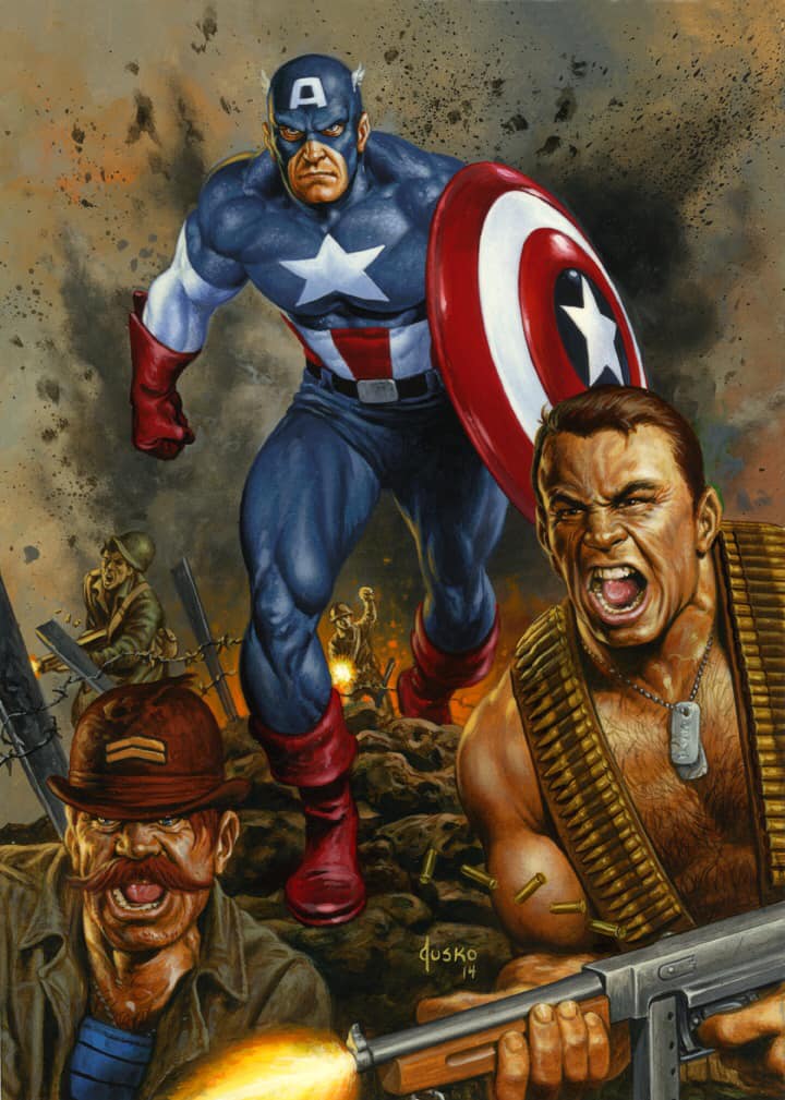
Captain America (Base) by Joe Jusko, 2016
This was actually the second attempt at Captain America for Jusko, as the first work was rejected by Marvel/Disney for being “too polarizing” as he mentioned in his book. He notes he was much happier with this piece in the end, and what we’ve got is the very WWII period Captain America I mentioned earlier alongside two other major characters from that run, Dum Dum Dugan on the left and an early Sgt. Fury on the right. This is perfectly situated to take us back to when Cap got his start in the comics and Nazi-beating business, and that all-business look is no doubt emblazoned across his face.
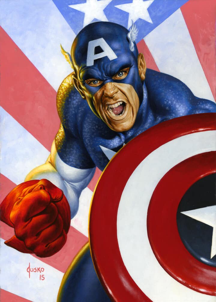
Captain America (Holofoil) by Joe Jusko, 2016
What did I just say about all business? In staying with our retro theme we’ll grab the other Jusko work from 2016, a close-up of Cap against a Stars & Stripes background. This falls right in between the ready for action Cap as we’ve seen, as he’s mid battle cry, and something more contemplative. It has a head shot quality as well, as if this would be used as the WWII propaganda poster to get citizens excited about supporting the war effort.
Captain America: Reflection
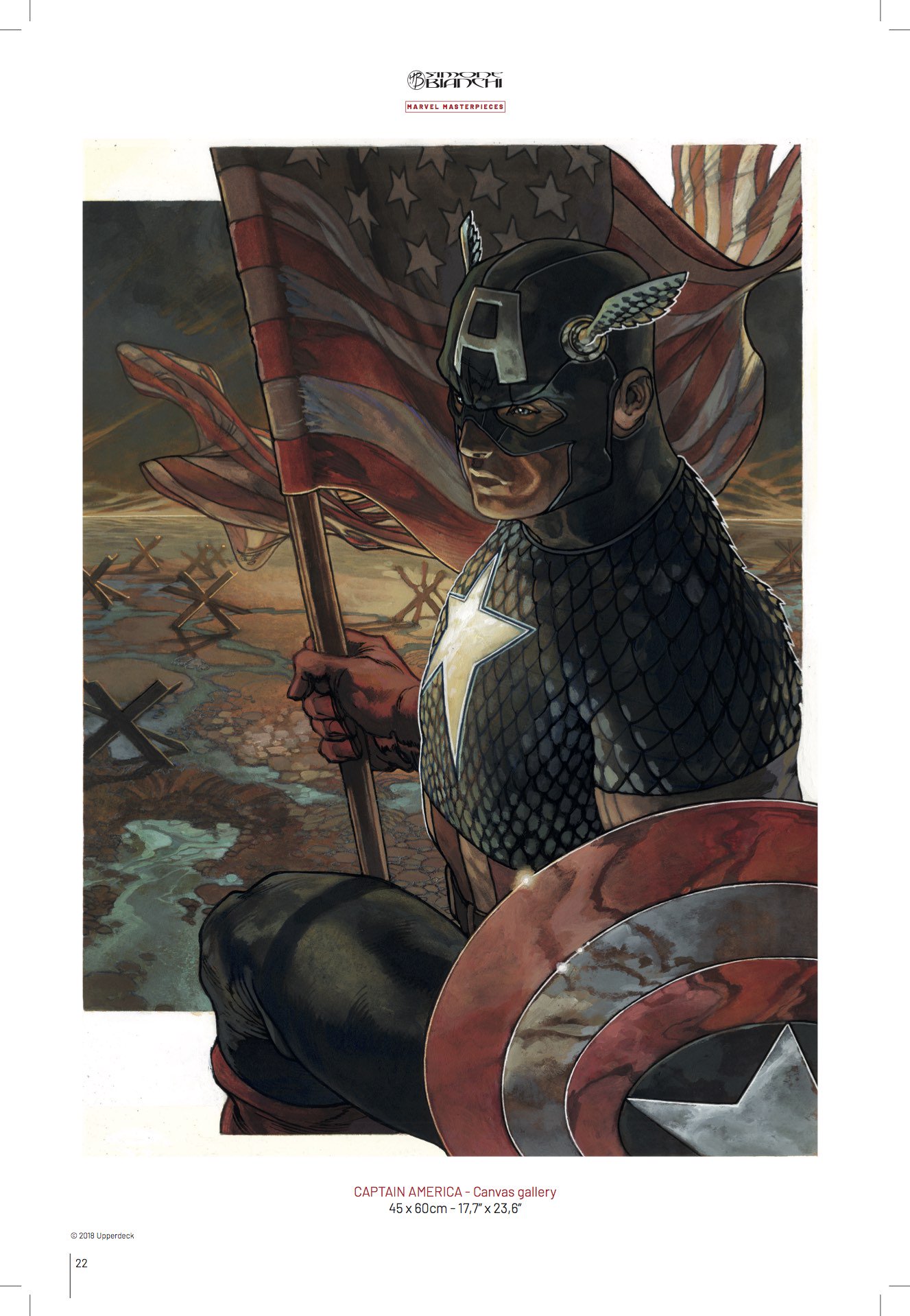
Captain America (Canvas Gallery) by Smone Bianchi, 2018
We’ve seen a lot of action in the two categories above, but for this section we’ll take it down a notch. I love this depiction of Captain America for the 2018 Canvas Gallery. A literal flag-bearer against a war games map backdrop, he strides into the frame, stoic, heroic, and all but triumphant. He’s the Cap of hope, and a brighter future for us all as the new day dawns.
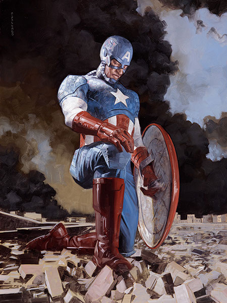
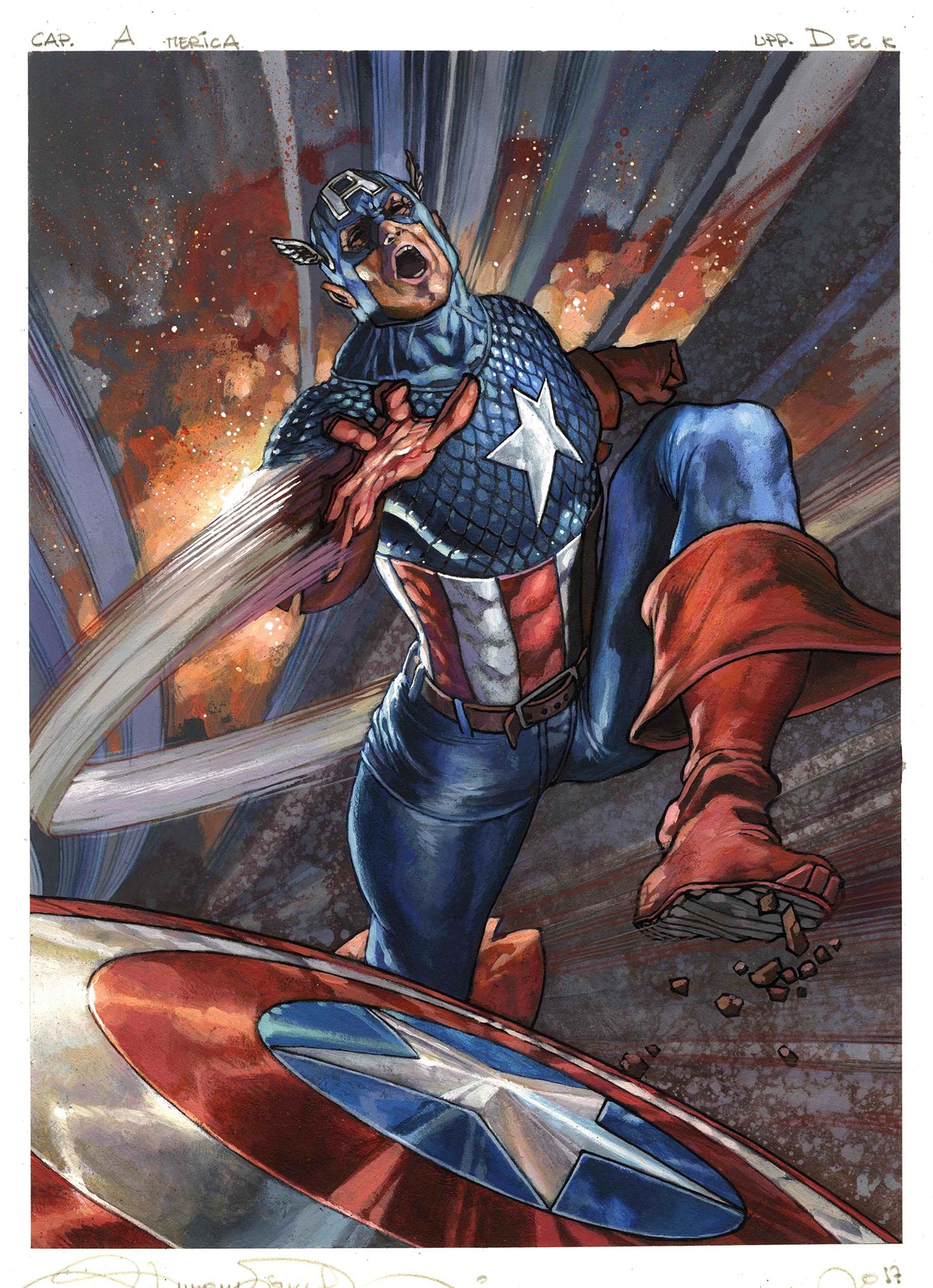
Captain America (Base) by Dave Palumbo, 2020
And on the other hand, I love Palumbo’s Base Set Captain America equally for what it stands for in a much more somber tone. When I spoke to Dave for the Marvel Masterpieces 2020 article series, he encapsulated everything about this artwork into a few sentences:
“Right off, this piece veered from the original music cue harder than any other piece. I did end up keeping the cue as inspiration for the holofoil version [seen above],” Palumbo said. “My original plan for this piece was going to be a bit more rah-rah in the traditional heroic style of Captain America, but I was feeling it did not match the tone of the current times. One of the things that I love about this character is that he doesn’t exactly represent the USA so much as he represents the purest ideals of the USA. He’s the best possible reflection of us. For me, that means that he also feels the pain of our collective failure to live up to those ideals greater than anyone.”
This fully tells the story of Captain America. He is the best of us and represents all we can be, but in doing that, bears the full burden when those ideals fall short.
Iron Man: Ready for Action
Iron Man (Base) by Simon Bianchi, 2018
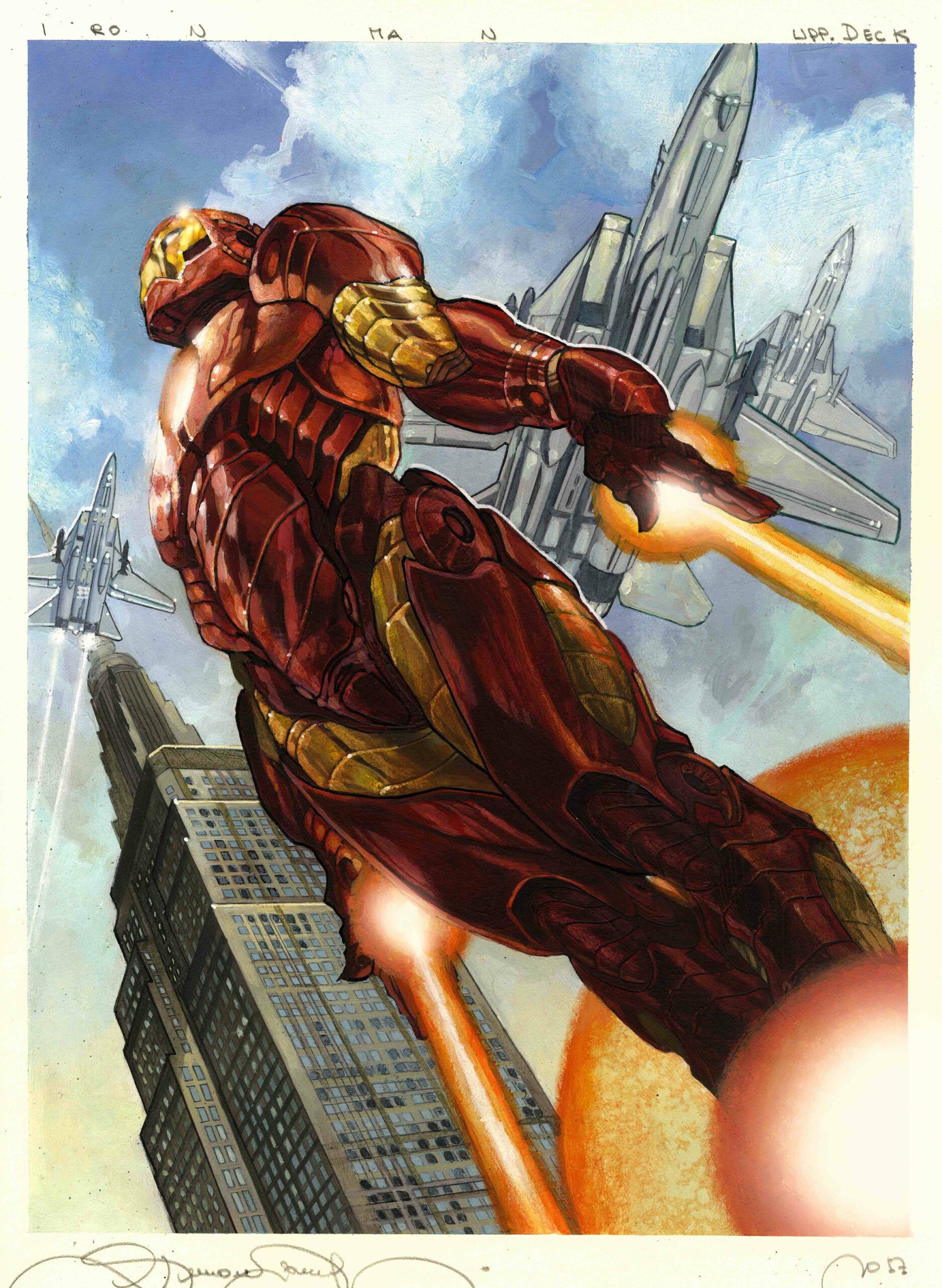
We’ll start the Ready for Action with the same artist and same series, Simone Bianchi’s Base card, and what would be the box artwork for the entire set. Iron Man is captured as he takes off from the city below, with fighter jets overhead, a “scale bird” sort of addition to show he’s every bit as fast and powerful as those attack aircraft. I love the strong diagonal Bianchi has used; it makes our hero feel larger than life in comparison to the buildings behind him, and gives the work an unparalleled strength.
Iron Man (Base) by Dave Palumbo, 2020
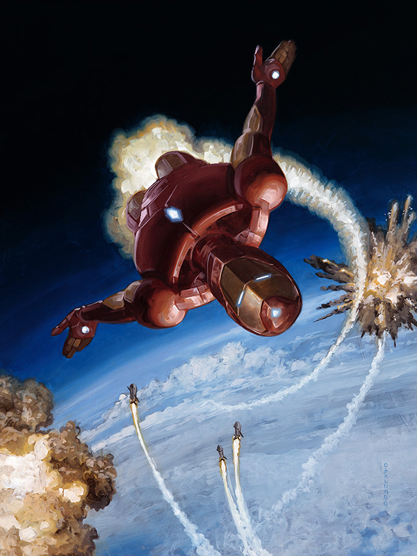
Palumbo has also invoked the use of aircraft, but instead we’re mid dogfight as Iron Man spins through the air high above the earth, shells exploding around him as he evades the unseen attack from below. It’s an action-packed scene for a base card, but a wonderfully unique take on a character whose feet aren’t often left off the ground.
Iron Man: Retro
Iron Man (Holofoil) by Joe Jusko, 2016
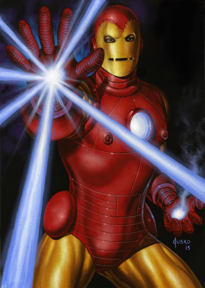
We’ll begin another double dose of Jusko Retro with the Holofoil Iron Man, the character depicted in his original suit when it turned from silvery steel origin story to the yellow gold MKII, early on the evolution of his robotic tech in the 1960s. This work in particular feels like a science fiction pulp cover or movie poster, and is a rare full shot of this suit of nostalgia that many modern fans might not know even exists.
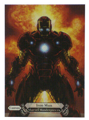
Iron Man (Canvas Gallery) by Joe Jusko, 2016
The Canvas Gallery card moves the armor on mark forward to the MKIII, known as the classic red and gold armor before additional redesigns in the 1970s. This is a rare glimpse at the man inside the suit, seen carefully through the eye holes, and reminds us that Iron Man is indeed human, and that there is a man, flawed or otherwise, behind the mask. It’s one of, if not the only, time we see Tony Stark clearly visible within his suit.
Iron Man: Reflection
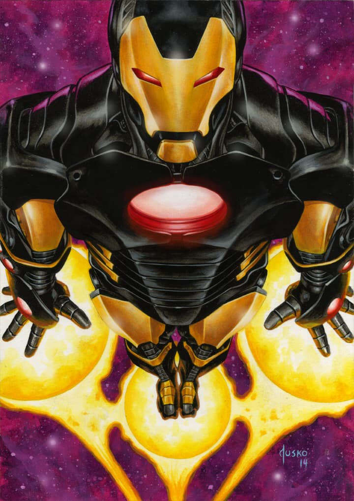
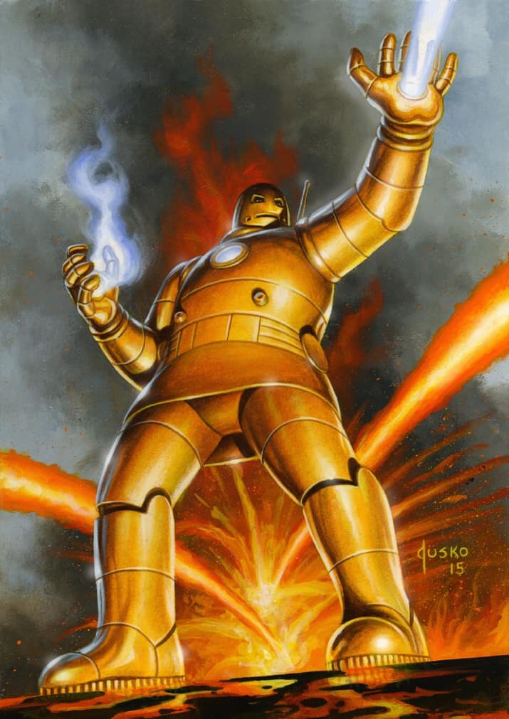
Iron Man (Base) by Joe Jusko, 2016
We’ll stay on the Jusko train and finish with his third Iron Man, the one painted for the Base Set card. Jusko makes it clear in his book he does not enjoy painting Iron Man, but he’s given us something wholly unique in his attempt to capture the man-made-machine mid-flight. The colors and background are unsettling and unusual for the character, creating a feeling both a bit overwhelming and a bit ominous. Here he is half hero, but also perhaps not. I guess that’s always been the question, hasn’t it?
Iron Man (Canvas Gallery) by Simone Bianchi, 2018
We’ll end our Iron Man exploration with Bianchi’s Canvas Gallery variant, a silhouetted Iron Man where all we see is the glow of his suit. This idea of it being the first thing you see before being saved and the last thing you see before you die has been used time and time again in the movies, but speaks directly to the dichotomy of the character at hand. Death and destruction, safety and salvation: it’s all within the suit.
Wrapping Up
These images naturally lent themselves to their aforementioned descriptors, despite not having any direct relationship with one another. For both characters Jusko’s work leans into the nostalgia of early comics and a retro rendition that’s a timeless representation of both a man and a machine. Both Bianchi and Palumbo work the opposite sides of the spectrum, with equal parts action and stoicism to show the opposing poles of both of these heroes. There is so much to these characters beyond a man that throws a shield and a man in a suit, and I hope I was able to peel back some of those layers in this exploration.
Next time in Masterpiece Theater we’ll take a look at the rest of the Avengers team, and then follow that up with the known enemies of the ever-changing group of good-doers in a final article two months from now. And, in between I’ll have the second Quarterly Report of the currently releasing Marvel Unbound set by fred.ian as well. In the meantime, you can keep up with all things Marvel Masterpieces 2020 by following me on Twitter. Feel free to ask questions or retweet to continue the conversation. Thanks and see you next time!
Donny Caltrider has been playing Magic since 2002 and collecting original Magic art since 2017. He has an M.A. in Museum Studies from Johns Hopkins University and enjoys telling stories about art, objects, and the intersection of fantasy with real-life. You can find him on Twitter talking about #mtgart, museums, and other #vorthos related goodness. Follow along and continue the conversation!