
Several times in the last year, Donny Caltrider and I have been teaming up to write about Magic art. It started with the art of the Lorwyn Five from our two different perspectives back in April, with the idea that we would pick up a good angle on a recurring series sometime after. When the time came for the anticipated continuation, I was excited; the idea to cover basic lands was brought up, and I jumped at the chance. Basic lands appear the most often, with the most variety, and would allow for in-depth expressions of personal tastes. Starting with Plains – Donny’s half and mine – the intention was to continue on whenever the time was right.
Good Art… Basically
Basic lands are an often overlooked element of a deck that can add so much to the experience, whether you’re playing in a Standard, Draft or Commander event. During deck construction, I now look at a lot of different land art and over time have begun to lean into them as an aesthetic way to set the tone for a deck. This by extension makes previews exciting, even when it’s just the basic lands.
My interest sprouted back when I stumbled across the Better Basic series by James Arnold on CoolStuffInc. While I have always been a fan of the art of Magic, for the first decade of playing the game I only ever thought about the game’s art in terms of how reprints could be a gateway to different interpretations of the same idea. Suddenly, James’s series made me see how lands could be an extension of my deck’s aesthetic—even the lands could tell a story.
As time has gone on, I’ve started each deck construction by finding the one piece of art I think fits best for each basic. I use that one piece whenever possible to help cement the visual themes of my deck. I held myself to no restrictions as I compiled this list, and sought to capture the lands that I use to set the stage for my decks.

Never Forget Your First
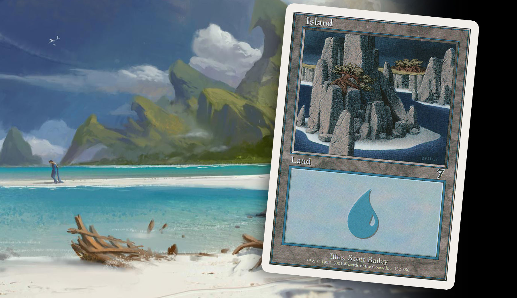
I first learned to play Magic along with my neighbor during Seventh Edition’s life cycle. As such, when the time came to pick up preconstructed decks, I picked up the white Armada deck and he chose the blue Bomber deck. While I have very distinct memories of my own deck, the one thing that was most etched onto my brain from my opponent’s deck was the land above. As I was entering Magic, the lands were already shaping my perceptions of the game and making it distinct from other fantasy properties.
This piece, done by Scott Bailey, might have benefited from Shakespeare being in the forefront of my middle-school world. The look of this Island brought me right back to the shipwrecked island of the sorcerer Prospero from The Tempest. Looking back it’s funny, as the art is remarkably basic compared to what we see with every set now. But at the time, it had leagues more depth to it than I think I would have expected from a card called “island”.
Urza’s Saga – Donato Giancola
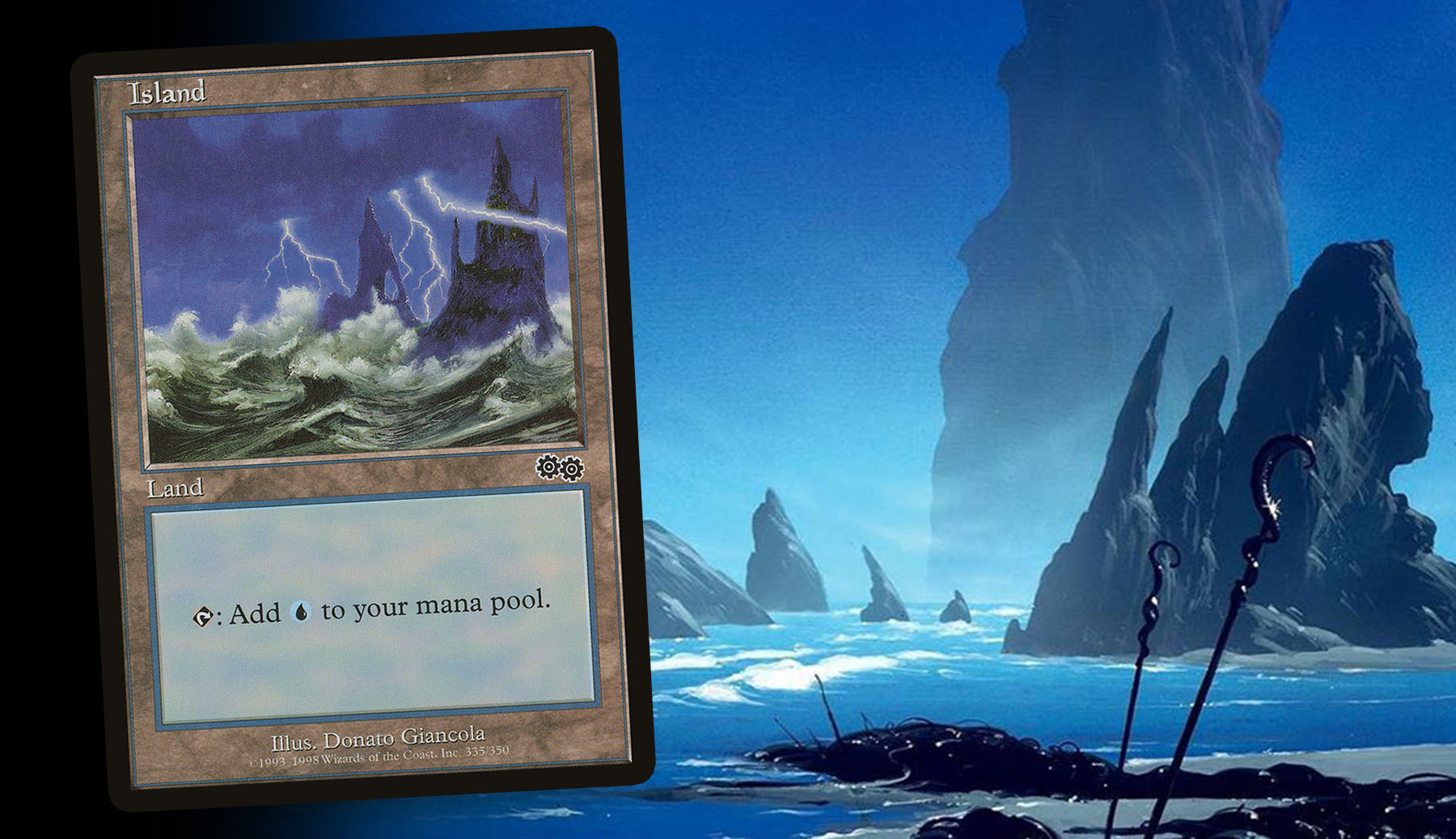
Speaking of The Tempest, Donato Giancola’s piece from Urza’s Saga was another all-star of my early years with Magic. This once again fed off of my infatuation with Shakespearean literature and probably a sense of wanting to portray my new favorite hobby as more edgy than it might have seemed on the surface. Despite the fact that I rarely ever had four or more copies of one piece of art for my lands at the beginning, the torrent of lightning and crashing waves brought movement to my mana base. I will readily admit that by today’s standards this piece leaves a lot to be desired, but at the time it was a first step into a deeper world.
Magic Origins – Jung Park
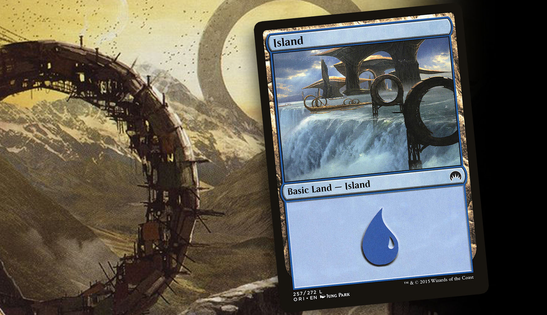
The release of Magic Origins occurred during a period of time when I was emboldened to obtain copies of any card I thought was going to be useful to me at any time in the future. This often meant I was going to get three or four copies of any card that might end up in a Commander deck. So what was I going to do when lands featuring Jace’s homeworld were printed? I bought thirty-five copies just to be safe.
I really love this art, something about the rushing waterfall mixed with the architecture and the rings visually linked to Vryn made it an immediate favorite the first time I saw it. I believe some of these feelings trace back to the unknown of Jace’s backstory and surprise that his homeworld would be so serene. It terms of basic land art coming out in the last decade, this might skew towards the more simple, but that simplicity is both beautiful and calming.
Shards of Alara – Chippy
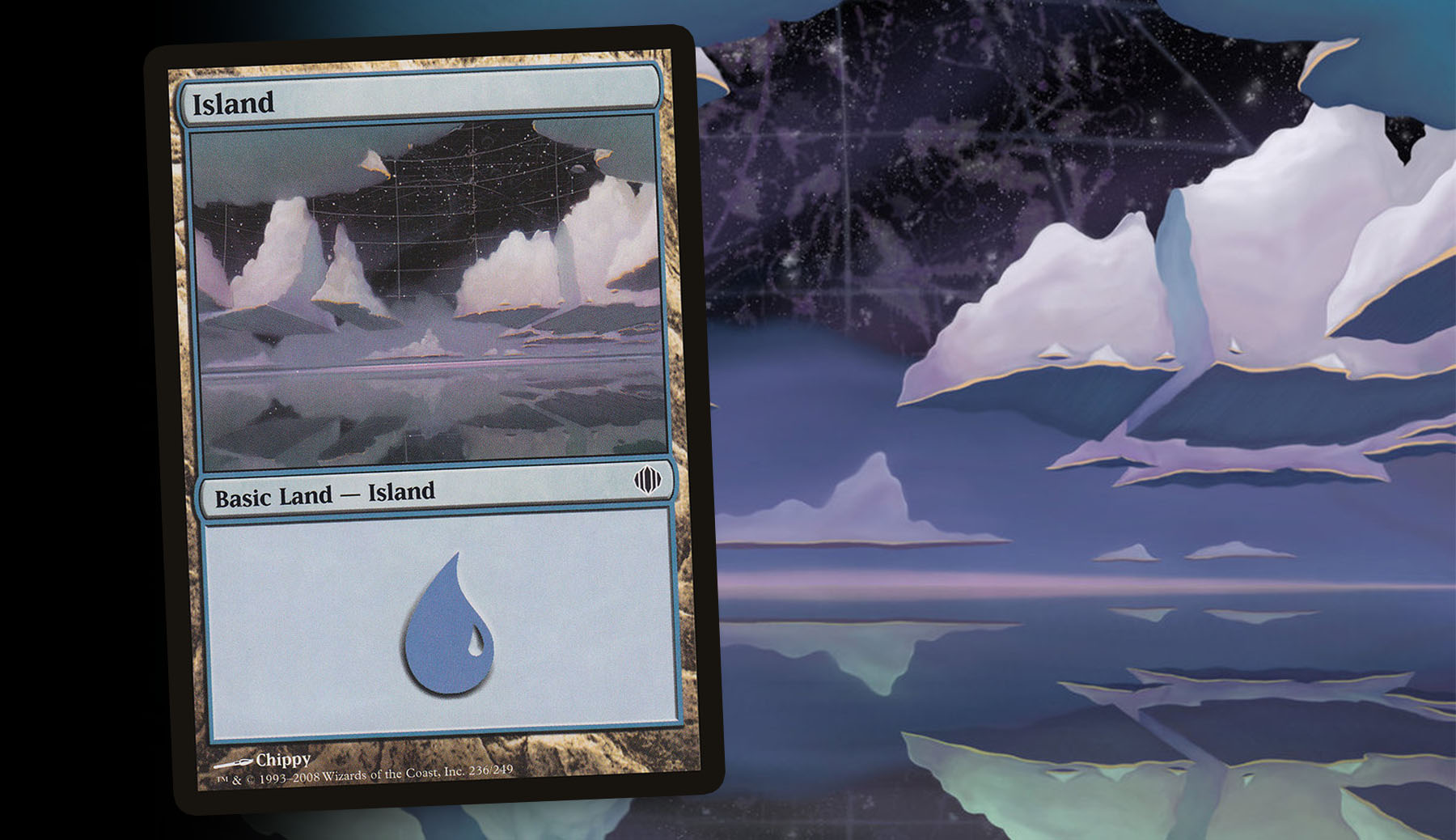
My longest time away from the game fell between the releases of Lorwyn and Magic 2010 (surprisingly a decade ago, jeez), and as such, I was around to witness Alara fresh and new. The Island capturing Esper and its mathematical aesthetic has been etched in my mind ever since seeing it in a pile of lands around the same time that I learned about Commander in early 2011. The piece has a wonderful contrast and reads as a blue mana source without actually featuring a land mass.
Unlike Mirrodin, which captured its blue lands with a sea of quicksilver, the Esper was less assuming from a distance, but captured the imagination upon closer inspection. I love the way the clouds reach a flat plane and how the night sky is beautifully marked and measured with lines as if created by blueprint. It is this distinct art direction that Wizards brought to all five of the Alara planes that made it immediately iconic to me and often makes me wonder how we haven’t visited since.
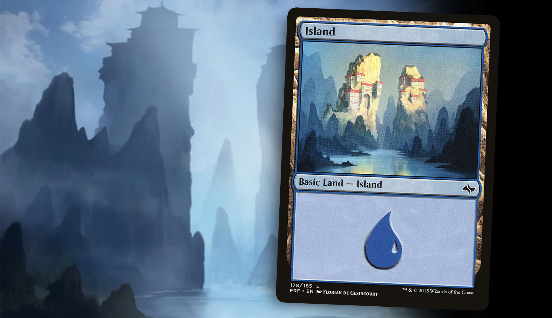
Fate Reforged – Florian De Gesincourt
Speaking of worlds I excitedly hope to see in the near future, Tarkir used its trope of time travel so well that the lands of the block became some of my all time favorites. They told the story just as well as any other part of the set. It is Florian De Gesincourt’s Island that has left the most lasting impression on me in terms of the basic lands – the common dual lands are also perfection. I use these in my Sygg, River Guide deck because at first glance they look remarkably like coral reef.
Once you take the time to examine the art up close, you’re once again treated to a beautiful mix of foreboding mountains in the foreground and background, set against the high contrast white and red of the focal point. This tranquil scene is a perfect Island in my opinion, especially when contrasted against De Gesincourt’s linked pieces in Khans of Tarkir and Dragons of Tarkir which show the same landscape, only this time ravaged by war.
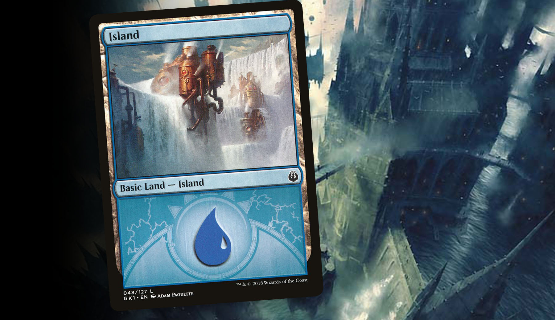
Guild Kit – Adam Paquette
One thing I have always appreciated about our trips to Ravnica is how they have helped to redefine what each of the basic lands look like. There are many wonderful examples of Island representation from the plane, but this piece stood out to me as I did my research this week. The waterfalls featured here could literally have been from any plane in Magic’s rolodex, but it’s the unmistakable steam vents that communicate that we are on Ravnica. That economical use of nature and structures not only paints a picture of how Ravnica is different than other planes, but also shows the audience a side of the mad scientists’ environment that we don’t often see.
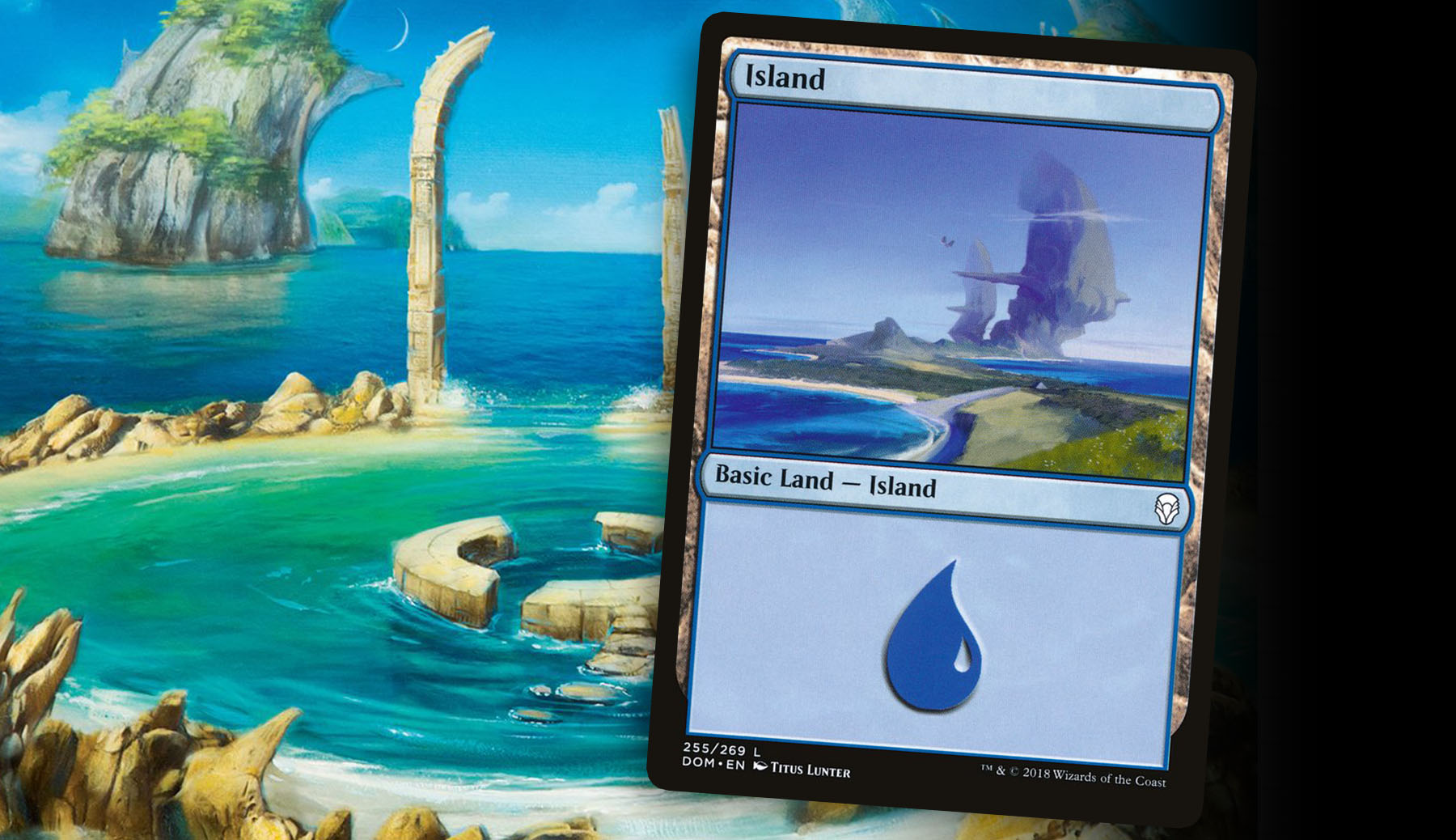
Dominaria – Titus Lunter
When it comes to lands, Dominaria has become a hard bar to clear in terms of beauty. So much so, in fact, that I was surprised that one of the Plains from the set didn’t make my list last time. Either way, when it came time to nail down which Island was going to get my praise, I had to choose Titus Lunter’s work. Much like the hedrons have become visually linked to Zendikar, the monolithic structures seen in “present day” Dominaria have become immediately recognizable.
The phrase I keep returning to with so many of these Islands is ‘high contrast’ and its funny to me how much this style keeps getting incorporated into an Island. But what I like here is that instead of the contrast coming purely from dark to light, it’s done from rich to dull. I think that says a lot about the state of the plane in a way I honestly can’t find the words to best describe beyond, a rich world coming back from a bleak history.
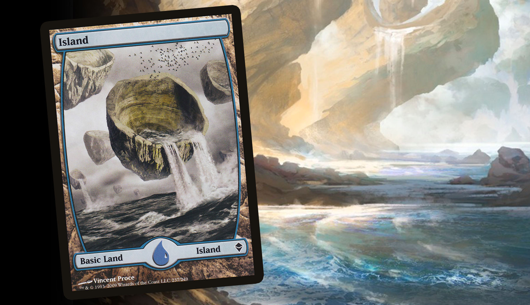
Zendikar – Vincent Proce
I would be lying to myself if I didn’t identify this as the most iconic Island in the game for me. The classic “bowl Island”, first seen a decade ago in Zendikar, was one of the first full art lands I saw from the set. Before the release of Zendikar, I didn’t really understand the appeal of full art lands, but I think some of that came down to the art Wizards was putting on them. While there is ultimately nothing disparaging to say of the art used in Unglued and Unhinged, that art could not compete with the floating vistas native to Zendikar.
Here, we have a whole host of bowls, pouring water down into the plane’s vast ocean; it gives a sense of scale to Zendikar and retroactively nods to how giant monsters like the eldrazi can manifest and still leave room for all the denizens to fight back. It is sad, though, that regular framed versions of the full art lands of the set exist; much of the wonderful art gets cropped out. When I want to bring grandeur, beauty, and impact to my Commander decks, this art is one that I use most—especially in full art.
This project often leaves me feeling like it’s nearly impossible to do it any justice, especially with the depth of full art lands we now have at our disposal, and the fact that I had to cut pieces by Kev Walker, Noah Bradley, and John Avon from my list.
That said, I think the art on lands is an excellent and sometimes overlooked element that can really set the aesthetic tone of a deck. Once you become really invested in a Commander deck, I would advise taking a look at your lands and really working to have them become an extension of your theme just as much as any other card.
I’m excited to touch back on this topic next time Donny or I are finding ourselves with nothing too pressing going on. If patterns are to be followed, we should be touching on Swamps next, which I already know will mean discussing a whole host of different artistic styles and themes we haven’t had the pleasure to touch on thus far. For my readers stateside, Happy Thanksgiving, and check out Donny’s piece here.
Ryan Sainio is a Graphic Designer who writes about EDH and the EDH community. He has been playing Magic: The Gathering since 7th Edition in 2002 and values flavorful and fun gameplay over competitively optimized decks.