
Hipsters of the Coast started out as the simple WordPress of Zac Clark in 2012 with a—let’s call it “lovely”—orange and black color scheme that is (thankfully) lost to the sands of time. Since then, as Hipsters has grown to become an important part the Magic content community, we’ve gone through a series of logos…both good and bad. So, to celebrate our newest logo (which you can buy on some sweet gear), here are the Top 5 Hipsters of the Coast Logos.
5. Halloween, but an Entire Website’s Theme
[Redacted for your own sanity]
4. Hipsters First Logo

Soon after launching the site, Zac brought in Matt Jones to both write for and redesign the site. Jones’s first version of Hipsters logo was simple all-caps affair—but he came up with the idea of adding a background image to the letters, which would become a key component of Hipsters logos for years.

3. Matt Jones’s Handwriting with Stars
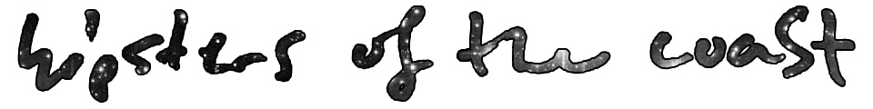
Jones recreated the Hipsters logo with his own handwriting in 2013, and the release of Theros later that year inspired him to add star/galaxy painting background to match the sky/star theme of Theros’s gods.
2. Super Fantasy Font with New Matt Jones Art
![]()
As Hipsters grew, we realized that we needed a pretty massive site redesign in 2016. Jones contributed to the redesign with a new logo, using a new font that emphasizes our fantasy roots, and using a new background that featured some of his latest art.
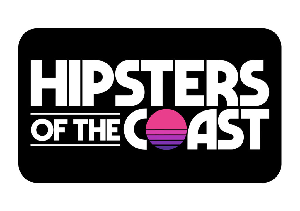
1. The Sunrise Logo
![]()
After another two years of growth, Hipsters has become more than just a Magic content site. We chose to reflect that by choosing a new font that doesn’t scream fantasy and incorporated the sunrise, since we’re mostly on the east coast of the US, to add a bit of color.
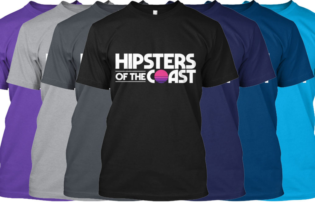
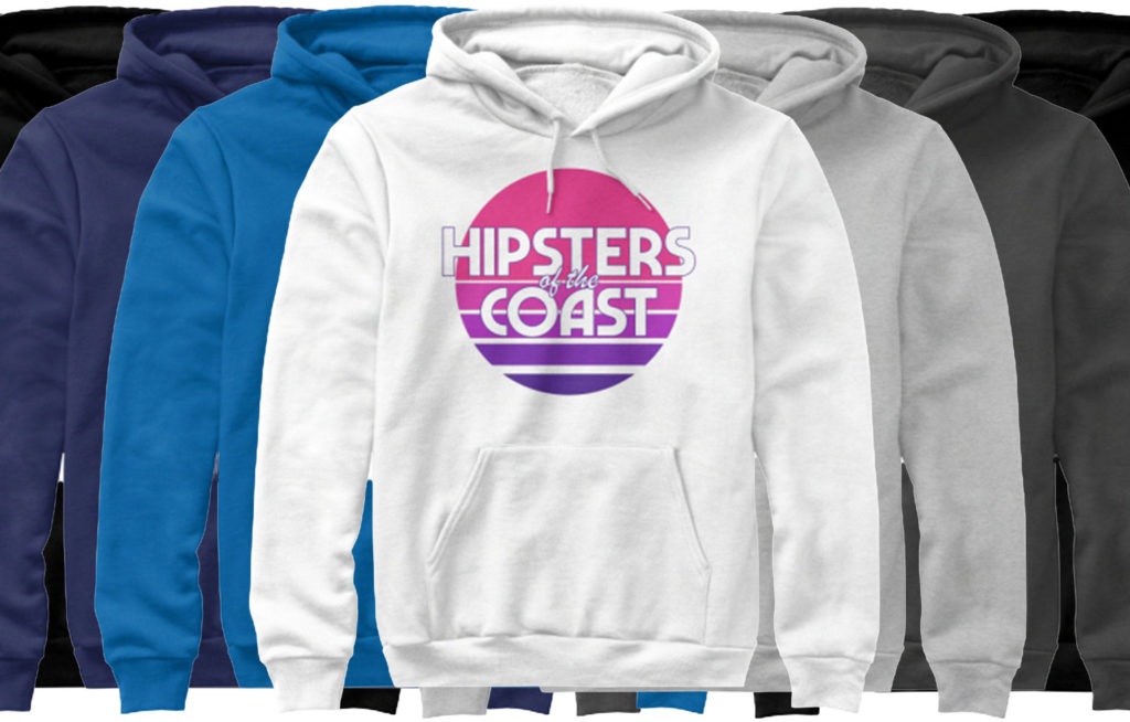
The sunrise logo looks great on t-shirts and sweatshirts, which you can buy here.
We will also have some awesome playmats for sale shortly. Check back soon to get one for yourself!
![]()