
My phone is clogged with photos—amusing signs, typos on local bands’ posters, ECU’s of ‘possum teeth—and old .mp3s, half-read ebooks, texts I can’t bear to delete, legacy games I keep just in case I ever feel the need to baste myself in nostalgia, and all the other digital hoarding we each get up to. 32 gigs can feel like all the space in the world—indeed, it’s more than NASA ran on to take us to the moon—but it fills up fast when you can’t bear to delete the things that once made you happy and now have made you what you are.
I thought of this over the last couple of weeks as Masters 25 spoilers began trickling in and it became clear that the set wasn’t an exercise in nostalgia, but in streamlining. Gone are the sludgy lists of one-time mechanics and fidgety interactions; instead, the design team seems to have capped card text at Tweet-length, letting brevity be the guiding signifier of a Masters 25 card.
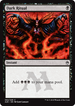
Take a look at Armageddon, Dark Ritual, Murder, Blood Moon, Vindicate—the centered text in the box, the dominance of a single color in the art, the way the text is bracketed by the watermarked set symbol. This is set design through minimalism, a depiction of Magic’s history as a timeline, not an artform. We’ve talked about effective language before, but with Magic 25 fully spoiled, let’s talk about effectiveness.

Magic cards are 2.5” x 3” (63 x 88 millimeters) and range in verbosity from Ice Cauldron or Soul Echo to Dark Ritual (which, starting with Dominaria, will simply say “Add BBB.” Officer Shrift approves). That’s a fascinatingly small window to hit with art and text—not to mention mana cost, artist, collector number, and legal text in the margins. Effective use of space equates to elegance—that’s what we’re taught, that’s what mid-tier graphic designers espouse as dogma, that’s what our eyes lead us to believe. It’s a narrow line between “minimalist” and “wasted space,” but if you hit that sweet spot, you have something that stays memorable without the viewer feeling as though they’ve done anything.
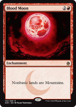
Here’s where I think Masters 25 succeeds. The cleanliness of the centered “All nonbasic lands are Mountains,” ensconced by the crescent moon of the Dark set symbol, carries with it a rich and niche subtext of corner cases, baffled new players, and years of tournament play. You also lose the needlessly expository flavor text. “Great, lands become mountains because the moon washes them out with red light, cool cool.” Conversely, Vindicate had fabulous flavor text on the original printing—it’s an aphorism with literary merit and a reasonably fluid sentence structure—but loses all flavor text in the new printing (kind of a wash, considering we could have gotten the “in-the-way-of-a-etc.” text).
The minute size of Magic cards doesn’t leave much territory exploitable as negative space. Negative space—defined as the space around the subject of a painting or artwork left unaltered or minimally altered—allows the viewer to separate images into discrete, manageable blocks. Think of how the new Noah Bradley Doomsday art in Masters 25 offsets the central focus of the painting—the kneeling figure—with the red background and interstitial space between the orbs. I much prefer “negative” to “neutral” space, as a blank area of canvas left in a painting by an expert artist is a deliberate choice. To call it “neutral” is like calling art “apolitical,” and that dog absolutely won’t hunt. Negative space is a statement.
Study the Obamas’ portraits, for example. Two different artists with two different takes on negative space: Amy Sherald, in depicting Michelle Obama, allows neutral space to dominate the frame, with Obama centered and enshrined in a cool blue wash. It highlights her, adds perspective, draws the eye to the subject’s face. In contrast, Kehinda Wiley overcrowds the frame with flowers and vines and rococo greenery—elegance through overstimulation, a whole presented through a subject displayed as a constant against a riotous backdrop. In both cases, your eye is drawn to the subject of the painting, despite the different tactics used in the negative space. It’s about reducing information to what is leading without being overwhelming, like good literature or debate. Art is information, and overload is just as harmful as underexpression.
Interestingly, as of last week, Wizards’ latest text-saving change became apparent through the Dominaria spoilers: the embrace of the singular “they.” This is a great change: it saves space, it provides more inclusive options than the restrictive “he or she,” and it does so with no drawback. In addition, the phrase “to your mana pool” has been cut from many cards, making Llanowar Elves say, simply, “(TAP): Add (G).” For many people, this change is years coming; for others, it comes as a sudden move. Magic grows, and it grows because people speak up, because people share, because the game incorporates input from activists and writers. It’s becoming clear that the last year or so—since Kaladesh, I would argue—has been a time of reinvention for Magic.
Between Kaladesh’s attempts to create a new mana system and map classic cards to energy, the launch of Magic the Gathering Arena, and these new revisions to language, mana, Planeswalkers, card frames, and the targeting system imply that Wizards is heading into a new phase of development, one dedicated to long-term sustainability. “Sustainability” is dangerous: it can imply stagnancy or conservative decision-making. There’s something wonderful in seeing the singular “they,” with its hard-fought acceptance and inclusive statement, as a conservative choice—it suggests that we truly are heading to a place (albeit slowly) where all are welcome at the table, a place where there’s space enough for us all.
A lifelong resident of the Carolinas and a graduate of the University of North Carolina, Rob has played Magic since he picked a Darkling Stalker up off the soccer field at summer camp. He works for nonprofits as an educational strategies developer and, in his off-hours, enjoys writing fiction, playing games, and exploring new beers.