
Greetings art enthusiasts!
It’s that time of whatever again, when a new set arrives and I layer them all in Photoshop, divide up the opacity so they’ll total 100%, and present you with the results. It’s the Blur of Theros! *fireworks*
I’ve done them all by colors (you’ll remember that Hunter forced me to do this with the Blur of M14) and have a few thoughts on them. Every time I do one of these I think they need to justify why I’m doing it. The only real justification is that I think it’s interesting and they look beautiful. Basically doing this is making art (that is, using material, found or otherwise acquired, and changing it, then changing it again, to generate a new thing to look at, experience, and think about). I’ll break’em down into a list.

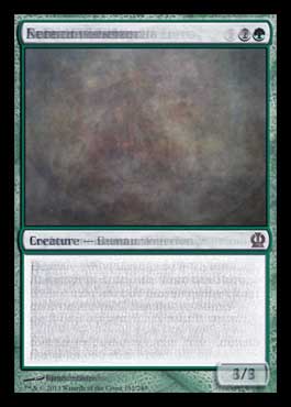
1. White
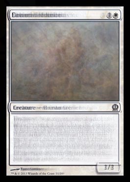
White creature power and toughness looks to be 2/3.
I’m not sure if it’s clear, but blurred Magic cards are always subpar William Turner late career watercolors.
.jpg)
William Turner
Incident at the London Parliament, 1834
Right? Right.
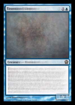
2. Blue
When we’ve posted these “The Blur of …” articles to Reddit there are always people who say “Who cares?” or “What a waste of time!” and sometimes even meaner things.
Blue creature power and toughness average seems to be 2.5/3
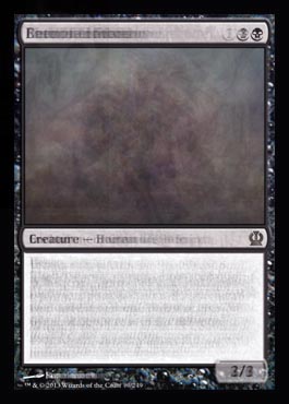
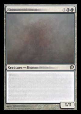
3. Black
And I never really understand that. Why’s it a waste of time? It takes two seconds using a Chrome add-on to download all the images off of whichever page on mythicspoiler.com that I need the images from. Photoshop has a stack script which makes layering all the images into one image super easy.
Black creature power and toughness average seems to be 3/3.
4. Red
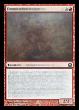
Average red creature power and toughness seems to be 2/3.
After a while they start looking like magic eye art. Let’s put quotes around “art”. It’s not really art, it’s just a thing they sold at Express Yourself or Spencer’s Gifts in the 90s. This is art:
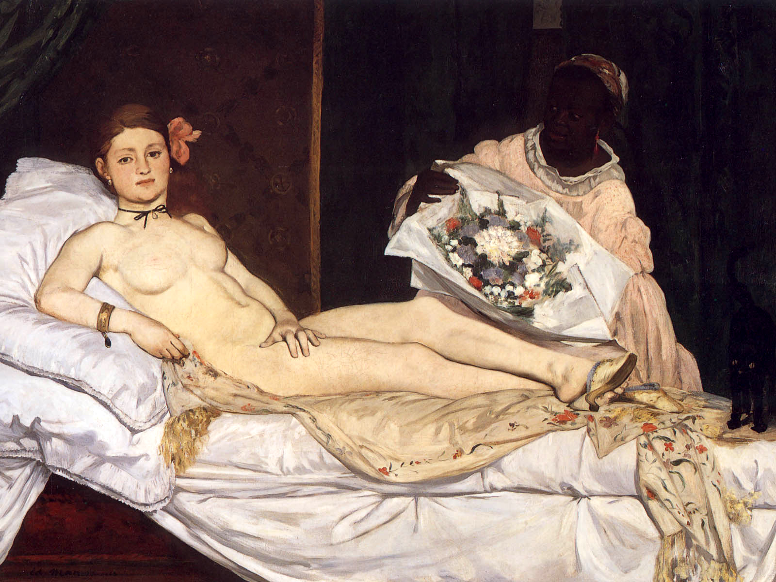
I saw this painting in real life when I was in Venice this past summer. It was mind blowing. I can’t get into it here, but her hands … OMG. It was incredible. Look at those hands. There’s depth in the painting that doesn’t exist in this shitty JPEG. I wish you guys could see the black cat better. He’s insane IRL.
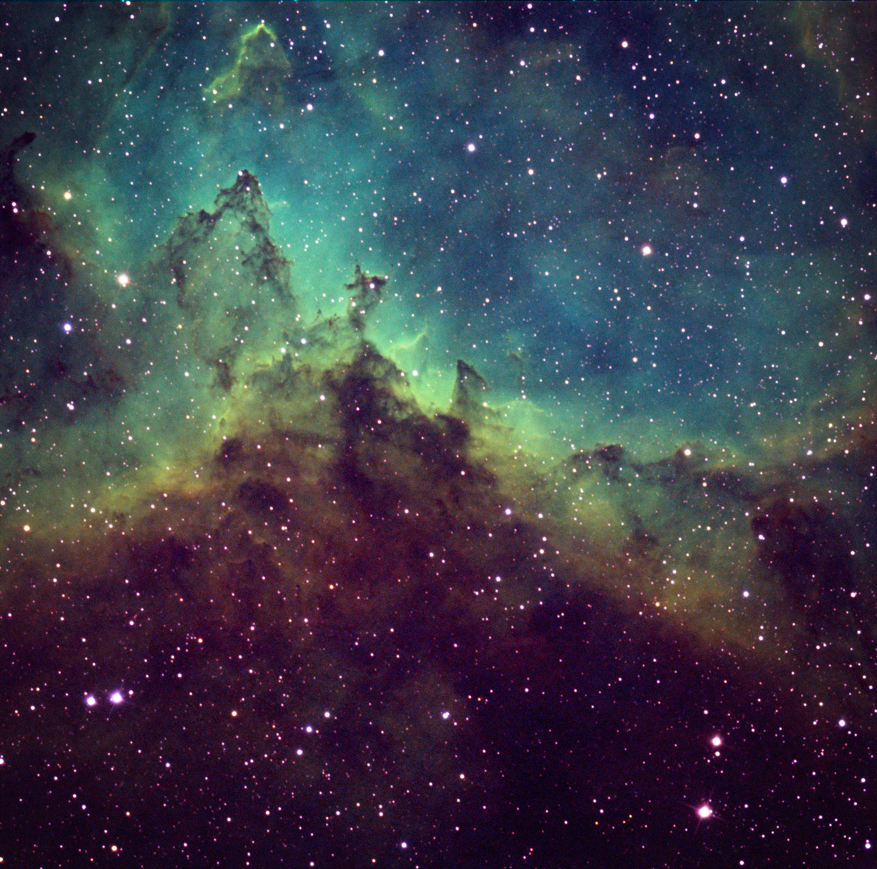
5. Green
Average green creatures power and toughness must be 3/3. This one looks kind of like some of those souped up NASA photos of space.
How incredibly childish is the US Government? Or is it just the republicans? I don’t care, politics make me super pissed. People don’t think enough about what’s best for everyone and instead think what’s best for their individual selves (I really wanted to write “selfs”) and I get that the drive for success of the individual helps our capitalist society chug along but I’m already exhausted typing this bullshit. www.nasa.gov is now basically a dead link and I’m unhappy about it. Get your shit together, US Government. You’re embarrassing yourselves.
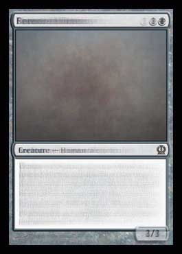
6. Creatures
This is a new layered blur for me. I really wanted to show that all Magic art is the same and this one was gonna do it. All the creatures would line up beautifully and it just didn’t happen. Clearly the creature always shows up somewhere in the middle-left of the image box. There’s maybe an arm or leg averaging extended to the left, too. And the background is relatively detail free. But, seriously, snore. Also: 3/3.
7. Land
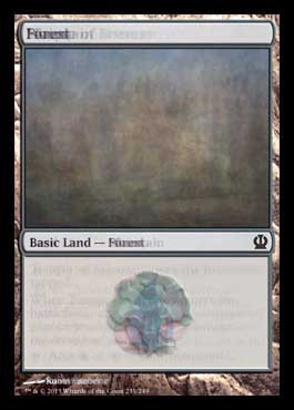
The land layered blur is always my favorite. It’s the only one that every looks like much of anything. How different can all the land images really be? Not that different. They’re always Courbet landscape painting kind of beautiful.

And now the layered blur of everything Theros!
It’s nothing. Or, or, maybe it’s the Nothing!

I know, I know. It’s not the Nothing. It’s Gmork.
Thanks for reading! Enjoy your Theros’ing!
Much love,
Matt
MTGO: The_Obliterator