
For $25, you can create an art gallery of Magic cards. They will be beautiful, striking, and memorable. They will also be, by and large, unplayable.
This was what I realized a few weeks ago, when I happened upon the work of Scott Kirschner. I hadn’t known Kirschner’s name or his catalogue until, in a recent game, a friend plagued our EDH table with a copy of “Grave Pact.” Wanting to form a mental map of the table, I pulled up the Scryfall page—and as soon as it had begun, my brief tenure as a focused player ended. Instead, I was swept into Kirschner’s weird, unsettling illustration for the original printing of Grave Pact.
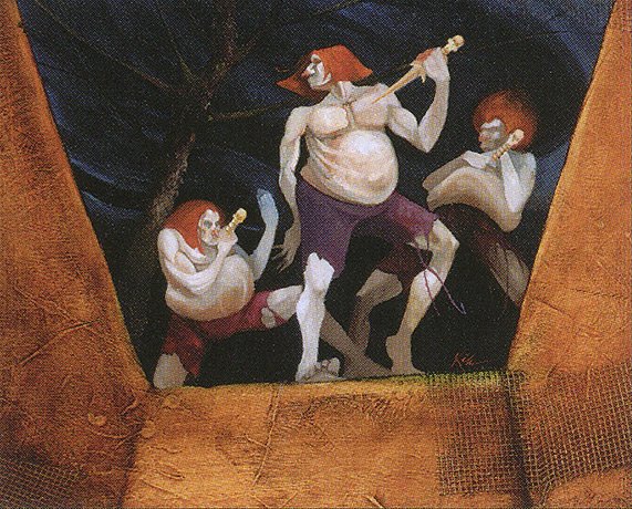
Grave Pact by Scott Kirchner
Ten seconds later, I was scrolling through a gallery of all 45 illustrations Kirschner created for Magic. Three minutes later, I had discovered that Grave Pact is actually fairly exceptional among Kirschner’s catalogue, in that it’s actually feasible to play—time (or initial strange design) has rendered most hopelessly outmoded. Five minutes later, I had placed an order for 25 Kirschner-illustrated cards—for a grand total of $21.
And now, as I look down on the three pages of Kirschner art filling my card binder (actually, I’m not looking at them right now—I’m taking notes in Seat 20C of a JetBlue flight to Boston—fooled ya, didn’t I?), I’ve gotten to thinking about this way of relating to Magic art.

This is a little bit different, I want to emphasize, from just collecting good art. I’m talking about a form of collection that pays attention specifically to those cards that are not just beautiful, but that also have no place in most contemporary Magic formats.
It’s a way of salvaging beauty from the dollar bins of history.
Remembered Pasts, Promised Futures
I’ll begin this discussion with the artist who crystallized my project: Scott Kirschner.

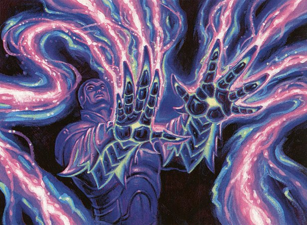
Immolation illustrated by Scott Kirschner
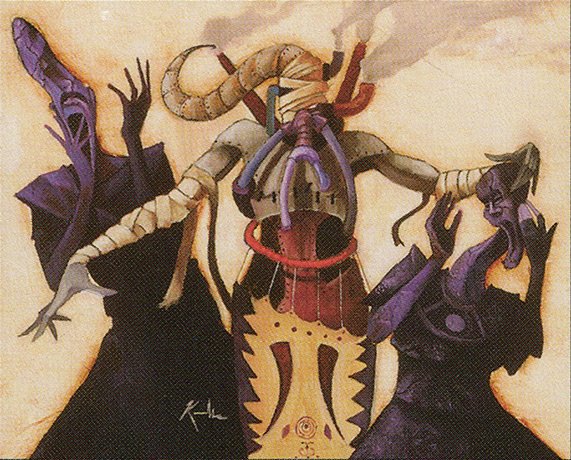
Kirschner has created 45 illustrations for Magic for 43 mechanically unique cards (in two cases, he made two illustrations for the same card), all within the span of four years (from Legends to Urza’s Saga). Among his first, and an excellent indication of his style, is Immolation..
In this gruesome, unsettling painting, three figures—evocative of the titular characters of Laocoon and His Sons—twist and contort and crumble before a rising wall of ruby flames. Their forms are expressive, but not lifelike; they look more like interpretive dancers striking dramatic poses, as though their suffering can’t be countenanced by the lifelike. I’m especially struck by the central victim’s figures, which crook and splinter like lightning bolts, his pain seeming to defy anatomical rule. The terracotta-colored background, in comparison to the foreground drama, is mute, a technique to which we’ll return in a moment.
It’s an exceptional illustration. It’s also not a terrifically useful card.
For one red mana, “Immolation” allows you to give a creature 2 additional power at the cost of 2 toughness. As Scryfall’s Tagger system helpfully notes, it is strictly worse than Dust Corona or Taste for Mayhem (by a certain artist we’ll be seeing again soon), which don’t have the toughness drawback and confer extra buffs on their targets. You could use it as a targeted removal spell, but there are quite a few other 1-red-mana spells that do the same thing, with added bonuses.
(On the upside, it’s about equal to Burning Cloak, a card with another hilarious and arresting image).
It’s true, you could probably find a place for this card (and I plan to—perhaps as a highly niche removal spell in a highly niche enchantment reanimation deck?). But that would miss the point, which is to savor precisely the fracture between mechanics and art.
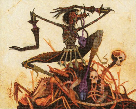
Bone Dancer by Scott Kirschner
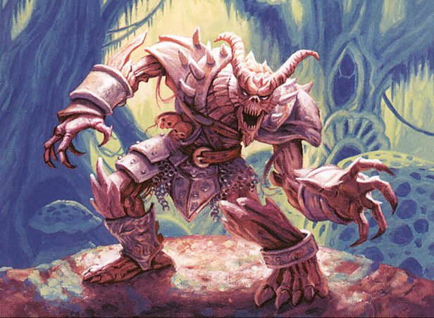
Viewing Kirschner’s art in the aggregate, it’s clear that—almost surely unintentionally—he infuses primordial horror into entirely banal creatures.

Lurking Evil by Scott Kirschner
Armor Sliver, Basalt Golem, Bone Dancer, Lurking Evil, Manakin, Paroxysm, Patagia Golem. There’s a lot of strangeness and grotesquery—unhinged jaws, jutting proboscises, theatrical poses. Kirschner’s backgrounds are monochromatic earth colors but aren’t blank: they flake, crack, and run in gradients, calling to mind ruined potsherds or cave painting.
All this makes these images feel primeval and haunting. They seem to channel the horror of the unimaginable, a darkness that defies human tools and eludes human memory. Collaged together on the pages of a binder, they become fragments of forgotten civilizations—not their conquests or triumphs, nor even their Ozymandiasesque vanity, but in the nightmares their imaginations struggled to contain.
And fittingly, many of those cards are at once memories of the past and grasps toward the future.
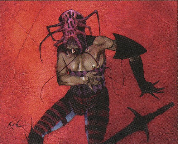
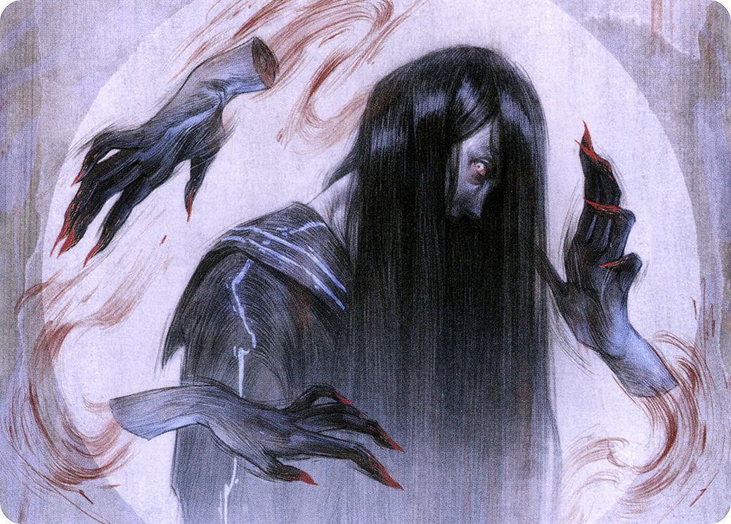
Convulsing Licid by Scott Kirschner
On one hand, many embody the off-kilter complexity and eccentric experimentation of days gone by, little time capsules of mechanics that might have made sense in context or that never made sense at all. Convulsing Licid, for example, anticipates Bestow, in a strange way.
Hibernation Sliver by Scott Kirschner
A few remained unplayable only in the short term. For cards like Hibernation Sliver, increased archetype support has made them easy inclusions (Modern Horizons’ First Sliver, with its bombastic cascade-granting power, loves slivers to return to their owner’s hand). Goblin Recruiter, similarly, has only grown stronger over time: at the time it appeared in Visions, it could tutor (to the top of the library, let’s not go wild) any of the 24 Goblin cards that had seen print. Since then, 474 more have lined up to join its list.
Basalt Golem by Scott Kirschner
And yet others among Kirschner’s catalogue are still looking for homes. Perhaps there’s some kind of place in some strange deck for Basalt Golem (Wall-Hate?) or Bone Dancer (I’m going to make Graveyard-Order-Matters work one day) or Icatian Javilineers (surely there’s some javelin counter lovers out there?). But more than that: if they’re without niches now, I feel confident—at least hopeful—that one day there’ll be a place for them in an A-1 deck.
And so in a strange way, Kirschner’s haunting primeval illustrations are the perfect pair for this collection of cheap, largely outclassed cards. Like the archaeological horrors of their art, these are cards that reach out to a viewer on the other side of history, intimations of darkness unimaginable. For under $25, you can look back.
Curated Collections
Say you aren’t terribly captivated by primordial terror, bizarre mechanics, or relatively niche Magic artists. No worries! There’s another approach to collecting the unplayable: make it a career study. Select an artist who, even if they’re uber-famous, registers something in you that you can’t quite explain—something you can feel, but can’t yet articulate.
Dosan’s Oldest Chant by Tim Hildebrandt
This is the principle that’s motivated me to form a mini-exhibition within my collection, provisionally titled The Hildebrandts in Living Color.
With nearly 200 cards to one or both of their names, Greg and Tim Hildebrandt sit in the upper echelon of Magic artists. While they earned a reputation as powerhouses of fantasy illustration (both individually and as a team) for their eye-catching composition and imaginative imagery, I was first compelled—and have organized my collection around—their use of color.
Golgari Grave-Troll by Tim Hildebrandt
The inspiration for The Hildebrandts in Living Color was Golgari Grave Troll, the first Hildebrandt illustration (in this case, Greg’s) that first entranced me. Besides the old-school-fantasy-paperback imagery that gives the titular troll his look, I was struck by the pink and white and blue that dominate the illustration—such vivid contrasts to the slimy green and inky black of most Golgari Swarm cards. These colors make the image pop off the page, make it feel like a strange otherworldly comic book poster rather than a photograph of a dim undercity.
The card spurred me to begin a quest: to document the Hildebrandts’ striking colors—and to do so without setting my wallet aflame. Whenever I had a few extra dollars to spare or had received a gift card for my LGS, I set money aside for Hildebrandt cards. I look for whichever ones are currently in stock, and ideally, whichever are dirt cheap.
Soon, this routine became a process of aesthetic exploration.
Not all of their cards, I found, popped with pastel color. Juniper Order Ranger, for example, has the more high-contrast cinematic look of latter-day Magic; Cho-Manno, Revolutionary shows oil-heavy brushwork and the center-facing composition evocative of early-Magic standout Terese Nielsen. The act of collecting for color thus took on a twofold function: investigation and documentation. I worked to articulate what it is, precisely, in some Hildebrandt illustrations, so energized me; striving to name it, I made it real.
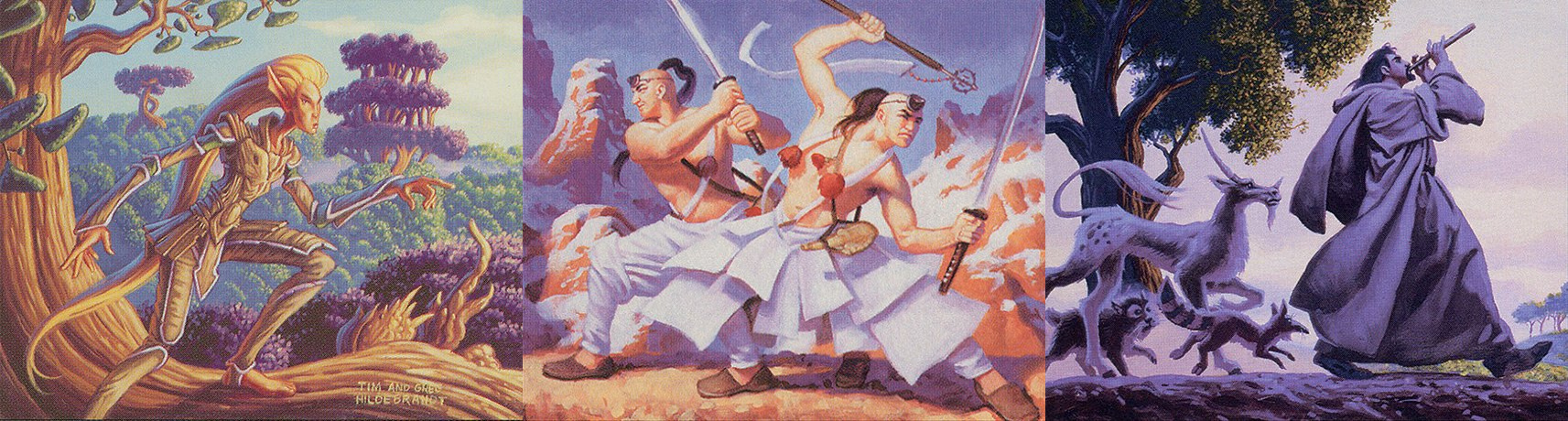
A spread of Greg and Tim Hildebrandt’s Elvish Lookout, Greg Hildebrandt’s Kumano’s Pupil, and the Hildebrandt brothers’ Piper’s Melody
I noticed, as I assembled cards like Elvish Lookout and Kumano’s Pupils and Piper’s Melody, that the Hildebrandts loved to get adventurous with their color palettes. In the color balancing on many of their illustrations, shadows aren’t black, they’re blue or cool bronze or deep purple. Light isn’t pure white, it’s cream or gold or pink or pale green.
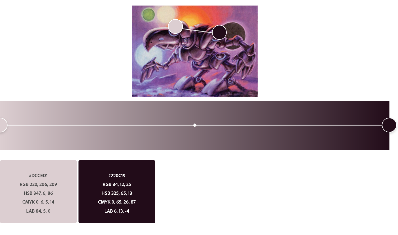
A screenshot of a Greg Hildebrant’s Suntouched Myr, along with a gradient of its lightest and darkest color
In Greg Hildebrandt’s “Suntouched Myr,” for example, the shadows dominating the image are mostly dark purple, while the reflections are pale pink; in hex code, the very lightest color is around #DCCED1 (a very, very pale pink) and the darkest is #220C19 (a very, very dark purple).

Sway of Illusion by Greg and Tim Hildenbrandts
Another page of my binder, a side-corridor in the exhibition walk, is a tribute to the Hildebrandts’ most ultra-colorful images. Here, you’ll find such images as Assert Authority, which washes the world in blue; Death Denied, a nightmare of purple and black; and Sway of Illusion, which, I think, is just the Hildebrandts showing off.
Greg Hildebrandt’s Blessing of the Nephilim
Of course, there are other kinds of private exhibitions that you can develop solely by exploring an artist’s dirt-cheap or ultra-niche cards. Perhaps you, like me, find yourself interested in the Hildebrandts’ love of hands as compositional anchors, in cards like Blessing of the Nephilim, Gauntlet of Power, Gempalm Avenger, Gempalm Sorcerer, Gempalm Strider, Shuko, and Zombie Brute.
Doing so allows you to move closer, if only by inches, to the most stellar artists. Sure, everyone who’s anyone knows the Hildebrandts–but nobody knows them like you do.
Literally Unplayable
Yet a third option for collecting unplayable cards involves getting into the literally unplayable: art cards.
Art cards, as their name implies, exist solely for the sake of art. They have no mechanics printed on them, and are thus not legal for official play; their frontsides comprise an extended illustration and their backsides are printed with set watermarks and other informational data.
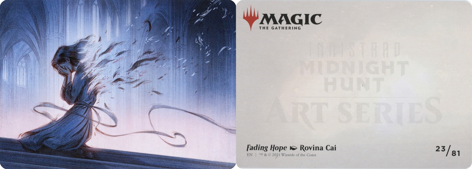
The front and back sides of the art card for Fading Hope, illustrated by Rovina Cai
Until recently, these peppered play boosters, taking up otherwise useful slots in prerelease card pools and tabletop booster box drafts alike. But starting with Edge of Eternities, art cards have been moved exclusively to collector boosters, and so have become ever-so-slightly rarer. For the vast majority of players, it’s pointless to collect them because they serve only half (or less) of a Magic card’s function; they’re all art, no mechanical value.
And that’s why you should collect them.
My growing collection of art cards is dedicated to the work of Rovina Cai, one of my favorite working Magic artists. As her 41 illustrations (including the six “Role” tokens from Wilds of Eldraine) bear out, Cai is deeply interested in the esoteric and the mystical.
The art card version of Rovina Cai’s Parasitic Grasp
Her images are full of cool washy colors, swirling wispy lines, and pulsing lights, and her visual language foregrounds dissolution—of human figures, as in Parastic Grasp and Fading Hope, or of the universe, as in Moment of Truth and Shadow Prophecy. Evoking both fairy tales and Gothic horror (I see Goya’s DNA spiraling in her dark lines), she at once entrances the viewer and asks us to revel in our own decomposition.
And so what better medium for a mini-gallery than art cards, which evoke card mechanics but also dissolve them?
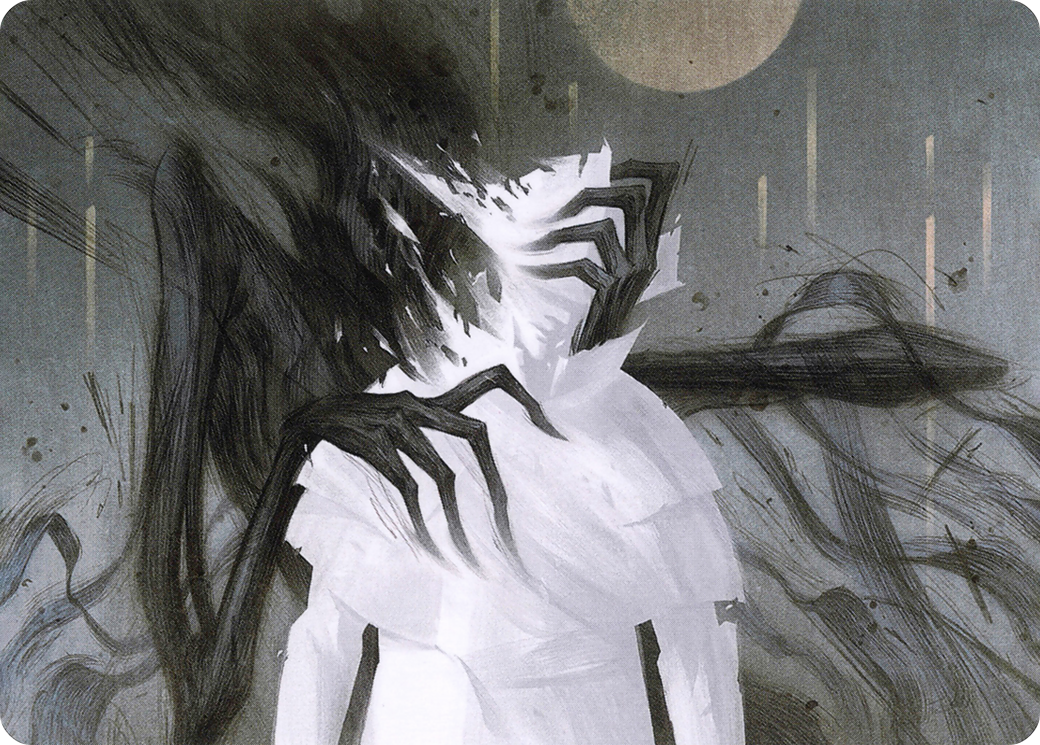
The art card version of Rovina Cai’s Shadow Prophecy
Collecting art cards, as I collect Cai’s, also means you can savor this effect all the more intensely. Seeing Shadow Prophecy at scale makes visible the gradients of light that lance through the illustration and that visualize the conflict between our hero (an Urborgian follower of Lord Windgrace) and the highly abstracted Phyrexians menacing them.
The art card version of Rovina Cai’s Clawing Torment
Holding an extra-large Clawing Torment allows you to trace the deep red of bloodstreams trailing from the zombified hands.
The art card version of Rovina Cai’s Moment of Truth
And with the benefit of moving the card closer, you can grow enamored, as I am, with the way Cai represents stars, as in Moment of Truth and Collective Nightmares—whorling oceans of blue and violet on which float multicolored speckled stars.
To be sure, some of these cards are solidly good—but that’s precisely why it’s worthwhile to collect them in their strictly unplayable form. Doing so allows you to absorb yourself in Cai’s images in themselves, slipping into the same dark and strange mystical reverie she brings to life. And then, if and when you do play with the fully functional card (perhaps you could learn to play, unofficially, with the art card), you’re all the more aware of the contingencies underwriting a card’s mechanical identity, all the fragile pieces that might easily drift away.
Looking Differently
What I’ve been describing here isn’t just a fun little side project to undertake between games or long turns, though it’s certainly that. I want to suggest that the Dollar-Bin-Art-Gallery School of Magic Collection™ is a method of looking at cards in a different way, of destabilizing and reimagining your investments in any card’s abilities or value. It can help you imagine the otherwise mysterious inner machinery that is the Magic card itself.
Let me be the angel on your shoulder (good or bad, it’s up to you): buy that card from the dollar bin. It might be the start of your art gallery.
Ryan Carroll (he/him) is a writer and Ph.D. candidate in English and Comparative Literature. On Substack as Dominarian Plowshare, he writes about Magic’s art, story, and experience. Outside of Magic, he writes on topics including 19th-century literature, information theory, television politics, and cliche.