
Wilds of Eldraine is the latest Magic set to boast a supplement sheet of bonus cards, following in the footsteps of Strixhaven, The Brothers’ War, and March of the Machine. The fact that Wizards has returned to this marketing technique four times in three years underlines that it’s successful. This time, we have iconic Enchantments, and Wizards has knocked it out of the park: almost every card is a tournament playable or casual staple, and the art is evocative and whimsical–a wonderful mix of Arthur Rackham, Gustave Doré, and the D’aulaires. Those touchstones are clear in the aesthetics, but they’re updated by a fantastic cast of new Magic artists, from Shafer Brown to Eva Eskelinen to Matteo Marjoram, all of whom create fairy-tale-inflected art with a Magical twist.
As a new father and a spouse to a children’s library employee, I’m saturated in children’s art, and I’ve developed a critical eye–but nothing close to the expert eye of my wife, Caitlin. Caitlin recently wrapped up a four-year tenure at Richland Library, where she was a Children’s Library Associate. She’s a graduate of the University of Texas, where she received her Master’s in Early Childhood Education, and I couldn’t think of anyone better suited to review the aesthetics of Wilds of Eldraine’s Enchanting Tales variants. Take it away, Caitlin:
“I have more than an affinity–really more of a mild obsession–with children’s book art and a deep love of fairy tales and fables and their use in helping us see the world in different and instructive ways. The practice of building empathy–the opposite of apathy, right?–is why they’ve had a lasting impact on culture for centuries. Fairy tales are designed to reinforce cultural expectations in young children, and it’s important to review them to see what past cultures prioritize and how people fit into those cultures. People want to see themselves as an archetype.”
A Mirri, Weatherlight Duelist player and never-drafter, Caitlin’s experience with Magic is mostly limited to Commander and the cards I excitedly bring to her like a cat bringing home prey. What follows is a conversation between the two of us as Caitlin first sees the Wilds of Eldraine Enchanting Tales cards–these are her first reactions, without any previous awareness of the set or its aesthetics. The conversation has been edited for clarity and does not cover every card in the Enchanted Tales subset.

Rob: Alright, so background: Eldraine is Magic’s fairy-tale world with some courtly Brit myth thrown in there. It’s part Into the Woods, part Arthurian legend. This is our second visit–the first time, it was 2019 and the set was kind of busted, by which I mean the cards were too good. This time, they’ve choked that back, and to balance it, they’re including powerful cards from Magic’s past with art that’s reminiscent of classic fairy-tale illustration. So these are all real, tournament-legal Magic cards, but they look a little different from the old orcs & dorks illustrations you’ve seen. We’re going to start with White.
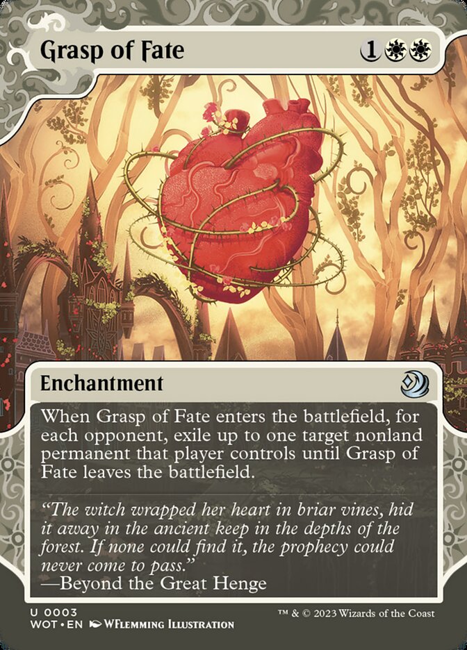
Caitlin: I find this one really compelling. The heart kind of looks like an apple, which is, I’m sure, intentional, and the vines around it make me think of Sleeping Beauty.
Rob: So, the plot of this set is Sleeping Beauty. To throw off the Phyrexian invasion, they cast a sleeping spell over the fairytale world of Eldraine. (long digression about the history of Phyrexia follows and has been cut)
Caitlin: Love it. I like the pink. Yeah, I like that it goes from sort of Pop Art on the edges to being very detailed in the center.
Rob: Interesting. I think it’s entirely too busy, but that’s me.
Caitlin: Don’t disagree, but I like that it’s busy.
Caitlin: Dope.
Rob: That’s a Green Knight to me.
Caitlin: Yeah, it totally is. These are really cool because they so clearly have layers of depth the way Sleeping Beauty has, which, Sleeping Beauty was a really special Disney movie because they actually layered–it’s actual layers of scene–
Rob: Right, the proscenium technique. Literally adding depth through practical effects.
Caitling: This replicates that. It’s gorgeous. Oh, I love Knightly Valor. That bright yellow–the bold colors. It’s also very Disney, but in the right way.
Rob: Yeah, the consistent use of golden light in these White cards really makes a cohesive palette for the set. It’s used very generously throughout the set and it looks sun-dappled in the best of ways. Also, Land Tax is sick.
Caitlin: Yeah, that’s super cool. Love the design of all the plants to make it look like gears.
Rob: Right, there’s a very inorganic but naturalistic, almost Social Realism vibe to this one. Contrast that to our next card: Phyrexian Unlife.
Caitlin: Terrifying in a good way. Almost has an art deco look in its stiffness.
Rob: It seems to be riffing, pretty intentionally, off [Zdzislaw] Beksinski–the horrifying, I mean, all Phyrexian art is, it’s Beksinski and [HR] Giger, yeah? Just absolute nightmare art. Very, very intentionally referencing–
Caitlin: –very dystopian.
Rob: Utopian, from a certain perspective.
Caitlin: That’s really fun.
Rob: So Shafer Brown, a North Carolina artist, they have six or seven artworks and they, to me, define the set–
Caitlin: –It’s got a really throwback-y, Sixties vibe to it. It reminds me of the Golden Book version of Cinderella that my mom had growing up, that we then had. The colors are almost exactly the same and it has a cozy, fairytale quality that’s also funky and upsetting. Jim Flora! That’s who it reminds me of. Different color palette–but The Day the Cow Sneezed is close. Mid-century modern children’s art is so fascinating, because of how it intersects with advertising, right?
Rob: Right, the post-War boom and the effective creation of childhood as we know it now. Brown defines their work as “flat fantasy,” which I love. Almost a kind of construction paperdoll aesthetic, with everything in a very geometric and very composed. What do you think about White as a gestalt?
Caitlin: Love it. They’re using a strong contrast of golden yellow and dark purple, as in Blind Obedience, that really creates an atmosphere. It’s very mysterious but balanced by how clear the light is.
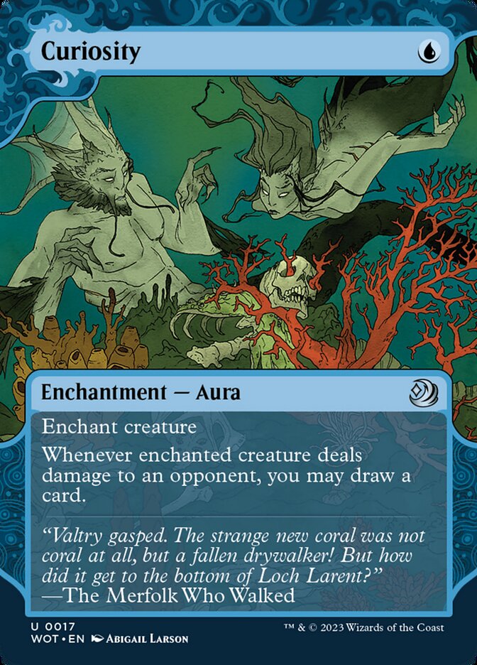
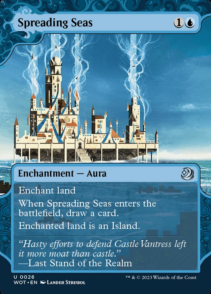
Caitlin: Spooky sea guys, of course. The obvious reference point is Arthur Rackham, spooky fairies–
Rob: They’re, uh, they’re Merfolk.
Caitlin: Merfolk. Rackham did a lot of fairies. But where Rackham is watercolor, and a bit washed out, this is crisp.
Rob: It’s also very Mike Mignola-esque, very Hellboy, the way the faces are distorted in a very angular way, and the lines–the coral just pops! I think it’s great.
Caitlin: The flavor text, I like a lot. “The Merfolk that Walked.”
Rob: Yeah, most of these are in-universe–diegetic. Stories and poems, etcetera. The illustrations aren’t necessary in-universe, right? They’re what we’re familiar with. So for immersion purposes, they’ve used flavor text that sinks you directly in a story or a song or a poem. So the art will be something that makes you think of a children’s book you had in real-world Earth, but it’s contrasted with a clip, or a passage or whatever, from a story that an Eldrainean courtier would tell their child.
Caitlin: Oh, love. The river’s interesting to me–that he’s out in the wilderness, instead of in a palace or a great hall.
Rob: Recurring theme in this set–the human world is being softened by the fae world, and it’s intruded into even the supposedly safest areas.
Caitlin: The king is so miniscule, it’s precious–but the strong lines and chunky shapes, it reminds me of, oh, what’s her name. Nine Fine Gifts. Naiad Einsel!
Rob: Naiad Einsel? Is she just straight-up a Magic card?
Caitlin: No, she was part of a husband-wife illustration team. She did a version of Pinocchio that’s iconic. Very static, almost primitive images, but with such a clear eye towards composition. Brown is more streamlined, less–
Rob: Rustic. Yeah, I see it, though. Sorry, I was a D’aulaires boy. That was my husband-wife team. Hatching Plans?
Caitlin: I love the dragon feet, love that the dragon’s eye is lit up, like, “hey, you are not alone in this.” Truly draws focus.
Rob: Right, and how the contrast works to create that focus. I like how realistic the figure in the foreground is, contrasted with the hyperstylized dragon in the background–heightens the uncanniness and sense of menace.
Caitlin: Love it. Love the pops of red, the water and how it balances the golden light. “Nameless Knight of Summer.”
Rob: It’s really crowded without being busy, almost like a cityscape. Dense, but very legible, even at card size.
Caitlin: Seeking knowledge, but very ominous, too, though. Everyone’s like “oh, mermaids are so cute and fun!” They’re not. They’re terrifying.
Rob: They’re mutant fish-people! They can drag you down. Really incredible use of lighting to depict deep water.
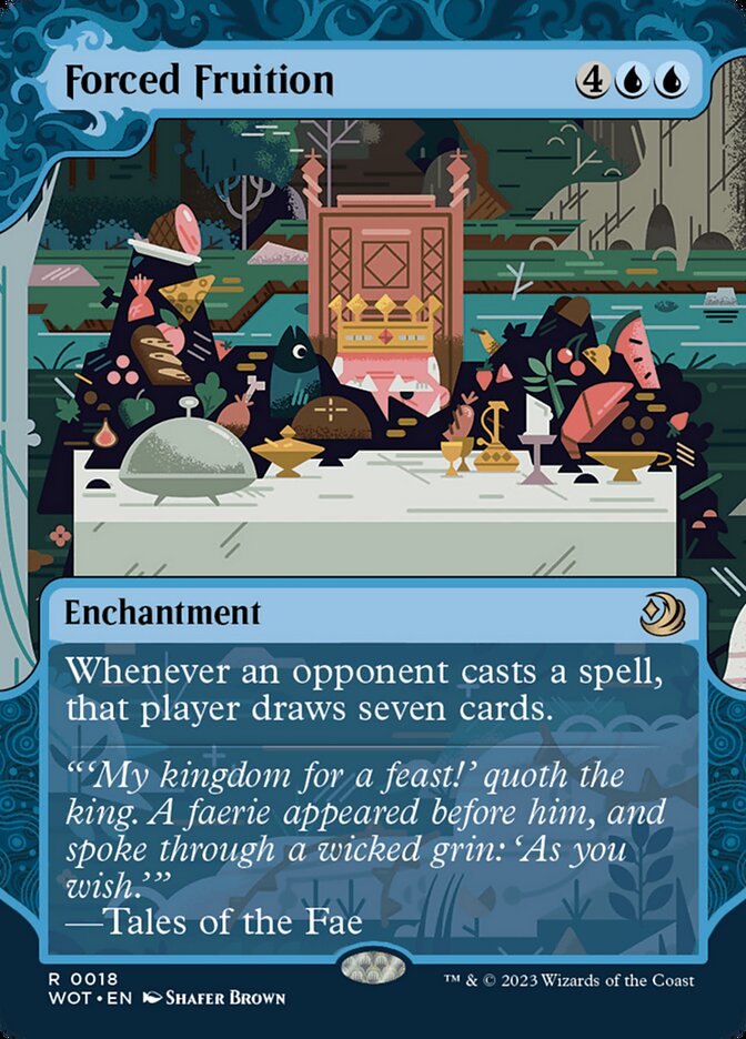
Rob: Two words: who cares.
Caitlin: Interesting. Yeah, it’s like the b-plot of human life in a fairy tale story–who cares about the regular people? Get us back to the fairy land.
Rob: Give us the mer-people! Even if we hate ‘em. And, the art doesn’t match the card mechanic, which is obtuse–they try to justify it in the flavor text, and I do think they justify it quite well in the flavor text, but it’s just very cover-of-a-1990’s fantasy novel. Put a guy in a loincloth with a big sword on the right side of the frame and you’re done, you know?
Caitlin: I have not read a 1990’s fantasy novel.
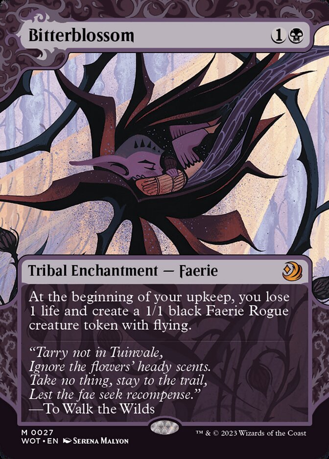
Caitlin: Love the color and the shadows and his diaphanous wings and how they line the blossom. They almost look like feathers and they almost look like flesh. He looks cozy.
Rob: He also sucks out one-twentieth of your life every turn.
Caitlin: I love the perspective in this one–are they underwater? Oh, no, the light is going through them. That’s powerful.
Rob: Yeah, the use of negative space in the skull really makes it pop. Love the holes punched through them and how the use of light–
Caitlin: –The particles coming through, amazing. High contrast, really powerful composition.
Rob: So, this is the Pied Piper being menaced by the Rat King. Utterly fantastic. I love that the rat is a crocodile-dragon and how it turns the tables on a noble knight defeating or outwitting a dragon or other cunning monster. Instead, the Pied Piper analogue–Totentantz, as in Franz Liszt’s “Totentanz,” yes–is negotiating or selling out humanity to the Rat King.
Caitlin: It’s almost like a warped version of a Golden Books illustration. Mid-century style, very stylized.
Rob: There’s depth in the sewer tunnel, the moonlight picking out the frazzled tail, it’s just stellar work that reads at card size and looks great blown up.
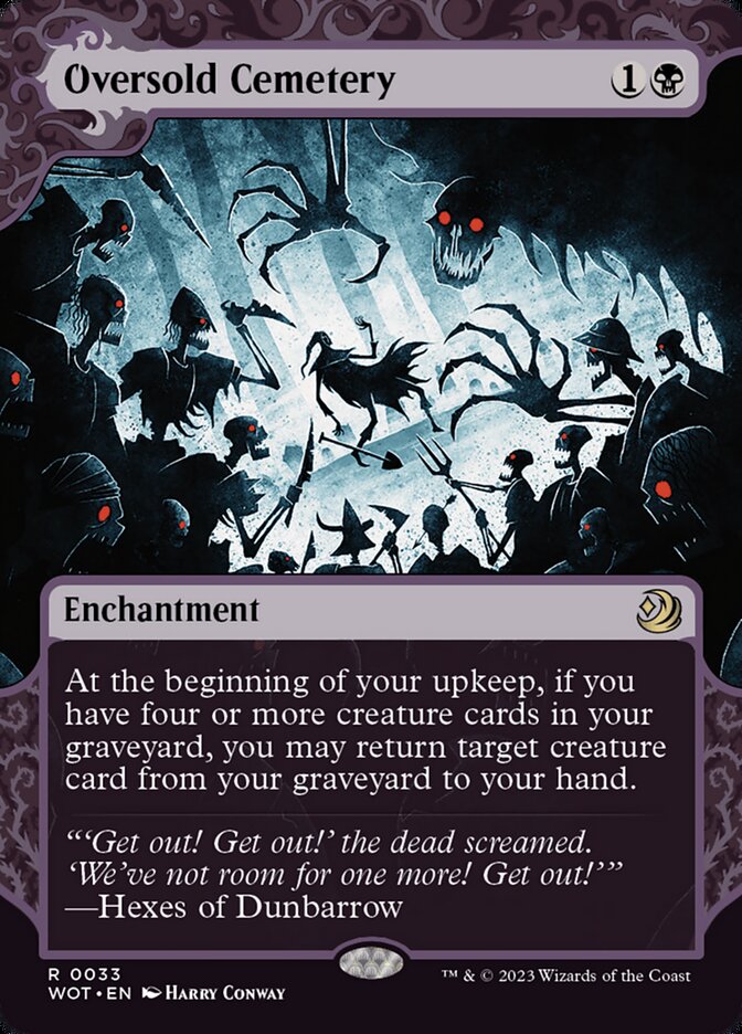
Rob: Black’s Enchanting Tales have a shadow-puppet quality to them that completely cooks, as exemplified in Harry Conway’s art for Oversold Cemetery. Speaking of Disney, this reminds me of The Black Cauldron, Lloyd Alexander’s fantastic Welsh legend that almost killed Disney as an animation studio when they tried to adapt it.
Caitlin: This one’s very Henry Selick.
Rob: Oh, for sure. That’s one Coraline-ass claw. The mint-blue light contrasting with the reds–I keep looking at these little guys and falling in love with them. That’s what Magic is, for me.
Caitlin: Little guys.
Rob: Absolute little guy culture, the most sacred thing humanity has invented.
Magic has always been adjacent, if not actually intersecting, with children’s literature. Some of Magic’s defining artists, like Adam Rex and Tony DiTerlizzi, are also illustrators of children’s books. Eldraine’s Enchanting Tales are the clearest crossover, now that Magic has the freedom to expand its aesthetic palette through bonus sheets and showcase cards and Secret Lairs. There’s space for whimsy and menace in Magic, and never more so than in fairytales, which both reinforce and challenge the cultural status quo. From Shafer Brown’s flat and geometric beauty to Abigail Larson’s wispy but ominous starkness, Eldraine has tales for everyone—and a palette for every taste.
Rob Bockman (he/him) is a native of South Carolina who has been playing Magic: the Gathering since Tempest block. A writer of fiction and stage plays, he loves the emergent comedy of Magic and the drama of high-level play. He’s been a Golgari player since before that had a name and is never happier than when he’s able to say “Overgrown Tomb into Thoughtseize,” no matter the format.