
At long last we have our winners of Hipsters of the Coast and Monday Night Magic’s You Draw The Card contest. A quick refresher: frustrated with the shitty sketches for what was at the time called Revenge of Necromancy, Wizards’ “You Make the Card” contest offering, me and the MNM guys, Chewie and Jeremey, decided we’d have a contest to see if our readers and listeners could come up with better art. AND THEY DID!
Here are two runner’s up. For their efforts they received no prizes beyond our unending gratitude for their submissions.
Honorable Mention #1—Tony Loman’s Ultra Violent Sharpie Drawing
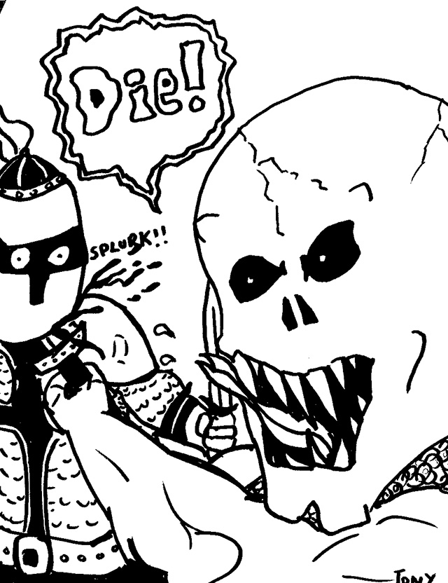

Hey it sucks but I am not an artist and I drew this with a fat sharpie at work.
—Tony Loman
As a man obsessed with the recent Dredd movie, no, FILM, I can say without a doubt that it took a lot of talking down from my fellow judges of quality to not have this be the grand prize winner. It’s so clear and honest and hilariously violent. It’s the only entry to include a sound effect.
But, Hunter’s critique rings truest and lead to our judging Tony’s excellent drawing falling short of the top three. “I think the Sharpie one is funny, but it doesn’t really speak to the card. It’s more of a joke, right?”
Honorable Mention #2—Dan Black’s Sexy Lady Necromancy
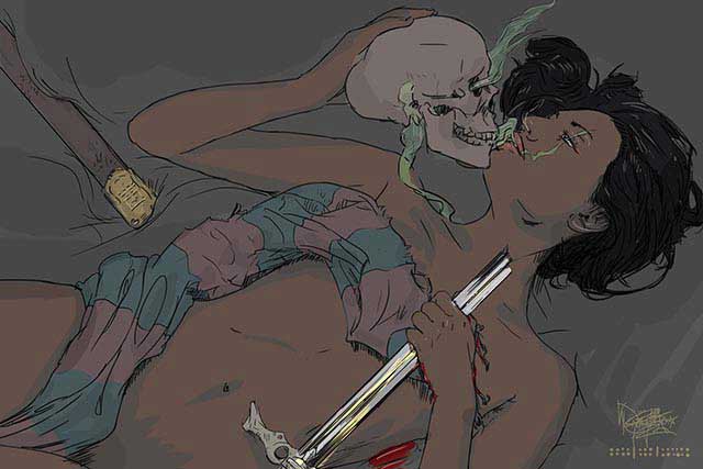
Dan and I talked a bit about his submission over email. I think his style is right on and his abilities are insanely good, duh, but the content is problematic. Here’s part of what we had to say:
Me: Yeah man, I think the art looks dope. I really like the idea of the ragman being a rag woman (though rag itself becomes pretty problematic a word now! HA!). I like the intimacy between the skull and the woman’s face. I’m not sure what the staves are but they’re mysterious and cool. Mostly I object to yet another powerful woman being naked in fantasy art. I think you toss some clothes on her and it’ll be dope. The composition is laid out in a super interesting and dynamic way for such a still image, etc. It’s awesome.
As for my philosophy, it’s not set in stone, I am just spitballing in an email to you about what I thought wasn’t quite right. Right now my thoughts are that powerful women depicted in the nude sends a confusing message that isn’t mysterious just overdone/bad/confusing. Powerful women can have clothes on 🙂
Dan: The skull is the necromancer. Okay maybe not…yet—the idea just occurred to me on the train this morning…
Matt: Ooooooo even better that the skull is the necromancer, more complex. But maybe now it’s worse that she’s naked because it’s another nude hot chick as a victim.
Dan didn’t send his revised image and I talked it over a bit with Hunter before pulling this image as a finalist. One of Hunter’s many responses, “I agree that the woman is too sexual, a bit much for a Magic card.”
While Dan’s work looks awesome the content and attitude didn’t really fit what we wanted our art finalists to convey.
Now onto our winners!
3rd Place—A Huntmaster of the Fells, used by a real life Hipsters writer (Matt) in a sanctioned event, and a pack of RTR!
Michael Comby!
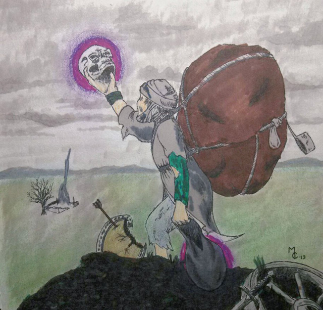
This is a weird one. It feels really honest and reminds me of the drawings I would make as a kid of D&D characters, comic characters, and imagery I’d use to represent whatever world and time period I was obsessed with at the moment. There’s an interesting mix of materials in the drawing. It follows the description pretty closely. I really enjoy the objects sparsely placed in a vast and mostly empty landscape. Recnetly I tried playing Dragon’s Dogman on PS3 and while the combat is much more enjoyable, the entire world seems to have undergone a dramatic population decline. Maybe it takes place right after a plague, I thought. After half an hour I went back to Skyrim. The stories are better and people actually live in its world. Population density isn’t such a problem with two dimensional non-time-based art. Michael’s drawing is sincere, hits all the right notes in terms of content, and adds a flair for the dramatic with the positioning of the skull in hand, glowing purple, as it’s addressed by the necromancer. All together with it and a good effort! Thanks for your submission, Michael! OH! The perspective is super fascinating to me, too. It’s like pre-renaissance ideas of space. That kinda shit always blows my mind.
2nd Place—Judge Promo Command Tower, and two packs of RTR!
Paula Parkman!
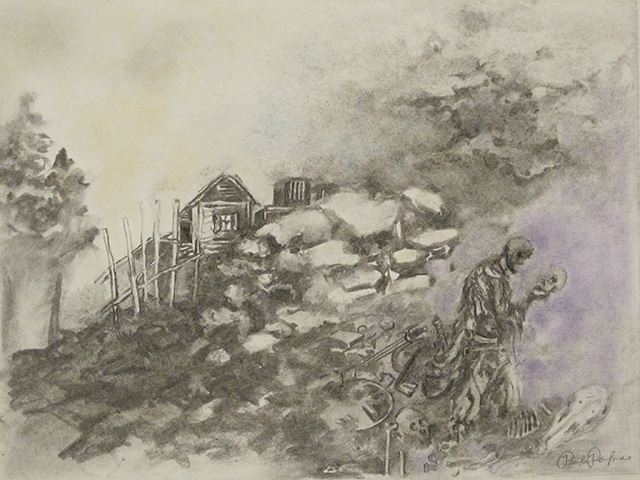
Chewie: Okay, so I really like the cabin.
Hunter: No. 1 is the weird charcoal drawing with the house in the middle.
This, too, has a kind of ancient charm to it. It feels like a drawing from the 1970s. The purple necro-energy is, like most of the drawing, so light, so soft, so smooth. I love the scale of everything and it goes a little further than our third place winner by including greater detail and enhancing the mood with ectoplasmic fog.
Aside from the great mood, setting, and accurate depiction of Wizards’ description this piece has one more aspect I keep returning to. The head and the skull look to be almost exactly the same shape and kind of form a heart.
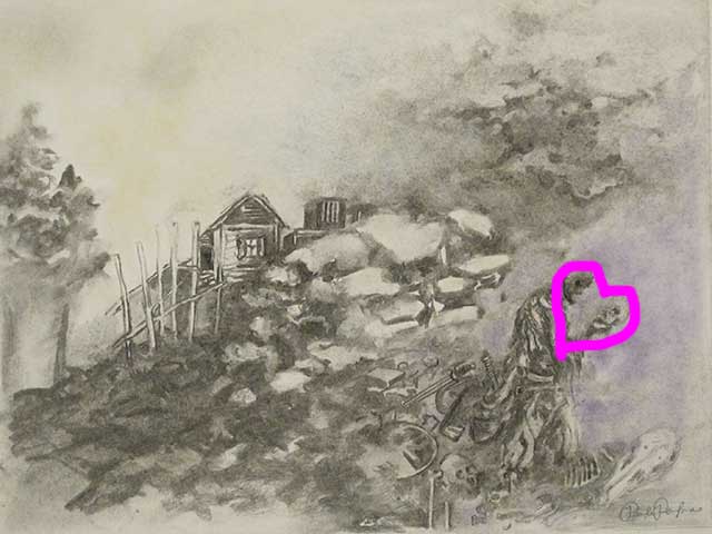
This hints at a meta commentary proposed by Thich Nhat Hahn in many a dharma talk:
Through my love for you, I want to express my love for the whole cosmos, the whole of humanity, and all beings. By living with you, I want to learn to love everyone and all species. If I succeed in loving you, I will be able to love everyone and all species on Earth… This is the real message of love.
Anyway, this image was in each of our finalists list, but, it doesn’t have quite the pop that our winning entry has.
1st Place—A signed print of Fauna Shaman by Steve Prescott and a brand new Hipsters of the Coast t-shirt, a Grand Prix Calgary Playmat, a three packs of Modern Masters!
Garrett Koeppicus
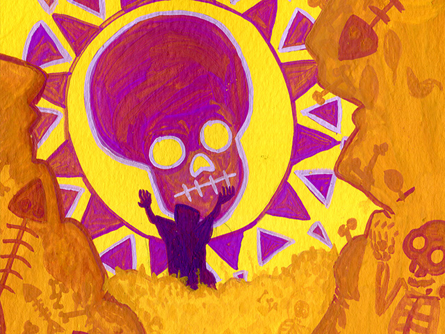
Chewie: It doesn’t really fit the description very well, but the big purple skull is pretty cool, too.
Hunter: I actually liked the yellow and purple one you liked, too, Matt, if that helps sway things.
If Tony’s ultra-violent Sharpie drawing couldn’t win then this little painting by Garrett had to be the champion. It stood out from the other entries in style, form, and color. It has a strong graphic presence, is reminiscent of some of the weirder bits of Magic art (think Stasis, anything by Melissa Benson, and Amy Weber), and generally fulfils my diversity requirements for Magic art.
Garrett took some big risks with his color selection without straying too far from the description of the card. The necro-energy remains purple and his sophisticated use of complimentary life affirming (and insanity inducing) yellow make the whole image roar with joy.
Real it in, Jones. Ok. I like Garrett’s painting very much and he is the winner.
Thanks to everyone who participated!! Prizes will go out to our winners next week!!! WOOO!
All the best,
Matt
MTGO: The_Obliterator