
Welcome to the Best of Hipsters of the Coast Week as we revisit some of the top articles we published this year. There will be some new content this week but for the most part we’ll be taking a look back before we kick off the new year. Back in September, before taking a break from writing to focus on his own artwork, Matt Jones used his weekly Arting Around column to discuss the finer points of Magic artwork. In the wake of Battle for Zendikar spoilers Matt decided he’d had enough with Wizards messing with the card frame and took them to task.
Here are my thoughts on Magic: The Gathering card graphic design over the last however many years.
The original graphic design was unique. It made cards look ancient and powerful. They look like they’re actual magical spells. The illustrations look like windows onto what the spell does. They’re as individual as the sorcerers wielding them. That’s what I thought we were, sorcerers, not stupid planeswalkers. Ugh. You can own the word Planeswalker™, right? Just toss a ™ on it and head to the bank. But you can’t put a price on my childhood, Wizards! YOU CAN’T! Ok ok you can. Jerks.

Eventually that changed to this. Sorcerers became Planeswalkers, the game got more serious, and all of a sudden people needed to read the cards more easily. If it was up to me there’s be no text, just the name of the card, its power and toughness, and its casting cost. You should be able to tell the rest of the information from the illustration. And if you can’t, make something cool up.
I do like that Wizards kept the bubbly black background. I do not like that they got rid of the burnt worn piece of parchment the rules text is written on. What’re we, robots?
The Unglued set tried to make full art lands a cool thing. The paintings look pretty good but that doo-doo gray-brown background border color is awful. The texture is straight up a Photoshop filter from 1992. An incredible waste of potential illustration space.
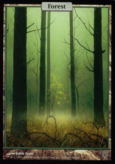
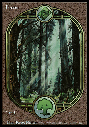
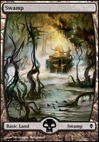
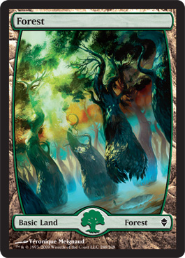
Then Wizards did the best thing they’ve ever done ever in the history of ever. They printed full art John Avon lands. they got the border right (just a little border to remind us that it’s a card, I guess) with maximum room for the beautiful illustration. Sure, Islands and Plains didn’t look so hot. But that’s not the border’s fault! Swamps, Mountains, and especially Forests look incredibly beautiful. Magic has never come close to this kind of border brilliance before or since.
Future site did an OK job though the design is still clunky. Why weren’t there full art Future Sight lands?
Zendikar got it kinda right. A lot of the lands don’t have zendikons on them (or whatever they’re called, they suck). There’s still to much wasted design space where beautiful illustrations could expand into! Why does the picture border curve in AT ALL? Why is there a giant white bar at the top that says “Swamp” really small to the left? Such a waste. It actually says “swamp” on it twice (AND has the black mana symbol!).
Zendikar 2 gets rid of the bottom image curve. Some of the full art lands in the new set are zendikon free, too. That’s great! HOORAY! Next time they do full art lands hopefully they’ll have removed the top border curve. OH! Then the one after that they’ll get rid of the large empty bar at the top and replace it with a much smaller bar! And then the one after that they’ll fully remove the dumb bar at the bottom that is insanely redundant. FINALLY they’ll make ultra premium versions of these cards and the primary market will explode as Planeswalkers™ hunt for ultra super premium versions and then the secondary market will just start ejaculating money as Planeswalkers™, sharks, dealers, and EDH players try and bash each other to death acquiring these new ultra rare mythic premium who-gives-a-shits! Who’s got future sight now?!
Oh wait, they already did that.
Can you feel my hate for this Trapper Keeper faux Aztec/Mayan/Olmec background imagery? I can. It’s ugly. The barely transparent rules text is shitty, too. The art is mostly amazing for these cards. The illustrators who painted the lands seriously kicked ass (ignoring any zendikons as one does) and they should be commended. It’s a real shame that the border imagery is as ridiculously bad and gimmicky as it is.
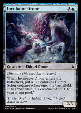
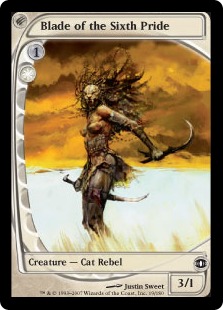
I love the artwork for Incubator Drone. Love it. Too bad it’s got that brain border imagery and is imprisoned within the modern border.
#freemagicart
UPDATE
Stop the press! Hold the phone! May the force be with you! Wizards of the Coast® finally nailed the full art Magic: The Gathering® card. Former Hipster of the Coast Hunter “Rolex” Slaton has just this very moment texted me an image of Jori En, Ruin Diver accompanied by the message “This looks fucking sweet,” and indeed it does!
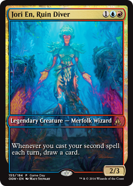
It is so good I asked him if it was an altered card. “Low! It is not,” said Rolex. “It’s the Oath of the Gatewatch® Game Day® Top 8 promo!”
“Why they don’t just do that all the time I will never know,” I said, shaking my head despite Rolex not being able to see me ‘cuz we were texting from different locations in the city.
“Mediocrity is appealing in some ways,” Rolex responded. “Also, I mean, 100% of everything can’t be great. It’s the shitty 90% that makes the amazing.” Sounds like a lousy excuse for having sucky things hanging around but I get what he’s saying.
Let’s also hear it for Matt Stewart! An artist I think I once complained about, Stewart has painted his masterpiece here. Well done!
Matt is currently painting, drawing, reading poetry, and working on collaborative books with writers, friends, and artists he loves. He hasn’t played a lick of Magic: The Gathering® in almost a year. You can see Matt’s artwork on his website.
![]()