
“Logos are hard!”—Hunter Slaton
“The Sherwin Williams ‘Cover the Earth’ logo is the best logo ever.”—Matt Jones
Tapping into our collective future-sight it’s clear to me that Hipsters is due for a redesign that better serves our goals. Dave “Bones” McCoy and I sat down for an hour after I 0-1 dropped from a draft I signed up for only ‘cuz I was at Twenty Sided to get some cards back from Monique. I flooded two straight games and decided the experience of playing one of three Orzhov-based decks drafted in our pod and the possibility of two packs if I managed, somehow, to win the remaining two matches, just weren’t worth it. Design gets me hot, efficiency in design even hotter! Dave’s a pleasure to work with and so we sat down to do something like 50 pencil-on-paper sketches of how we thought the site should look. Dave translated these sketches into this digital sketch when he got home:


The idea for the new layout is so that you, Dear Reader, would see more all at once; the main page would be more visually exciting because of all the images for the featured articles at the top flipping through via a javascript slideshow, and the article images below. We will utilize the Twitter feed more (Rich will be live-tweeting PAX East this weekend, for instance).
Dave and I talked a bit about how we’d like to hear people refer to Hipsters of the Coast whenever our name gets brought up. We writers often abbreviate it as HOTC and a mini-debate arose in our Google Group about whether or not it should be HOTC or HotC. I’m a fan of this not mattering ‘cuz I’d prefer to call it Hipsters the way that Magic: The Gathering is most often referred to simply as Magic (and likewise Wizards of the Coast is referred to as Wizards). This is the conceptual reason for the word HIPSTERS at the top and “of the coast” not so big below it. Think of the way Magic and Wizards’ logos look:
![]()
![]()
The purpose of both logos seems to be variations of looking cool and magical. Magic’s logo kicks the snot out of the Wizards logo as it’s timeless and not so trapped in the 1990s (despite both coming into being in that decade). A quick Google search for “hipster font” brings this up:

And it’s not much help. Further search indicates that Helvetica, the most standard of all sans-serif fonts, is about as hipster as it gets and is probably best suited for a clear/clean/crisp heading font—but this, like most things when working with a group, is up for debate. Maybe the top HIPSTERS line, not the logo, just a heading, will look something like these:


Now onto that diamond shape top right of the sketch, the real reason I am talking about any of this. Here’s your no-scroll refresher image:

We figured some kind of quick, funny, clear, brightly colored logo was in order. Since most of us play at Twenty Sided Store, an homage to the store’s logo seems appropriate.
Twenty Sided’s logo looks like this:

And I realized our acronym (if that’s the right word), the four letters in HOTC, fits into four sides of an eight-sided die (the only die that shows only four sides when photographed from any one angle). So I made these:


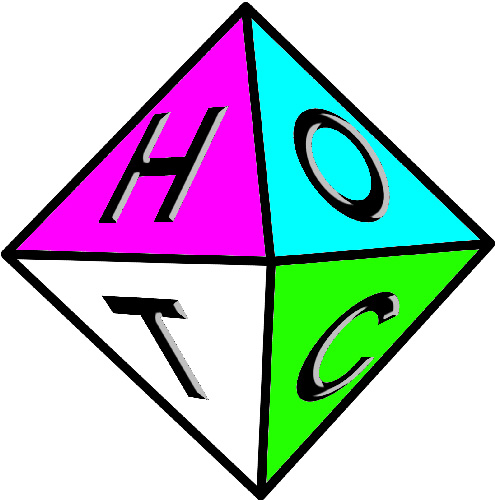

Dave said that the letters didn’t look like they were on the same plane so I explained to him how via email how I made this image.
I had tons of problems getting this right, playing with it in Photoshop and all that. I kept trying to make it “look” right. But I couldn’t get it.
I emailed the image to a couple of close friends and no one was super excited about it. I remember learning that the Apple and MTV logos were shit on by just about everyone when they came out and they’re the two most iconic things around.
![]()
![]()
I like that the colors can be changed in either logo to serve whatever purpose one wants. It could be reminiscent of a holiday, of a deck that has been consistently winning, whatever.
I started wondering why I was so partial to this image over the others:

And I realized I’ve always loved a type of hazmat warning logo I’d seen a lot when working in various woodshops and grocery stores as a kid. It looks like this:
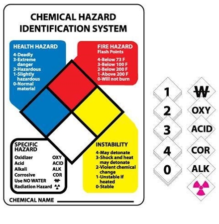
or this:

I flattened out our eight sided die and came up with these variations:


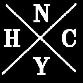
The first image I ever thought of using as a foundation for the Hipsters logo is the New York Hardcore (punk music) logo.
At some point on Monday I threw my hands up and asked Dan Brown, another local 20SS MTG player and graphic design extraordinare, if he’d have a shot at it. I explained everything above ‘cept for the stuff I threw together Tuesday morning (the NY Hardcore and the hazmat stuff) and gave him some words about the logo representing MTG (the colors), paying homage to where we play (the die), and being sort of humorous and clever (you know, like us). He said he’d think about it and get back to me.
Now, my friends, do you have any ideas for a logo? What do you think about what I’ve put forth so far? Do you want to have a hand in coming up with the image? Give it a shot! Email us at info@hipstersofthecoast.com or post your thoughts and ideas below!
Thanks for reading. Next week I’ll have a pictorial essay about Team Hipsters/20SS’s preparation for Grand Prix Pittsburgh and photographs from the event! Go Pirates!
Lots of love,
Matt
MTGO: The_Obliterator