
M15, you’re a pretty nice looking set. You’re even easier on the eyes when you’re all made evenly transparent and stacked on top of one another. That’s what “The Blur of …” series does. I flatten the transparent pile and auto-contrast them in Photoshop (so the color is truer).
The results vary within sets. The illustration box has variations like a from any given series Pollock has variation within the series. The blurs are sometimes subtly tinted to the color type. White is often the least on color tinted (cuz its usually brown or yellow anyway). The average power and toughness is visible along with the average mana cost of cards.
Beleren, the unnecessarily clunky new font Wizards invented for the updated card design, blurs much like Matrix did (the old font).
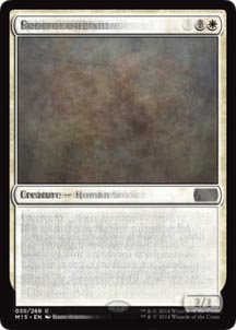
White

A 2/2 human creature at CMS**2 is our blurred white card. It lives in a glorious mass of browns, yellows, and dark blues. I can make out at least one skull in profile within the illustration.
Blue
Blue gets a 2/3 undefined creature for two mana symbols. It looks like the blur is trying to form the head of an OG* sliver peering through the depths of an ocean of tears created by all OG slivers upon finding out they were replaced by slivers with arms and legs.
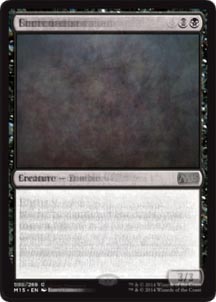
Black
A 2/2 mostly zombie with CMS 1.5, our black blur makes the case for black’s general weakness in M15. The illustration is the most mysterious and powerful. When you aren’t that useful in any conventional way, make sure your art is awesome.
Red
Another 2/2, this time a mostly goblin, for CMS2. The illustration is a blurred ode to 2001: A Space Odyssey.
Green
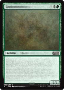
A 3/3 for CMS2. A mess of creature types. The illustration is the mossy bed of a forest. Green is the Drax of the set. Big and literal.
Land
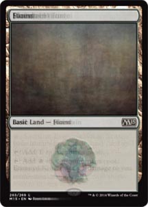
The land blurs are often the prettiest and this one is no exception.
Artifacts
So geometric! Joseph Stella eat your heart out!
Gold
I mean, there are two gold cards. I made this one mostly for shits and giggles and it provides both.
All of the cards in M15
Looks like we get a 2/3 creature of some kind for CMS2. The color of the boarder, the yellowed gray, is super attractive to me. Black isn’t as good when it’s ivory black as it is when it’s burnt umber mixed just right with ultramarine blue (or better yet phthalo or Prussian blue!). Color is richer when it’s slightly off. Maybe I mean “more interesting” and not “richer”.
Ok, kids, see you Monday with a new Power and Toughness about last weekend’s PTQ experience! Spoiler alert: I had a fucking blast playing a bunch of creative good-natured weirdos and didn’t win!
Thanks for reading!
Matt
Matt Jones (born 1980, Rochester, New York) is an artist living and working in Brooklyn, NY. Matt works between a variety of inter-related genres that explore mythology, archaeology, ancient history, theoretical physics, comedy, and the paranormal—all developed and inspired by research and personal experience. Together his bodies of work form a way for Matt to evaluate, negotiate, and play with the world around him. You can check out his art at www.mattjonesrules.com.
Matt’s played Magic since early 1995, took a break for a decade or so, and came back to the game the weekend after the Scars of Mirrodin release. With Hugh Kramer he formed New York’s Team Draft League and is one of the original writers for Hipsters of the Coast. Matt’s been sober for seven years.
*Original Gangster
**Converted Mana Symbols, I just made this up cuz you can’t really determine the numbers in the second portion of the mana cost. So it’s not really CMC (converted mana cost). CMS is a mostly useless label but, hell, I’m an artist and the idea of this conversion’s uselessness is kinda funny to me.