I “met” Winona Nelson while interviewing her boyfriend Anthony Palumbo for this column a couple months ago. Anthony suggested interviewing Winona so I asked and she said yes. Winona, as you’ll see, supplied us with a number of awesome preliminary sketches of her work for Magic. You all know preliminary art is my favorite art and can imagine how jazzed I was when I saw an email from Winona overflowing with images in my inbox.
Matt Jones: Can you please tell me everything you can about illustrating Voice of Resurgence? That card is gorgeous. Please include any sketches and/or other preliminary imagery you can!
Winona Nelson: Sadly that one is old enough that I can’t find the original assignment description. It was notable in that many assignments are somewhat specific about what to depict, while in the case of Voice of Resurgence, it was very much open to interpretation. It was short and said something like “Show us a protective spirit warrior of the forest, whatever that means to you.”
I had an image in my mind immediately. Forests mean a LOT to me. I grew up in Northern Minnesota, in the city of Duluth which has a lot of wilderness and park areas. I spent most of my free time outside in the forest, a lot of it alone. I just explored, or brought a picnic and rested on a rock to eat, or searched for berries when the season was right. I feel the most truly alive when I’m in the forests of the North. One thing in particular I liked to do was search for faces in the leaves, or shapes made by the sky showing through the leaves. When I read that description, I could *feel* the energy it should have, and that old pastime of looking for shapes in the leaves came back to me.
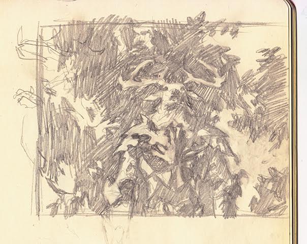
I started by doodling in pencil, which is my usual method. I knew I wanted the piece to be just slightly difficult to read, so you might look at it and not see this guardian spirit at first. But I had to make it readable enough for you to find him without being told he’s there, so it was kind of a fine balance I was trying to create.
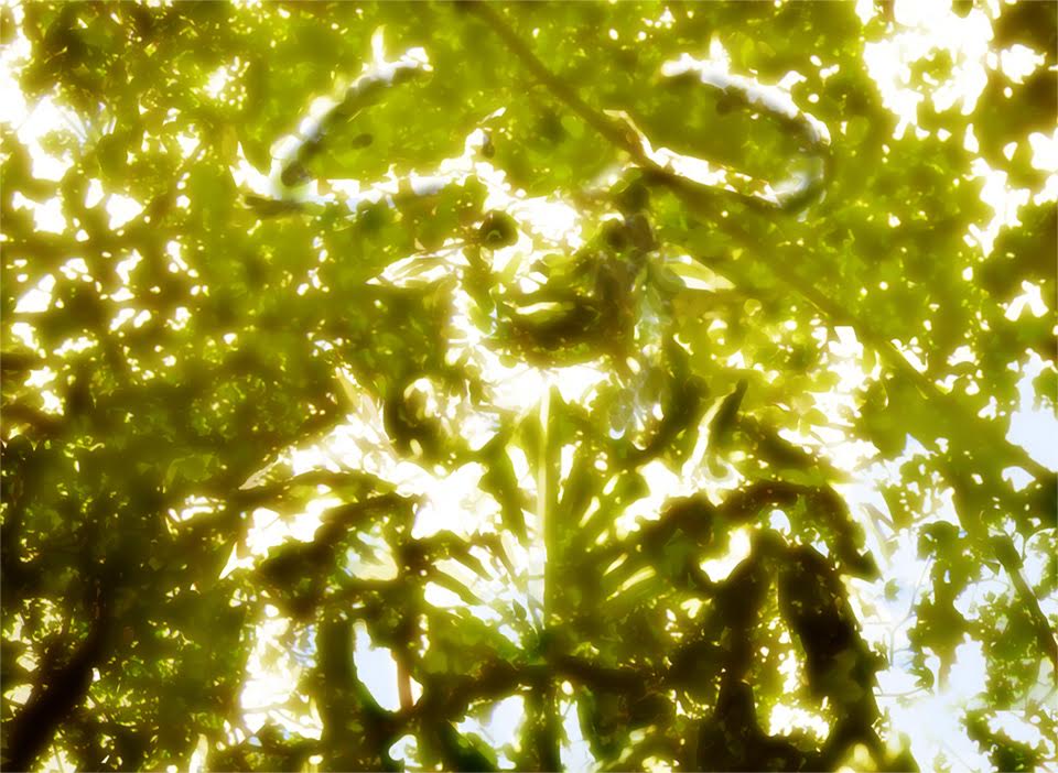
I then did a digital sketch based on my pencil sketch, and used photos I shot looking up through the leaves in the forest. (I shoot a lot of pictures of leaves, branches, and rocks, just in case I need reference like this)
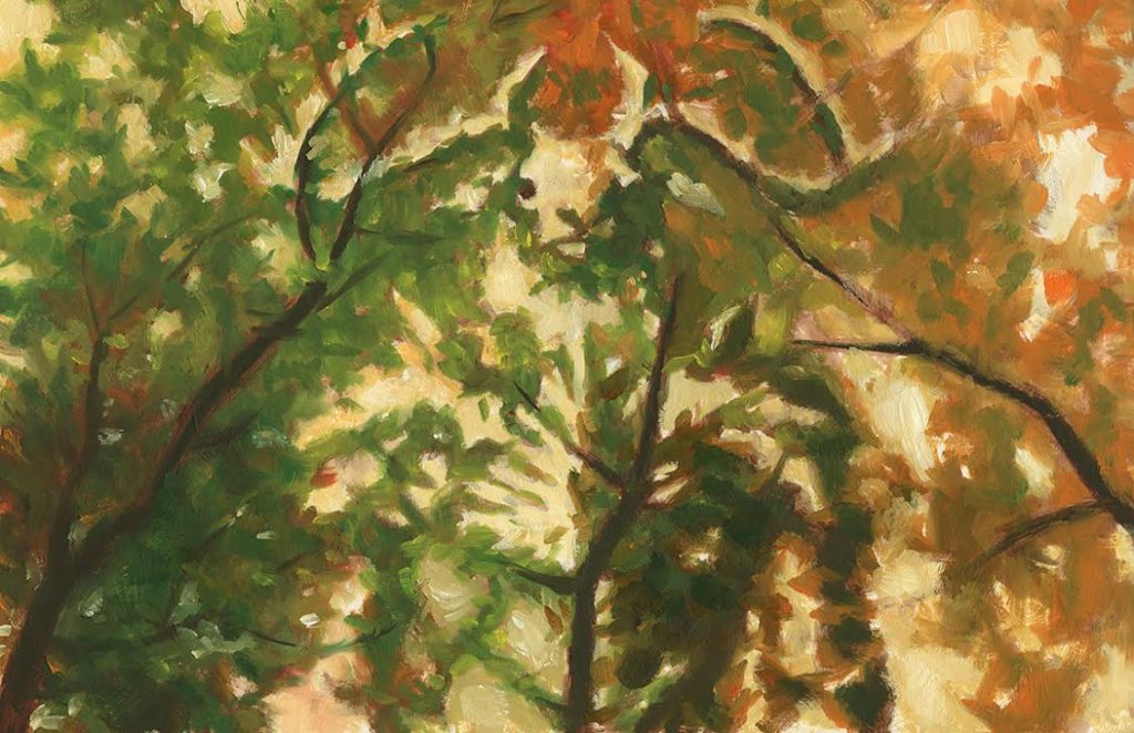
After the digital sketch was approved, I did an oil sketch so that I could begin with some natural texture. Because I was too lazy to reload my palette, I started running out of green as I worked from left to right (I usually work that way to avoid getting paint on my hand) – so I accidentally created a version that sort of goes from summer into fall.
I photographed the oil sketch and worked digitally from there to finish the piece.
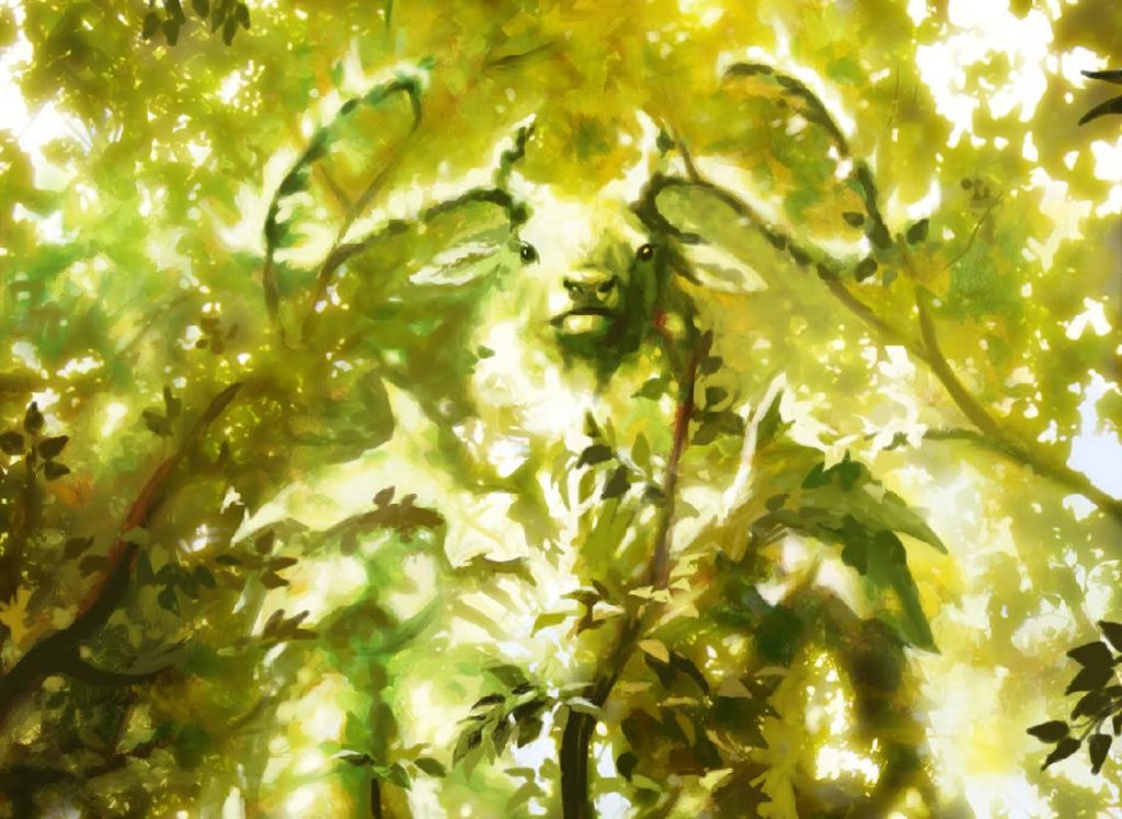
The art director was really happy with this one, and it’s still one of my favorites. It’s one of the most personal paintings I’ve done for Magic. They almost never have a description that open to the artist’s vision these days, and I got to taste a little of the freedom some of the earlier Magic artists had when the assignment used to be nothing but a title.
From what I’ve heard, this card was not originally supposed to be very strong. But a different card was overpowered, and they removed a mechanic from that card and put it on mine, making Voice of Resurgence a very strong card.
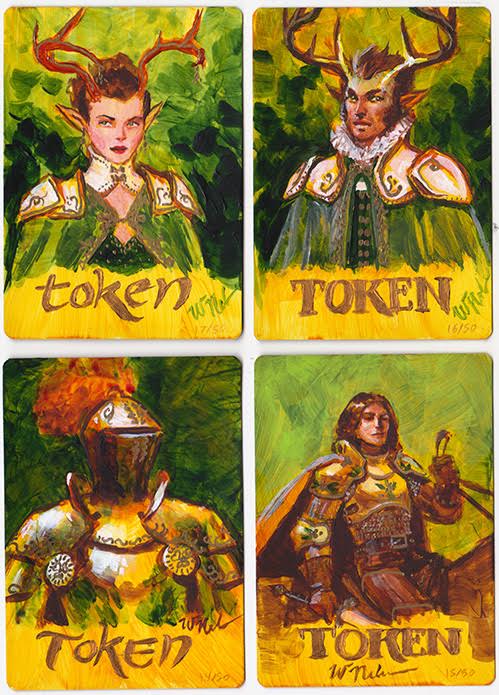
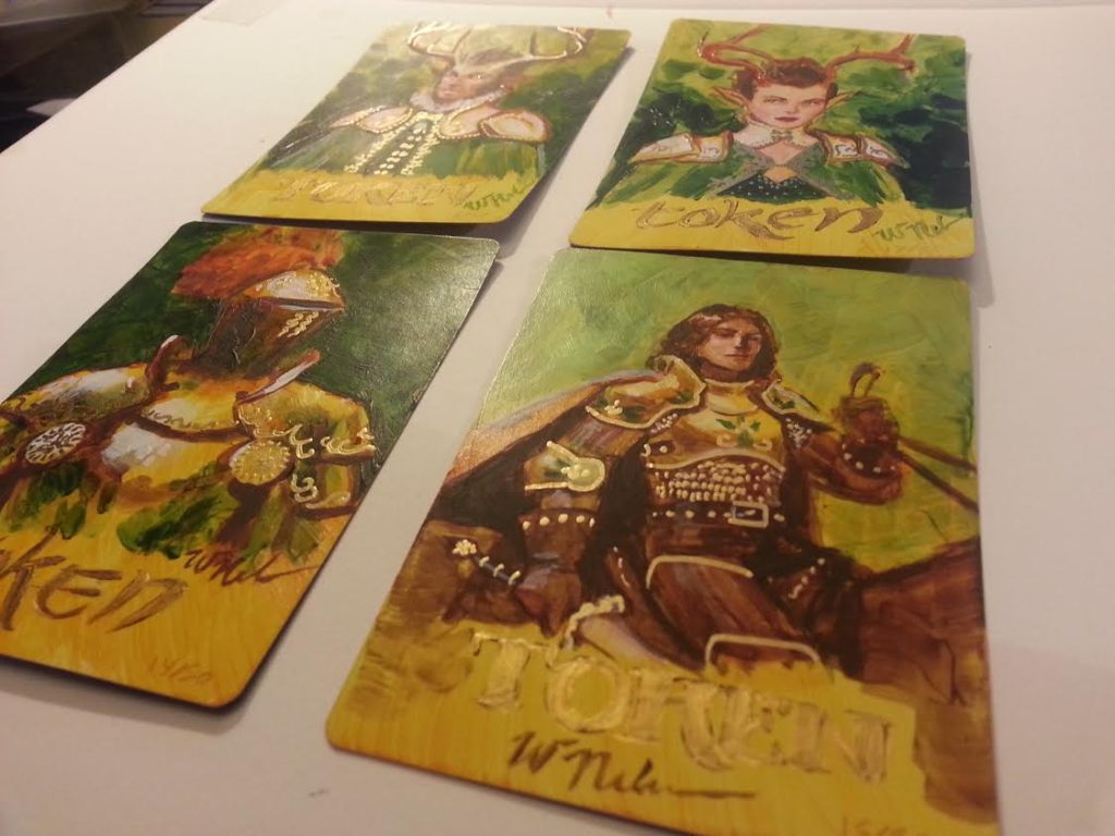
A Magic fan gave me the idea to do a green/white token on the backs of the Voice of Resurgence Artist Proofs and I’ve sold very few of them blank – most have a painted token on the back.
Voice of Resurgence was also my first very strong card and I wound up getting invitations to GPs around the world because of him. I went to Japan, Vienna, Malaysia, and Taipei, as well as a bunch of North American GPs. So my forest spirit has allowed me to travel the world quite a bit!
MJ: What do the tokens on the back of the proofs look like?
WN: Each one is different and I didn’t photograph them all, but here’s a set of four I did for a collector. Each has metallic gold embellishment. Most have been done in acrylic, and I have four at home that I did in oil but I’m away from the studio for a couple weeks, so I can’t scan them right now…
MJ: These are so awesome! I’m still into your response from the first question and identifying with your story. I grew up near a forest, too. Emily (my girlfriend) came home with me a couple weeks ago and we walked through the forest together, the one I grew up walking through, and it was one of the more magical moments in my life, to share that with her. So I get you about trees and leaves and forests. The sketches look amazing and you can feel your love of the things you talk about, they’re really apparent in the works. Going from pencil to digital to painting to digital again, that’s a great use of all mediums! Do you work this in depth every time you make an illustration? You really owned this one. I know that when I paint there are some that just peel pour outta me and some I have to spend more time with. There are some I can’t stand but keep around because there’s so much to learn from when looking at them. Can you share with us a card illustration that wasn’t as personal as Voice and talk about it a little?
WN: I usually try to find a personal angle for each piece. It’s hard to care about doing a good job on a painting if you can’t find a way to connect with it, and the art directors at Wizards are very good at assigning things that make sense for you. I’ve rarely done any pieces that are mainly landscape for instance, because I just don’t have much of that in my portfolio. I’m much more into characters. But then I didn’t think I was that into monsters and gruesome things, and I still enjoyed the hell out of the darker assignments in Innistrad.
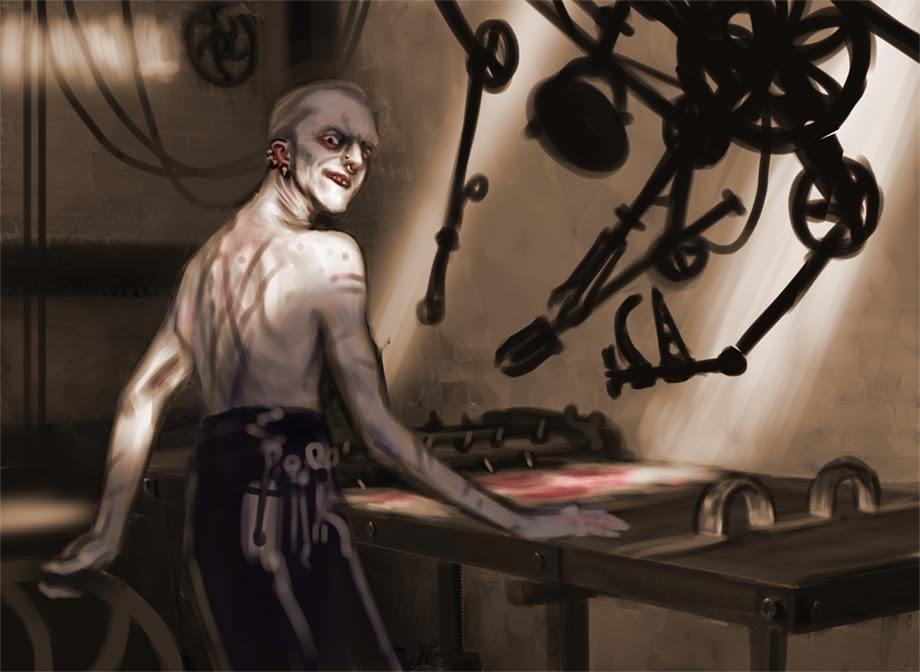
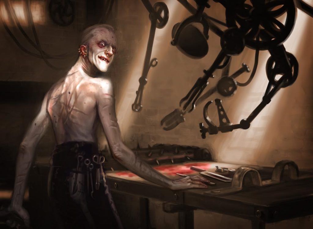
There’s one I did, Hired Torturer, that I would definitely not have seen myself being the first pick for. I usually paint the powerful and beautiful characters, not so much the monstrous. In this case, the thing I connected with in the assignment was that he is an expert who loves what he does. That I can understand. To him what he does is art, and there’s a tenderness in the way he arranges and caresses his tools, getting ready for his next client.
To further increase my excitement about painting a subject that was a bit different for me, I used an unusual lighting scheme that allowed some of the technical side of painting to become a motivator. I remember at one certain breakfast in a coffee shop with my boyfriend Anthony Palumbo, the wall behind him was so close to the color of his forehead that the outline between them was lost at certain angles, but where the light was hitting his chin it actually made the wall look much darker than next to his forehead even though it was the same color. If we weren’t also an artist, my total distraction from whatever he was talking about that morning might have annoyed him, but instead he sat still to let me sketch the effect. That moment was still in my mind when trying to find a magic in this gruesome character, and it wound up being an incredibly fun piece to paint.
This one is also an example of a piece I did that was fully digital from beginning to end, so to answer re: switching mediums, I definitely work in a lot of different ways.
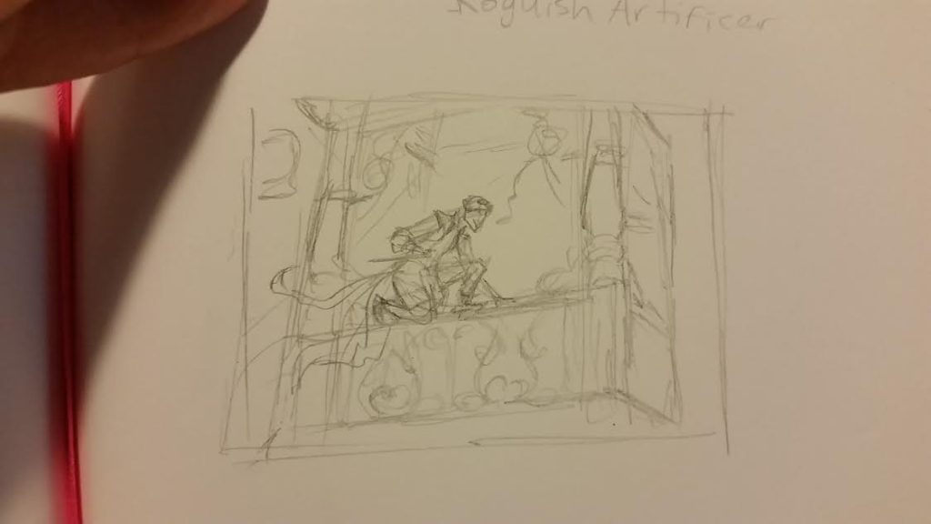
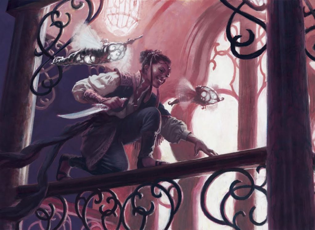
And as an example of one that tried its hardest to be unloveable, here’s Whirler Rogue. I am not that into painting architecture, and since the assignment called for a figure on a balcony railing, that meant painting architecture.
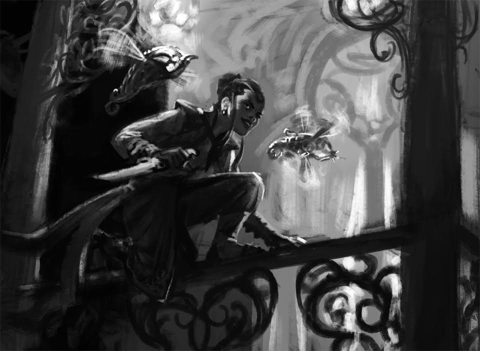
I cropped in as much as I could from my original pencil thumbnail, and it was still proving a challenge. I ended up building the balcony in Sketchup to help get the perspective correct. Check out this amazingly ugly reference image Tony helped me create using my Sketchup model and a Poser figure dropped in for scale. Ew! It was useful though.
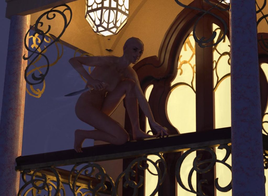
He also helped me take a self reference photo for the costume.
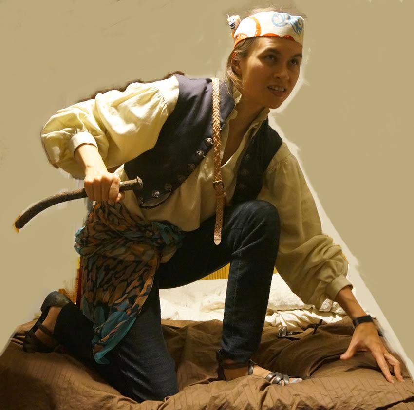
It’s nice to be dating another artist so he understands these ridiculous things I must do in pursuit of a painting…
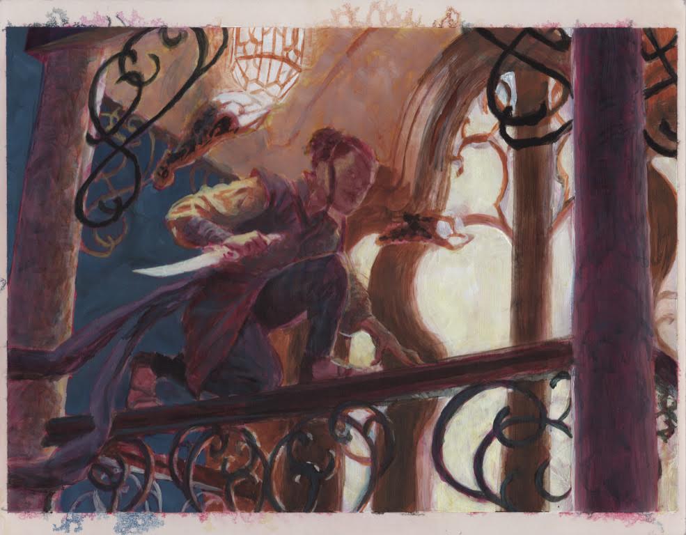
After getting tons of reference together, I did a painted sketch similar to what I did for Voice of Resurgence only it was acrylic instead of oil, and I hated it the whole time. It felt like the “ugly stage” of this piece was never going to end.
After a lot of digital work I like how it finally came out, but it was a real study in patience. It just looked more and more wrong until it all finally started clicking into place. This is one of the few that have had me fully freak out and lie down on the floor in frustration, utterly positive it was a total loss and I would be fired and probably die in disrepute. It doesn’t happen often, and actually now a year later I think this may have been the last time I went all the way floor mode. When you manage to work through those fits and find out you’ll be just fine, it makes you stronger. It happens sometimes to either me or Tony, and we’re fortunate to have each other so that when one of us is having a fit, the other one can come and make a couple changes to the piece to get it moving again, or help with more reference, or make food, or just comfort the afflicted person until they calm down. It’s nice.
And that’s where I abruptly cut it off because of deadlines and ‘cuz Winona had given so much of her time and sent so many images I was well past the 1000 words David “Bones” McCoy allows me per article. Check out Winona’s work on her website and check back here at some point for more with her and her work ‘cuz there’s definitely more to talk about! Oh, and I highly recommend checking out her webcomic Unikron.
Matt Jones (born on at the beginning of the 8th decade of the 2oth century) is an artist living and working in Brooklyn, NY. Matt’s played Magic since Revised. Lately Matt’s game has become more about hanging out with friends and shooting the shit and less about competitive tournament play. He writes the weekly Arting Around column on Hipsters of the Coast, interviewing Magic illustrators and occasionally adding his thoughts on the art of various cards and sets. You can see Matt’s artwork on his website.


